lil background: part 2
Posted by Rebecca, March 29th, 2010
Once we got through choosing the exterior options of our home, we were sent to the design center for the interior. This place was ginormous. There wasn’t even a hole dug for our home yet, and the model we previously walked through had been sold, so it’s safe to say we had no clue what we were doing. Plus our wedding was less than 3 months away, so we were up to our necks in those choices. In fact, since we were short on time off, we did our floral/table design for the wedding, then shot over to the design center for our house options all in one single day. Yes we are crazy and that is why I got a case of the shingles shortly after…TMI.
Anywho, we arrived at the design center to hear that they did not have our appointment in their book. Read above blurb about limited time off. So the “design” person we were supposed to work with had another couple in our time slot. There was nothing they could do for us that day, but told us we could work on our own. And with that, we chose almost all of our options that day, without any help, decoding the crazy builder price sheet. It took us more than 3 hours.
We had remodeled our condo a little less than 2 years before and we were really pleased with how our it turned out. We had awesome Pergo flooring, which was not too brown, not too cherry, in about a 3.5 inch wide plank with beveled edges. Apparently they don’t make it anymore…
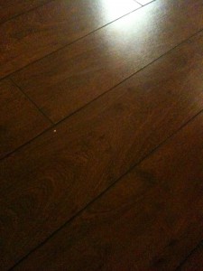 We also added a wide baseboard, which we loved. I always wanted dark wood cabinets, but with the dark floor and the lack of windows in our condo kitchen, we went with white….
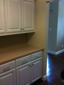 I apologize in advance for the quality of some of these pictures, they were taken from my husband’s iPhone right before we handed over the keys to our condo. We are currently trying to get the pictures our realtor took of the place when it was actually decorated. Here’s the part of the other side with the stainless appliances we also added…
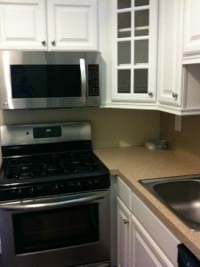 So we definitely had ideas in mind. I wanted a very similar floor, and with my desire to keep the place light and airy, we decided to go with the ‘antique’ colored cabinets, which are slightly less white than the…white ones. For hardwoods, it was much, much harder. First of all, the pricing list may as well have been in Spanish, so we had no clue what anything cost the first time around. Second, of the hundreds of flooring samples, I wasn’t in love with a single one. They just were not rustic enough for me. That being said, once we found out the pricing, we decided to go with the least expensive option, in the darkest color and widest plank available. Which was the Bruce oak floor in Cherry, 3 1/4 inch plank….
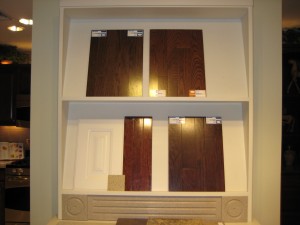
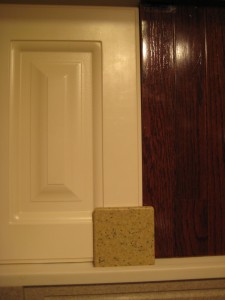
The other options, some of which are shown in the top pic, were a little too 1970s looking for me. They weren’t a modern brown, more of a Brady Bunch brown. I previously did not like cherry, but it was the darkest option they had in that price range. So I sucked it up this time. The countertop sample shown above with our cabinets is Corian in Bethany. Corian came standard in our kitchen, and there were only two beige options, so that choice was cake.
We rounded out our design center visit with some basic carpeting choices…
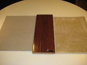 This one was pretty simple as well. The carpet on the right of the wood is a standard choice. The colors we had to choose from were that, pink, blue or WHITE. There were millions of carpet choices, but only 4 which were not upgrades. Since I had a budget, I think it is the most beautiful carpet I have ever seen. But not beautiful enough to put downstairs, which we upgraded to the berber one pictured on the left…
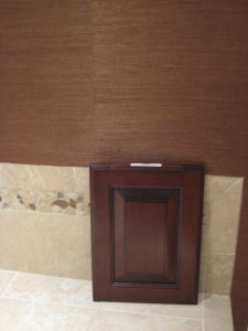
Then we chose this master bath cabinet and tile, the latter which blew the bathroom budget but I had to have it….
 We also stuck with the stainless appliances that we loved before.
Flash forward 7 or so months when we finally got to see how everything we chose worked out…(note: the house had yet to be cleaned in the following pre-closing pictures, the random dust and crap around is not ours)
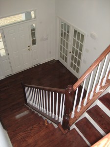
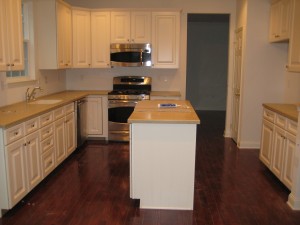
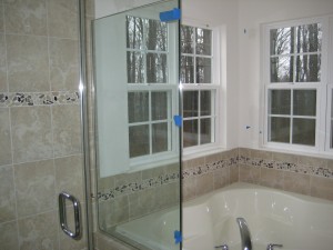
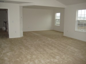
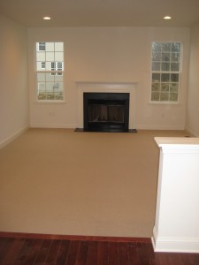
We are very, very happy with the way the hardwood floors turned out. Ecstatic even. They are no where near as red as I thought they would be and have a great variation in color which I love. In fact, we are very, very happy with the way every one of our choices turned out, even that standard upstairs carpet that I thought was gold. It’s actually quite nicer than I thought!
Our closing is on Tuesday. After 10 long months, we will finally have a home again. We’re painting within the week, as well as doing some other small projects, so expect many more pictures as we make our house a home!


test