Archive for September, 2010

window drama

2 Comments

Posted by Rebecca, September 30th, 2010

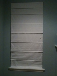
A while back, I posted this picture of a failed adventure in natural woven shades with separate you-attach-it-privacy liner.  The good news is, I figured out how to properly attach that thing.  The bad news is, I hated it once it was up.

I wish I could say this was the first time this had happened.  But it was the second.  Then there was a third. And a fourth.  Add in a bunch of ideas that were canned before we actually purchased them and we’ve gone through about 10 ideas for what the hell to do with the family room windows.  Someday, when we find a solution, I will go through all of the ideas and why they didn’t work for me.  I won’t do that now just incase I have to backtrack and choose one of the treatments I didn’t like… then eat my words that I described how cheap it looked on my blog.

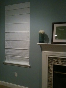
For now, cue our most recent attempt…meet the Allen + Roth roman shade from Lowe’s in snow white.

The woven shade previously linked it also from the Allen + Roth line.  I absolutely love their stuff… our walk in closet and other roman shades were made by them.  Plus they carry 72 inch long shades in stock, for around $30 each.  I decided to give the white a try (I’ll explain my logic once I figure it out…)

The problem was, the white is too white.

(Tangent: ignore the random mish mash going on with the  fireplace.  The frames are going to be hung, the vase is experimental, and the fireplace is not yet finished.  Work in progress!)

Until we hung this, I had no clue that our trim work wasn’t bright white.  The mantel, baseboards and window sill looked dirty compared to the shade.  Which I’m actually happy about in the long run, since the creamier tones blend better with most colors.

There are a total of 5 windows in the room, so I’m limited price wise.  I’m desperately trying to avoid anything that falls into the ‘custom’ category! Suggestions welcome 🙂

mailbox makeover

2 Comments

Posted by Rebecca, September 30th, 2010

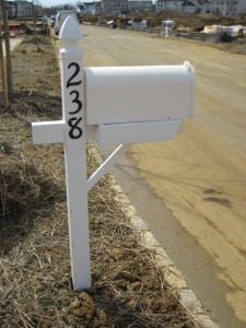
The very first project I tackled after moving in was to do something with this awful mailbox the builder gave us.

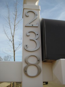
I just could not stand the font of the numbers and the fact that both the mailbox and the post were white. Where’s the contrast? So uninteresting!

So I decided I was going to paint it and change the numbers. Lucky for me, Lowe’s had some house numbers in a font that I actually liked for a couple of bucks each (I am extremely font-picky and swore I’d have to order some online). I also picked up a can of spray paint in a dark brown color to match our doors and shutters.

First, I unscrewed the very dirty mailbox and wiped it down (the thing was covered in orangey construction dirt). I also popped off the red mailbox “flag”….

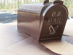
Then I started to spray paint…

First coat….

Then second coat…

Then time to dry….

I then unscrewed the existing numbers to put on our pretty new ones!

There are no pictures of me with drill in hand 🙁

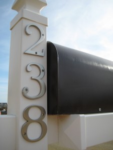
Then I snapped the red mailbox “flag”, arm thingy back on, screwed the mailbox back into place and tada! The finished product!

It was such an easy and inexpensive fix that helped our mailbox better compliment our house and stand out from the neighbors (we all got the same one). It is now very easy to give directions since we’re the only people on the block with a brown mailbox!

ps- These pictures were taken back in April, before we had sod, neighbors and when the street was very much a construction zone. I plan on posting an updated view from the street soon, since the final house on our street was recently completed 🙂

pps- I’m linking this post up to Thrifty Decor Chick’s spray paint party. Go check out some good spray paint makeovers!

since I’m in love with…

No Comments

Posted by Rebecca, September 28th, 2010

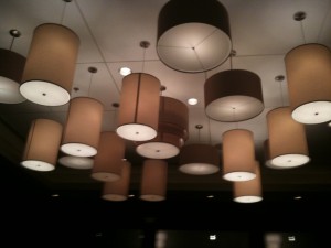
Drum style pendant lights, you can imagine my excitement when I walked into a restaurant last night and saw this. They can spare a few for me, can’t they? 🙂

i see a pattern here…

No Comments

Posted by Rebecca, September 26th, 2010

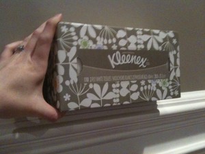
Because I don’t like the combination of taupe and white or anything. I couldn’t have matched this better if I tried. But the tissues won’t be going in my dining room….

the newest kitchen accessories

3 Comments

Posted by Rebecca, September 25th, 2010

Square glass canisters, with writeable chalkboard labels(!), from Pier 1

Copyright 2010 - 2011. The Lil House That Could. All rights reserved.