planning ahead
Posted by Rebecca, December 8th, 2010
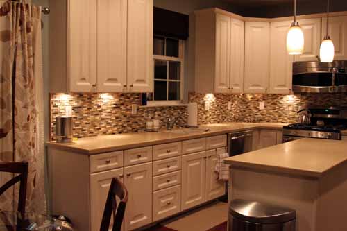
We still have 2 bedrooms with zero furniture in them and an empty formal living room, but we can’t help thinking of ways to improve on our house. One of the ideas floating around our heads for a future renovation is an overhaul of our eat-in kitchen space.
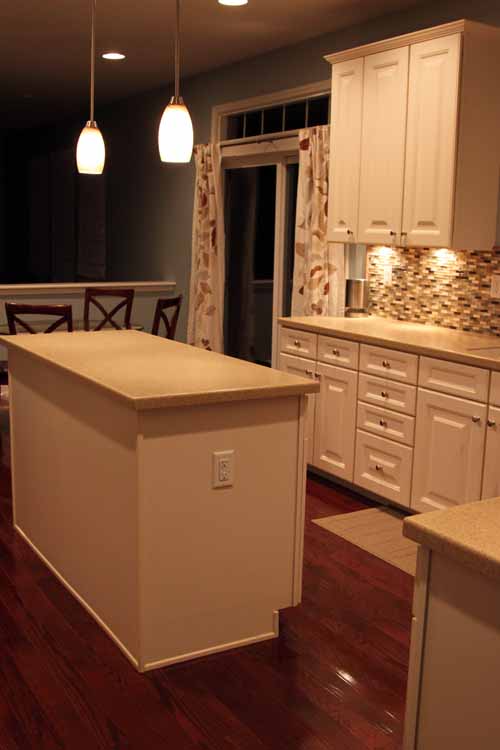
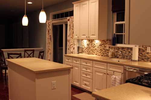
When we bought our house, the model had already been sold. We walked through it about a year before, but we were in so many models that we hardly remember the details. One of those details was whether or not there would be room at our island for some stools. The saleswoman assured us there would be, but when we moved in we realized she was wrong.
We hoped to change the countertop on our island to a contrasting color (I imagined a dark butcher block) with about a 12 inch overhang for two stools. Hence the two pendant lights over the island. Though I was sad that I couldn’t sit at the island as Mike cooked and tell him about my day, we were okay with it. We always planned to use our condo dining set since I wanted a much more casual dining feel than a formal dining room has (and we paid only $199 for it in ’07- table AND chairs AND glass top!)
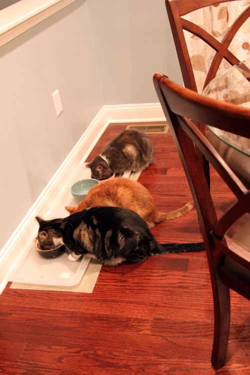
(sidenote- it was dinner time when I took these pictures, how cute are they??)
Now that we actually live here, we’ve realized that the kitchen really is the heart of the home. Whenever we have people over, everyone stands around the island. We try to tell people to move into the family room or dining room, but they won’t budge. So we started to think of solutions and I was reminded of a model we walked through about almost 3 years ago now. It had a similar kitchen floor plan as ours, but the builder offered an optional sunroom. I remembered that the builder was Ryan Homes and I recently scoured their website for pictures. Unfortunately, the development we visited was sold out, but I was in luck that I have a disgusting memory and figured out that the model was the Yorkshire. I managed to find floor plans and pictures on the Ryan Homes website.
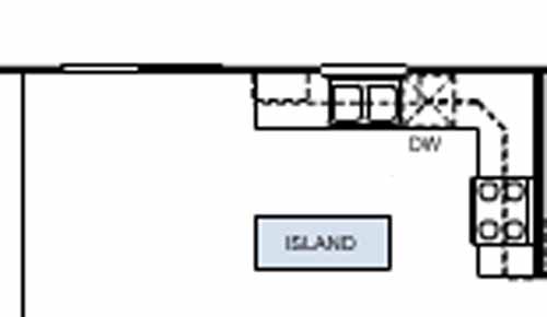
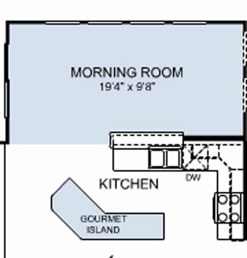
Here is the basic layout of our kitchen, as displayed on their website…
And here are the additions we’d like to make, also via the Ryan Homes interactive floorplan tool…
Our builder did offer an add-on to the back of our house, but it was more vertical than horizontal and we didn’t think it would be very functional. We liked that this was more of a room than a bump-out and didn’t extend very far into the backyard. We also have high hopes for the backyard area someday, but that’s for another post.
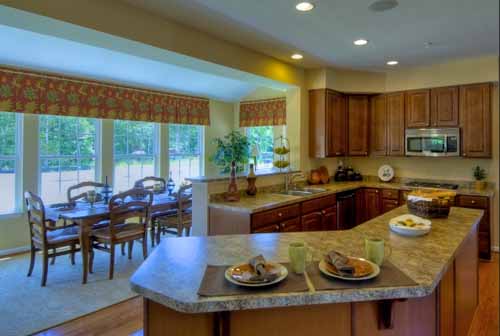
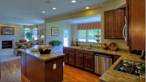
I also found some still images of a Ryan model home that was upgraded with the exact changes we would like…
There is also a virtual tour of this house here!
Ideally, we would love to do something like this, opening up our kitchen, extending our island, adding an area for stools at the island, making a bar area on the opposite side of our sink with additional seating. We would open up the area from the window through the sliding glass door. We would lose the upper cabinets to the left, but honestly there’s nothing really in those. And we’d gain the space in the new base cabinets in the island.
We just think we can add some special touches (Wine fridge anyone?? Bookcase area in the island??) that will make our kitchen look more custom and less builder grade. Plus adding a nice large sunroom will give us a ton of options to work with. And of course, the cats would love all of those additional windows! 🙂
Maybe in 10 years. But we can dream, right?
ps- I started a Facebook fan page for this place, come here to join!
pss- Please join, don’t feel creepy, I need friends 🙂





The morning room addition would be AWESOME! It’s always good to dream. And not that it’s any consolation, but your current kitchen is exponentially bigger than ours. Sigh.
I would love to friend Lil House on Facebook, but I’m taking a Facebook hiatus for an undetermined period of time (for my own sanity!). Here’s hoping you get lots and lots of friends! 😉
I think I need a Facebook hiatus! I’ve been slowly trying to distance myself, but that leaves me addicted to Twitter 🙂
I never realized how much a kitchen would be a focal point of a social gathering until we moved into our apartment and had basically a 7×7 nonexistent kitchen. That’s where the food and sitting places are, and that’s where people want to be. So I totally understand what you mean about trying to herd people into a family room. People will go where people go.
And I think the more open a kitchen is, the more inviting it is. That’s been the thing I like the most about more of the modern houses is that they have a much more open format compared to older closed-in homes. As if the builders were originally thinking “This is the kitchen, and that is all.”
And if you’ve got the room, you can do it! AWESOMENESS!
(and I’m already a “fan,” or a “friend,” or whatever, on FB. So you’re cries of desperation…err… assistance have been answered!)
Haha we realized in our condo, which didn’t have an open floor plan, nor an eating area in the kitchen, but everyone just stood there! I hating using that kitchen because I couldn’t holler from any other area.
Thank you for answering my cries for help 🙂
awwwwwwwww kitties! Mine is chowing down as we speak… or maybe it’s the ferrets? I hear someone pigging out in the other room. I’m an enabler and leave the bowl full all day. Madison will be 30lbs before we know it… haha! jk I could never let that happen. She’d just roll down the stairs…
back on track! Ok the new island idea is fan-freaking-tastic! I never thought of having one shaped like that but now I know it is an amazing amazing idea! Your current island is the same size, and the same layout as mine — and stools would be a pain. paul lounges on the couch while I cook and that makes me sad… missed interaction time! boo!
I know a stool could be pulled up temporarily so you can chat with him while he cooks (and vice versa for my situation) but in a perfect would we would just be able to snap our fingers and make the impossible possible! <3 haha — hope you get that baller island!
xoXOXO
PS: don't you dare stop reading my blog b/c i make you hungry. i'll mail you snacks to eat while you read =) love ya!
More on the stool situation in about 5 minutes 🙂
I guess will just have to keep a bag of Goldfish next to me while reading your blog…
I love the morning room and island idea! Our kitchen is pretty teeny, but it has a half wall into the living room, so it sort of lends itself to socializing-while-cooking. Unless someone is running water, then it lends itself to a lot of “Whaaaat?! What did you say?”
PS- Our houses can be friends on FB when I get on a computer that doesn’t have it blocked (I am definitely NOT reading blogs at work. Nope! …ok maybe just a little.)
PPS- I think it’d be nice of Santa if he helped you turn one of those two empty bedrooms into an art room. Do dark purple paint and Urban Outfitters curtains fit in a stocking? 😉
Who reads blogs at work! I would never do such a thing! 🙂
I agree that would be very very nice of Santa! I should have put an art room on the house Christmas list! Though that would sort of be unfair because I told Mike a finished basement didn’t count.
[…] Like The Lil House that Could discovered, people really like hanging out in the kitchen. I love that, but our kitchen is as small […]