Master Bath
Posted by Rebecca, August 18th, 2011
I figured I should get back to working on My Casa tour I started two weeks ago, eh? I kinda lost steam because well, most of the other rooms in this place we haven’t done much to. Most of the rooms I have left to cover are still in their “before” stage. Quite like our white box of a master bedroom, our master bath is also still sporting some paper blinds and white walls. Woohoo.
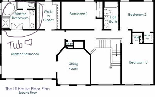
Here’s where it lives on our floorplan.
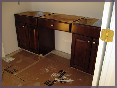
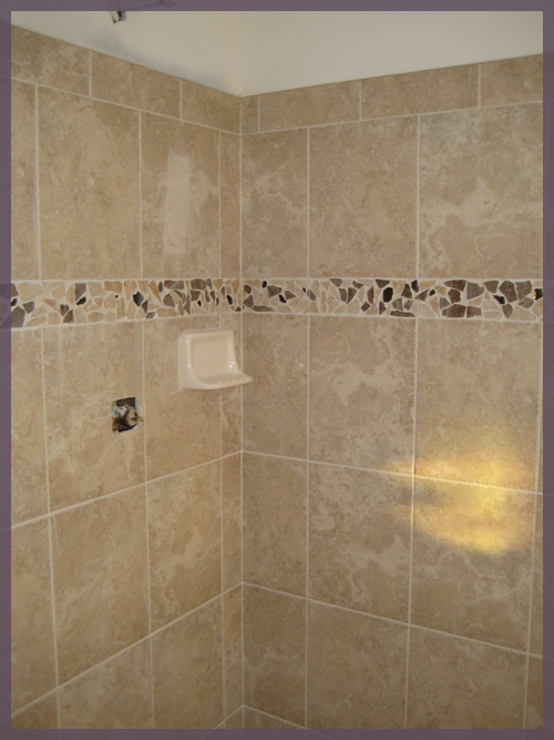
The two good things about this room are the vanity and the tile. Here they are while the house was still under construction…
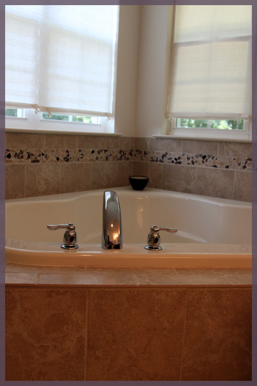
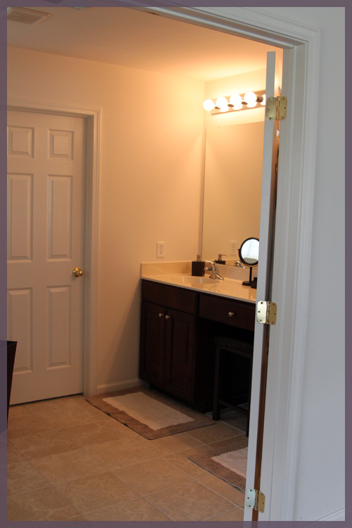
These two elements were two of the few upgrades we made to the house through the builder. I didn’t think that ripping out brand new tile after we moved in was environmentally friendly, so we made sure to pick one that we liked, even if we paid a little extra for it. For the vanity, I love super dark cabinetry and chose the darkest one that the builder had available. I wish it was even darker (since they are actually glazed) but I think once we actually decorate this room it will have that spa like feel I was going for 🙂
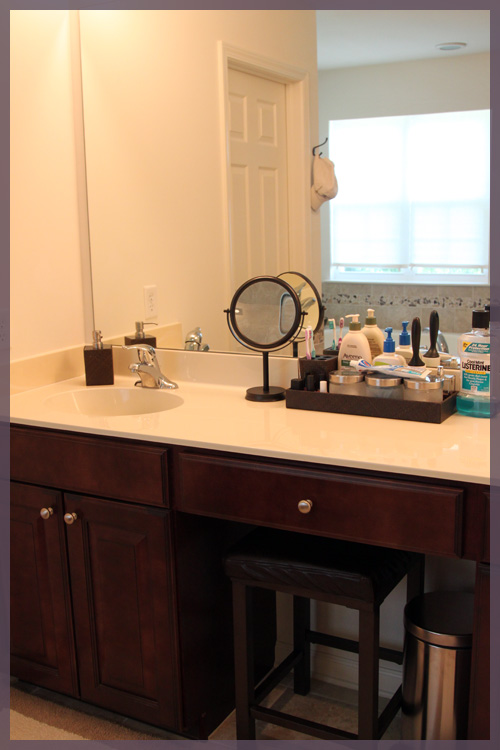
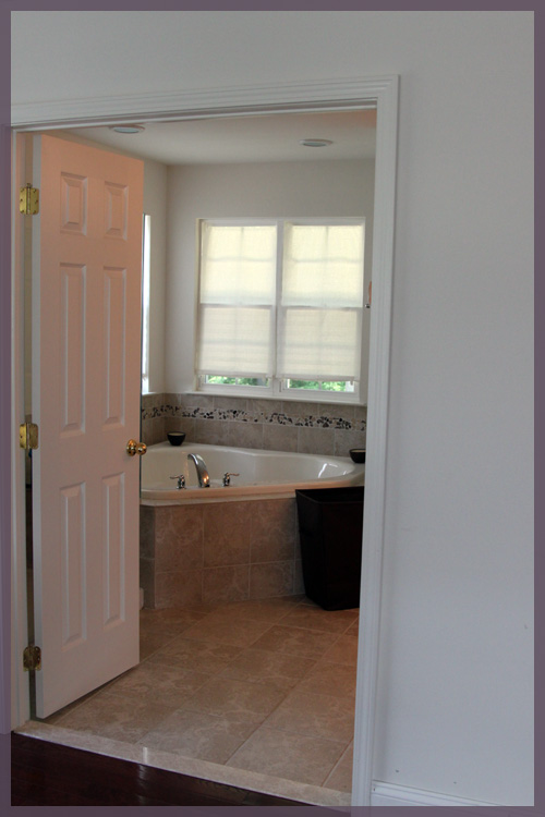
Without further adieu, the current state of the master bath (as I cringe a little….)
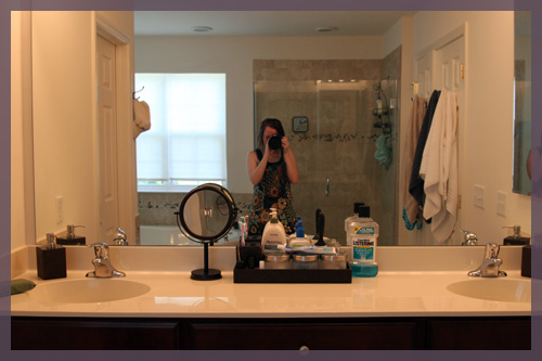
I wasn’t going to include this last picture because my hair is wet and fresh out of the shower, the towels are mismatched, there’s a hat hanging on a towel hook and my funny shower cap is clearly visible in the shower. But it’s the best room shot I have. It’s hard to stage a bathroom when you just showered in it, so here’s my very realistic shot 🙂
I wanted that giant corner tub so bad and I even tried to get the builder to put an outlet on the wall across from it so I could watch tv from there. But they told me no, something about passing the electrical inspection because I’d get electrocuted and blah blah. Since we’ve moved in though, my favorite spot is my little Target stool and make up mirror at the vanity. I never realized how lazy I am until I realized I can brush my teeth while sitting down. It’s wonderful.
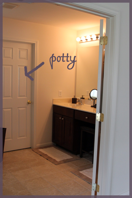
I often forget to mention this even in real life tours, so if you’re wondering where the toilet is, it’s behind this door…
There’s a window in the potty room, so maybe I should have left the door open to show you. But that window also has a paper shade on it, so maybe it is best that I left it closed…
We have a lot of things we’d like to change in this room… the vanity lights, the standard countertop, the public restroom looking fixtures, the paper blinds, the hardware on the vanity, the frameless mirror, perhaps adding some sort of cabinetry/shelving on the center of the vanity to conceal that Listerine. The list goes on and on. But for now, it works and it’s not completey awful, so it’s on the long list 🙂
And that’s the master bath’s blog debut! It only took a year to make an appearance…




The tub looks amazing! Bummer about the tv, though. Can you add one somewhere? haha
Haha! Those pesky building inspectors, always trying to prevent people from getting electrocuted and stuff. But seriously, that’s one huge and amazing bathroom, even if it’s looking a bit more lived-in than you’d like — ours is miniscule and way outdated by comparison.
The bathroom is really great! I love the huge vanity and tub but my favorite part is that the toilet is in it’s own space. Two people can use the bathroom at a time. It’s almost like having separate toilets!
Brushing your teeth while sitting down. This would change my life….
Awesome house. Awesome bathroom. My wife and I are in South Jersey and recently built a new home ourselves. We bought a Ryan home. Our home plans appear pretty similar to yours in terms of layout. We’ll be keeping an eye on your blog. Great work so far!
We’re adding a link to your site.
I love the sketch and the architecture made. looks genuine. very informative article by the way
Towels come in a wide range of colors, and they can be stylish and functional. White towels are the easiest to maintain because you can wash them in hot water to disinfect without worrying about color fading.