Just Let It Go
Posted by Michael, September 13th, 2011
A few months ago, I wrote about my obsession with 20×200. And that obsession continues tonight!
Ever since we’ve visited the Museum of Modern Art, I’ve been obsessed with typography (well, more so than usual). It’s been catching my eye on just about everything — advertising, signs, letterhead, etc. It’s amazing that so much thought is put into typography yet we all really take it for granted.
If you’re in New York City and can visit MoMA, check out the Typography exhibit; it’s well worth it.
Oh and just remember, if you plan on visiting and you’re a Bank of America customer, you get free tickets to museums during the first weekend of every month.
Back to typography — it’s no surprise that my latest two finds on 20×200 have been pieces around typography.
“Just Let it Go” by Kotama Bouabane. Such a simple photograph with subtle text, yet you can almost make an entire story out of it; a couple wine glasses, a lemon, a napkin, an empty glass. Maybe an argument took place at this table? And then you’re hit with Just Let It Go. Sometimes you just have to let it go. Forget regret, or life is yours to miss. No day but today. Okay, now I’m just quoting Rent.
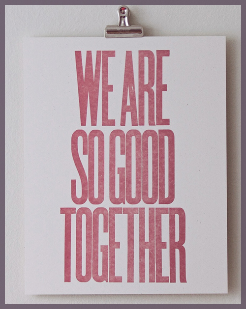
“We Are So Good Together” by Dylan Fareed. I love the spacing between the characters; so incredibly thin yet enough to notice the distance. I find it pretty funny that the artist created this after a breakup. He created it to find humor and then the thing blew up with several people asking for copies. I love that it’s more than ‘Better Together’ à la Jack Johnson.
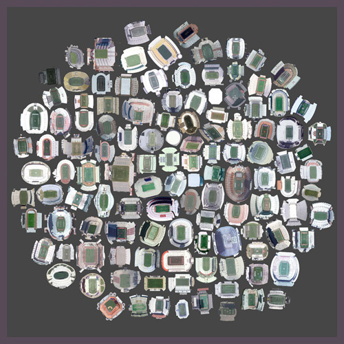
“125 Stadiums” by Jenny Odell. Get this, these are satellite views of various stadiums in the United States. This would be an awesome piece for my man-cave one day.
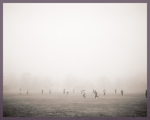
“The Suspension of Physics Necessary for All Athletic Endeavors” by Colin Blakely. I was really taken aback by this piece. I love the subtle lomo effect captured here and the top-half which looks to be nothing more than a haze. Yet, you can depict the individuals on the bottom of the picture playing some kind of sport or activity. Definitely neat.
Remember folks, 20×200 makes it incredibly cheap to own some unique art. And no, I wasn’t paid to write this post; I genuinely enjoy what they’re doing.
Tags: 20x200, MoMA, typography


I love 2×200 and typography as well! I had no idea the Moma had an exhibition on it. Is it temporary or has it always been there? Thanks for the tip!
I’ve chosen you for Versatile Blogger. See my blog for details.
I can’t get enough of your insightful articles and engaging stories. Thank you for sharing your passion with the world!