Archive for September, 2011

A Powder Room Update

8 Comments

Posted by Rebecca, September 19th, 2011

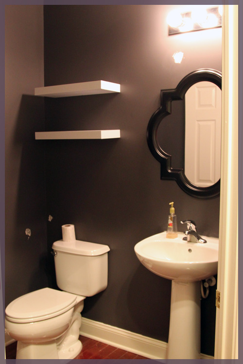
This weekend we got around to hanging a few things in the powder room- 2 white shelves from Target and a mirror from Lowe’s.

The lighting is impossible in this room and yes there is spackle all over the walls. One of the shelves took a plummet in the hanging process and took some wall with it. The story of our lives.

We’re thinking of spraying the shelves a glossy white, using the remaining spray paint from the deer bookends I recently sprayed. I just like the idea of blending them with with the sink and potty.

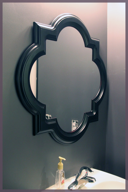
As for that mirror?

We knew we wanted something fancy looking. I’ve loved this mirror for as long as I can remember and previously considered putting it in the entryway.

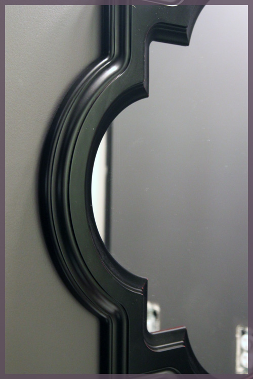
But this espresso finish? Not staying.

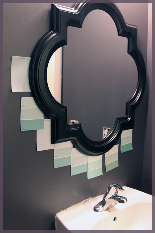
Yes, we’re planning on painting this frame an aqua sort of color, as I mentioned my love for this combo last week.

(the sink needs another round of caulk and some paint from when the previous mirror came crashing down….I told you touch ups were the story of our lives…)

I’m thinking we’ll go with one of the lighter tones to balance the super dark walls.

It’s come a long way from where it was just 2 weeks ago!

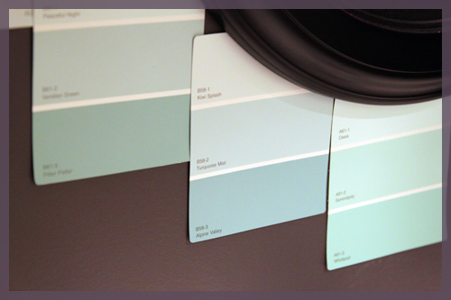
We also shopped around a little for some accessories with no luck. Who knew turquoise mist hand towels were so hard to find? Yes, turquoise mist is the new name I’m using for that color we’re trying to achieve. It’s actually the name of one of the paint swatches up there, but it’s a little too blue I think. I’m in search of the perfect turquoise mist 🙂

Our main goals at this point are to paint the shelves, paint the mirror and finish all of the touch up work that we keep piling on. Then I’ll figure out what to put on those shelves!

Crossing Disciplines

8 Comments

Posted by Rebecca, September 14th, 2011

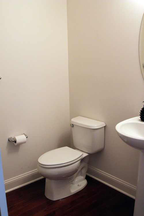
You already know that we unexpectedly painted our powder room a bold charcoal gray. I knew I wanted some bright white floating shelves, so we picked up some inexpensive ones from Target and we’re currently in the midst of hanging them.


Since the gray was a complete compulsive move, I didn’t have much else planned. The room is dark and needs pops of white (which we plan to add more of with the shelves, frames and some crown molding), but I also feel like it needs a fun accent color.

My initial instinct was to go yellow. Gray and yellow are about as hot as brown and blue were 5 years ago. Don’t get me wrong, I like the combo and I’m planning to add some yellow to our living/dining rooms, but it seemed a little not me. I’m just not a warm color person and for the amount of bold I want in this bathroom, it would be a little too much yellow for me. Maybe elsewhere yellow, maybe elsewhere.

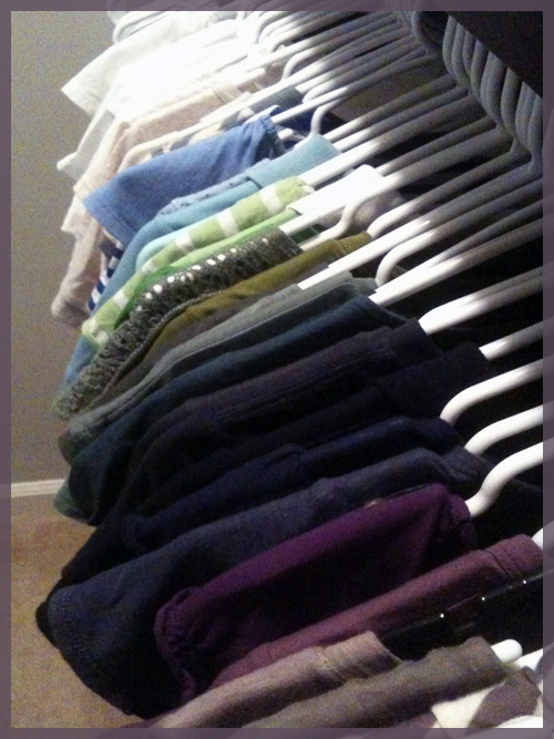
Last week, I realized how much charcoal colored clothing I own. It has become my standard neutral over the past year or so. You already know about my sweats and flip flops, but I also have a few other pieces, such as my sneakers (from Target)…

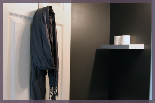
A scarf (also from Target)…

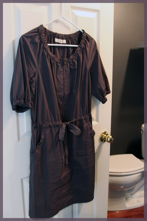
A dress (from Loft)…


As well as a pair of cargo pants and numerous shirts.

As I got dressed one morning last week, I started to browse my color-coded shirt selections for something to go with my sneakers and scarf (please excuse the iPhone quality on this one)


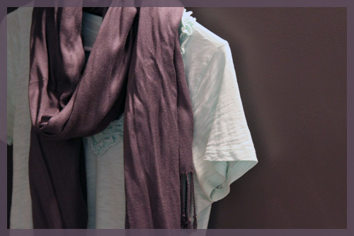
I then remembered this outfit I have pinned on Pinterest and have always loved for the aqua scarf and gray tank.

(via Polyvore on Pinterest)

Does Pinterest make anyone else think outside of their normal wardrobe? I’m suddenly more bold in my clothing choices. Such an unexpected perk of joining that site 🙂

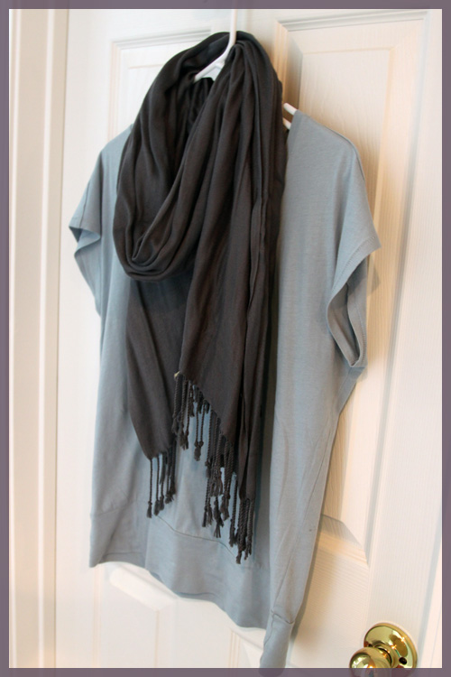
So I went for a pale blue shirt to go with my gray scarf.


Then a little light went off in my head. Why don’t I use my Pinterest outfit to inspire my bathroom?

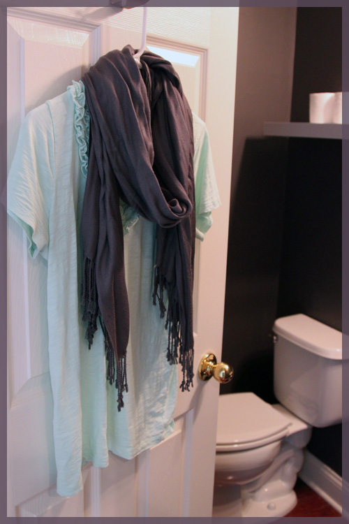
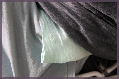
I love the aqua and gray and I even love my take of the light blue and gray, though this other shirt I have is probably more accurate to the Pinterest scarf. 

It has more of a minty green tone to it compared to the light blue shirt, though it’s subtle. 


And so that’s how it began. I figured going with a refreshing, but bright blue tone would incorporate the powder room into the color scheme of the remainder of the house. Otherwise it would scream “hey I’m completely bold and randomly dropped here!”, but I believe it will still be way more dramatic than the rest of the downstairs rooms.I attempted to buy a mirror and some paint this past weekend, but Lowe’s was out of what I had in mind. Hopefully the upcoming weekend will be good to me and I can put this little vision of mine together and show you what I have planned 🙂 

ps- I inititally planned to photograph myself in all of these outfits while standing in the bathroom for some comedic effect, but the thought of changing all of those times before it gets dark out in 20 minutes was just draining. If anyone else would like to stand in their bathroom, in outfits that match their walls, please do so for my entertainment 🙂 And if you’ve ever decided on a color palette while standing in your closet, please share that too!

Just Let It Go

3 Comments

Posted by Michael, September 13th, 2011

A few months ago, I wrote about my obsession with 20×200.  And that obsession continues tonight!

Ever since we’ve visited the Museum of Modern Art, I’ve been obsessed with typography (well, more so than usual).  It’s been catching my eye on just about everything — advertising, signs, letterhead, etc.  It’s amazing that so much thought is put into typography yet we all really take it for granted.

If you’re in New York City and can visit MoMA, check out the Typography exhibit; it’s well worth it.

Oh and just remember, if you plan on visiting and you’re a Bank of America customer, you get free tickets to museums during the first weekend of every month.

Back to typography — it’s no surprise that my latest two finds on 20×200 have been pieces around typography.

“Just Let it Go” by Kotama Bouabane.  Such a simple photograph with subtle text, yet you can almost make an entire story out of it; a couple wine glasses, a lemon, a napkin, an empty glass.  Maybe an argument took place at this table?  And then you’re hit with Just Let It Go.  Sometimes you just have to let it go.  Forget regret, or life is yours to miss.  No day but today.  Okay, now I’m just quoting Rent.

“We Are So Good Together” by Dylan Fareed.  I love the spacing between the characters; so incredibly thin yet enough to notice the distance.  I find it pretty funny that the artist created this after a breakup.  He created it to find humor and then the thing blew up with several people asking for copies.  I love that it’s more than ‘Better Together’ à la Jack Johnson.

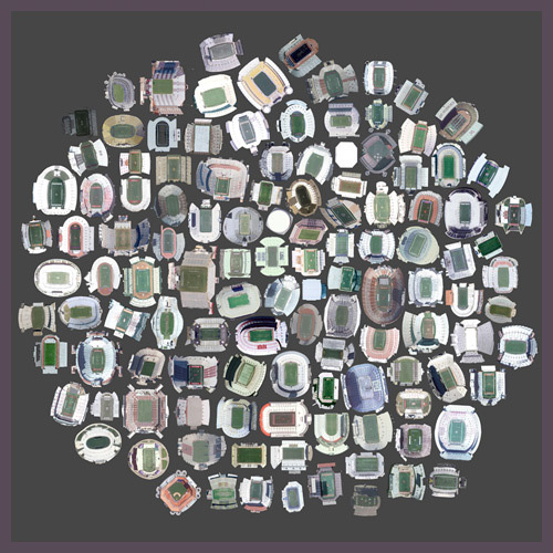
“125 Stadiums” by Jenny Odell.  Get this, these are satellite views of various stadiums in the United States.  This would be an awesome piece for my man-cave one day.

“The Suspension of Physics Necessary for All Athletic Endeavors” by Colin Blakely.  I was really taken aback by this piece.  I love the subtle lomo effect captured here and the top-half which looks to be nothing more than a haze.  Yet, you can depict the individuals on the bottom of the picture playing some kind of sport or activity.  Definitely neat.

Remember folks, 20×200 makes it incredibly cheap to own some unique art.  And no, I wasn’t paid to write this post;  I genuinely enjoy what they’re doing.

The Cats and the Couch

13 Comments

Posted by Rebecca, September 12th, 2011

On Saturday, our new sectional was finally delivered! (You can read more about it here) Before the delivery men arrived, Mike’s dad came over to move our current couch and our chair/couch (as we lovingly call it) into our formal living room. The living room had nothing in it up until this point, so while it may not be a permanent solution, it’s better than nothing for now. The chair/couch is definitely too big but the room is already getting more use than it ever has…
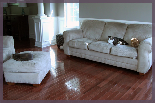
Yes, that is all 3 of our babies passed out on the new thing in the room. Aren’t they so sweet when they’re sleeping?
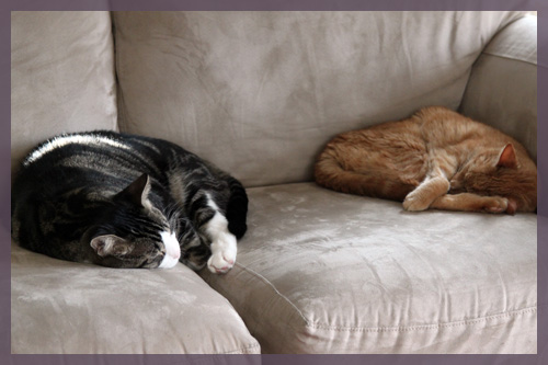
But the sweet never lasts. Especially when you have a cat named Macky and you get a new sectional.

Literally minutes after the guys put the couch pieces together (since he was following them back and forth from the door to the family room), Macky claimed the couch as his and started trouble.
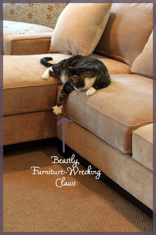
This meant that we immediately ran to Target and snatched up some anti-cat scratch tape. It’s sticky on both sides and is supposed to be unappealing and eventually train them to not scratch the couch. We tried out a piece on the back of the couch for a day or so, then covered a Macky danger zone.
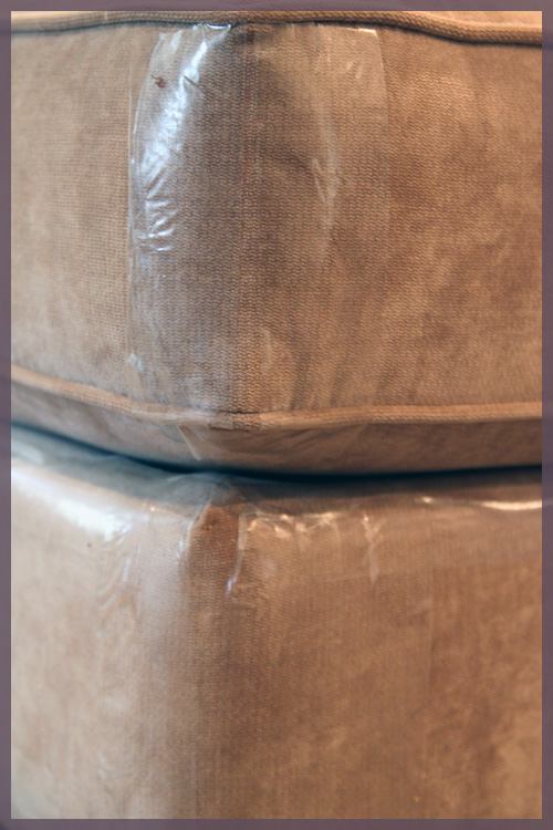
We’ve never bought this tape before, but we have had furniture shredded before so we were being cautious. Thankfully, it is hardly noticeable from a distance and only lets off a little shine.
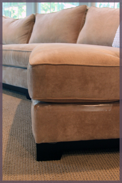
We knew Macky was incredibly intelligent (he runs to the door when the doorbell rings, plays fetch and cries upstairs when he wants to go to bed), but even we were not prepared for his reaction to the tape. He went to scratch the couch and didn’t like the feel of the tape (effective!), so he decided to use his teeth to peel a piece off (ineffective!). I just removed him from the situation and stuck it back on. So far he hasn’t scratched it again and I’m hoping it was just a curious, “I’m just being Macky” moment.

Thankfully, Macky lost interest in the new couch quickly. However, someone else is couch obsessed (besides me).
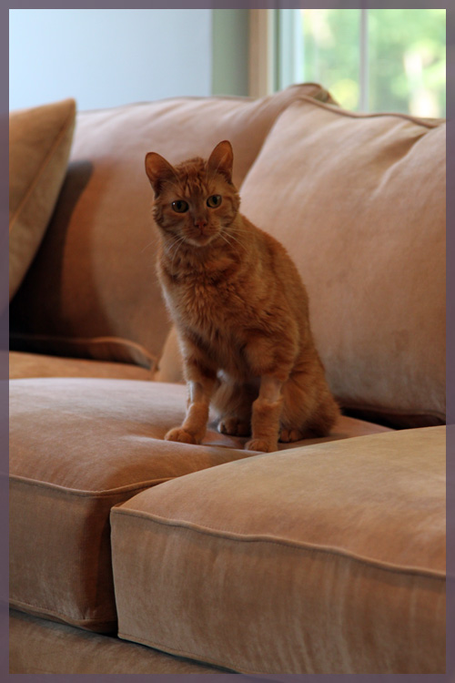
Darwin. My cancer fighting, little orange love of my life (his arms are shaved for his chemo treatments, we call them his legwarmers :)). He never slept on the old couch in the family room, but he has not left the new sectional. He’s been gaining weight, but he’s still a little cat on a big couch.
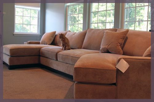
He settled on the crack of the chaise and has since been the only member of this family to use the chaise. We are just so happy that he made it to see the new couch that we don’t dare move him. My heart melts looking at his little body curled up there.

I could not wait to get rid of the pillows that came with the couch. I shoved them in our linen closet and put out the ones I’ve been waiting to use 🙂
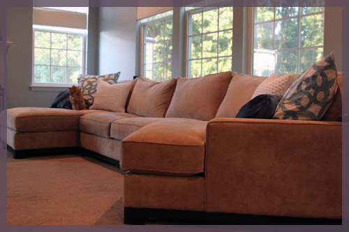
And of course, Darwin was available to model them.

I put the Organic Ironwork euro sham and Harbour Rope pillow (both from West Elm) with a wavy blue pillow I picked up at Bed, Bath & Beyond a while back.
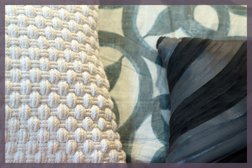
We decided to go with the euro pillows because a) the couch is large enough to handle them and b) we fall asleep here all.the.time. I liked that we could use a real sized pillow and wash the shams easily. It’s supporting my back as I type this 🙂
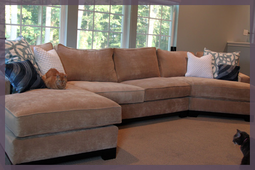
I was a little surprised at how gold the couch is in the room. I thought it was a little more neutral and less clashy with the carpet. It also seemed massive at first. I think it just took a while to get used to the different arrangement and fabric. The couch seems large because instead of having a bunch of room to one side, we have now centered the couch and have some dead space on either side.

One side is housing Macky’s bed (which he sleeps in every time we’re in the family room, including now) and their scratching post (which Darwin is scratching now). Obviously very important elements in this room and I like that they are tucked behind the half wall.
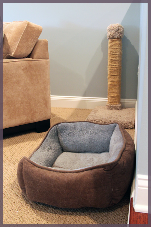
(note to self- time to pry Macky out of his bed and wash it)

They were previously next to the entertainment center (on the opposite side of the opening to the family room), but more about why they were moved in a second. This space seems a little awkward and we were hoping to put a console here to store our laptops, phone chargers, remotes, etc., but I’m torn about where to put the kitten’s furniture.  One option is the other side of the couch!
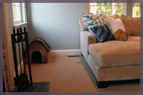
Because of space constraints by the chaise, we had to move the accent chair we had in this corner (you can see it in the photo of Macky with his claws out above). That’s Darwin’s cat house, but it’s collapsable and he hasn’t slept in it in a while so it can probably go upstairs. We would like to put a round table with a lamp over here.

As for the accent chair? Well, it got moved to where Macky’s bed and scratching post previously were!
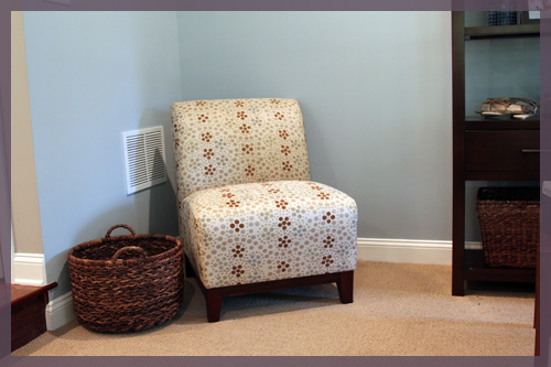
I know, you’re probably confused by all of the cat paraphenalia and need a full room shot. But I can’t give you one because we still have a bunch of stuff in this room that needs to find a new home. We’re still using our former end tables and ottoman for the time being. They’re just pushed out of the way right now, making it obvious that we need to find replacements with mucho storage.
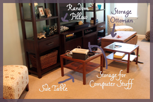
We want taller, darker, round end tables and the round storage ottoman from Target that I mentioned here. We’ll get to it probably sooner rather than later since this arrangement isn’t quite working. But, two accessories that I planned for this room that I did manage to get were my weathered wood urchin thingys!
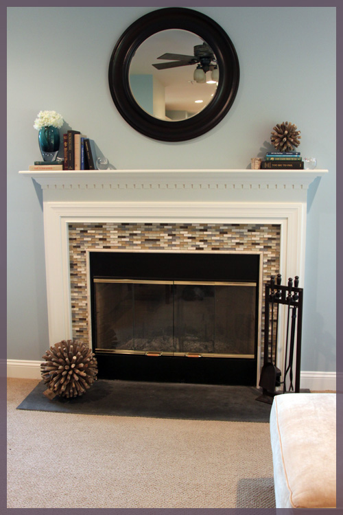
They required some mantel tweaking, but I love them 🙂

I originally planned to get just the large one, but I couldn’t resist the thought of stacking the little one on a pile of books.
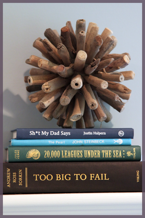
So there you have it, 20 something pictures of cats, old couch, new couch and my West Elm finds all crammed into one post. Overwhelmed and confused? Yeah, me too 🙂

West Elm’ing

9 Comments

Posted by Rebecca, September 8th, 2011

I haven’t been home before it’s gotten dark out all week, so I haven’t had a chance to take any pictures around the house. Soo I figured I’d share some of my favorite finds from a recent trip to West Elm. I wanted basically everything in there, it was just one of those days when they had a bunch of great stuff. I bought a lot, but nothing is ready to show yet so onto the list! 🙂

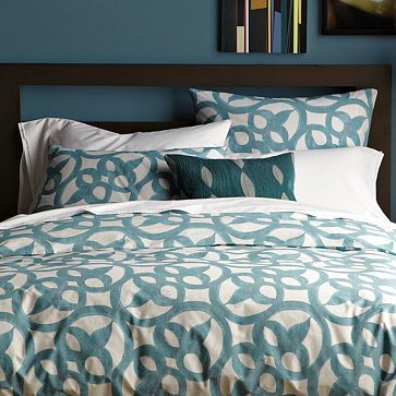
1. Organic Ironwork Bedding

I’ve loved this since I first saw it pop up in an email West Elm sent me. I already have 2 duvets for my king sized bed I don’t yet have, so I really had no need for this. Buuut, I picked up two euro shams for our new sectional that hasn’t come yet. More about those (and the sectional) next week 🙂

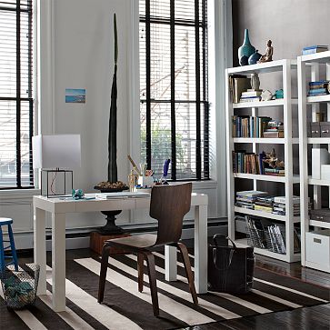
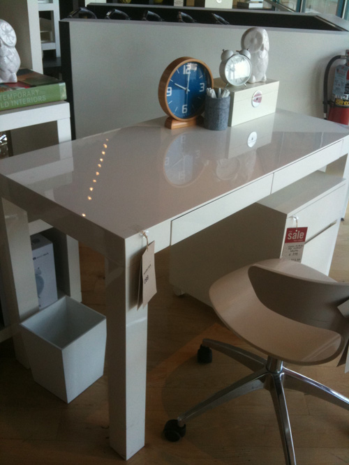
2. Parsons Desk in Polished White

This picture doesn’t do the finish on this desk justice, so here’s one I snapped with my iPhone…

I would looove to have one of these for my side of our new office, but at $299 and with no office plans in sight, I didn’t buy it. This desk was one of those things that I’ve seen online, but could never tell how sophisticated the finish looked in person. I really thought it was some in-store only version of the parsons desk.

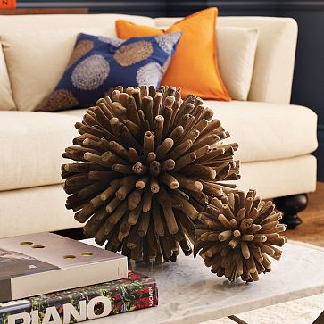
3. Weathered Wood Spheres

I’ve mentioned these urchin thingys before, so I picked up both sizes for our family room. They still have the tags on them but I love them! Once I get some daylight I will be sure to snap pictures of my new friends 🙂

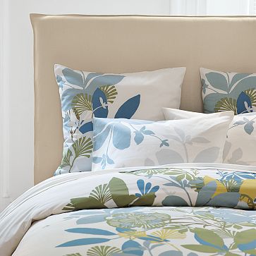
4. Spring Floral Duvet

Yet another one of those items that I’ve seen online, but it really caught my eye in store. I seriously carried around two of these euro shams for most of my trip, but then decided to go with the Ironwork ones above. Tough choice, considering they were on sale. I wish it was rational to have 100 duvets….

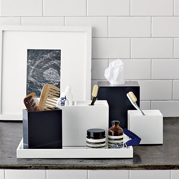
5. Lacquer Bath Accessories

I pretty much loved all of these and stood in front of them scratching my head for a while. We have soap dispensers and a tray for our master, but nothing for our hall bath. I decided to use some serious restraint and only get a small navy tray to balance all of the white in our hall bath. Our shower curtain has navy in it and I figured it would neaten up the stuff we keep on the counter for guests.

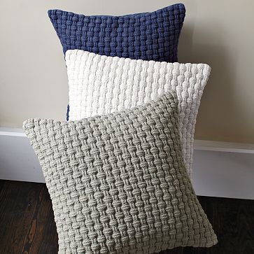
6. Harbour Rope Pillows

I went into the store with goals in mind and a shopping list of sorts. One of the throw pillows I planned to get for the new sectional wasn’t as great as I thought it would be, so I snatched up 2 of these in white. They were on sale and I already had 20 inch inserts I’m not currently using. Hello texture 🙂

7. Hammam Stripe Hand Towel

I’ve been fascinated by these things since I saw them on an episode of Dear Genevieve. They feel like a heavenly piece of fabric, but they somehow absorb water well. I passed these up because they didn’t match any of our bathrooms, but now that the powder room is dark gray, my little imagination keeps going back to them…

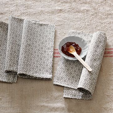
8. Floral Kaleidoscope Napkins

These were definitely not on my list, but I bought them anyway. I loved the pattern and I often use a napkin to line our bread basket. Then I got the idea that I might possibly want to sew them together to make a pillow. As if I need anymore throw pillows, I seriously have a problem.

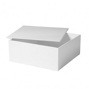
9. White Lacquered Box

This is part of the Lacquer Office storage, but the box is no longer available online. I figured it would look great on our entertainment center (following Emily Henderson’s styling rules of books, boxes, vessels and structural items). I think it was like $40 though so I walked away 🙁

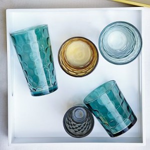
10. Dimpled Drinkware

We’ve had a few glass casualties lately and wouldn’t mind a few spares. Our current ones are hefty ones from Crate and Barrel that we got for $1 each on clearance. These were $8 each for the large size (which we use the most). I think I’ll wait for them to go on clearance…

I think I said this during my last West Elm list, but WE is my new go-to, I-know-I’ll-love-it store. Once I get my new pillows up and running (sectional is coming on Saturday!!!) and the tags off of my urchins, I will be sure to share them with you. In the meantime, is there anything I missed? What have you guys been drooling over at West Elm?

ps- I don’t get paid for my West Elm lists… in fact, I paid them for my addiction. But I got pretty stuff so it’s okay! 🙂

Copyright 2010 - 2011. The Lil House That Could. All rights reserved.