ABC, Easy As?
Posted by Rebecca, April 26th, 2012
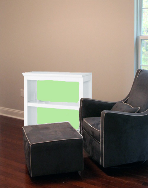
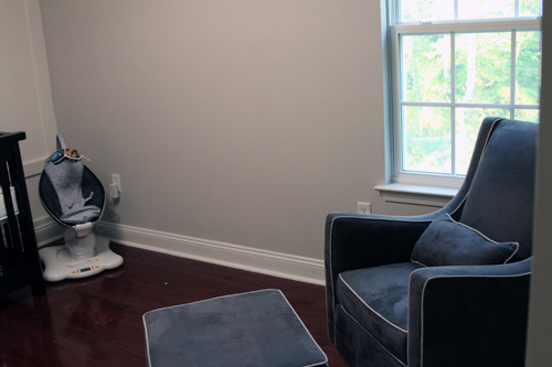
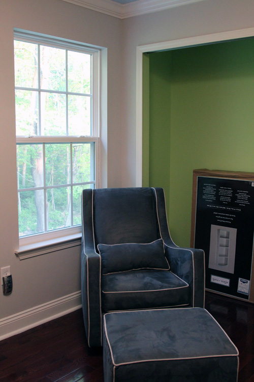
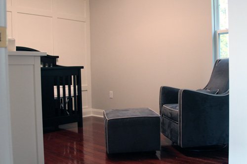
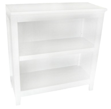
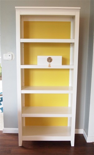
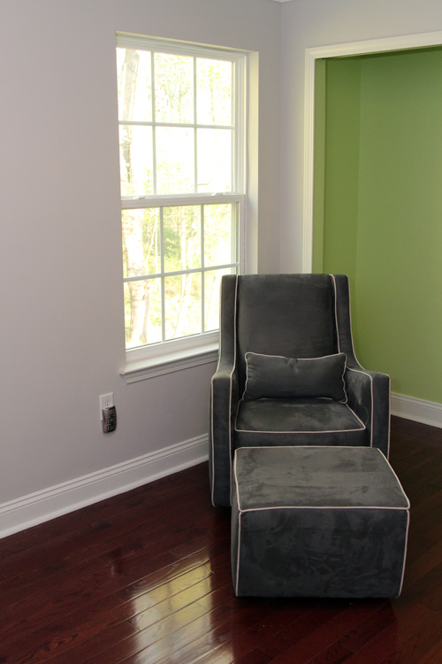
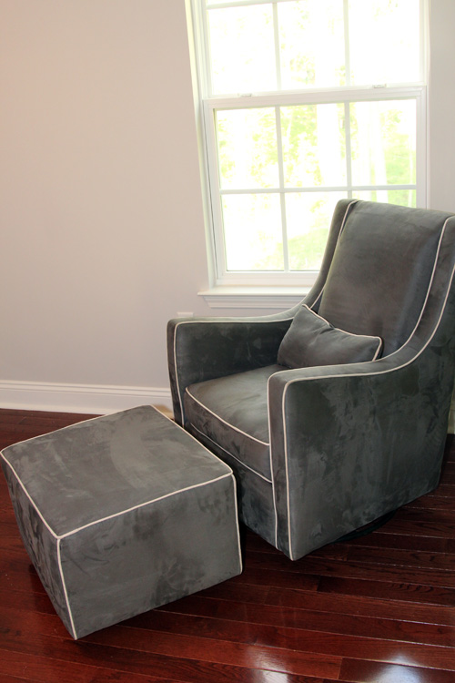
Confession: I love lettering, typography, whatever you want to call it. I’ve known forever that I wanted to make some sort of alphabet art for the baby’s room, but I put off actually making something until I had a better idea of the space. Now that we have the elusive glider and ordered a bookcase, I know that we can add a mix of pieces to the wall over the bookcase (which has not yet arrived…)
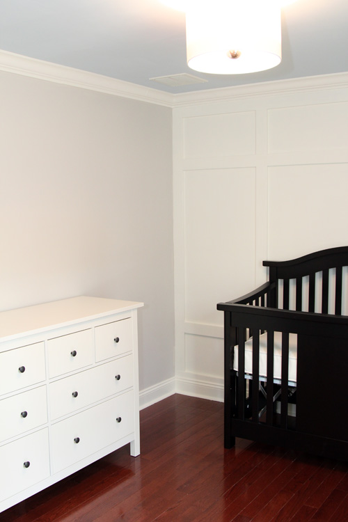
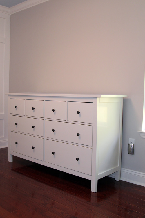
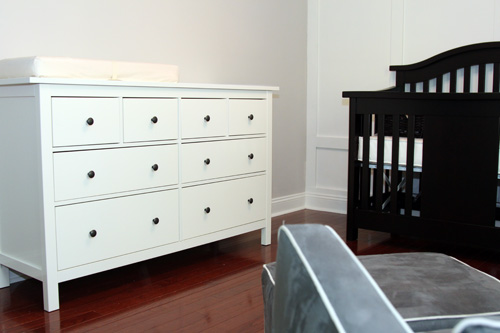
Which means I can finally decide what to do with the space on the other side of the room, above the dresser. Mike talked about our adding some framed art here, but now that we know we can add a TON of frames to the space above the bookcase, I’m leaning towards one giant artpiece.
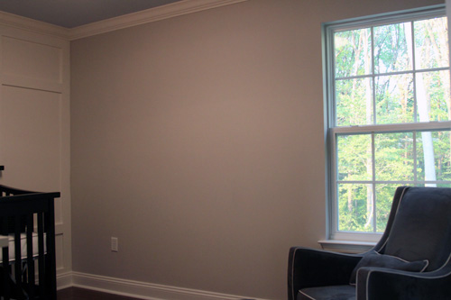
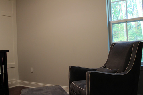
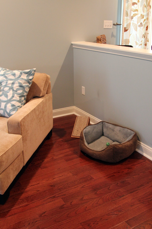
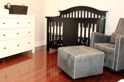
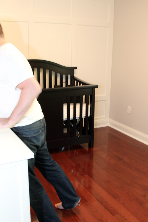
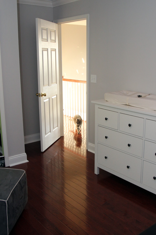
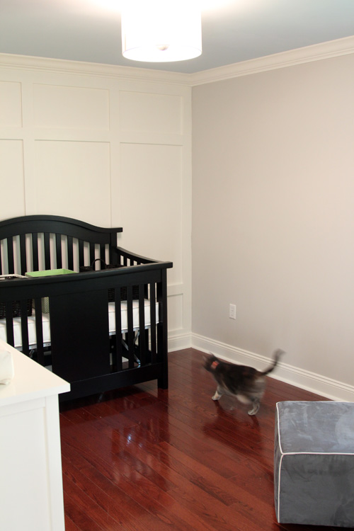
Of course I don’t have a head-on picture of the dresser, on the wall it’s staying on, that includes the height of the ceiling. But you get the idea that the wall above the dresser is a giant blank slate.
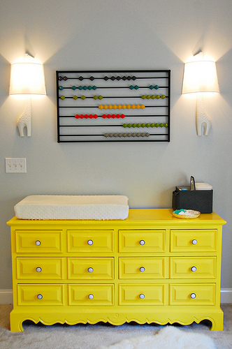
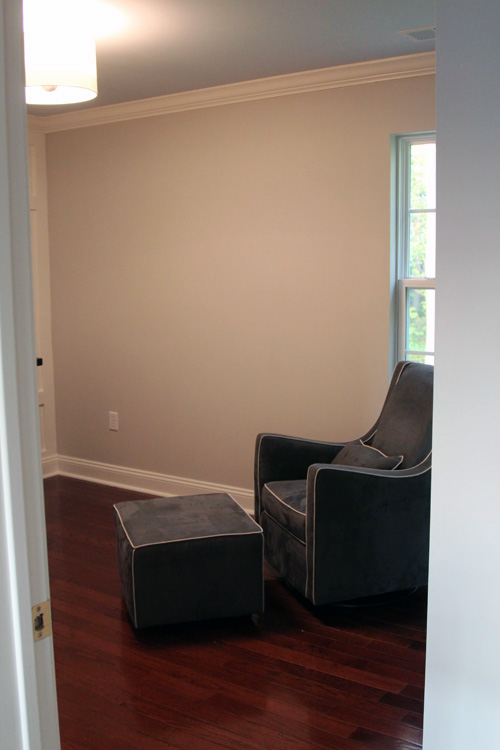
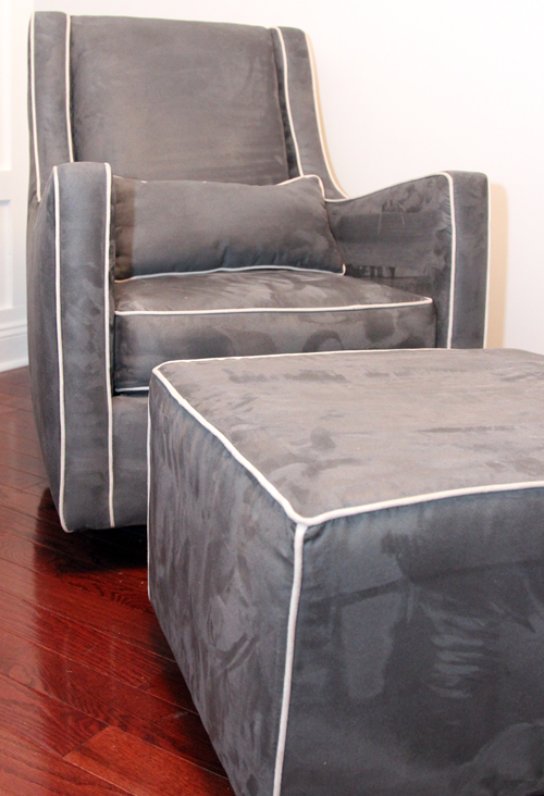
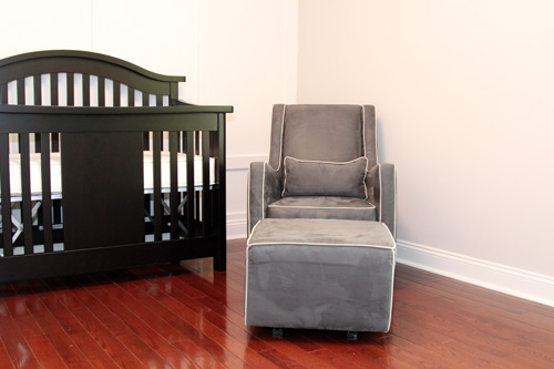
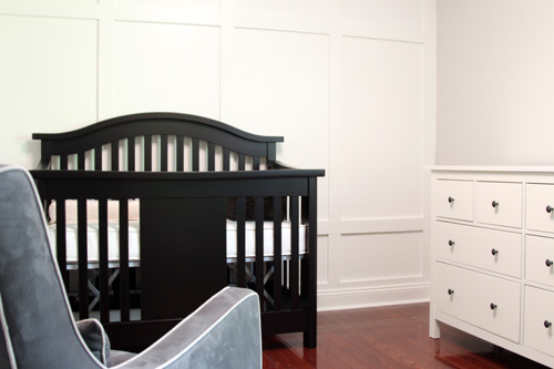
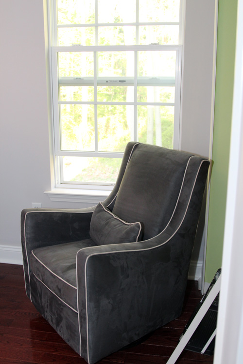
We’ve waited to install our giraffe sconces until we were sure of where we were putting the dresser. Which meant we had to have the glider. Which we just got last week. See how everything comes back to that damn glider?
Now we know we can install our giraffe sconces over the dresser like our inspiration picture…
(Honey & Fitz via Centsational Girl)
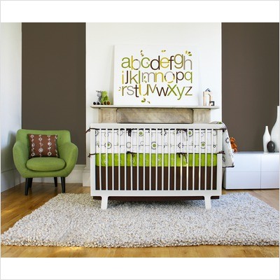
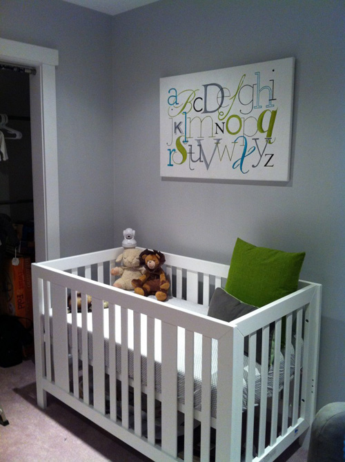
Then in the middle, I want to add some giant, horizontal alphabet art. Like this…
(from Free Home Decorating Ideas via Pinterest)
Or like this…
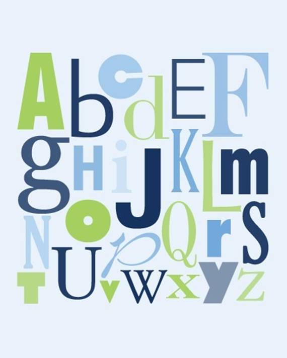
I’m partial to styles that have multiple fonts, sizes and are not perfectly aligned. Like this one…
Or this…
(via Etsy)
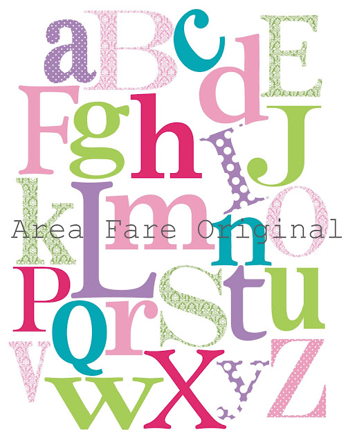
Or even patterned like this one…
You notice how all of those last 3 have blue in them and 2 out 3 also have green? That’s for all of you people who have tried to tell us that you know we’re having a boy because of our nursery paint choices. Muhahaha.
Up until last night, I figured I’d draft something using a couple of different fonts, then paint the final product on canvas. As I fiddled with Photoshop last night trying to do that fancy mock up of our new bookcase that I posted above, I realized that we can just design something in Photoshop and have it printed on canvas. This would save me a TON of time and be a lot more fool proof than my free handing. I looked up the prices of printing on canvas using Kodak Gallery and was shocked to see that it would be about $150 for a 24″ x 36″, which is about what we would want.
So I went back to doing it myself, when Mike reminded me that the last time I went to Michael’s to buy a canvas that large, they were super expensive too (even with 50% off sale). I do know how to stretch my own canvas, which is always an option, but then I would still be freehanding the letters. Humpf.
Then I thought of just doing a print in a matted frame. I decided to see how large of a print we could order and I was shocked to see that they come as large as 20″ x 30″ for just $20! I checked the Ikea website to see how large their frames go and it seems as though they sell them pretty large. We’d probably want the finished product, meaning the outside of the frame, to be around 24″ x 36″. Ikea notoriously has awkward sized frames, so I think we’ll pick up a frame first. Then we can see how large the opening is and plan a print to fit the opening. The whole thing– print, mat and frame should run us about $50 and would be less tedious than painting by hand. Though I need Mike to be in charge of the Photoshopping magic, I am still a rookie and what takes me 2 hours takes him 2 minutes.
We’ll keep you posted on our progress (though not the specific colors we’re using just yet!). Hopefully the logistics work out and between the 2 of us, we can whip up something awesome 🙂
ps- My last day of work is Monday. Let’s hope the baby gives me a full week to wrap up all of this nursery business!


