Paint Color Trial Run
Posted by Rebecca, February 1st, 2011
Okay so I told you last week that I had pretty much decided on the Oatlands Subtle Taupe for our master and the Smoked Oyster (Valspar rendition) for the sitting room. When we had most of our downstairs painted before we moved in, we chose three Benjamin Moore colors- Wedgewood Gray for the kitchen/family room, Waynesboro Taupe for the living/dining room and 2 shades lighter than Waynesboro Taupe, Himalayan Trek for the entryway. The Wedgewood Gray was more blue than we had wanted and the Himalayan Trek was a little too gray. Since the entryway is two stories and we had to hire someone to paint it, we knew changing it wasn’t an option. I do like it though, it’s just not what I had pictured.
While we’re on the topic, I’ve been meaning to do a ‘how I choose paint colors’ post since I started this blog. Outside of the blog, it is probably the #1 question I am asked. I’ve gone paint shopping or have visit quite a few people’s homes to help them choose colors, though they don’t always listen to me or they end up not painting at all! I know this is a very poor business model, I won’t be quitting my day job for this one. But the moral of the story is, I don’t think anyone has a fool proof method of choosing paint. It is all a bunch of trial and error that depends on so many variables. Our Wedgewood Gray is a little blue because we overestimated the amount of light the room would get and went one shade darker than we were going to go. But it’s okay, because it’s still pretty close to what we wanted. In fact, I was watching HGTV a few nights ago and commented that I liked a wall color on one of the shows. Mike pointed out that it was our exact family room color, as evidenced by the fact that the TV is mounted on the wall color itself for a side by side comparison. Whoops. But we seem to get the blue/gray feel we were going for more at night than during the day.
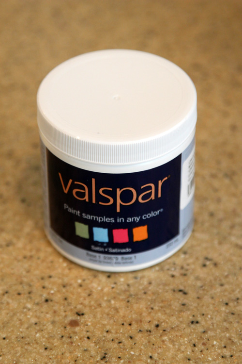
So for the bedroom, we decided to take the extra step and pick up some testers. We headed to Lowe’s and paid $2 and change for these things…
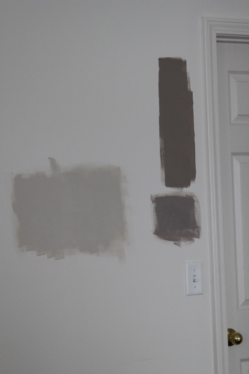
Then I pulled out my brush and got to painting! And can I tell you, even a little dabble felt great. I cannot wait to actually paint. I added the two new colors to the old failed Waynesboro Taupe trial area…
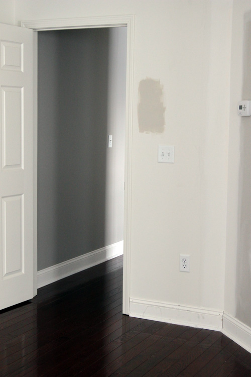
The big giant light one is the Oatlands Subtle Taupe. The top dark one is the ruled out Waynesboro Taupe and the bottom one is the Valspar Smoked Oyster. Not having enough evidence, I added the Oatlands to another wall…
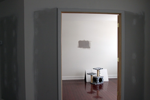
And the Smoked Oyster to the sitting room (where it would go)…
(Please ignore the cats’ scratching post and playhouse. Yes that is a Crate and Barrel box and they love it…)
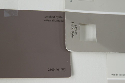
The verdict? Love the lighter Oatlands, but the Smoked Oyster is too purple. Which is ironic because the Benjamin Moore Smoked Oyster IS purple but this Valspar one looks more brown on the swatch.
The Smoked Oyster on the right is the one on the sitting room wall, doesn’t it look completely different??
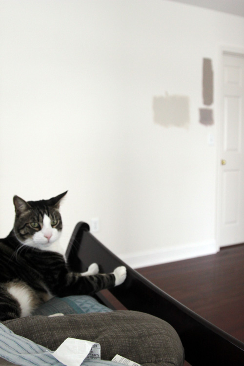
For a second opinion, I called upon my always present sidekick, Macky.
“No like!!”
I’m going to try one more option, Olympic’s slightly more gray versions of these colors. I like the Oatlands Subtle Taupe, but I get nervous when trying to do two different shades between different brands/swatches. I’ve made that mistake before and though they may look like they go well together, it’s tricky to match the undertones. Plus, I want to use Olympic paint regardless, without a doubt. I asked the worker at Lowe’s to color match the Valspar color to Olympic and she told me they couldn’t. I’m pretty sure she was lying. But we might as well try the pre-existing Olympic colors first. The no VOC aspect is huge to us since a) the room is our bedroom and I’d rather not sleep on the couch for a week while the stench leaves b) it’s winter and we can’t open any windows while painting and c) Macky has seizures and we try to keep him away from any and all possible triggers- chemicals being one. We had our downstairs areas painted long before we moved in and in the spring, so we dodged that bullet. But from now on, I’m sticking to no VOC, and I’m thankful Olympic has provided an easily accessible and affordable option!
Back to the drawing board!
Tags: Benjamin Moore, choosing paint, Olympic, purple, taupe, Valspar





I’m loving Oatlands 🙂
Looking forward to seeing how you like the Olympic paint! I hated Olympic the last time we painted with it for some reason.
The Lowe’s lady told us that Olympic was of a lesser quality than Valspar, but I am going to force myself to like it! Haha
Ok, so just found your blog today and LOVE IT! But…. what did you decide for paint for the master and where are the pictures??? Don’t leave us hanging! And if it’s already out there and I’m not not seeing it, sorry.
Hi Sue! Long story short, I wasn’t crazy about any of these colors and picked up a new tester. Which turned into one of our office colors which you can see here: http://thelilhousethatcould.com/2011/02/21/the-office-stripes/
After the office, we began to focus on the entryway and put the bedroom on the back burner. Still looking for the perfect color, whatever it may be 🙂
I am completely stunned and thrilled by your amazing article cause the way you have submitted the data over here is blown my mind away.Couple of days back i was really seeking for these information but didn’t find mind soothing data anywhere .One after another failed attempt and surfing the internet continuously i have got you but lately.I have really liked the art of presentation of paint but i really want more details information like which particular brand i really need to go for these stuffs, Can you recommend? Highly appreciation for your amazing professionalism and great patience.
Quality content is the main driver for users to go see a site and that’s what this website is providing. Thank you!