the house still stands…
Posted by Rebecca, July 9th, 2010
We have been chaotic the past few months and I haven’t had a chance to post anything we’ve done. I’m hoping to get this thing up and running for good very soon!
One of my posting hurdles is that we have yet to find our memory card readers in the packed-last-minute boxes. What good is a house transformation blog with no pictures?! I hope to dig them out shortly..or succumb and buy new ones.
Anywho, most of my time the next two weeks will be consumed with throwing a baby shower for my sister-in-law. Pictures of that will be coming, but
for now I’ll share this awesome nursery I saw while browsing for shower games at thebump.com. They’re having a nursery decor contest and this entry immediately caught my eye…
There are more pictures here…..http://www.thebump.com/contests/Our-Real-Nursery/story/153540/dr-seuss-nursery-for-charlie
It is just so unbelievably original, something no one else will ever have and most importantly, it’s fun! Sure everyone these days wants the classy, well designed baby’s room, but I think the black and white polka dots give the right amount of style. Theme rooms can sometimes be anything but stylish, but this one strikes a perfect balance of trendy and kid friendly.
Oh and I almost forgot my favorite part! The characters were hand painted by a family member, which I consider to be priceless. No mass produced item can capture the creativity and love that goes into making artwork. More about that at a later date!


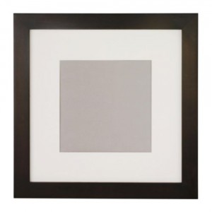
 Unfortunately, they are no longer available from Ikea’s website for me to link. I paired them with a frame similar to this simple matted Fjallsta frame.

