Archive for the ‘family room’ Category

The Couch Crisis

9 Comments

Posted by Rebecca, August 4th, 2011

Last week when I started my casa tour (which I will probably resume next week), something about the family room was seriously irking me. It’s not something new, in fact, I’ve been wanting to replace these damn couches since long before we moved in.

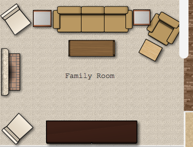
Actually it’s not couches, it’s couch and chair-couch (as we lovingly refer to it). In fact, we love our couch and chair-couch and they have served us well. But we bought them about 6 years ago for our condo and the layout of this room just doesn’t work with the couch/chair-couch combo.

Along with couch and chair couch, we also still have 2 square, glass topped tables from Ikea that are about 5 years old. They are too short and too tight in this space, but we need somewhere to put drinks and laptops. We knew when we first saw this family room that we wanted a big comfy sectional with some round tables on either end. We figured our current furniture will find a nice home in our formal living room or sitting room and would not go to waste. And so we’ve been searching for a sectional…FOR TWO YEARS.

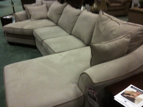
I would like the same profile and size of the furniture we have, just without the table in between the couch and the chair-couch. We searched for a bit before we moved in but then decided just to put our existing furniture in the family room for the time being. We realized that the configuration we wanted would probably be a special order and we didn’t feel like spending a large chunk of change on it. But lately our couch is looking worn and the layout is bothering us, so we decided to look again this weekend. Much to my surprise, we walked into Raymour and Flanigan and saw the configuration we wanted in front of us.

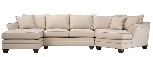
Sorry for the crappy pic, I snapped it quick before we got bombarded with sales people. It’s hard to tell in this picture, but it has some contrast piping on it that i’m not crazy about. Plus the arms are tapered funny and I’m not a fan of the back pillows. Here’s a picture from the Raymour and Flanigan website

It’s much cheaper than ordering a custom sectional, but since I wasn’t crazy about it, we decided to check out the custom selection. There was nothing with that caddy cornered “cuddler” piece that I want to match the current angle of our chair-couch. I felt like I’ve hit a road block… do I go with a less expensive sectional that meets my size and shape requirements but that I’m not crazy about design wise?

Part of my concern is that we are not easy on our couches. We spill ice cream, we once had a cat cut a paw and smear blood all over our couch and so far, microfiber has been good to us. We normally pay extra for the stain guard so that spills wipe up with warm water. Macky also has a habit of scratching ottomans, so I’m worried about paying a lot for something that is essentially going to be beat up. Decisions decisions.

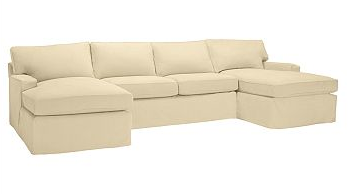
I’ve heard that Pottery Barn slipcovered furniture can be machine washed and does so well, so I checked out their website. Of course, no corner cuddle piece, but I like the idea of a machine washable slipcover and their more modern lines. Plus this configuration would technically work for us…

We’re going to check out a few more stores and hope we get lucky, but here’s where I need your advice! Have you seen any sectionals in the layout we’re looking for anywhere? Do you own a washable slipcovered sofa? What would you rather give up, shape, design or ease of cleaning?

I’m not sure if we should settle for the light sectional with dark piping. It was awfully comfortable when I lounged on it…. 🙂

Knocked Up

10 Comments

Posted by Michael, August 3rd, 2011

No, mom, this entry title does not mean Rebecca is knocked up.  I wouldn’t tell you via the blog; I’d do on Facebook instead.  Or via an email.  I’m not sure yet, I’ll let you know after our 5-year plan to have kids.

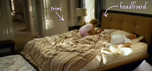
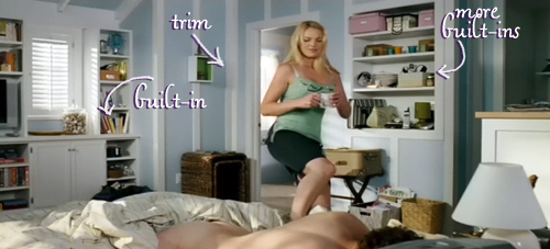
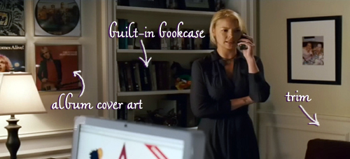
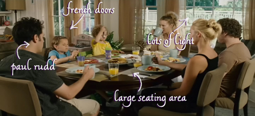
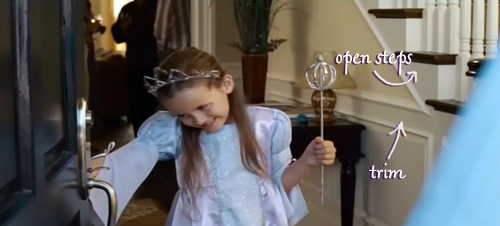
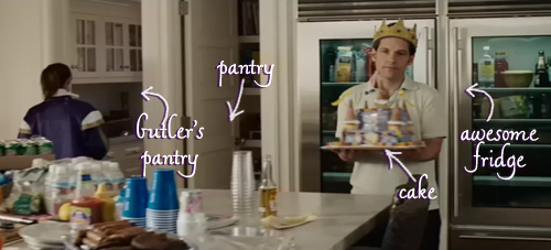
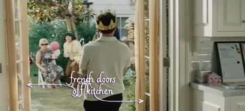
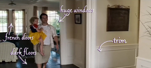
Every time Rebecca and I watch Knocked Up, one of us always brings up how we love the house in this movie.  Then we spend the next 5-10 minutes discussing why we love the house so much.  And then we spend the following 5 minutes laughing about how whenever we watch this movie, we comment on the house.  It’s a vicious cycle.

Anyways, as we watched Knocked Up the other night, I had the idea to highlight the areas of the house we love and post them!  Original, right?  Right!  So for your viewing pleasure, here are all the things we love about the Knocked Up house!  (btw, it was incredibly hard not to label Katherine Heigl in every picture).

Okay, I don’t like this pool and seating area.  I like the idea of this pool and seating area.  Got it?  Good.

Actually, is that house for sale? We want to trade up.

ps- This is our 200th post! So far we’re doing well on our list of goals we set out in our 100th post, which can be found here.

Casa Tour!

6 Comments

Posted by Rebecca, July 25th, 2011

Aaaand I’m back! I’m not going to lie, it’s been a rough, rough week. Having a sick kitten is not at all fun and is an emotional rollercoaster. We’re doing much better with the routine and we go back to the vet for a second round of chemo tomorrow night.

By some sort of miracle, I finished my summer classes this weekend. Which means I have no school for the next 6 weeks! I had high hopes for the house and the blog these 6 weeks, but with a sick kitty I’m not sure how much I will actually get done. I decided to get started while I had this free night and get a Casa Tour page going up there on the navigation bar. This is a long time coming, but I figured I’d add a room every day this week until I get it (mostly) done.

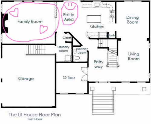
So today? We’ll start with the room we spend the most time in (and I’m currently in), the family room! Here’s a little reminder of where it is in our floorplan

I’ll be covering the eat-in area too, so that is why it has that funny smiley face on it. When I was in college I worked at Chili’s and I made that smiley face on every check. It felt right to associate it with food.

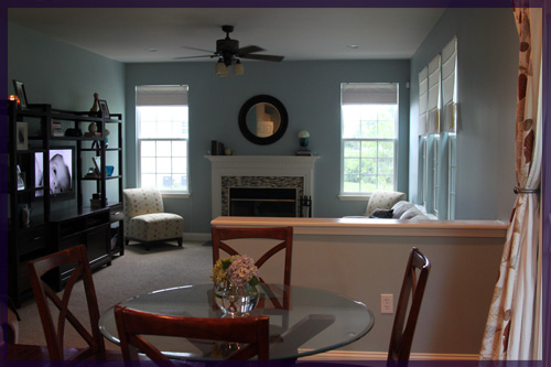
Anyway, the eat-in area!

You like those flowers I put there? They’re from our very own hydrangea and are the first flowers I’ve trimed from it 🙂
Directly off of the kitchen/eat-in area is the family room.

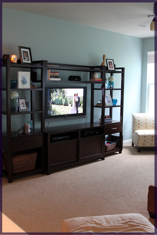
Our media center, which still needs to be styled but is complete with wedding photo on the tv (it was just good timing, it was a slideshow playing on apple tv)

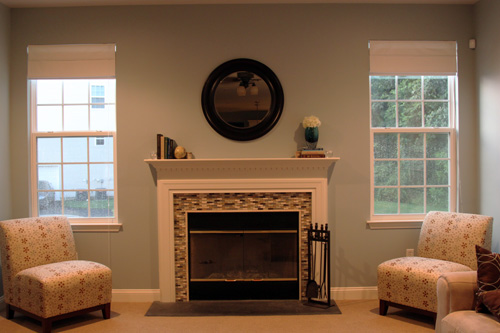
Fireplace with mosaic tile surround and we still need to hang the curtains we bought on these windows!

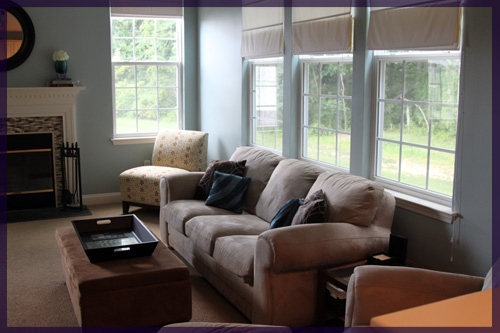
And our beloved old couch and chair, the first major purchase we made in our condo. We didn’t have a tv, so we didn’t sit on them really for a year. We have since made up for that time and we desperately want to replace them with a better fitting sectional. Probably sooner rather than later.

Tada, that’s the family room! Now I’m off to add these pictures to my new tour. Not sure what I’ll share next. The kitchen is the logical choice but since we have to go to the vet tomorrow, I can’t promise it will be dish free. Maybe I’ll be random and bounce around the house 🙂
All of the Books, All of the Books

4 Comments

Posted by Michael, July 12th, 2011

Several weeks ago (who am I kidding, several months ago (we just didn’t tell you)), we began decorating our television media console furniture thing with books. The console has a very dark stain and consists of several rectangles — a library or bookshelf feel. It screamed PUT BOOKS ON ME! several times while we were watching (or obsessing over) Dexter.

But the thing is, I’m not really a book reader – and neither is Rebecca – so what could we possibly put on this thing? I’ve read two or three books, in full, maybe in the last decade.

And one of those might have just been an audio book, too.

I began searching Google and Amazon for queries such as ‘all time classic books’ and ‘must own books’ which gave me a great starting point. Most of the books presented I certainly recognized (probably because I saw the movie-adaptation) so I quickly added them to my shopping cart. They were DIRT cheap since I only added used books mainly from Goodwill stores across the country.

The first batch of books came and we started to organize and decorate with them. Sure they were great, but being we were not readers, they were only decorations and they didn’t hold much meaning for us. The smart thing would have been to pick up those books and start reading, right?

Nope.  Instead I opted to buy more books!

I started to look for used books that could at least potentially hold my interest: sports. And specifically, the New York Yankees. I quickly picked up several great and relatively new books, too: Selena Robert’s ‘A-Rod: The Many Lives of Alex Rodriguez’ aka ‘Arod: Steroids’, Buster Olney’s ‘The Last Night of the Yankee Dynasty’ and ‘The Yankee Years’ by Joe Torre.

And so here is my little corner of books that I can actually speak about! Or at least bullshit about the contents of the book.  Hey, I’m just being honest.

The other day, Rebecca began moving some books on top of the mantle when we put the new mirror on the wall. Suddenly, our media console was lacking books. She then gave me the nod to order more books. And once again, I began searching like mad for used books. I filled my cart up with maybe 8 or 9 books when I thought back about my Yankee books. I once again was adding books to my cart only for decoration.

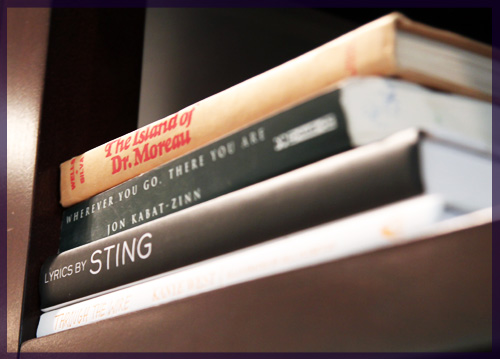
So I began searching for books on another topic that I’m very passionate about: lyrics and music. Being that I co-manage a great music community focused around lyrics (cheap plug), how great would it be to house some music or lyric related books? I quickly found some used (and cheap!) lyric books from artists such as Sting, Paul Simon and Bob Dylan. I also ordered some non-lyric music books, too – Jay-Z’s ‘Decoded’ and Kanye’s ‘Thank You and You’re Welcome’. They’re all on their way this week!

Adios Christmas in July

7 Comments

Posted by Rebecca, July 6th, 2011

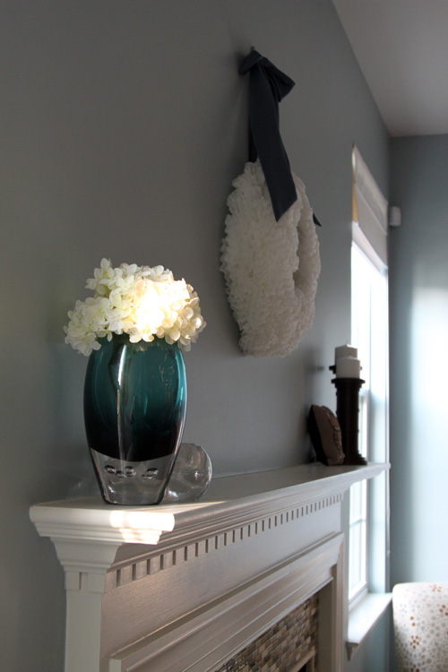
Confession: Remember that coffee filter wreath I made back in December? Well as of today, it was still hanging above my mantel…

It wasn’t still there because I’m one of those lazy people who leave Christmas around for months, since all of the Christmas stuff was packed away the first week in January. We just didn’t have anything to hang above the fireplace and I figured why not keep it around! Plenty of people use their coffee filter wreaths year round and I thought it made a decent placeholder. But I was getting sick of looking at it’s awkward, disproportionate-ness.

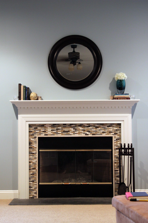
This area remained naked because of our constant flip-flopping on what to put up there. First I planned to reuse a rectangular mirror from our condo, but when we held it up over the mantel, it didn’t look right. Too small, too square, just not right. At that point we considering adding a round mirror but we thought since we have a ceiling fan in the family room, maybe a mirror wasn’t the right choice. Even though we have a pretty ceiling fan (if one exists), we didn’t necessarily want to see it’s reflection.

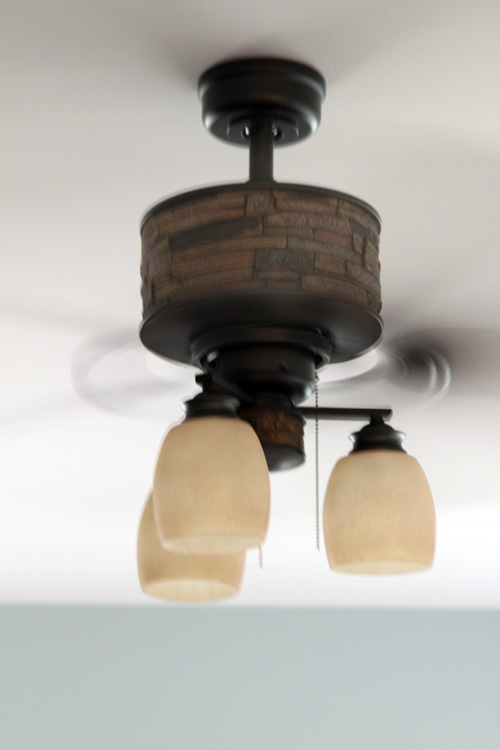
By the way, that fan has never made it to this blog. We got it on eBay for less than $100 and all proceeds went to a children’s charity. Pretty cool right?

Anyway, at that point we decided to hang some pictures from our Hawaiian honeymoon over the mantel. We just never got around to choosing 4 to hang, then we decided to do an entire entryway gallery and thought we might be overkilling the photo arrangments in the house. Back to square one it was!

While searching for an entryway mirror, we stumbled upon a large, dark, round, chunky mirror at Lowe’s that I loved. Problem was that it was too big for the entryway. I was fortunate enough to find a smaller, yet similar mirror at Target for the entryway, but I decided I wanted the Lowe’s one too. For over the mantel 🙂

We picked it up a few weeks ago and never got around to hanging it. Tonight was extremely stormy and we decided to take advantage of the rainy evening.

When we opened the box, the mirror had a few little blemishes.

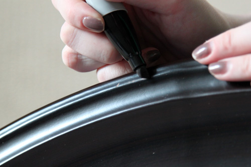
We could have marched back to Lowe’s and demanded a new one, but that would have required time and energy. Plus, those little marks were nothing a Sharpie couldn’t fix!

We took turns filling in and wiping excess marker while it was still wet. We’re all about gender equality 🙂

Meanwhile, Macky looked on and admired his mug in our new mirror.

This one is his bridal portrait, because it makes his neck look skinny…He needs a veil.

The command strip we used to hang the wreath peeled the drywall off the wall. I have honestly never removed one of those things without issues. I wanted to hang the new mirror on the low end and we were worried that the spot would show. Thankfully, we could cover it and still hang the mirror where I wanted it.

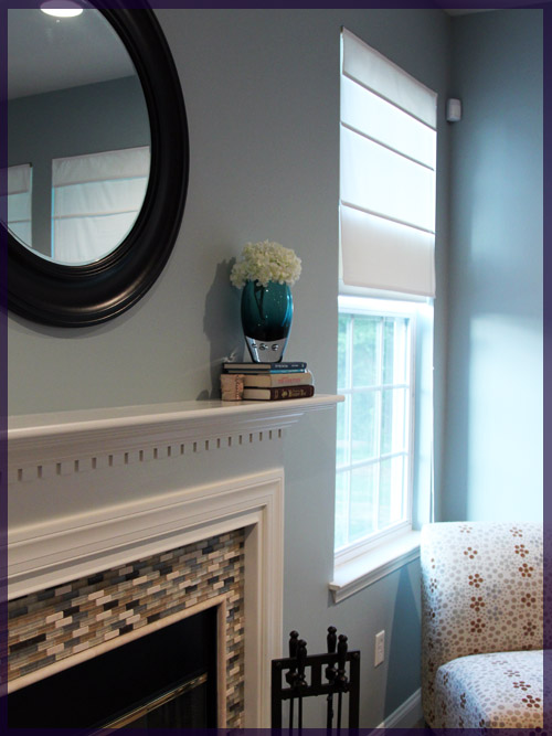
I love the way it worked out, now we just need to hang those curtains we bought 6 months ago

(the coloring in this picture is yellowy due to the setting sun and the recessed lights on in the room :()

I even purposely took a picture where you can see the fan’s reflection, which was only when I was sitting on the floor. Most of the time you see the kitchen cabinets.

Not a single imperfection can be seen 🙂

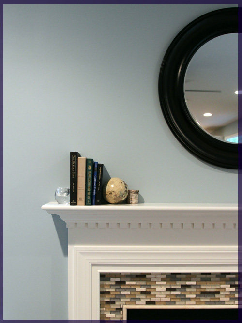
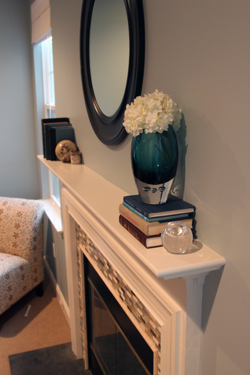
While I was futzing around with the mirror, I figured I’d put some accessories on the mantel. Sadly, I never really “styled” anything on our entertainment center or mantel. I’ve slowly been accumulating things and just sticking them wherever. The books, well, Mike was supposed to post about them a while ago, but we bought most of them for $1 off of Amazon. They’re used hardcover books with the jackets removed. These were totally Mike’s idea since he liked the way Crate & Barrel staged our entertainment center in the store and he wanted to create it himself. He’s a keeper. I moved some books and other things from the entertainment center to the mantel.

Note to self: Remove sticker from back of that book.

I thought I had a lot of accessories, but I apparently don’t since now my entertainment center is nakey. I asked Mike to order some more used books to replenish my stash. Maybe now I can get him to write that post on decorating with books? 🙂

Copyright 2010 - 2011. The Lil House That Could. All rights reserved.