Today marks guest post number two in the whole history of The Lil House That Could! Cait did a fabulous job yesterday and today we have :::drumroll::: Tabatha from Turn Right At Lake Michigan!
I could not be more thankful for this post today. If any of you follow me on Twitter, you probably saw my frantic tweets about how we struggled to give Darwin his fluids and pills last night. Quite possibly the hardest night of my life, in terms of frustration and helplessness. It ended with a trip to the vet after midnight to have them give him his pills. But! I am very happy to report that our second night as nurses was a grand success, we got him to take his pills and administered his fluids with ease tonight. There was clearly a learning curve no one told us about.
Anyway, back to Tabatha and how I should be fanning her with palm leaves for posting for me. I first found Tabatha when I saw her glorious bold purple nursery on A Brooklyn Limestone. And the nursery started as a room for her cats. Cats? Sold! Loved her immediately. She will also be sharing her entryway plans with us today!
Hello Lil House readers, I’m Tabatha from Turn Right At Lake Michigan, and I’m here today to help out Rebecca this week. A little about me – I’m 27, and I have five cats, two kids under three, a super-sized Chihuahua, and a husband all crammed into a 113 year old Folk Victorian home (with a whopping 1250 square feet) in Dayton, Ohio, that we’ve been renovating for the past four years. Yes, while we live in it. Yes, I take donations for therapy. 🙂
Anyway, as I understand it, we’re talking entryways this week since Rebecca has been working hard on hers, so let’s talk about my itty bitty foyer, yes?
A little background on my home – it survived the 1913 Great Flood of Dayton and was moved further up the hill afterwards (along with several other houses in our neighborhood) to create a flood plain (which later became a parking lot) to where it now resides. Somewhere in the 1960s, it was bought by a Korean war veteran and his Korean wife, and they raised four(!) daughters here, spending over 40 years in the house we now call ours. So our house had seen a whole lot of the same people for a long time.
Now our foyer is a grand 7.5 feet by 5.5 feet, and is not only the first place you enter once you come through our front door, but it’s also the gateway to the living room, the dining room, and the stairs that lead, well, upstairs, to the two bedrooms and full bath that chill up there. It’s also our shoe repository, mail sorting area, leash and key wrangler, purse/baby bag drop-off, and open-plan coat closet. This tiny space does a lot for us. But before we get ahead of ourselves, let’s start back at the beginning to show what we started with:
This was the front door when we moved in:

And this was the entryway “tile” put down for a yet really discernable reason:

I can be a bit of a perfectionist, so what first bothered me about the tile was that it didn’t match up with the door properly. That, and it was ugly. So the easy solution was to remove all signs of the previous occupants, paint, and cover that tile up with a rug:

Which, admittedly, I was less than thrilled about. The wall color was supposed to be more grey than green, but once that happened we committed to it (even though I HATED it) and found accessories, like that indoor/outdoor mat on clearance at TJMaxx for $10, that at least coordinated.
But as time passed on, the foyer bugged me more and more. We had an unfinished wood bench I never got around to painting. The walls made me angsty. (They continued up the stairs and throughout the upstairs hall area, for reference. That’s a lot of space to hate the color of, especially in our little house.) The coat hooks we installed started to fall out of the plaster walls. The cats climbed the curtains on the door. It was all just too much.
So one day, fed up with it all (and nesting while pregnant with my now 2 ½ year old son) I unloaded the space, got out a crowbar, and tore up the tile and terrible cheap parquet flooring – to find HARDWOODS underneath:

You cannot imagine my excitement. They were under the parquet throughout the dining room and under some vinyl tile in the downstairs bedroom as well. When we refinished those floors we did the foyer too, a nice dark chocolate almost black color, but that’s temporary – and we’ll get to that.
I ended up selling the bench on Craigslist as it was more of a dumping grounds than somewhere to put on your shoes, and I purged a great deal of our coats to keep the clutter to a minimum – or at least make more room for the baby-related clutter. The curtains have moved to the scrap pile of fabric in the basement and have been replaced with this:

A window decal that lets far more light in than the curtains ever did, while still allowing us some privacy. It almost looks like it should be there, right? I also frosted the windows on our tiny decorative dormer window, seen here:

After our next door neighbor informed us he could see into our house from his upstairs window. Not awesome. But now we have a ton more natural light for such a small space, which helps it feel less cramped.
However, obviously we’re nowhere near what I hope the space can become. So I whipped this little inspiration board up for you:

Let’s go over it, shall we?
#1: This is my inspiration photo, found on Pinterest. All of the components are Ikea, which I’m a huge fan of. However, I think I would want to add doors on the shelving units (or switch them out with shallow wardrobe units) so I could hide the mess that will inevitably form. I’m not so fond of the colors, but I can work that out later. Basically this sort of system would wrap around my dormer window, utilizing the height of our ceiling to maximize storage.
#2: I have this thing where I try to work stars into each of my rooms, however subtly. I also have a thing for mirrored surfaces. I’ve long since wanted a Moravian pendant for the foyer, and this one just takes my breath away. So does the price, for the record.
#3: Wherever the cases don’t cover, I really want to use paintable wallpaper to give more texture to the greater foyer/stairs/upstairs hall space. I also plan on adding decorative wainscoting, but that’s for another time. I’m still leaning towards a really great grey color, but I still haven’t really made up my mind. I love this damask pattern though – just the right mixture of traditional and fun, especially if I pick the right paint for it.
#4: I was shopping for tile for my bathroom (which we’re currently building) when I stumbled upon this beauty. I was considering a white-and-black combo similar to this for the foyer – the wood there isn’t in the best shape, and I think tile would not only be more practical, but more beautiful in such a small space. I love that it’s black on black.
#5: I actually own this! We picked it up at Ikea when the old mat had worn out its welcome, and I love it. Even if we did tile, we’d need something at the front door to catch all the gross that comes in on shoes. Again, love the black on black, and the pattern is subtle yet fun in a modern way.
#6: Lastly, I don’t remember how I came across this piece of carved wooden art, but it made me crack up. We’re lacking in art around here (I’ve been kind of busy making babies since 2008) and I think this would just be hilarious by the front door. Double entendres and all that. I’m not sure on the yellow (or the price) but I’m pretty sure I could make something similar in whatever shade would coordinate with what the walls end up.
Sources:
1) http://www.bhg.com/decorating/storage/mudroom/mudroom/?sssdmh=dm17.507987&esrc=nwhi021711&email=2114809685
2) http://cgi.ebay.com/ws/eBayISAPI.dll?ViewItem&item=280626072722&category=103438&_trksid=p5197.c0.m619#ht_3468wt_905
3) http://www.grahambrown.com/us/product/18628/Empire+Damask+Paintable+wallpaper
4) http://www.glasstileoasis.com/item.asp?item=15669&utm_source=Amazon%2BCSE&utm_medium=cpc&utm_campaign=Amazon
5) http://www.ikea.com/us/en/catalog/products/90121823#/40122561/
6) http://www.etsy.com/listing/60873299/shut-the-front-door-18×22-handmade-sign?ref=af_you_favitem
Of course, I would love any feedback you have – the foyer’s a little low on the priority list these days (have I mentioned we’re building a bathroom?) but it’s something I hope to tackle soon.
I’d like to thank Rebecca for letting me guest post for her, and my family and I send out our deepest heartfelt good vibes to her family, especially Darwin. Tell him Bailey, Max, Roxy, Nubbs, Antonia and Cheech give him all cuddles and licks and purrs (well, Cheech doesn’t purr, but you catch my drift …) and we all hope he gets better soon. And thanks to you Lil House Readers for hanging out with me today!
Okay seriously, my guest posters are killing me with the inspiration boards. I have never done one of those. Teach me your tricks please? My readers are getting used to this 🙂
I love the shut the front door sign (it obviously inspired this post title) and that wonderful star fixture. I’m also happy to hear that I don’t have the only cat that climbs curtains, as Macky recently pulled our dining room rod out of the wall (that’s what happens when you’re 20 lbs of cat…)
Thank you again Tabatha, isn’t it amazing how she managed to write a guest post with 2 kids and 5 cats AND a dog? I haven’t even found the time to put on makeup this week! Stop by her blog for some more from her!




 this is actually a nightstand
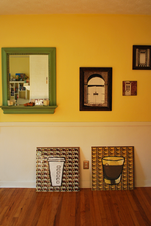 I should add that the late afternoon sun made the yellow a lot more “gold”.
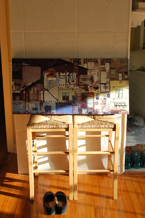 one day a DIY version of the West Elm Chunky Console will go here