Archive for the ‘inexpensive design’ Category

Ikea To The Rescue

26 Comments

Posted by Rebecca, July 17th, 2013

A while back, I posted about wanting to add some book storage to the playroom. I mentioned possibly building some ledges since it seemed fairly simple. Well, after a trip to Ikea a few months ago, we realized that we could use their picture ledges for a cheap and fast solution. Since my goal in life these days is to keep it simple, we decided to buy them.

First, let’s talk about Easton’s love of Ikea. If you follow me on Instagram (@lilhousecould), you are already aware.

(ps- I made my Instagram private since it’s more of my personal pictures than blog pictures, but as long as you look like a genuine person, I’ll accept!)

easton ikea 1

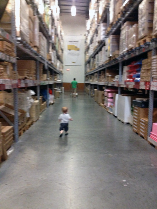
We went (again) over the 4th of July weekend, so the store was empty. Since he’s currently a full out toddler, he had enough of the stroller at the end and just wanted to run. A giant, empty warehouse was the perfect place for all of his energy.
easton ikea 2

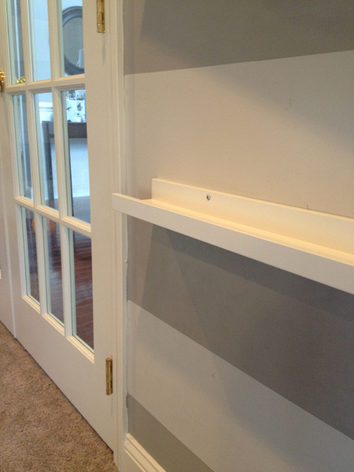
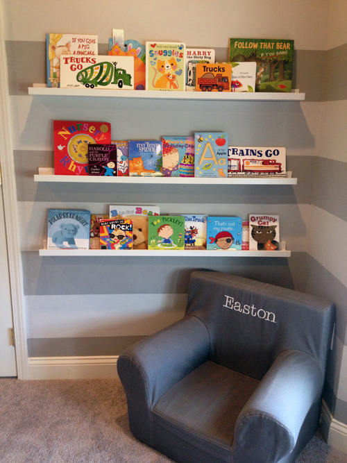
We picked up 3 of the Ribba ledges in white, in the longer length (45 1/4″). We hung them while we were together one weekend during a nap.
book shelves1

We used the stripes as spacing and decided to hang a shelf every stripe and a half to make sure Easton has space for taller books as he gets older. The stripes are 12 inches wide so the shelves are 18 inches apart from the actual flat part the books sit on.
book shelves2

As Mike put it, it’s such a great use of space. Easton has a lot of books (he still has some in the family room and his bookcase full in his room) and this saved us precious space in his toy storage. Plus the colorful books “make it look like real playroom” according to Mike.

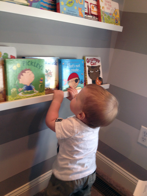
When Easton woke up from his nap, he ran over to his new book wall right away. Baby bookworm.
book shelves3

I am thankful that we did not put that lower shelf any lower or we would have a child standing on it. I originally thought of adding a 4th shelf lower for him, but it definitely would have become a ladder/climbing wall. Just to be safe, each screw that is not in a stud is drilled into a drywall anchor that holds 50lbs. Thankfully, Easton is only 24lbs 🙂

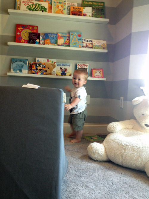
His only objection was to where I placed his chair, he prefers it like this…
book shelves4

One day I’ll have to take a picture of him rearranging the furniture in our family room. I’m talking full out chairs and ottomans moving across the room. He says he just has an eye for these things….

After the shelves were up, we decided to head back to Ikea (this was the 4th of July weekend trip) to look at tables for the playroom. I’ve been eyeing up sales at Pottery Barn Kids and Land of Nod, but their tables were all still ridiculously expensive. The playroom is small, so I didn’t want anything big, but something that Easton can use now and as he gets older. More and more, we’d been building blocks on the lid to his drum set, on the carpet, so I knew it was time…
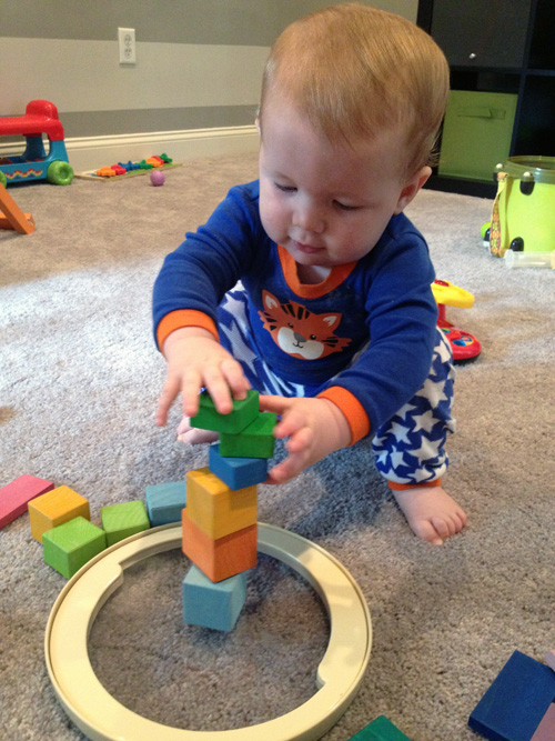
blocks 1

We went with the Sundvik children’s table in white. It’s solid wood, which was something I really wanted and it is the perfect size.
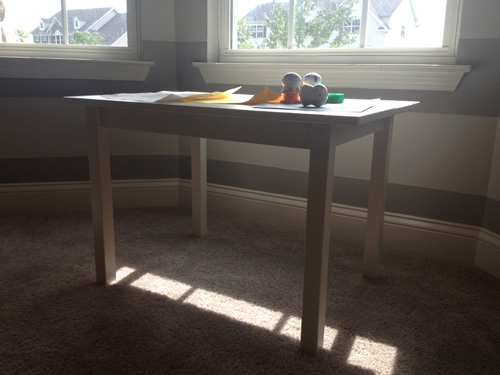
play table 2

We picked up 2 of the matching chairs to go with it, but for now they are still in their boxes. Easton wouldn’t be able to reach the table sitting and would definitely use them to Spider Man himself up on the windows..or the book ledges… or my head. In a couple of months they will be perfect and I might even paint them a bright color, we’ll see.

For now, the table is perfect for Easton to stand at.
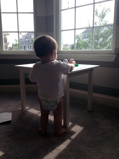
play table 4

He has a nice little section of the room furnished now. There’s still a lot I want to do in here and I know it will be never ending as his needs/skills are constantly evolving.
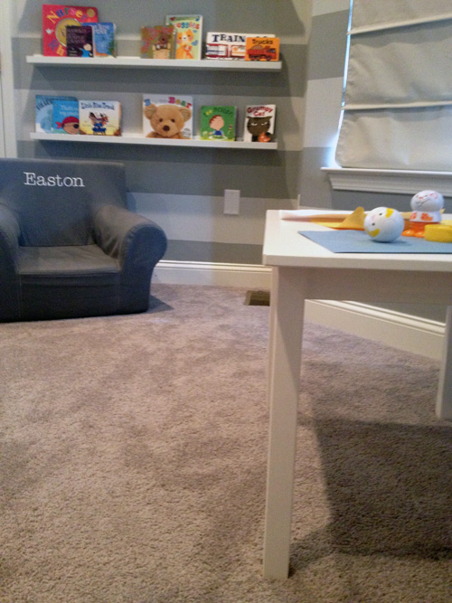
play table 3

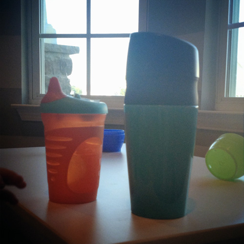
I’ve been trying to bust out some arts and crafts, but he’s more fascinated by how the crayons fit into the little Crayola palm grip things we have. He has been a master stamper though, even if it means there are stamps on the new table. We’ll be testing the durability of that Ikea paint with the multiple wipe downs. He uses the table for his blocks and stacking toys mostly, but also as a place to put his sippy cup.
play table 1

Wonder where he learned that one?
Making Spirits Bright

6 Comments

Posted by Rebecca, December 18th, 2012

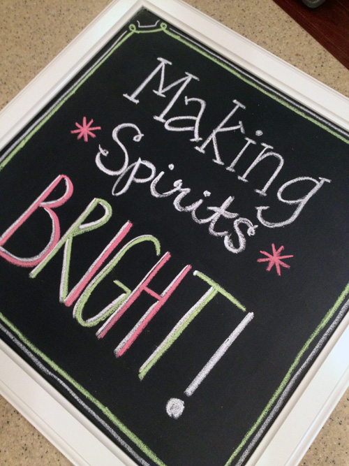
I think we have all had heavy hearts lately, saddened that the world can be such a cruel place for those who are so innocent. After watching/reading the news all day on Friday, I decided to doodle on something I made the weekend before. Doodles always make me smile, maybe they do the same for you.

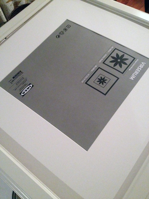
I started with an Ikea frame we already had.

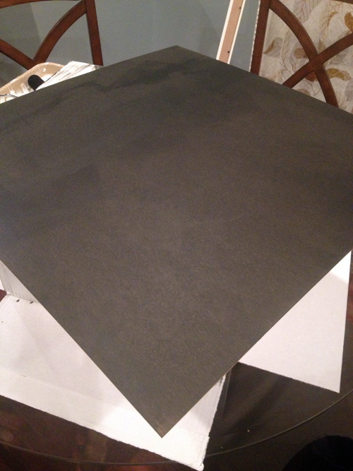
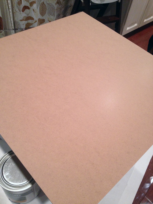
I checked to see what the backing to the frame looked like. Turns out, it was a nice smooth board. Perfect for some chalkboard paint 🙂

As a kid, I always loved playing school and writing on the blue chalkboard I had in my room. I was always the first to volunteer to write on the board at school and I loved trying different types of handwriting (my middle school speciality was that I could write on a chalkboard just as well with my left hand as my right). With the chalkboard trend making the rounds, I have wanted one for over a year. We’re planning on making one wall of the office a chalkboard wall, but I got impatient. Need. Doodles.

While I was taking an initial look at the frame, I broke the glass. It was a total accident that actually worked out for me because I felt bad wasting it. Now the only part I wasn’t using was the mat, which I ended up placing behind the board to keep everything fitting tight. Whew?

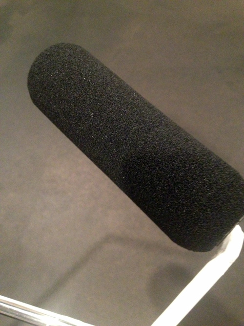
I used Valspar’s chalkboard paint in black and rolled it on with a foam roller we had hanging around.

Each coat took me about… 1 minute. I waited maybe 10 minutes between each coat and ended up doing 3 coats.

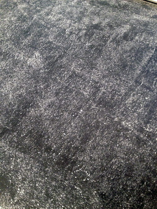
I let it completely cure overnight, then I rubbed some chalk over the entire surface. The Valspar can said nothing about doing this, but I had seen it all over other blogs. Better safe than sorry.

Once it was all done, I got to writing. In the past, I’ve watched some YouTube videos of professional chalkboard writers and took some hints. One of these days, I’ll try something elaborate with proper spacing and planning but for now, this is what I did in a total of 10 minutes.

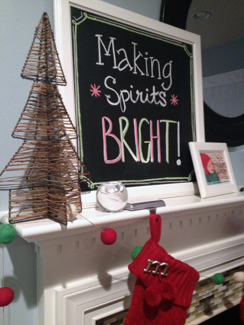
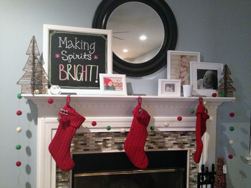
Needs work, but not bad for a first attempt at chalkboard art. I then stuck it on the mantel, which is still a work in progress.

We’re waiting for some Christmas prints of Easton to arrive to fill a frame or two, then I might add some wrapping paper to the remaining ones. Once that happens I can take some decent daylight pictures of our Christmas mantel.

I planned this post out in my head and then jumped in the shower. It didn’t feel right to me to not fully address what happened in Connecticut, though I really don’t feel like I have the right words to say. “Making Spirits Bright”, while positive, still felt like I was being cold.

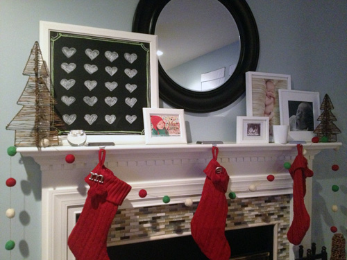
So I just ran downstairs, erased my chalkboard, and changed it to this.

Twenty little hearts, for twenty little hearts.

Because a picture is worth more words than I could string together.

Easy Art Switcheroo

3 Comments

Posted by Rebecca, July 10th, 2012

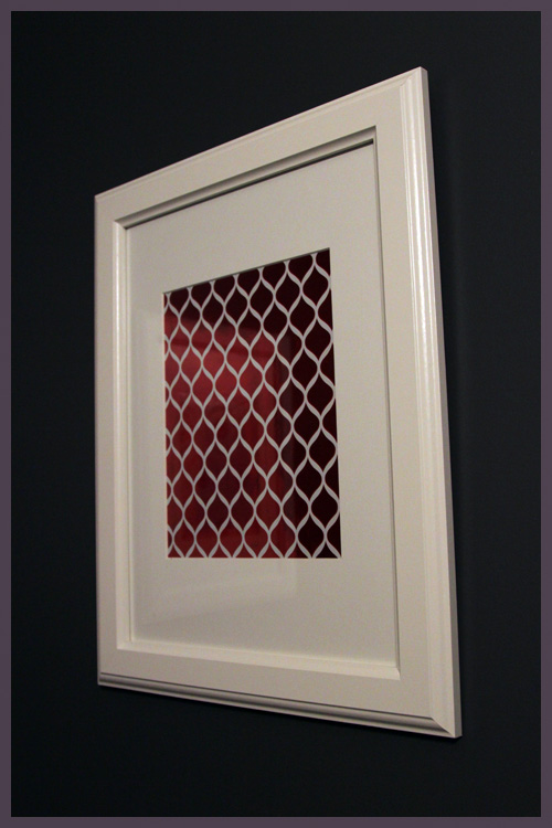
Remember way back at Christmas time, when I framed some metallic wrapping paper to make our powder room all festive?

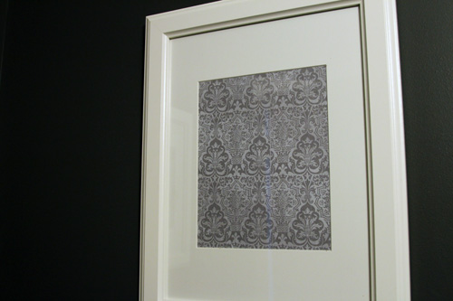
Well it stayed like that for much longer than I’d like to admit. One of my to-do list items before Easton was born was to switch out the paper in these frames. I planned to browse Target or Michael’s or something to get some brand new wrapping paper but I ran out of time and ended up using what I had around. I had a few sheets of different scrapbook paper hanging around and I dug out some gray and white damask sheets.

This time around I went with two of the same sheets of paper since I didn’t have two related patterns. But to change it up, I put one right side up and one upside down 🙂

This room is insanely, insanely hard to photograph since it’s well, a small powder room and painted nearly black. A full room shot is nearly impossible, but this gives is where we stand now…

Now that I look at that above picture, it’s quite funny that we can never get the frame and the shelves in the same picture. It looks like a drunken bathroom picture… or like our camera accidentally took that…while drunk.

We originally planned to add aqua accents to this room, but right now it’s just shades of gray and white. And I like it! I like the idea of keeping the shelves white and painting the mirror we have in there white. Then we can change out the accessories as we want and make a hand towel, pictures or little things on the shelf aqua or even red again around Christmas. Up next, I have a date with a can of white spray paint and the bathroom mirror. It’s long overdue.

Alphabet Art for the Nursery

33 Comments

Posted by Rebecca, June 22nd, 2012

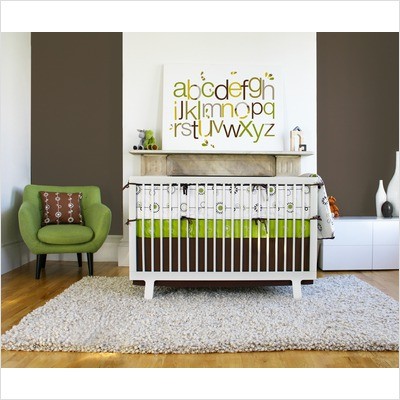
Before Easton was born, I posted about my plans to make some sort of an alphabet print for his room. My original inspiration image hailed from Pinterest…

(from Free Home Decorating Ideas via Pinterest)

My previous post covers how I went from planning this out using paint and canvas, to printing on canvas, to finally just making it a print using Photoshop.

I’ve said this before, but I am no Photoshop expert. In fact, I have no clue of what I’m doing 99% of the time. When I posted about deciding to make the art using Photoshop, I figured Mike would make it because I was lacking the skils. Well, throw in a late baby, a husband who is busy with his own work and me spending hours in bed and guess what? I did it all by myself 🙂
I camped out in bed the last days before Easton came and one of the things I did was whip up a little art on my laptop. I started as just playing around to give Mike an idea of what I wanted, so that he could then do it better. As I played around, I realized I could do it on my own if I just kept tweaking it. It ended up being far easier than I thought!

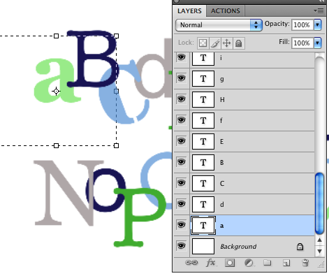
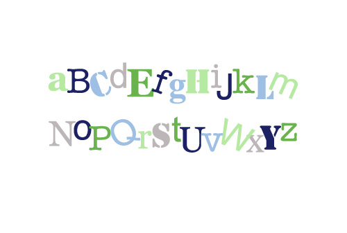
I started with a rough draft… all I did was type some letters in Photoshop and change the font, color, size and location of each individual letter until I liked the way it looked. I was surprised at how easy this part was since each letter was it’s own layer and I could go back and tweak whichever letter I didn’t like.

My first attempt looked like this…

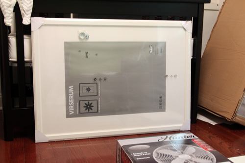
I liked it for the most part, but there was a lot of dead space. I had to figure out how the letters would look in the frame and make sure there wasn’t too much white space at the top and the bottom of the letters. We had picked up a large Virserum frame from Ikea before even starting this project, so that we were sure that we could size the print properly to fit the inexpensive frame. You may remember seeing the frame hanging around in some pictures…

The frame is 30 ¾” x 41 ½” and the mat opening is about 27 ½” x 19 ½”. I mentioned in my previous post that I saw on Shutterfly that I could order a print as large as 30″ x 20″, which was perfect. I would just have to make sure that my text was centered around the  27 ½” x 19 ½” size of the opening and that I made the image large enough pixel wise to print clearly.

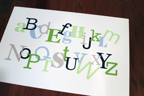
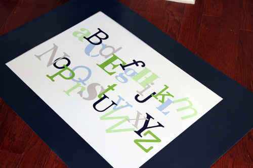
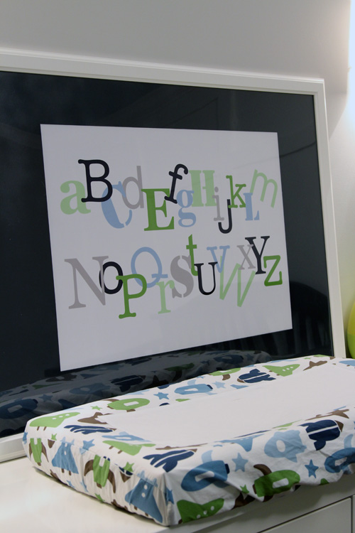
So I set my Photoshop canvas to the size of the print (30″ x 20″) and began to tweak my first draft. A little bit of making fonts bigger, a little bit of overlapping letters and just playing around, then my final product looked like this…

I ordered it and it cost me a whopping $15 to print through Shutterfly. It was supposed to take over a week to come, but it ended up arriving in a few days and coming the day before Easton was born. If you remember from my birth story, I was already in labor at this point so Mike ran it upstairs to show me how great it printed. He put it in the frame just so I could see how it looked, but I didn’t snap a picture of it.

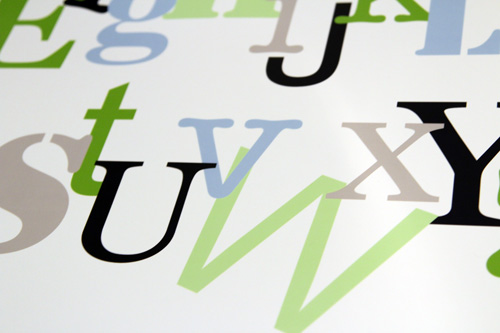
The large canvas size I chose worked because the letters were not at all blurry.

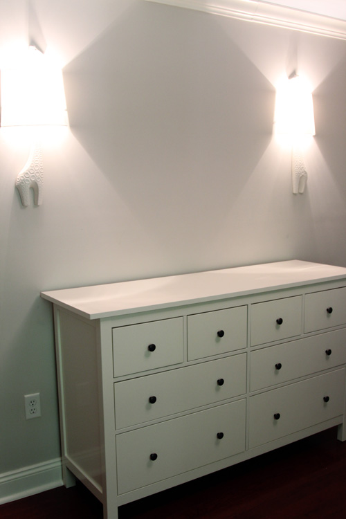
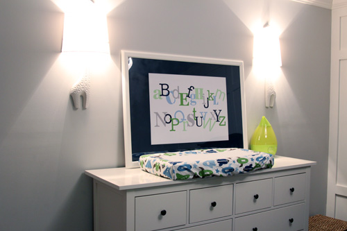
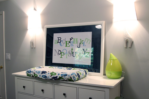
We planned to put it on the wall in between the giraffe sconces.

Since the sconces are white, the dresser is white, the frame is white and the mat is white, I thought it was too much white. It would look nice and clean, but I was just looking for a little more fun and contrast on this wall. So I decided to spray paint the mat navy blue.

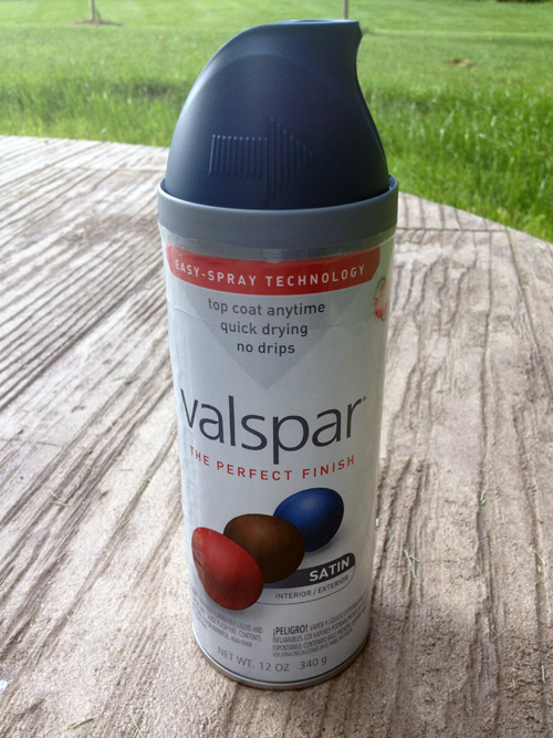
I picked up this can of paint while I was in labor. I figured walking around Lowe’s would help, though I was in such pain that I could hardly walk and I had to stop and sit on a pile of wood. Whoops.

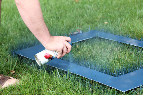
Finally this week, I decided to take the hour I had in between feeding, burping and cuddling to run outside and spray the mat. Hello backyard, I haven’t seen you in a while.

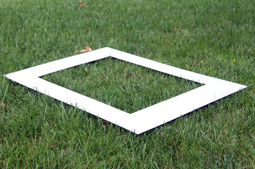
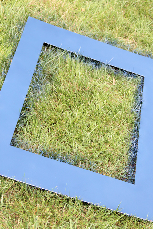
I just laid the mat on the grass because Mike was due to cut it anyway. The blue will be gone with one pass of the John Deere 🙂

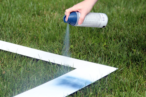
It took several coats to make sure there were no white spots. My hand started cramping since the Valspar trigger was really hard to push down, so Mike took over.

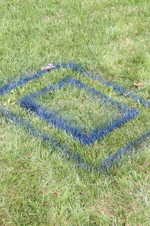
Once we were done, the grass looked like this (which was actually really cool looking)…

But the mat looked like this!

Fast forward a few days after it completely dried and I had another baby nap to put the mat in the actual frame. Sidenote: Mike’s been spending most of his spare time working on the built-ins in the new office that we abandoned to work on the nursery. So I’m usually on baby duty and can’t work on projects, but I can’t complain because the built-ins are looking awesome 🙂

First I wanted to make sure the blues looked good together. The lid of the spray paint can looked more bluish than navy, but it was the most navy one I could find. Thankfully, it dried much darker!

I put it in the frame and I was surprised that he “glass” in the frame is plastic. No wonder why Ikea can sell such a large frame, with a mat for just $29.99!

We couldn’t find the hardware that came with the frame, so I just leaned it up against the wall to see how it would look.

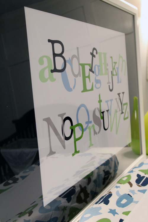
And I love it. I’m shocked at how well the colors match the color scheme of the room. I really just tried to incorporate the blues of the bedding/curtains/ceiling, the greens of the bedding/closet/bookcase and the gray of the walls. This artwork was meant to be the glue that brought everything together, and I think it does.

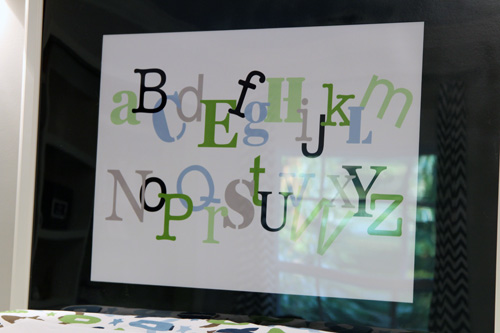
The plastic “glass” of the frame made for some awful glare, so it was hard to capture pictures. I may actually just remove it when we mount the frame, at least to take better pictures for you guys 🙂

Though the glare does allow you to see the other elements in the room with the art, like how you can see the chevron curtains hanging out in this picture…

One more picture from the other side of the room!

Not to shabby for $15 for a DIY print + $29.99 for a large frame and mat. Oh and a couple of bucks for spray paint!

Since this post took me 3 sessions to write, Mike is actually at Lowe’s at the moment picking up some stuff for the office and some hardware to hang this bad boy. Hopefully this weekend we can both have time, at the same time, to hang it since it’s a two person job. Then we’re one step closer to actually being ready to give you a full nursery reveal and tour. I’m so excited 🙂

Update! Since I just completed this and I didn’t have time to tackle a new project, I decided to use this as project as my summer Pinterest Challenge entry, hosted by Young House Love, Bower Power, Centsational Girl and Ten June, all of which are some of my favorite blogs. 3 out of 4 of my Pinterest Challenge projects have been some form of wall art, guess you can tell what I like to do for fun…

Oh and we did get around to hanging this print on the wall, which I posted about here.

Tada! 🙂

Baby’s Dresser

42 Comments

Posted by Rebecca, April 11th, 2012

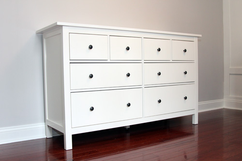
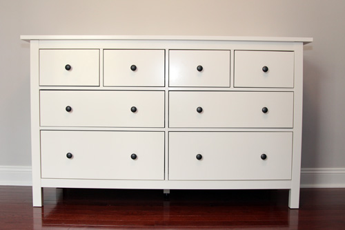
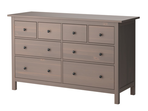
Since we started planning a nursery, the Hemnes 8-drawer dresser from Ikea has been in my plans.

(via Ikea)

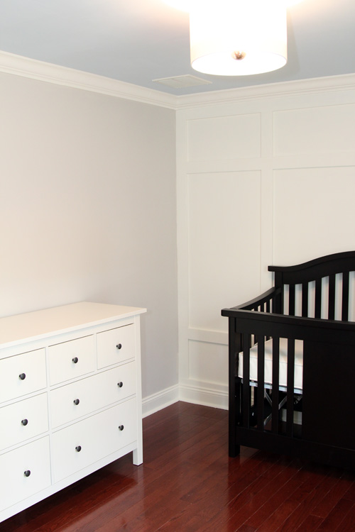
The question was the color. Ikea has a few options that would work– the black brown, the gray brown (pictured above), the white or we could paint it a bold color. The bold color was my choice up until we actually painted the room. When I saw everything all complete, I couldn’t help but think of a white dresser.

I figured this would be a piece of cake, we would just buy the dresser in white! But then I realized something– Ikea’s white furniture is not solid wood. Part of the appeal of the Hemnes collection was that (I thought) it was all solid wood. After selecting a solid wood crib that was made without the use of formaldehyde, I wanted to also have a safe dresser.

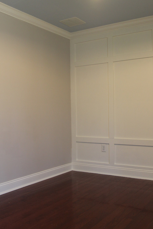
Our line of thinking around here has always been that we do the best we can. We knew that it would be impossible (or rather, out of our budget) to make a 100% eco-friendly, non-toxic nursery, but we wanted to make smart decisions where we could. I knew it would be inevitable that say, an upholstered chair and our hardwood flooring would off-gas somewhat, so we used no-VOC paint, solid wood molding for the paneling behind the crib, non-toxic construction adhesive and purchased an organic mattress and changing pad. We tried to cut out the chemicals where we could.

I also know that nearly no dresser is 100% solid wood. Unlike cribs, many dressers contain particleboard to make up the back of the dresser or drawer components, so I assumed this would be part of our “suck it up” off-gassing to account for. Still, I could not swallow the idea of a particleboard and fiberboard dresser. We started to look for other dressers that were white and solid wood.

I should mention here that my original, original thought was to find a secondhand dresser to refinish. I don’t know where all of these bloggers with awesome Goodwill stores and thrift shops live, but we looked for a few months and never found anything we liked as much as the Hemnes dresser. Okay, we never even found anything we liked, period.

In looking at other options, we quickly realized that no one can beat Ikea in price. Pottery Barn Kids and Land of Nod have high quality, solid wood furniture, but it is more than double the price of Ikea. $700 for a dresser was not in our budget. We also checked the usual baby furniture at Babies R Us and Buy Buy Baby, but we did not find a single dresser we liked there either… and they were more expensive than Ikea.

We decided to take a trip to Ikea to check out the dresser in person. We liked it. We scratched our heads. We talked in the dresser section for probably 20 mins. We said our mantra was always to do the best we can within our budget. Since we’re going over budget with our glider purchase, we knew we couldn’t do it again. We decided that I was just being neurotic and that plenty of people have non-solid wood furniture. We cut out where we could. Mike told me that if this purchase was going to bother me, then we shouldn’t do it. But we did it, and it did bother me even minutes after buying it.

I felt that maybe we should have gone with one of the children’s furniture lines because at least they have some sort of certification from the JPMA or whatever. So I decided to email Ikea and ask them if their non-solid wood products met any sort of emissions standards, specifically if they were CARB compliant in the state of California (the strictest emissions standards in the US). Their response shocked me. Part of the email read:

We have strict rules concerning formaldehyde, and we do not permit the use of paints and varnishes containing formaldehyde additives. For wooden products, we apply the German E1 standard and have done so for many years now. For textiles, we apply the Finnish regulations.  In both cases, these are currently the strictest within their field worldwide.

I googled around a bit and found that Ikea had run into some trouble with formaldehyde emissions in their furniture products back in the 90s. Since then, they have a policy that they will meet the strictest regulations that exist within their markets, which for furniture is currently Germany. That way, they don’t have to make a separate piece of furniture to sell in the US, Germany, Japan or wherever. Kudos Ikea!

My googling also let me to find that the second round of California’s CARB emissions should be more strict that the European E1 standards. Interesting and good for California! Now if only the rest of the country would catch on…

I have seriously read so many documents about parts-per-million, different types of wood and standards around the world that my head is spinning. I feel much better about my purchase knowing that it contains minimal amounts of formaldehyde (since formaldehyde does indeed occur naturally in wood and some off-gassing will inevitably occur in all pieces).

Moral of the story: Don’t be afraid to email companies and ask them about their policies. Even if it just helps you sleep better at night knowing what you purchased, it’s worth it.

Very long story short: We have a new dresser and we are very happy with it 🙂

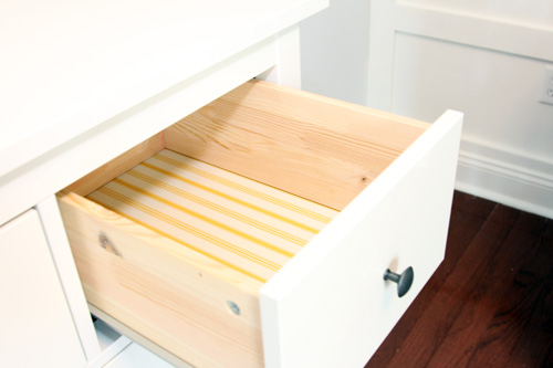
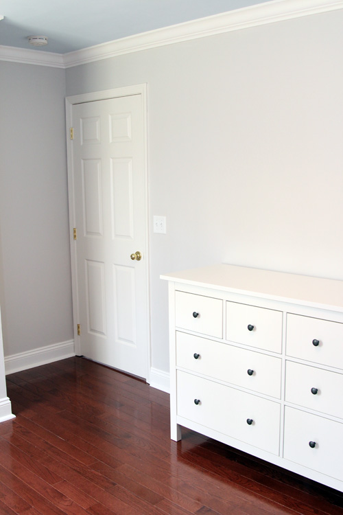
Some parts of the dresser are indeed solid wood and the drawers are lined with adorable yellow striped paper. These little top drawers are perfect for storing our cloth diapers.

We thought of changing out the standard drawer knobs, but I actually like them. The dark balances well with everything.

It’s amazing how quickly a room can get smaller when you add furniture. I seriously used to think this room was too big for a baby!

We love how classy the white looks in the room. We’re happy that it only cost us $299 for a brand new dresser and that it came with some morals. Thank you Ikea for bringing some non-solid wood standards to the little people, you get a bad rap far too often.

Okay, who made it to the end? 🙂

Copyright 2010 - 2011. The Lil House That Could. All rights reserved.