Planning an Accent Wall
Posted by Rebecca, February 7th, 2012
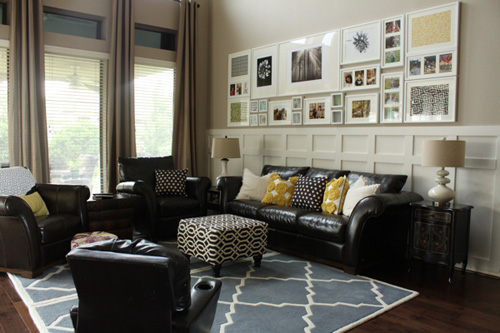
I’ve mentioned before how our nursery plans included some sort of board and batten. I’ve always wanted to add some molding to the nursery and I was inspired by Emily’s living room makeover this summer…
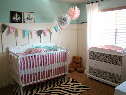
I figured we’d do something a little higher than chair rail height like hers, but all the way around the room. Here are some nursery versions I’ve seen around Pinterest…
(from Sweet Tea Paper on Etsy via Pinterest)
(from The Fickle Pickle via Pinterest)
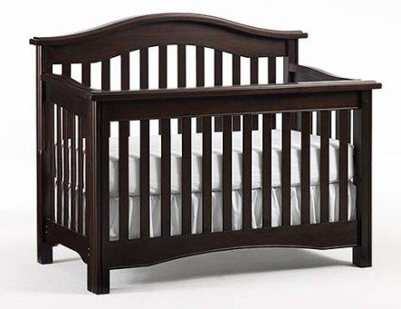
I’ve always liked this idea because I figured it would add a pop of white for me to put dark nursery furniture against. It would also allow me to add some darker colored walls than I would if the more classic molding was not there. But, I didn’t want to do a simple vertical board and batten and I liked the design of Emily’s wall in the first picture the most.
When I started to think about how I could make our board and batten more interesting, I realized that the multiple lines in the first design, the part I loved the most, would get kinda busy and clashy with the crib and straight dresser. I debated whether or not to keep my board and batten as the usual horizontal boards on top and bottom with vertical lines in between, but I didn’t want it to compete with the wainscoting we started to add to our entryway, which will be right outside of the baby’s room. I didn’t want our house to have a molding identity crisis!
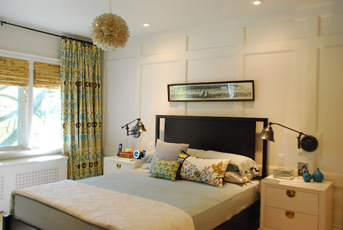
So just recently, like the past week or two, I started thinking more about keeping the molding limited to just one accent wall, like Rambling Renovators did behind their bed in their master….
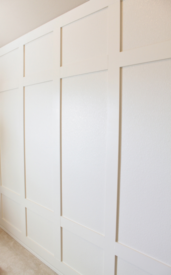
And Emily did in her stepson’s room…
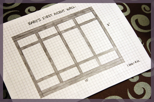
I thought this would be a great solution because the dark, curved back of the crib would fall in between all of the horizontal lines of the molding, so they would not compete for attention. The problem was that I didn’t know how many boards to add or how it would look in our room. I’ve used both Photoshop and Google SketchUp before, but I am not used to either and they take me for.ev.er. So I decided to just sketch it out by hand to give myself an idea of what design we could do.
Then I got a better idea… I could draw it to scale with some graph paper!
First, I printed off some free graph paper from PaperPrintout.com. I used the 1/4″ sized squares so that I could draw it to scale without it being too small or too big. The wall we are adding the molding to is 8’x10′, so I counted each box as 4 inches. So I needed my wall to be 24 boxes by 30 boxes on my graph paper.
After a trip to Lowe’s and some googling, we decided to use 4 inch wide by 1 inch thick boards for our molding. I’ll explain that decision a little later, but then each board in my sketch took up either a row or column of boxes. I kept it as easy as possible 🙂
Note that the 3 vertical boards in the middle ended up being smack in the middle of a column of boxes! Just my luck, though still easy to sketch 🙂
The top and bottom boards are doubled- there are two 4 inch boards stacked on top of one another. This is to integrate 5.25 inch baseboards and crown molding with the rest of the room. Once those moldings are added, the seam between the 4 inch boards will be covered and we can still have higher and beveled crown and baseboards on the other walls of the room. We wanted to ensure that everything sat nice and flush.
Having everything drawn out made the process so much easier… and it took me a whole 5 minutes to draw. And spoiler! We finished putting the boards up tonight and will snap some pictures and share more details tomorrow 🙂


