Archive for the ‘paint’ Category

The New Office Inspiration

6 Comments

Posted by Rebecca, October 19th, 2011

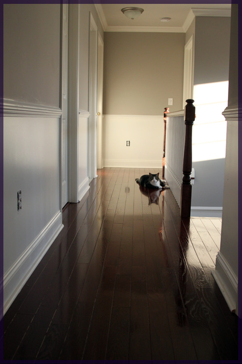
No, I’m not talking about the Office with Andy Bernard in charge (which just isn’t the same, btw), I’m talking about the office we plan to move upstairs that I mentioned here. I’ve blogged about how I’d like to build a window seat and Mike posted about how he’d like to do some dramatically large lyrics on the wall, but other than that we haven’t told you much. We have received an estimate to continue the hardwood flooring we added to our hallway and master last year into the remaining 3 bedrooms. That would mean that our entire upstairs would be seamlessly full of this…

This was our plan all along, we just tried to break up the expense over 2 installs. Since we’re getting serious about moving the office, we figured the carpet should go before we do so. Macky looooves shredding that particular type of carpet and whenever he weasels his way into one of the spare bedrooms, he immediately goes to town. This would probably drive us crazy after about…. an hour of sitting in the new office.

Then we bought a couch and a tv so the addition of the floors got put on the back burner. We like to only tackle a major expense at a time, so we’ve decided to wait until November/December to add the floors (depending on our contractor’s availability). In the meantime, Mike and I have been scouring Pinterest for some inspiration. Yes, Mike sneaks on Pinterest and sends me links to things he likes quite often.

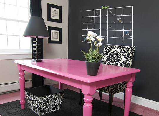
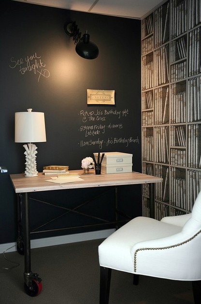
First, the chalkboard walls. We want chalkboard paint walls behind our desks. We’re both desperately missing a space to jot down notes, code and to-do lists in our current office and chalkboard paint is the natural choice.

(from Craftaholics Anonymous via Pinterest)

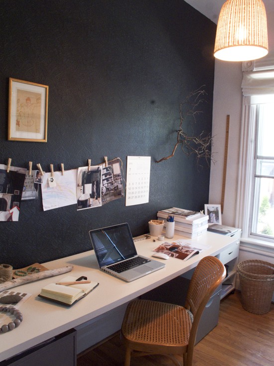
I love the clothesline for inspiration pictures in this one, though I’m not sure it’s chalkboard paint, it could be!

(from The Marion House Book via Pinterest)

(from Decor Pad via Pinterest)

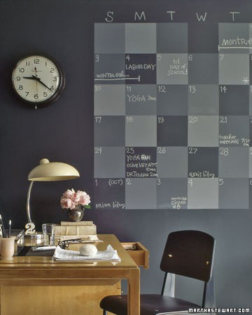
And the classic chalkboard calendar from good, ol’ Martha.

(from Martha Stewart via Pinterest)

Other than giant chalkboard walls and a built-in bench, we’re not entirely sure what we want to do with the rest of the room. The room is so large that it’s hard to visualize and I’m afraid we’ll end up with 2 smallish desks floating in the center of two 15 foot walls. Then today, Mike found a few ideas that I think can work for us.

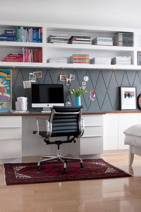
First, some wall cabinetry flanking either side of the desk to break up the large chalkboard wall…

(from Blueprint Bliss via Pinterest)

Second, maybe some high, open shelving to keep the “backsplash” area open for chalkboard writing.

(from Design*Sponge via Pinterest)

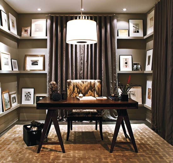
Furthering the open shelving look, I like the idea of doing just one continous shelf around the top of the room. Sort of like the top shelf in this picture…

(from Marcus Design via Pinterest)

Whatever we decide, the change will likely be gradual. I know Mike wants to get settled into the office quickly, but we’ll still tackle one project at a time and see where the room takes us. We just know we want it to be streamlined, clean, full of storage and uncluttered. We’re currently having a serious paper issue in our office. Meaning that, Mowie chews paper… in our office. She ate my softcover, rented textbook last night. Needless to say, we’re reaching our limit with storage-less desks and we’re looking forward to some new solutions 🙂

Our Paint Colors

52 Comments

Posted by Rebecca, October 13th, 2011

A couple of weeks ago when I planned to do a post with some frequently asked questions, I wanted to include a section for all of the paint colors we’ve used in our house. Mike ended up taking over the post for me when I fell asleep, answering his own version of our FAQs. Since the #1 question I am asked is what paint colors we’ve used in various rooms, I figured it was about time the question received it’s own post!

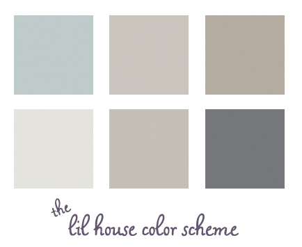
Here are all of our current paint colors displayed together. Some observations…

1. I never realized how well all of our house colors blend together. Since I didn’t really have the whole house in mind when choosing colors, I’m surprised that they all work well! I especially thought the dark gray was bolder and less expected, but even that blends in well.

2. The two middle colors on the top and bottom rows do not look that similar in real life. Or maybe they do? Mike says they do. I think the top color is more brown based and the bottom one is more of a true gray. At least I’m consistent in my choices 🙂
Here is our color breakdown, by room.

Family Room & Kitchen:

Wedgewood Gray

Benjamin Moore HC-146

Entryway & Upstairs Hallway:

Himalayan Trek

Benjamin Moore 1542

Living Room & Dining Room:

Waynesboro Taupe

Benjamin Moore 1544

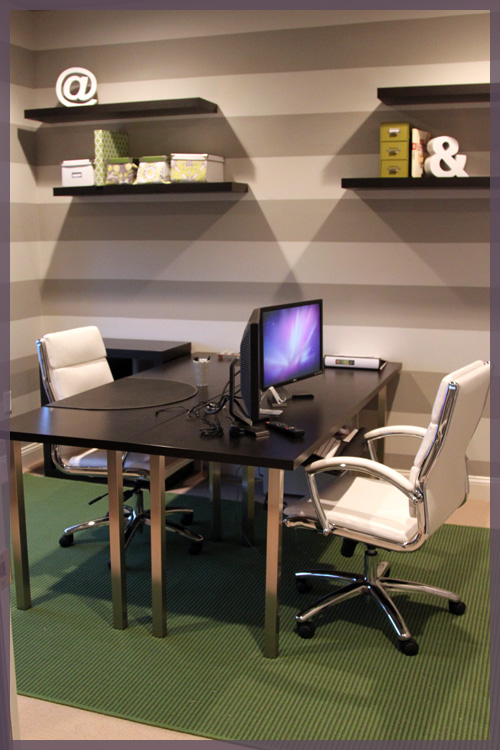
Office:

Light Stripe- Gray Ghost

Olympic D17-2

Dark Stripe- Silver Fox

Benjamin Moore 2108-50

(we color matched the dark stripe to Olympic, but it is nearly identical to Olympic’s Silver Dollar D17-3)

Powder Room:

Cracked Slate

Olympic D44-5

You’ll notice that our recent paint projects have been done with Olympic’s no VOC paint. We try to keep things as toxin free as possible around here since Macky has seizures and we don’t want any unnecessary triggers. Plus those smells just aren’t good for anyone 🙁 The Benjamin Moore paints we used were for rooms we had professionally painted before we moved in so Macky wasn’t exposed to those fumes (we couldn’t paint our two story entryway on our own so we hired it out).

I hope this post answers all of your paint questions in one spot. I plan to update it as we paint more rooms down the road. I’ll also add this post to our top navigation bar for easy access 🙂
A Powder Room Update

8 Comments

Posted by Rebecca, September 19th, 2011

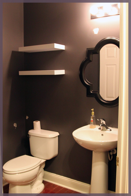
This weekend we got around to hanging a few things in the powder room- 2 white shelves from Target and a mirror from Lowe’s.

The lighting is impossible in this room and yes there is spackle all over the walls. One of the shelves took a plummet in the hanging process and took some wall with it. The story of our lives.

We’re thinking of spraying the shelves a glossy white, using the remaining spray paint from the deer bookends I recently sprayed. I just like the idea of blending them with with the sink and potty.

As for that mirror?

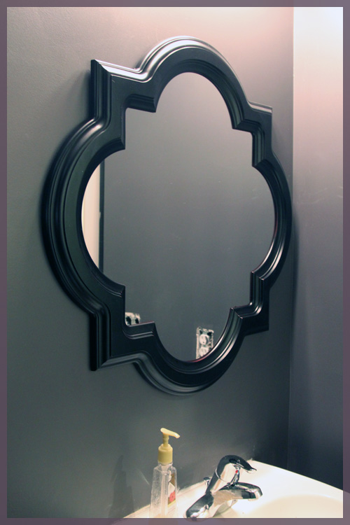
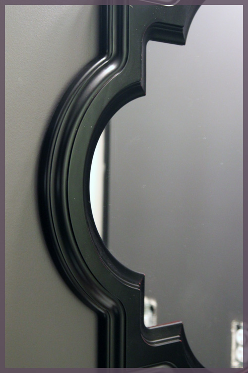
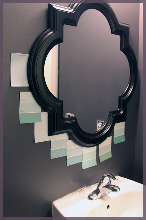
We knew we wanted something fancy looking. I’ve loved this mirror for as long as I can remember and previously considered putting it in the entryway.

But this espresso finish? Not staying.

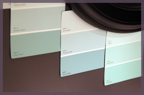
Yes, we’re planning on painting this frame an aqua sort of color, as I mentioned my love for this combo last week.

(the sink needs another round of caulk and some paint from when the previous mirror came crashing down….I told you touch ups were the story of our lives…)

I’m thinking we’ll go with one of the lighter tones to balance the super dark walls.

It’s come a long way from where it was just 2 weeks ago!

We also shopped around a little for some accessories with no luck. Who knew turquoise mist hand towels were so hard to find? Yes, turquoise mist is the new name I’m using for that color we’re trying to achieve. It’s actually the name of one of the paint swatches up there, but it’s a little too blue I think. I’m in search of the perfect turquoise mist 🙂

Our main goals at this point are to paint the shelves, paint the mirror and finish all of the touch up work that we keep piling on. Then I’ll figure out what to put on those shelves!

Paint It Black, errr, Dark Gray?

20 Comments

Posted by Michael, September 6th, 2011

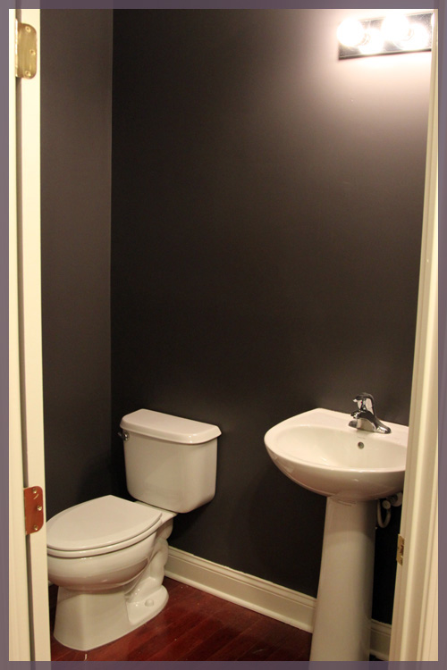
Before I even dive into this post, do you guys know how hard it is to take pictures of an awkward sized powder room?  An awkward sized powder room that is a bit sandwiched in the hallway between the front door and the kitchen?  I had NO idea how to properly capture this space, so you’re only  getting two pictures tonight!

The powder room is pretty much entirely painted.  We do have some touch-up work to do as well as some re-caulking in some areas.  But otherwise, the incredibly dark and dramatic paint is here to stay.  The pictures don’t really do it justice, the contrast just isn’t strong enough.  I’m sure once we fill the space with some accessories, the space will look incredible.

The dark gray really is growing on me though!  Especially after spending a few minutes in there glazing at a wall.  TMI?  Too far?  We’re friends, right?

Here is the powder room from the hallway.  Holy dark Batman!  It does look a bit black, but I swear, it’s not.

And here is from another angle.  I was hoping to capture the color better against the glossy white sink.  Did it work?

While spending some time in Home Depot yesterday picking up supplies, we decided to look at towel racks and the like.  We found a set we liked, but for the price (roughly $25 for the towel bar and another $25 for the toilet paper holder) we just weren’t completely sold.

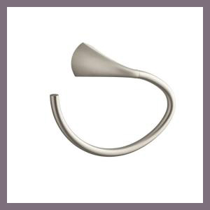
We both loved this towel ring as it’s entirely seamless, but after sleeping on it, I think it screams “THIS IS US!” too much.  Do we really want something that screams “US!” in such a dramatic powder room?  I think we can be a bit more creative in this space than going with something predictable.  But ten bucks says we still settle on it.

And here is the toiler paper holder.  Again, we love the brushed nickel and the seamless design — but I feel like we’ve done this before.

What do you think?  Do we go with the predictable options?  Or do we set out to discover something a bit more creative?  My hesitation with the latter is, how creative can you really get with these things anyways?

And by the way, this was the first time I have painted where 1) I didn’t get paint all over my clothes and 2) I didn’t get paint in my hair!  And Macky stayed paint-free as well!

A Day of Labor

6 Comments

Posted by Rebecca, September 5th, 2011

Remember that project I mentioned last week? Yeah well, I didn’t work on it at all this weekend. Mostly because it’s labor intensive and not a Mike job, so it’s a lonely one. With a spare day in this weekend, I woke up and decided to tackle an entirely different project, yay! Because really, what is this blog if it’s not full of unfinished projects and decorating A.D.H.D.?

With a little twisting of the arm, I talked Mike into painting today. He HATES painting. Did I ever tell you that we started our chair rail project because Mike didn’t want to paint the powder room? Yes, he would rather start a major molding project than paint a very small room. Well today, his time was up. The powder room it was!

We had a spare can of Benjamin Moore Smoked Oyster that was color matched to Olympic’s no VOC paint. We originally bought it to paint our office stripes but our lighter stripe ended up being darker than we wanted so we made that our dark stripe and picked a new light stripe, sidelining the Smoked Oyster. The Smoked Oyster was actually the color of our spare bathroom in our condo and I always loved it. I’ve been itching to incorporate it into this house and I figured the small powder room was the best choice.

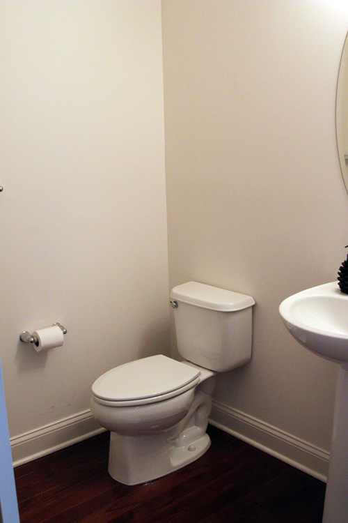
First, I guess I should introduce you to the powder room?

It’s not much (and very hard to take pictures of), but it’s a decent size for a powder room. My major pet peeve with this room is that the towel bar is to the left of the toilet paper holder in this picture. So you wash your hands at the sink, then have to run across the room for a towel? No bueno.

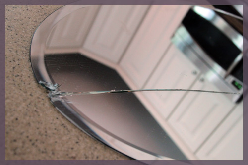
We knew that towel bar was coming down, so we removed it (along with the toilet paper holder, to paint. I wanted a quick and easy day project, so we didn’t plan to replace anything else at this point…just get some color on the walls and do the rest gradually. We were going to remove the mirror because we were planning to replace it eventually and we didn’t want to paint around it, but upon unscrewing… it broke.

Seven years of bad luck…or less time with an awkward, oval shaped mirror. No biggie, it’s not like we get dressed in there in the morning.

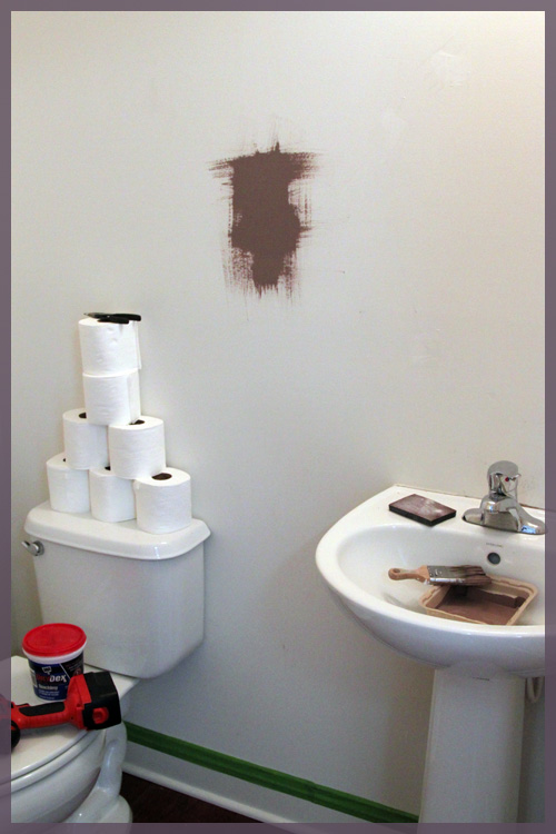
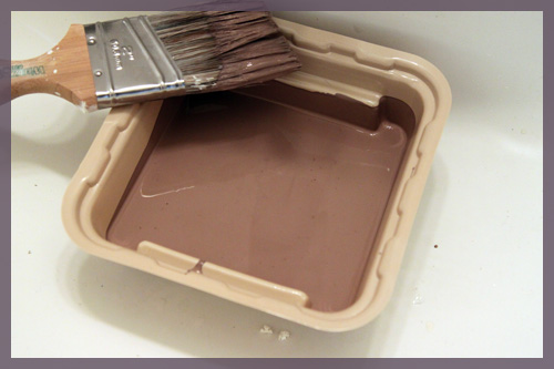
Then something else happened, I put the Smoked Oyster on the wall and… it was fugly.

(ps- if you follow me on Twitter you already know about the T.P. teepee. Mike stacked it on Thursday night in an attempt to liven up the space? It was removed before painting)

It had this red violet tint to it that I don’t remember it having…

I was going to live with it, but Mike hated it and I pretty much did too. I didn’t want to have to repaint again in a few months, so off to Lowe’s we went (it was 5:30 tonight, btw)

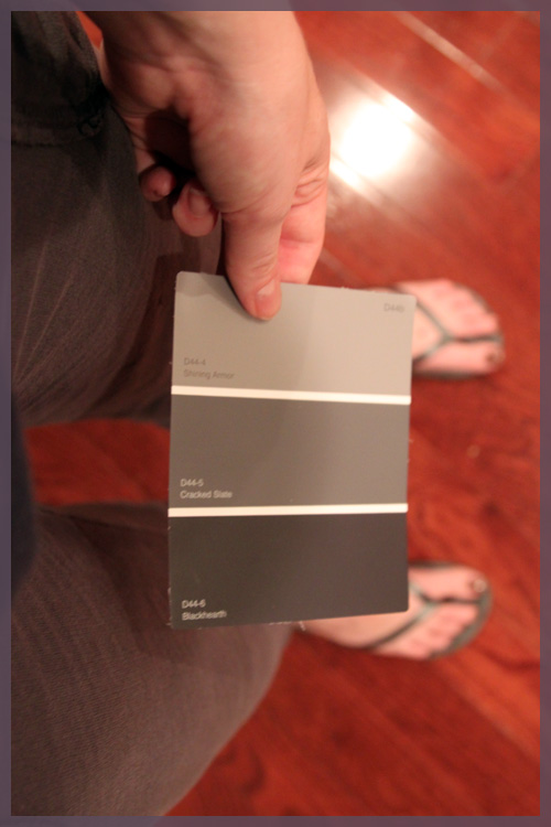
I knew I wanted something dramatic, so we decided to go with a dark gray color. We picked it straight off of the Olympic selections in a matter of minutes. I later realized that my choice matched my pants and flip flops…

It’s the color in the middle- Cracked Slate.

Yes, it’s incredibly dark and dramatic (I think the picture above makes it appear even darker than it is). I’m still having my doubts, but I secretly love my nearly black bathroom. Mike literally just finished rolling (he was still rolling when I started writing this) so there won’t be any after pictures just yet, but here it is during my cutting in…

I know, some of you just fell over. I painted a small room with no windows nearly black? Yes, yes I did. And it’s not black, it’s very hard to capture on camera. It’s a satiny navy blue-ish, deep purple-ish, very inky color. I normally never tape and just free hand it, but I thought a dark color was risky. Turns out taping made more of a mess and we have a lot of touch ups to do. Somehow our to-do list has grown to include crown molding, since a dark wall meets white ceiling is near impossible to do flawlessly.

I think this room will be one that is transformed with accessories. I love the dark color now, because I can see it and I know where I’m going with it. I didn’t plan (at least at the beginning of this day) to paint it so dark, but I plan on adding glossy white accessories, possibly large matted frames and pops of yellow. Somehow my little 2 hour Labor Day project has turned into a room overhaul complete with a stretching of my limits 🙂

ps- I start grad school again tomorrow and I have class on Tuesday nights until 10:30… which means I won’t be home until 11:30. I will do my best to get you some after pictures tomorrow!

Copyright 2010 - 2011. The Lil House That Could. All rights reserved.