i see a pattern here…
Posted by Rebecca, September 26th, 2010
Posted by Rebecca, September 26th, 2010
Posted by Rebecca, September 7th, 2010
Posted by Rebecca, February 10th, 2010
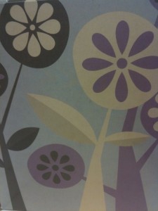
I recently fell in love with this tissue box from Walmart…

If I had a daughter, I would be all over this. I love the color scheme- it’s a mix of grays, purples, browns and creams that somehow looks wonderful together. The graphic is simple yet so modern and sophisticated, with that little hint of whimsy that I think would be great for a kid’s room. So often, people assume a little girl’s room has to be pink to be girly. A little outside the box thinking could make a really unique room.
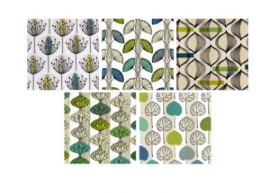
Looking at this pattern reminded me of some prints I bought from Ikea for our condo about a year ago. They were different variations of a simple pattern….
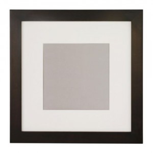
 Unfortunately, they are no longer available from Ikea’s website for me to link. I paired them with a frame similar to this simple matted Fjallsta frame.

I’m not sure of the size of the frames I have, they are currently in a storage unit with the other 90% of my belongings. But I would say they were about a 10″x10″ square. I then hung 3 of the prints on top of one another and placed them on a long narrow wall space we had. I absolutely loved them and plan on hanging them again in our new house.
I am wondering if there are other variations of this tissue box scheme. But even on it’s own or the same image multiplied by 3, it would look great with a cream colored mat and a dark brown frame. Using a mats and great frames arranged in multiples can make even the most ordinary image into a piece of art. Why not get artwork for the price of a tissue box!