Posts Tagged ‘20×200’

To Da Beach

5 Comments

Posted by Michael, September 12th, 2012

I seriously always find myself on 20×200 which releases great, but affordable, art each and every week. Being on the site always makes me want to post on here and show off some cool stuff I find like I did here, here and here some time ago.

So it’s no surprise that tonight I’ll be showing off some 20×200 finds.  Act like you love it.

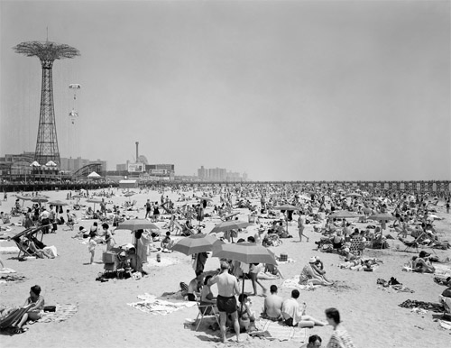
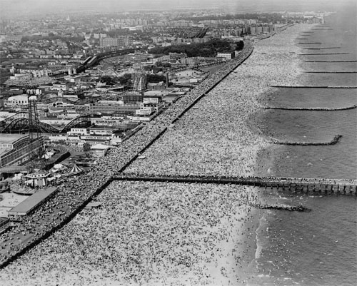
There were two photographs that instantly jumped out at me.  They are essentially the same topic; just different angles.  But the topic in photography is always one that sucks me in.

The topic?  Old pictures of crowded beaches and especially Coney Island.

Rebecca and I have lived close to the Jersey shore our entire lives; we’ve been to our share of beaches here.  And while some get crowded today (think Seaside Heights), they never seem to be as jammed packed as what beaches were like 50-60 years ago.  It always blows my mind looking at beach pictures from the 1960s with what seems like millions lounging on the sand and another million standing in the water.

“Parachute Jump and Beach Scene, Coney Island, ca. 1965” via 20×200.

“Coney Island Beach, June 10, 1947” via 20×200.

Seriously, look.  Look at all of those people on the sand, in the water and on the boardwalk.  I’m totally geeking out over here.  Perhaps one day we’ll have a library where I’ll dedicate one area for vintage crowded beach photographs like the one above.  And Easton will stand there, holding his iPad 15 and asking, “what is a library?”

In other art news outside of :gasp: 20×200, a few weeks back I stumbled upon www.wearedorothy.com.

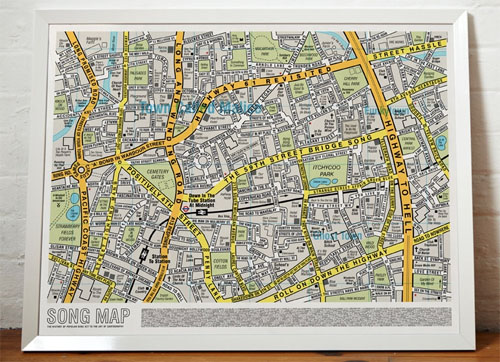
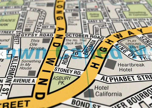
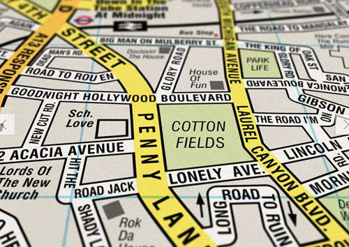
And my jaw dropped to the floor when I discovered a piece of art which was a map.  A map made up of 390 song titles.  Before I even decided to read any of the road and street names, I already had the thing purchased.  Talk about a total impulse buy.  An awesome impulse buy, I might add.

“Song Map” Original Open Edition via wearedorothy.com

The print is still rolled up in it’s tube.  It needs a great frame and then we’ll rock it somewhere in the new office.  I’d love to perhaps center this above my desk and have some of my favorite album art flanking each side of it.  Stay tuned. 🙂

Can You Imagine

3 Comments

Posted by Michael, April 12th, 2012

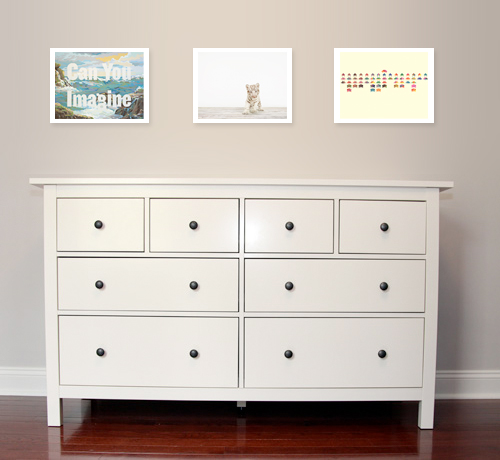
Rebecca has been asking me all week what should we do above the baby’s dresser.  We know we want to rock the giraffe sconces, but we’re not so sure what to do exactly in between them.

Do we go with the classic three frame horizontal look?  Maybe one large frame?  We’ve bounced ideas back and forth to one another ranging from absolutely nothing besides the sconces to crazy framed patterns.

Ok, crazy framed pattern really means what you trendy kids are calling “chevron” patterns.  It’s called a zig-zag.  Seriously.  What’s easier to understand, “I think we should do a chevron pattern” or “I think we should do a zig-zag pattern.”  Yup, zig-zag.  Mike 1, rest of you 0.

Anyways, tonight I present you a combination that popped in my head as I was browsing 20×200.

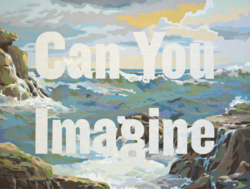
(“Can You Imagine” via 20×200)

On the left, we have ‘Can You Imagine’ which instantly grabbed my attention.  For one, the background scenery reminded me much of our time spent in Hawaii.  And then the typography brought out the aspect of an imagination.  This baby girl or boy is going to have one helluva imagination; especially since he or she will be talking about Macky to friends as if Macky was a non-fur-baby.

But really, I glazed at this picture for a solid five minutes watching the waves grow as they approached me and then watching as they hit against the rocks.  Then I realized nothing was moving in this piece of art work.

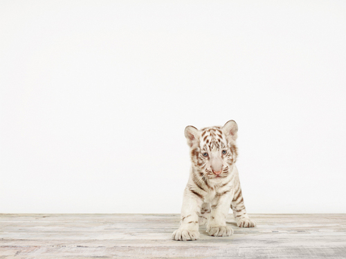
(“Baby White Tiger No 5 via 20×200)

And then I saw this baby tiger.  What better way to make The Baby a crazy cat person than to hang a picture of a big cat?  Gotta start them young, right?

I love the simplicity of this piece, a baby white tiger on a simple backdrop.  But more importantly, I couldn’t help but think that this tiger had a piece of all of our cats — small sized tiger with big paws reminds me of Darwin, the fluffy white chest reminding me of Sunny (our precious guy we lost to panleukopenia), the big eyes with a slight tilt of the head reminding me of Mowie and the overall goofiness that Macky shares with this tiger.

In 20 years, you’re going to hear about The Baby having a TLC special about owning too many cats.

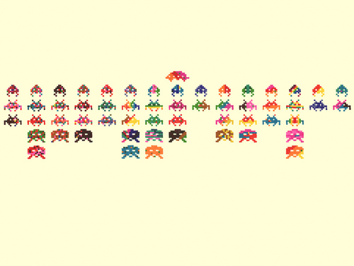
(“Closing Credits at the End of a Movie” via 20×200)

And to end, we have some artwork reflecting the geekiness in me.  I love that this really screams our youth while throwing several colors into the mix.  I really want to go play space invaders now.

I’m not sure if we’ll go with any of these, but I figured I’d throw them out there.  Maybe Rebecca will let me mount three LED televisions up there so the artwork can always rotate and be random.

Now that is a great idea.

Just Let It Go

3 Comments

Posted by Michael, September 13th, 2011

A few months ago, I wrote about my obsession with 20×200.  And that obsession continues tonight!

Ever since we’ve visited the Museum of Modern Art, I’ve been obsessed with typography (well, more so than usual).  It’s been catching my eye on just about everything — advertising, signs, letterhead, etc.  It’s amazing that so much thought is put into typography yet we all really take it for granted.

If you’re in New York City and can visit MoMA, check out the Typography exhibit; it’s well worth it.

Oh and just remember, if you plan on visiting and you’re a Bank of America customer, you get free tickets to museums during the first weekend of every month.

Back to typography — it’s no surprise that my latest two finds on 20×200 have been pieces around typography.

“Just Let it Go” by Kotama Bouabane.  Such a simple photograph with subtle text, yet you can almost make an entire story out of it; a couple wine glasses, a lemon, a napkin, an empty glass.  Maybe an argument took place at this table?  And then you’re hit with Just Let It Go.  Sometimes you just have to let it go.  Forget regret, or life is yours to miss.  No day but today.  Okay, now I’m just quoting Rent.

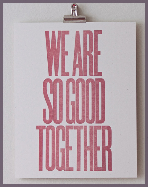
“We Are So Good Together” by Dylan Fareed.  I love the spacing between the characters; so incredibly thin yet enough to notice the distance.  I find it pretty funny that the artist created this after a breakup.  He created it to find humor and then the thing blew up with several people asking for copies.  I love that it’s more than ‘Better Together’ à la Jack Johnson.

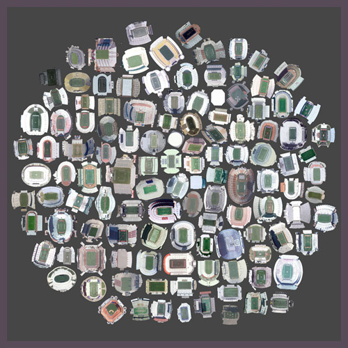
“125 Stadiums” by Jenny Odell.  Get this, these are satellite views of various stadiums in the United States.  This would be an awesome piece for my man-cave one day.

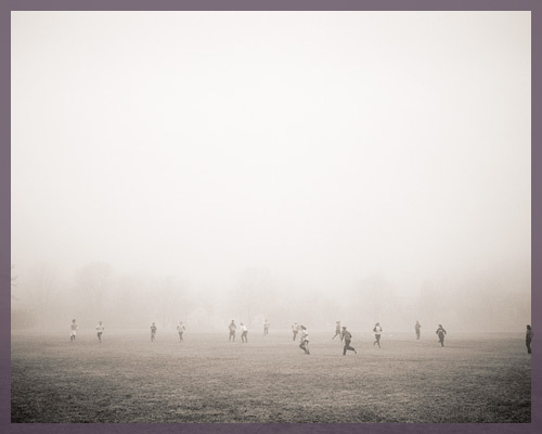
“The Suspension of Physics Necessary for All Athletic Endeavors” by Colin Blakely.  I was really taken aback by this piece.  I love the subtle lomo effect captured here and the top-half which looks to be nothing more than a haze.  Yet, you can depict the individuals on the bottom of the picture playing some kind of sport or activity.  Definitely neat.

Remember folks, 20×200 makes it incredibly cheap to own some unique art.  And no, I wasn’t paid to write this post;  I genuinely enjoy what they’re doing.

Some Different Art

2 Comments

Posted by Michael, April 28th, 2011

It’s not every day that I look for art — especially when I have the patience of a 2 year old.  It’s not that I don’t appreciate it; I just don’t know how to apply it to our various spaces.  But there has been one site that I continually check for new works.  I have no idea how I stumbled upon it, but I’ve been absolutely hooked.

No, I’m not talking about Etsy.  I’m predictable, but not that predictable.

The site I’m loving (and no, I’m not being paid to write this post) introduces two new editions each week, one photo and one work on paper.  And GASP!  It’s incredibly affordable, too.  Each edition is reprinted 200 times for 20 bucks.  Granted it’s a small reprint, the idea is still incredibly inspiring.  And I’ll quote the founder to prove so:

(limited editions x low prices) + the internet = art for everyone

They do offer larger reprints, but at the same general idea.  For instance, they sell 20 16″x20″ reprints for $200 a pop, 500 reprints of 11″x14″ at $50.

The site? 20×200.

When I first ventured on the site, I immediately fell in love with, and then purchased, a great piece.  Mainly because I’m a huge Apple fanboy.  I can admit it.
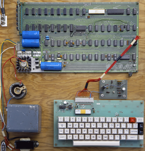
What you are looking at is a photograph of the Apple 1 by Mark Richards.  Even now while looking at the photograph, I’m doing that geeky laugh/giggle.  So needless to say, it didn’t take much for me to drop $50 for a 11″x14″ reprint.
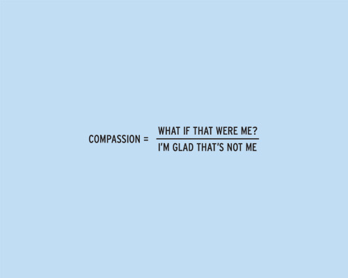
These works, by Craig Damrauer, have been continually calling my name as they go with a lyric that Rebecca and I are always saying, Hold your own / know your name/ and everything will be fine.  I’m debating if I should just pick them up, place them in a frame and hang them in the office.  Sadly, I’m not quite sure if they’ll fit with the green rug and accessories.
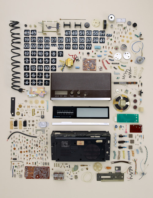
I’m doing that geeky giggle with this print, too.  It’s a photograph of an old and dissambled flip clock by Todd McLellan.  Lately I’ve been inspired by technology that we take for granted every day.  I mean, look at this thing; look at all the parts that made this time-telling device possible.  We go about our day, every day, just taking devices like this for granted.  We don’t think about why they work or how they work.  We just go about our day taking advantage of the service or information they provide.
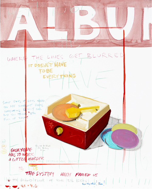
Album 1, by Paul Madonna, is another edition I have been eye-ing.  In the description, Paul writes,

“Though I’ve been drawing and writing for as long as I can remember, music is the medium that has influenced me the most. I love the thought of an album being a collection that encapsulates a period of ideas, work and life into a tidy package, allowing the artist to work through a creative goal then move on to the next.”

How true is that though?  How often does music inspire and influence us?  For me, far too often.   I honestly don’t know where I would be without music.  There are certain albums that have guided me through tough times, wonderful events, and so forth.  And ten bucks says this is something that we can all relate with.
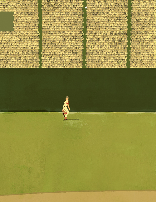
I think this might just make its way into the office; though I don’t think Rebecca knows this just yet (oh, hey wife!).  The print is In the Ballpark by Tatsuro Kiuchi.  If you’ve ever seen the movie City Slickers, there is a great quote in there.

“Whenever my father and I couldn’t talk about anything else, we could always talk about baseball.”

My father and I have a great relationship.  Sure, growing up we had our differences — but what father-son relationship doesn’t?  Communication wasn’t our strongest trait when I was young; we were both just too much alike to see eye-to-eye.  And when I was 12 or 13 years old and when my father and I couldn’t talk about anything else, we could always talk about baseball computers.  It was our ice breaker.  It was the one thing that was “ours” and nobody else’s. And while today I can talk to my dad about anything and everything, including how I didn’t lose his precious jig-saw, baseball is becoming “our” thing; our time together.
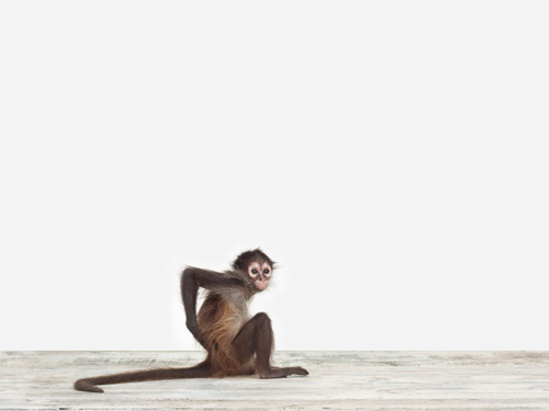
I was going to end this post with the baseball print above, but then I saw this print.  And then I saw Macky eat a stink bug.  His second stink bug, that I know about, in 48 hours.  Macky is just too funny and when I saw this print, I couldn’t help but laugh.

Though Macky is currently at the top of the stairs crying and screaming at the top of his tiny lungs.  I guess he wants to go to bed and that was my queue to wrap this up.  And suddenly, he’s not very funny anymore….

Copyright 2010 - 2011. The Lil House That Could. All rights reserved.