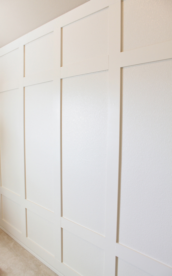
How to Create a Paneled Accent Wall
Posted by Rebecca, February 8th, 2012
Yesterday I shared how we decided on and planned out the accent wall for the nursery. Once we had made all of our major decisions, we headed to Lowe’s to buy some wood. We decided to use solid wood for this project, despite the fact that nearly every tutorial I saw used MDF. We figured since we were being neurotic about having a solid wood crib, it would be a little counterproductive for us to line the entire wall behind the crib with MDF. While MDF would have been the cheaper option, we decided to buy some 1×4″ whitewood boards. We liked the chunkier look of a 4 inch wide board and it was most cost efficient to go with the 1 inch depth. We picked up 10 foot pieces and it ran us about $75 for more than enough wood. Which we paid for with a gift card from Christmas 🙂 But if you wanted to save money you could certainly use MDF boards, or have a sheet of MDF cut for half the price. I’ve also read of some people using lattice or furring strips, which we were open to using but the sizes didn’t work out for us.
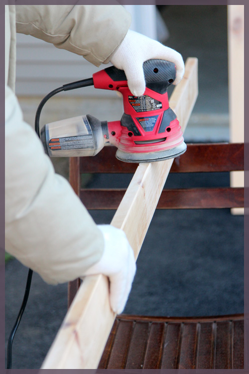
Once we got the boards home, we sanded the fronts and sides with our new sander, which we also got for Christmas.
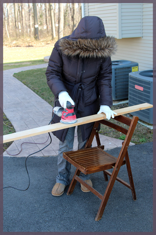
Since we bought decent boards and were picky about the ones we chose, we didn’t have to do too much sanding and used 220 grit paper. We mostly just got rid of the rough edges and made sure the fronts were nice and smooth. I even got to play with the sander, since it was extremely user friendly.
I have no face! The only way you can tell it’s me is by the exceptionally tight non-maternity jacket I am still squeezing into. Every week I think it will be the last for that coat and a few weeks ago my belly actually busted the zipper. But I managed to get the zipper back on track and continue to squeeze myself into it. Anyway, despite the fact that I had a dust mask and goggles nearby, the new sander sucks up the dust as you sand so there really was none. Pretty fancy 🙂
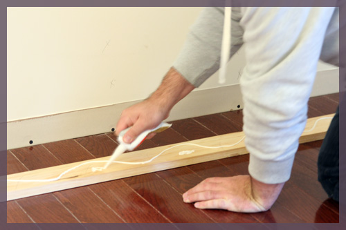
When we researched how to get the boards onto the wall, we saw that most people glued and nailed their boards. Knowing that our solid wood, 1 inch thick boards were larger and heavier than most other tutorials, I thought gluing and nailing was our best bet. But then we were back in the VOC predicament… here I am, the lady who emailed Baby Appleseed to ensure that the crib we wanted did not use glue that contained formaldehyde and I’m about to glue a bunch of boards to my nursery wall. After a little visit to the Liquid Nails website, I saw that their “Projects” product worked on wood and molding and came in a low-VOC, green certified, no toxic fumes and safe for use around children, version. We picked some up and put some on each board.
Yeah we have no light in the baby’s room so we’re working with a single Ikea lamp for the time being. Please forgive the poor quality pictures until we buy a light fixture.
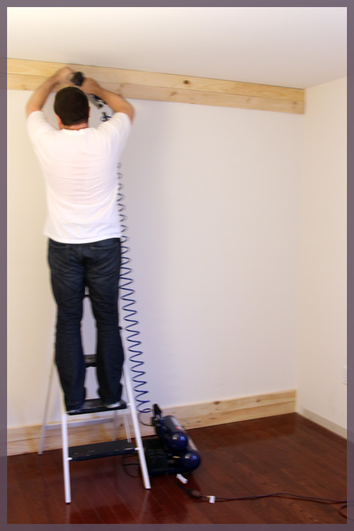
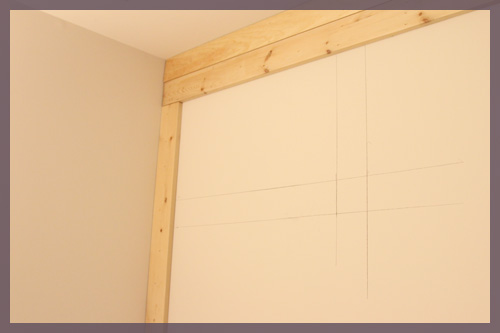
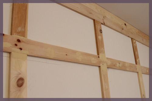
We started with the bottom boards, then added the top boards. We made sure that these 4 boards were nailed into studs and well, we nailed the hell out of them. We wanted to make sure that the weight of the 10 foot board was not going anywhere.
Then we added the two boards to either side.
At this point, as you can see in the picture above, we decided to trace some boards to make sure our interior boards would work. We ran into 2 very minor issues… #1- there is an outlet on the wall and #2- 1×4″ boards are actually smaller than 4 inches wide.
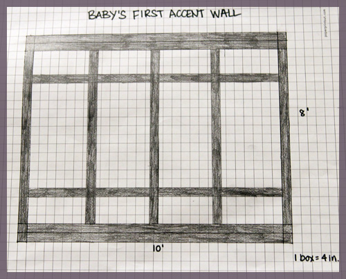
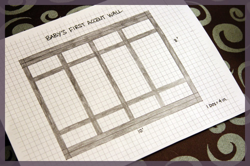
In my sketch, the two interior horizontal boards are 12 inches from the frame. The vertical boards are 24 inches apart.
There is an outlet in the bottom box on the left hand side, about 12 inches from the bottom board. We easily fixed this by making each of the horizontal boards 13″ from the frame rather than 12″. Like I said, easy fix.
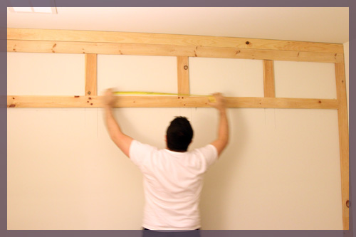
For the vertical boards, since we couldn’t nail them into studs, we decided to make those our “choppy” pieces that we cut in 3 pieces to keep them lighter. We kept the horizontal boards (which could be nailed into multiple studs) whole. Since we did this, it was easy to cut the 3 top small pieces and adjust them to compensate for the slightly thinner boards. Here’s Mike measuring before they were actually attached to the wall…
I think each gap ended up being around 25 1/4″. Then we just lined up the remaining vertical boards to make sure they matched the top ones, leveled (plumbed?) them, and we were done!
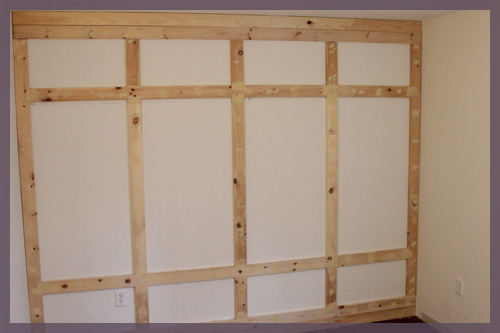
Mike filled all of the seams and nail holes with wood filler and it’s just waiting for a sanding.
Then we need to add crown molding to the top, base boards to the bottom, caulk, prime the boards, paint… and we’re done!
Really this wall was incredibly easy and took us such little time. We spent maybe 2-3 hours on it Sunday before the Superbowl, which allowed us to sand and install the boards for the outside frame. Then last night we spent another 2-3 hours sanding and installing the interior boards and that was it! Oh and included in that is the time I spent sitting on a chair eating Thin Mints….


