Posts Tagged ‘DIY’

Our DIY Christmas Cards

7 Comments

Posted by Rebecca, January 8th, 2013

Well, nothing like a Christmas post in January! I planned to post this before Christmas, but we wanted to wait until our family/friends received their actual cards and by then we were caught up in actual getting ready for Christmas. So even though you saw the finished product on Christmas day and no one is thinking Christmas right now, it’s pretty applicable to any card/occasion.

I started with an exact idea in my head of how I wanted the finished product to look. I kept telling Mike that “I had a vision!!!” By the end of this he probably wanted to be like, F your vision.

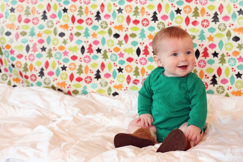
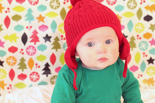
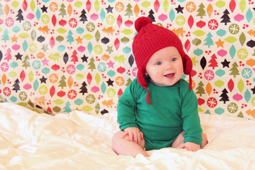
I knew I wanted Easton to wear a red hat and a green onesie. I had to order a solid green onesie from a tshirt supplier because I couldn’t find one anywhere. The red hat was an easy find at Baby Gap.

The next thing I needed was patterned wrapping paper that contained… red and green to match the baby. I knew Target always has a healthy supply of paper, so I headed there with Easton strapped to my chest. The options were endless and adorable. My only criteria were the red and green, plus nothing shiny or sparkly that would photograph poorly. I sent Mike these contenders.
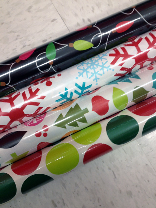
I loved the Christmas lights one but I knew the black background would be too dark. My favorite was the one with the mix of tree shapes and ornaments. Mike agreed without me telling him which one I liked. I liked the fun, whimsy of it for a first Christmas card.

The weekend after Thanksgiving we decided to hold our photoshoot. We shot the pictures in our bedroom, which is when we removed all of our paper blinds for once and for all! We set up everything while Easton napped so that we could get him right at his best when he woke up.

I taped a piece of wrapping paper up. I also added some foam mats underneath just incase Easton decided to faceplant on our hardwood floors. He didn’t, but saftey first!
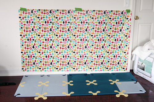
On top I added our white king sized comforter (which you can see hanging out off to the side in the above picture. I wanted the floor in the photo to look like a fluffy winter scene, so the comforter was perfect.

Once that was done, we had this. This picture actually shows a white, furry baby blanket over the comforter. We decided to scratch it because it was too small and Easton would have been yanking at it the whole time since that’s his usual blanky.

We tested everything out just like that before Easton woke up. We even threw in a model.
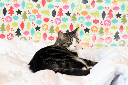
Once the human model woke up, we added him to the scene.
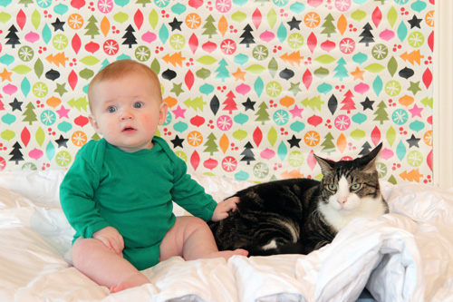
Which made for quite possibly my favorite picture of all time. If only they weren’t so serious and didn’t resemble the couple from that American Gothic painting.

Mike and I each had a camera and we snapped away. Easton was in a really good mood since we had waited until right after he woke up (with a feeding thrown in, which only made him happier). In the end, we took, no lie, over 1,000 photos in about an hour.

Here are some of our favorite shots that didn’t make the Christmas card cut, but you may have seen on our Christmas mantel

Once we chose a picture (which took forever becuase there were so many great ones), Mike Photoshopped the text on. Part of my “vision” was to have several fonts spell out “Merry Little Christmas”. Mike fiddled a little, sent me some files for suggestions/approval and we settled on the final product you saw.

Next we had to decide how to print these things. I was sad to find out that services like Shutterfly (we were just going to get 5×7 prints) were about $1 each. We knew we could get a premade card where we just uploaded an image for the same price, so we were a bit discouraged. We needed about 75 of these things and really didn’t want to spend $100 on Christmas cards. The cheapest option I found was to do cardstock on Vistaprint.com and spend about 60 cents/card.

Then I received a Groupon for Vista Print, as if someone knew we needed it. It was for $75 worth of merchandise for $17! There were no restrictions for what we wanted to do, so we ordered them. Turns out, the custom holiday cards we ordered also came with envelopes. Yeeeees!

So that is how we got 100 Christmas cards for $17. Or 17 cents each. Vision achieved.
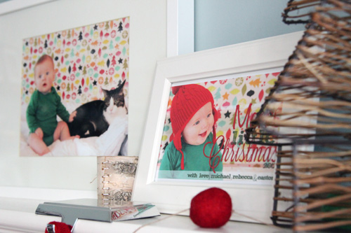
Now I just need to come up with a vision for first birthday invites 🙂

Alphabet Art for the Nursery

33 Comments

Posted by Rebecca, June 22nd, 2012

Before Easton was born, I posted about my plans to make some sort of an alphabet print for his room. My original inspiration image hailed from Pinterest…

(from Free Home Decorating Ideas via Pinterest)

My previous post covers how I went from planning this out using paint and canvas, to printing on canvas, to finally just making it a print using Photoshop.

I’ve said this before, but I am no Photoshop expert. In fact, I have no clue of what I’m doing 99% of the time. When I posted about deciding to make the art using Photoshop, I figured Mike would make it because I was lacking the skils. Well, throw in a late baby, a husband who is busy with his own work and me spending hours in bed and guess what? I did it all by myself 🙂

I camped out in bed the last days before Easton came and one of the things I did was whip up a little art on my laptop. I started as just playing around to give Mike an idea of what I wanted, so that he could then do it better. As I played around, I realized I could do it on my own if I just kept tweaking it. It ended up being far easier than I thought!

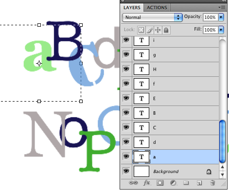
I started with a rough draft… all I did was type some letters in Photoshop and change the font, color, size and location of each individual letter until I liked the way it looked. I was surprised at how easy this part was since each letter was it’s own layer and I could go back and tweak whichever letter I didn’t like.

My first attempt looked like this…

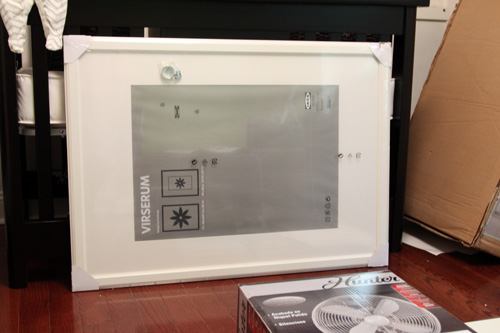
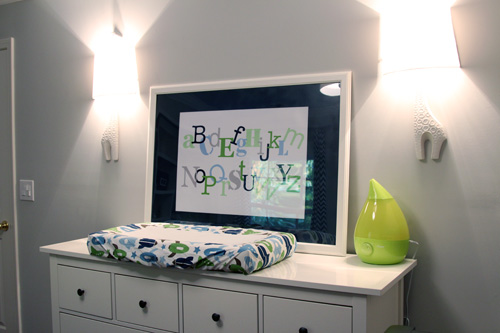
I liked it for the most part, but there was a lot of dead space. I had to figure out how the letters would look in the frame and make sure there wasn’t too much white space at the top and the bottom of the letters. We had picked up a large Virserum frame from Ikea before even starting this project, so that we were sure that we could size the print properly to fit the inexpensive frame. You may remember seeing the frame hanging around in some pictures…

The frame is 30 ¾” x 41 ½” and the mat opening is about 27 ½” x 19 ½”. I mentioned in my previous post that I saw on Shutterfly that I could order a print as large as 30″ x 20″, which was perfect. I would just have to make sure that my text was centered around the  27 ½” x 19 ½” size of the opening and that I made the image large enough pixel wise to print clearly.

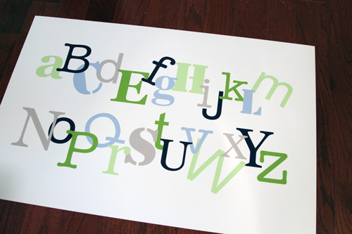
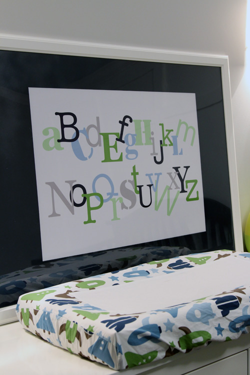
So I set my Photoshop canvas to the size of the print (30″ x 20″) and began to tweak my first draft. A little bit of making fonts bigger, a little bit of overlapping letters and just playing around, then my final product looked like this…

I ordered it and it cost me a whopping $15 to print through Shutterfly. It was supposed to take over a week to come, but it ended up arriving in a few days and coming the day before Easton was born. If you remember from my birth story, I was already in labor at this point so Mike ran it upstairs to show me how great it printed. He put it in the frame just so I could see how it looked, but I didn’t snap a picture of it.

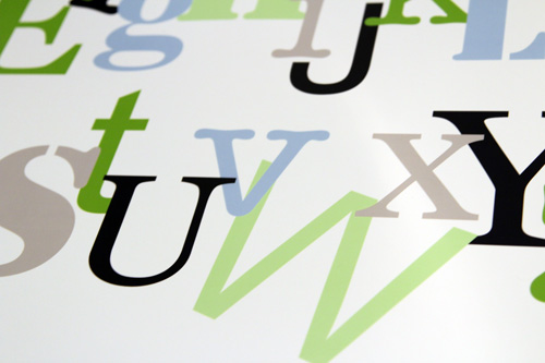
The large canvas size I chose worked because the letters were not at all blurry.

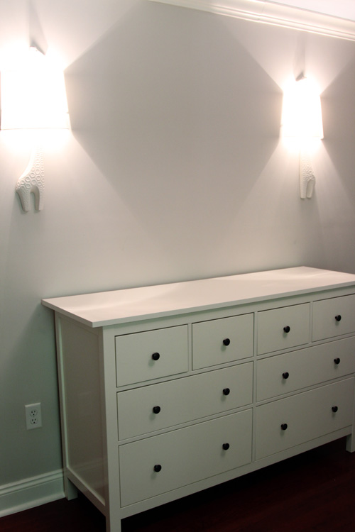
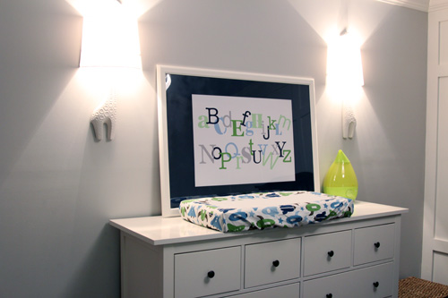
We planned to put it on the wall in between the giraffe sconces.

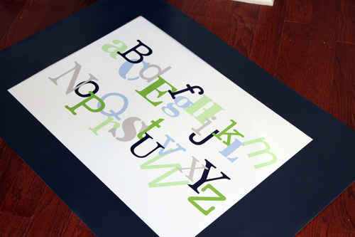
Since the sconces are white, the dresser is white, the frame is white and the mat is white, I thought it was too much white. It would look nice and clean, but I was just looking for a little more fun and contrast on this wall. So I decided to spray paint the mat navy blue.

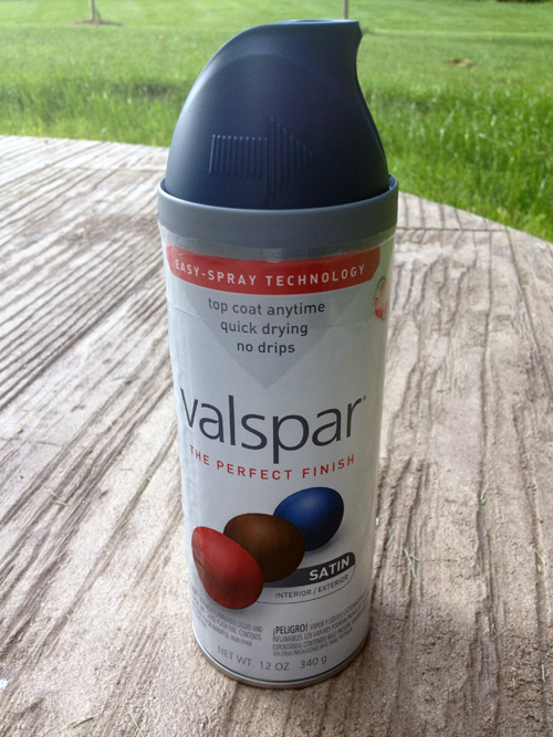
I picked up this can of paint while I was in labor. I figured walking around Lowe’s would help, though I was in such pain that I could hardly walk and I had to stop and sit on a pile of wood. Whoops.

Finally this week, I decided to take the hour I had in between feeding, burping and cuddling to run outside and spray the mat. Hello backyard, I haven’t seen you in a while.

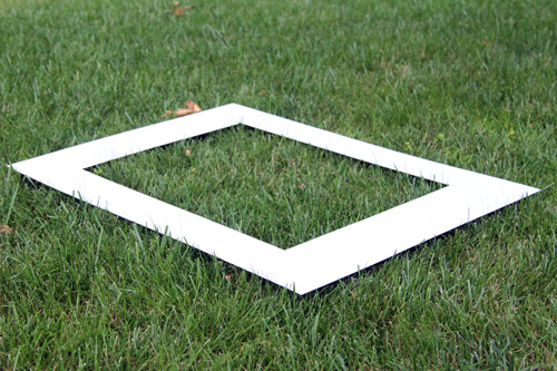
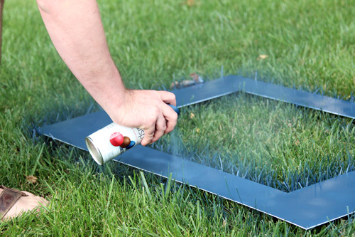
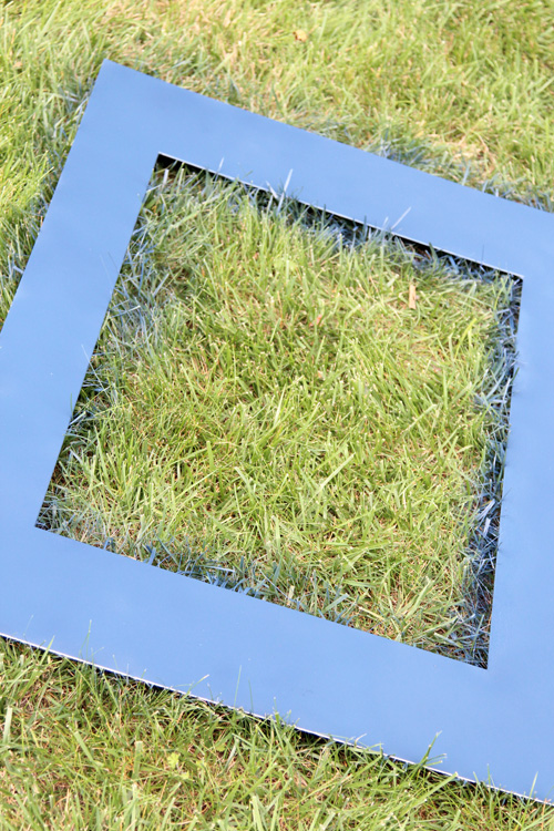
I just laid the mat on the grass because Mike was due to cut it anyway. The blue will be gone with one pass of the John Deere 🙂

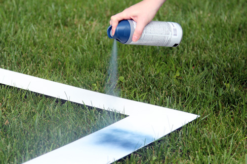
It took several coats to make sure there were no white spots. My hand started cramping since the Valspar trigger was really hard to push down, so Mike took over.

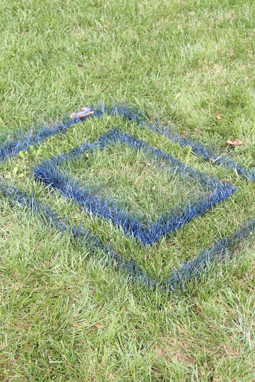
Once we were done, the grass looked like this (which was actually really cool looking)…

But the mat looked like this!

Fast forward a few days after it completely dried and I had another baby nap to put the mat in the actual frame. Sidenote: Mike’s been spending most of his spare time working on the built-ins in the new office that we abandoned to work on the nursery. So I’m usually on baby duty and can’t work on projects, but I can’t complain because the built-ins are looking awesome 🙂

First I wanted to make sure the blues looked good together. The lid of the spray paint can looked more bluish than navy, but it was the most navy one I could find. Thankfully, it dried much darker!

I put it in the frame and I was surprised that he “glass” in the frame is plastic. No wonder why Ikea can sell such a large frame, with a mat for just $29.99!

We couldn’t find the hardware that came with the frame, so I just leaned it up against the wall to see how it would look.

And I love it. I’m shocked at how well the colors match the color scheme of the room. I really just tried to incorporate the blues of the bedding/curtains/ceiling, the greens of the bedding/closet/bookcase and the gray of the walls. This artwork was meant to be the glue that brought everything together, and I think it does.

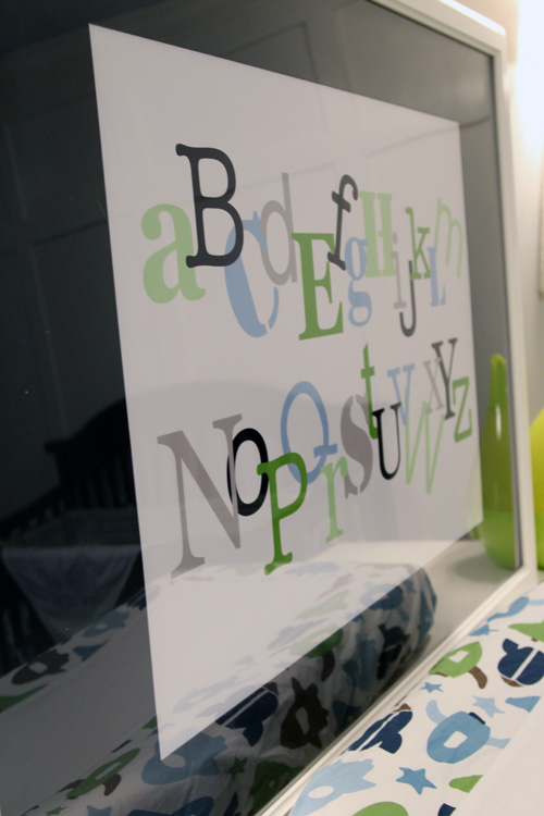
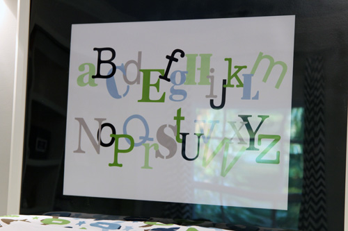
The plastic “glass” of the frame made for some awful glare, so it was hard to capture pictures. I may actually just remove it when we mount the frame, at least to take better pictures for you guys 🙂
Though the glare does allow you to see the other elements in the room with the art, like how you can see the chevron curtains hanging out in this picture…

One more picture from the other side of the room!

Not to shabby for $15 for a DIY print + $29.99 for a large frame and mat. Oh and a couple of bucks for spray paint!

Since this post took me 3 sessions to write, Mike is actually at Lowe’s at the moment picking up some stuff for the office and some hardware to hang this bad boy. Hopefully this weekend we can both have time, at the same time, to hang it since it’s a two person job. Then we’re one step closer to actually being ready to give you a full nursery reveal and tour. I’m so excited 🙂
Update! Since I just completed this and I didn’t have time to tackle a new project, I decided to use this as project as my summer Pinterest Challenge entry, hosted by Young House Love, Bower Power, Centsational Girl and Ten June, all of which are some of my favorite blogs. 3 out of 4 of my Pinterest Challenge projects have been some form of wall art, guess you can tell what I like to do for fun…

Oh and we did get around to hanging this print on the wall, which I posted about here.

Tada! 🙂
No Sew Crib Skirt

20 Comments

Posted by Rebecca, June 13th, 2012

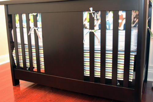
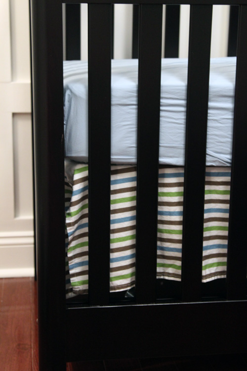
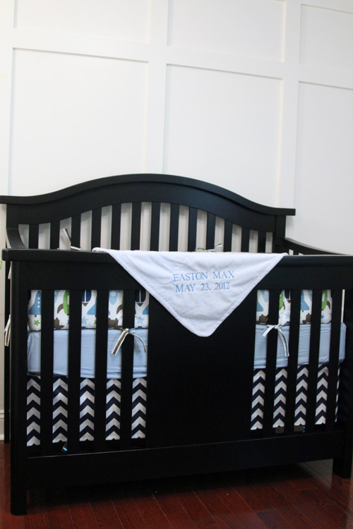
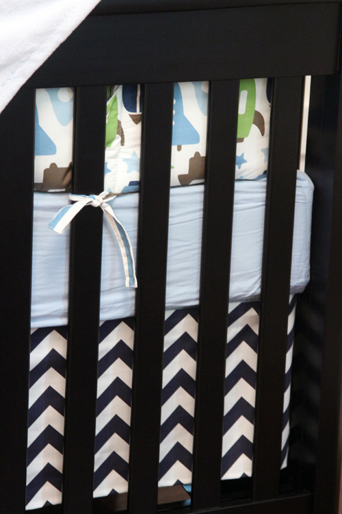
Earlier this week, I shared how I made the no sew chevron curtains in Easton’s nursery using Premier Prints Zig Zag Blue Twill fabric. I had a bunch of fabric leftover and I wasn’t too happy with the crib skirt that came with our DwellStudio for Target bedding…

Not only was I not really feeling the stripes, but the skirt looked sloppy and was impossible to keep straight.

I remembered seeing a tutorial for a no sew crib skirt over at Young House Love, so I decided to make one. Easton was overdue and it was one of those completely random, on a whim projects. Thankfully it only took a couple of hours one afternoon.

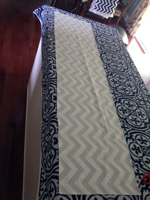
I pretty much made up my own rules with this one. I decided to make 3 separate panels for the skirt– one on each side and one across the front. I figured since you’ll never see the back, there was no point in making that panel. To keep things simple, I used the measurements from the crib skirt I already had and determined that I needed two 25″ x 10″ panels and one 51″ x 10″ panel. I added about two inches to those measurements and cut some panels.

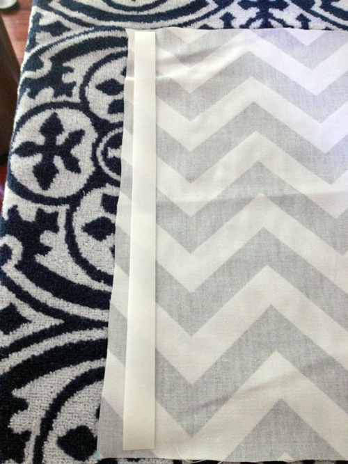
Then, like the curtains, I just ironed on some no sew hem tape for each edge.

Once again, you can see my wonderful cutting skills. I cannot cut straight for the life of me, but as long as the hem fold is straight, it’s okay.

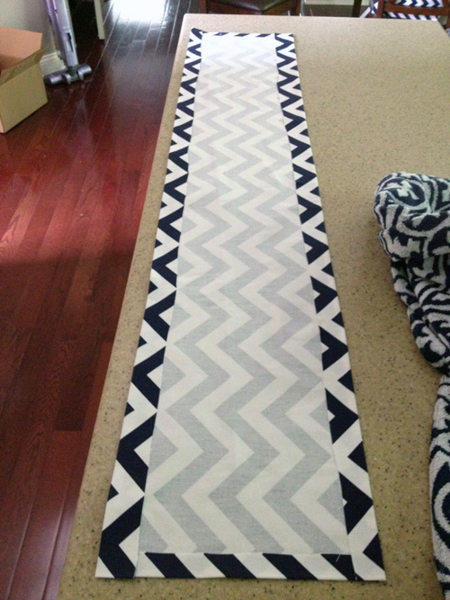
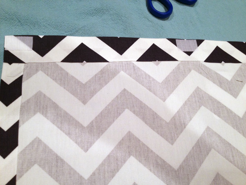
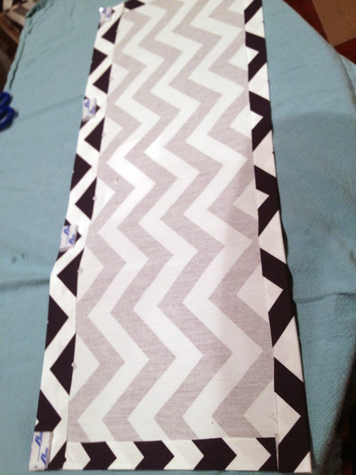
Once I hemmed all 4 sides, I was left with this.

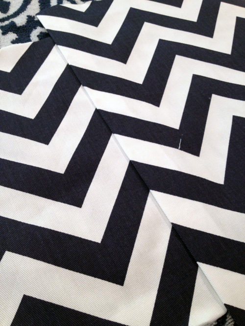
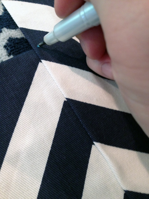
When I started the side panels, I made sure that my zig zags were going to line up.

I just marked the top and the bottom with a disappearing marker and pinned them before ironing and hemming.

I realized after the fact that this step was unnecessary. Because the crib has fairly thick, solid legs on each corner, you don’t see where the fabric meets. Plus I kept my 3 panels completely separate, so they never touch and are never seen.

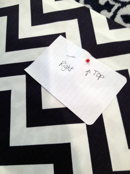
I now had 3 separate hemmed panels. I marked each one so that all of my hard work was not in vain (though it sort of was, see above line).

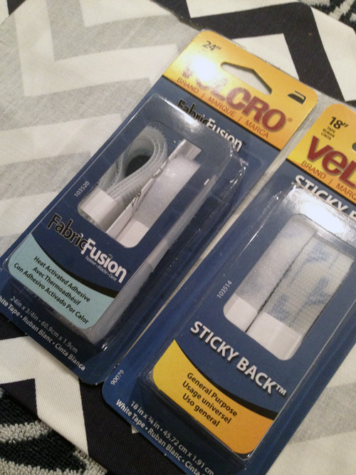
Then I had to figure out how to get these on the crib. After browsing the velcro aisle at Michael’s, I came home with these two packs of velcro.

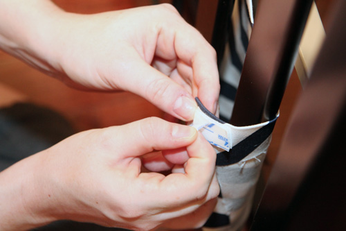
I got one pack of Fabric Fusion velcro to adhere to the panels I just made. Then I got one pack of Sticky Back velcro to adhere to the actual bed frame. I cut small pieces of the Fabric Fusion velcro loop side and ironed it across the top of each panel, placing a piece every 8 inches or so.

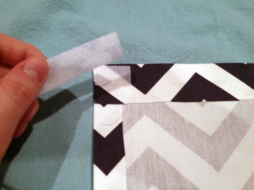
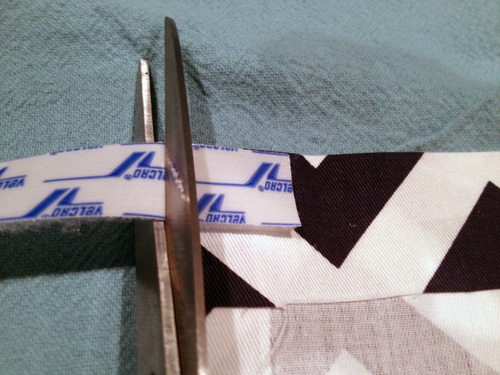
Then I cut the opposide side of velcro, the fuzzy side, from the Sticky Back velcro.

To make sure it was the same size as the pieces I ironed on, I stuck the pieces together first then trimmed them.

Then I had panels with velcro at the top that just needed to be adhered to the crib.

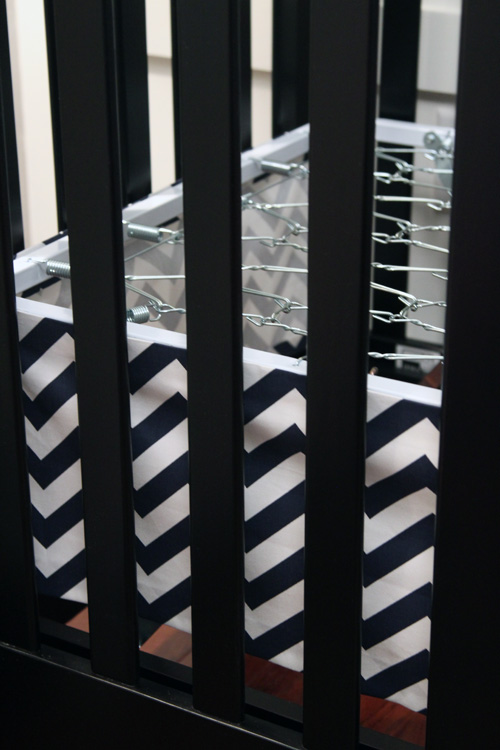
I peeled the paper off of the Sticky Back side and stuck it onto the metal frame of the crib.

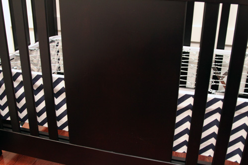
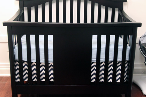
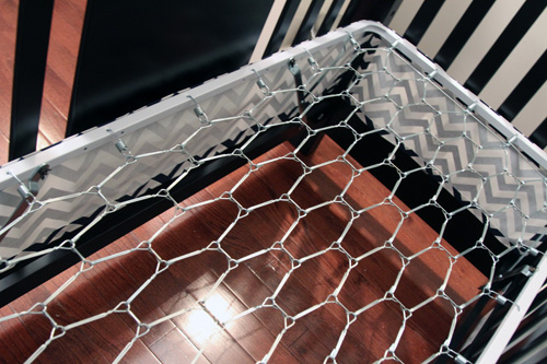
After all 3 sides were adhered, the crib looked like this…

The great thing about velcroed panels is that they are easy to remove to adjust or wash. There’s no need to remove an entire mattress just to fight with the skirt.

Once the crib was all made, I loved this new skirt so much more than the cookie cutter one that came with the bedding.

It adds such a cleaner, more modern look to the room that incorporates the curtain fabric from the other side of the room. The skirt also looks great without the bumper so it will only grow with Easton. That was our goal in creating this nursery from the beginning, giving Easton a space that he can grow into 🙂

Update! February 13th, 2013

I’m entering this project I did while super pregnant and too tired to adjust my camera settings into East Coast Creative’s Creating with the stars competition. Worth a shot, right? 🙂

Copyright 2010 - 2011. The Lil House That Could. All rights reserved.