Goal Setting 2012- Blog Edition
Posted by Rebecca, January 23rd, 2012
Last week, I listed some goals we’d like to achieve as far as house projects go. After I wrote that post, I realized how many goals I have for this lil bloggy that deserve some of my time. So hey, why not another list?!
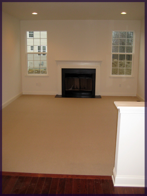
I started assembling a bunch of pictures from when the house was being built and where it is now, but it quickly got overwhelming with trying to add to it, while going to school and writing posts. Now that I have a little more time, I need to finish it.
2. Make everything easier to navigate
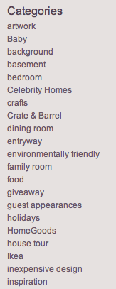
One of my pet peeves is that my archives and categories lists are incredibly long over there. I’m not sure how to tackle making everything more user friendly (Mike, are you reading? Help?), but I’m thinking a drop down menu and being a little more conscious of how Mike and I categorize posts are a good start. Like realizing that I started an “outdoor space” category and Mike started an “outdoors” category. Whoops…
3. Add a list of our personal favorite projects
The current list we have over there on the right is a list of ‘Most Popular Posts’ that WordPress provides. It counts popularity as the posts that are most commented on, but we’d like to have a list of posts we like the most, complete with pretty thumbnails 🙂
4. Add a Macky & Co button
Since we started our other, more personal blog we haven’t added any way for you guys to find it easily. We want to find a way to integrate it so that you know it’s ours and can check for updates without us having to tell you we posted or be obnoxious.
5. Prettier design!
The most important part and the part I’ve wanted to do for a good 6 months. I have no clue what I want to do with this part and this is pretty much why I haven’t accomplished numbers 1-4. I can come up with design ideas for pretty much any other discipline, but I cannot translate into website design. Mike always asks me to find some inspiration pictures or write down what I want since he designed our current layout, but I can’t visualize these things. I definitely want the current header gone and a cleaner look, but as far as colors, fonts, patterns and navigation… I am clueless.
Now that Mike ditched the full-time gig, I’m hoping he has a little more time to set aside to fix some of these things ::wink wink:: I patiently waited for him to have some more time and it would be nice to get this place in order before the baby comes. You know, like nesting 🙂


