Posts Tagged ‘lighting’

Giraffe Sconces

10 Comments

Posted by Rebecca, May 10th, 2012

Remember way back when we started planning this nursery, when my very first nursery purchase was a pair of Jonathan Adler giraffe sconces? Well, yesterday they finally went on the wall!

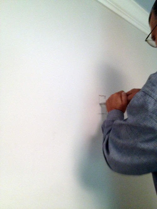
I can tell you nothing about the install process– Mike and his dad did everything, but Mike did snap some in-progress photos for you with his iPhone. I will try my best to narrate.

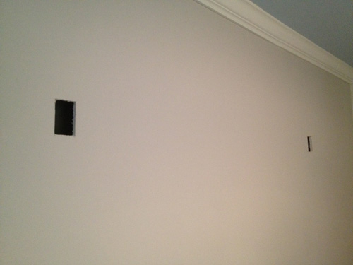
Step 1: Holes went in wall.

Step 2: Wires somehow came out of wall (I know it involved crawling around the attic)

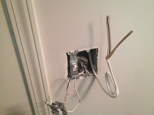
Step 3: New light switch went in, with more wires.

Step 4: I took a nap (not documented through photos)

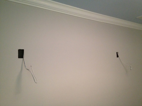
Step 5: More wires and blue boxes. Please note that the electricity is off in this picture, safety first kids!

Then Mike did the usual taping and capping of wires while I neglected to take pictures of the fixtures actually going up. The sconces came in 4 pieces: the actual light fixture (which was just a round circle sconce with a light bulb pointing upwards), a shade, a giraffe head and a giraffe body (which were just mounted to the wall without any electrical business). You can see here how the actual giraffe is separate from the light…

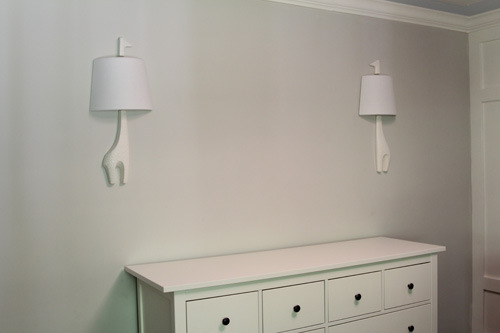
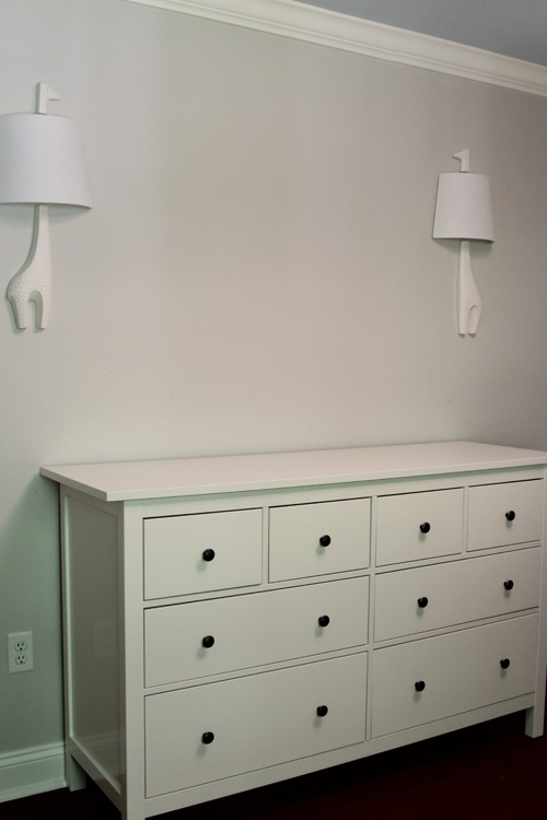
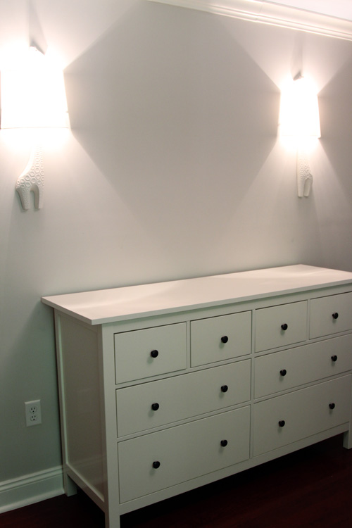
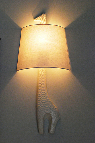
Then, we had sconces!!!

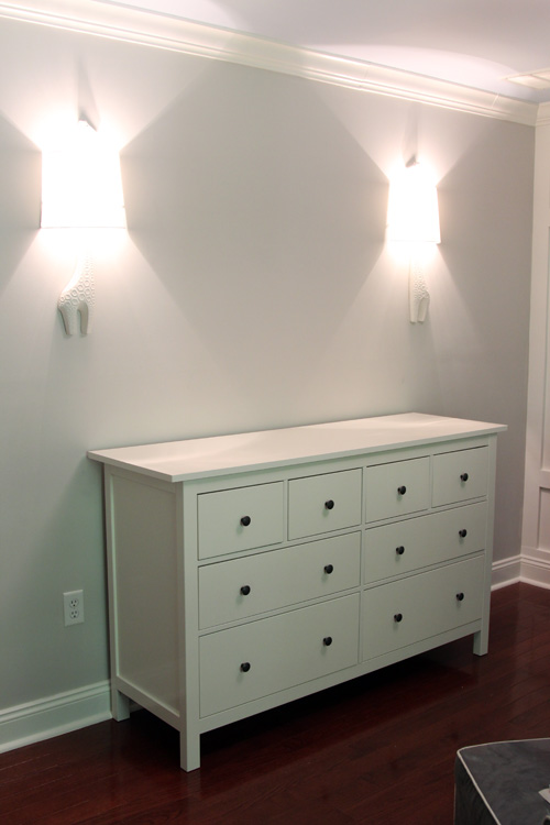
We based the height and width of the sconces off of the giant frame we bought to put in between them. The frame will come slightly above and slightly below the length of the giraffes. Each giraffe extends slightly beyond the width of the dresser.

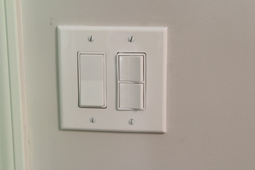
We also have a new fancy light switch in the room.

The big switch is for the ceiling fixture, then one little switch is for the sconces and one is for an outlet in the room.

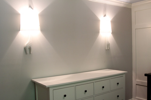
Sconces on!

Trying to get a head on shot in this room is nearly impossible, especially with all of the closet pieces still hanging around. Hopefully they will be gone tomorrow since we finally got our replacement piece!

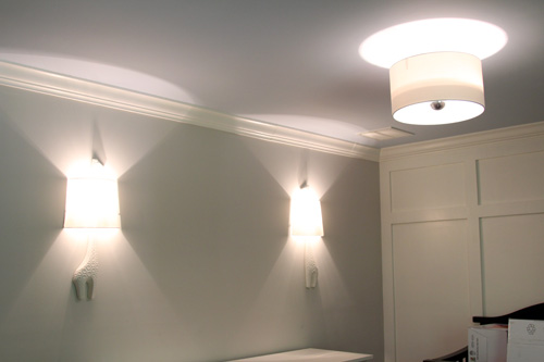
Thankfully, the sconce shades match almost perfectly with the ceiling fixture. The whole vibe in the room is totally different now.

We love them.

We’re finally wrapping things up in the nursery, which is good considering I’m due on Tuesday. The bookcase we ordered arrived and has been assembled. We have a shade on the window that is just waiting for some chevron curtains. The final closet piece arrived and will hopefully be assembled tomorrow. We have a frame for our ABC art print that we just need to design. The only thing I’m unsure of at this point is if I want to hang anything over the crib. After I decide that, this room will be Β d-o-n-e πŸ™‚

ps- the winner of the Cutting Edge Stencil giveaway has been announced! Check the post to see if it was you!

Random Ramblings

3 Comments

Posted by Rebecca, November 30th, 2011

I managed to write 35+ pages of papers since Thanksgiving, so needless to say I’ve been a little busy. However, we do have a few minor things to report on, so why I figured why not throw them all in one post? So here you have it, our random ramblings…

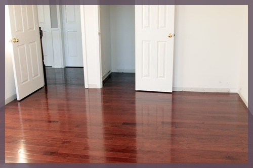
1. It gets dark before we get home from work now and the 3 spare bedrooms do not have lights in them. Taking pictures of the new floors all cleaned up has been difficult. Even more difficult when I finally got a spare minute to take pictures and the camera died on me… and the battery charger was missing… as was the extra camera. Here are the lone pictures of the new floors. This happens to be the new office.

2. The future office will soon be getting more action because this weekend we decided to paint it! We picked out paint then proceeded to run a bunch more errands and by the time we got home, we only had an hour before darkness. The color we chose is Olympic’s Denim. Unfortunately I could only find this tiny thumbnail of the color on Olympic’s site…
Hopefully this weekend when we’re a little less chaotic we’ll get some paint on the walls before the sun goes down.Β We really need to get a light in that room.

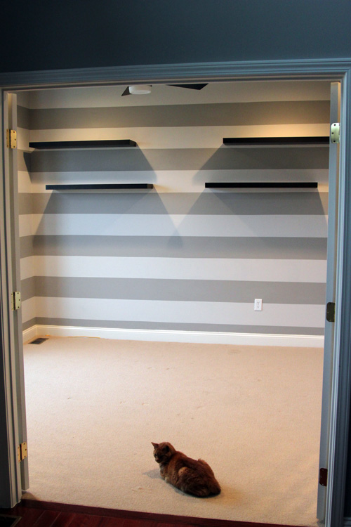
3. Speaking of lights! (you like that segue?) We went to Ikea last weekend to pick up a light I wanted for the playroom (the old office). You know, this room with the stripes…

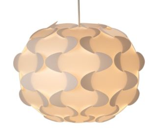
No we didn’t clear the room out yet, but I chose this picture because you can see that we currently have a ceiling fan in there. We need the fan for whatever room the office is in because all of the hardware we have produces some major heat. We decided to take the ceiling fan from the stripey room and put it upstairs in the new office. To replace the ceiling fan, I wanted something fun, but that would still look classy as it will be seen from the entryway. We picked up this guy…

Of course, he still has to be put together and hung.

4. Speaking of lights! Does that work twice? Anyway our Jonathan Adler giraffe sconces arrived early!

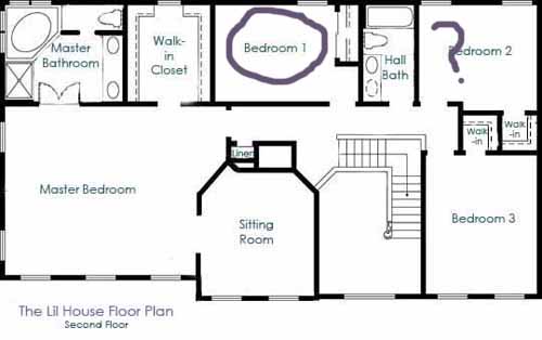
I think I have an idea of what I want to do with the nursery and I’m planning to write something up in the next few days. Right now I’m leaning towards giving the baby the room with 1 window, as it’s known around here. This one…

Bedroom 2 is still a consideration. At first I always imagined using bedroom 2 since it has 2 windows and a walk-in closet. I imagined the pretty window treatments I could have, but I think that bedroom 1 has more wall space for a better furniture arrangement. Decisions decisions.

5. While we’re on the topic of window treatments, the 6 white roman shades that we ordered for our master bedroom came last week. We’ll throw those on the weekend to-do list too since they won’t take very long to install.

I think that pretty much catches you up with what’s been going on around here. Thanks for hanging around through the chaos. I’m looking forward to December 21st when I can finally put my feet up. But then we’re hosting Christmas events on the 22nd and 24th… so maybe I’ll put my feet up on the 26th πŸ™‚

Our First Nursery Purchase

6 Comments

Posted by Rebecca, November 10th, 2011

Mike and I haven’t decided which room to give the baby. We don’t know too much about what we want to do with the room yet (though I feel like I’m getting closer, maybe I’ll share some inspiration next week). But today, I spotted something and I had to have it. Okay I spotted two things and I had to have them.

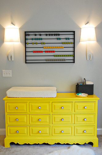
While reading one of my usual daily reads, Centsational Girl, I stumbled upon this inspiration image.

(Honey & Fitz via Centsational Girl)

This image was included in the post at Centsational Girl because of the painted dresser. I most definitely want a bold painted dresser to use as a changing table, but that’s not what caught my eye. The abacus (from CB2) is also insanely awesome, but that’s not what I had to have right now. Okay have you figured it out yet? Yes, the giraffe sconces!

(via Honey & Fitz)

I love how clean and sophisticated these sconces are, but that they still hold the whimsy of being a favorite childhood animal. Plus I love the added light around the changing area and that they were put on a dimmer in this image. Even smarter for late night changing πŸ™‚

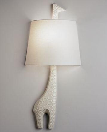
Dina, the genius behind Honey & Fitz that discovered these sconces, was kind enough to include a complete source list at the bottom of her post for all of the materials used in her nursery. From there I learned that these were Jonathan Adler sconces and were about $150 each. I then went to my buddy Google, and searched for “Jonathan Adler giraffe sconces”, hoping to find them on eBay or something for cheap. I even briefly considered somehow making my own, then I realized that anything involving electrical is probably over my head. THEN! I saw that Macy’s sold these online…

(via Macy’s)

You’re probably wondering why I cared about this. Well, Mike and I are gift card hoarders. I mentioned the other day that we’re hoping to carpet our office with a Home Depot gift card we have hanging around. We just so happen to have a bunch of money remaining on some Macy’s gift cards from… our wedding. Mike also has received rewards at his job that he gets in the form of credit to a gift card mall, so he redeemed some for Macy’s gift cards. We’ve been waiting to use to our Macy’s cards on a major purchase that we really wanted rather than just use them for odds and ends.

They were a little bit more on the Macy’s site, $167, but still less than the $195 listed on the Jonathan Adler site. I was able to use the Veteran’s Day code advertised to save another $30 and received free shipping. Then I used my gift cards and paid a total of… ::drumroll::: $50.96.

Yes, $50.96 out of my pocket for 2 sconces that would have cost me over $400 with taxes and shipping had I ordered them from Jonathan Adler. Granted, it wasn’t technically “free” money as people did pay for those gift cards, but I’m still proud to have gotten 2 sconces that we really wanted and would not have otherwise spent the money on. I now value those gift cards even more because they truly were the gifts that kept on giving… from wedding to baby πŸ™‚

The shipping time is about a month, so I won’t have these to show off anytime soon. But that’s okay because I won’t have the baby or a room ready anytime soon either πŸ™‚

Master Bath

7 Comments

Posted by Rebecca, August 18th, 2011

I figured I should get back to working on My Casa tour I started two weeks ago, eh? I kinda lost steam because well, most of the other rooms in this place we haven’t done much to. Most of the rooms I have left to cover are still in their “before” stage. Quite like our white box of a master bedroom, our master bath is also still sporting some paper blinds and white walls. Woohoo.

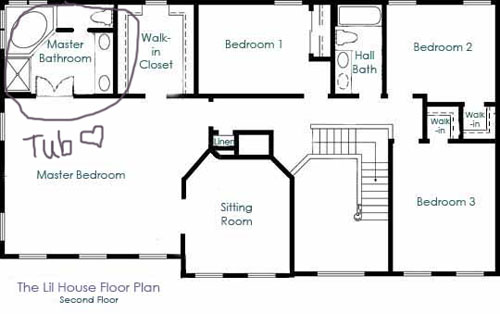
Here’s where it lives on our floorplan.

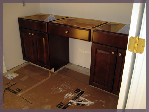
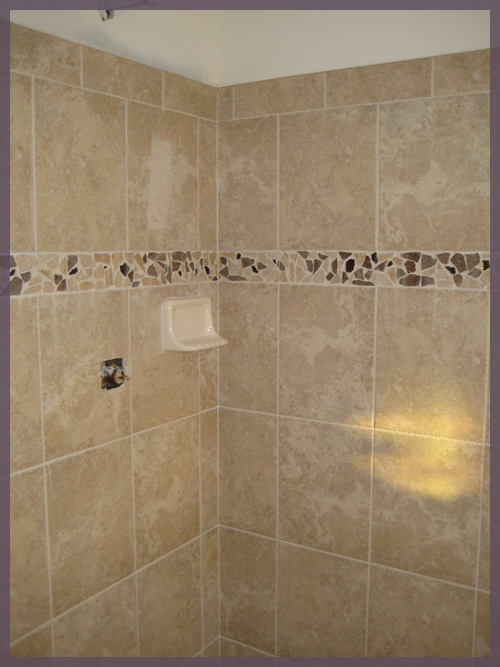
The two good things about this room are the vanity and the tile. Here they are while the house was still under construction…

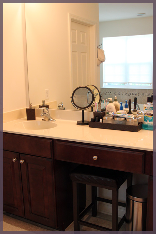
These two elements were two of the few upgrades we made to the house through the builder. I didn’t think that ripping out brand new tile after we moved in was environmentally friendly, so we made sure to pick one that we liked, even if we paid a little extra for it. For the vanity, I love super dark cabinetry and chose the darkest one that the builder had available. I wish it was even darker (since they are actually glazed) but I think once we actually decorate this room it will have that spa like feel I was going for πŸ™‚

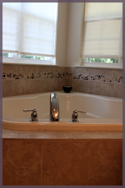
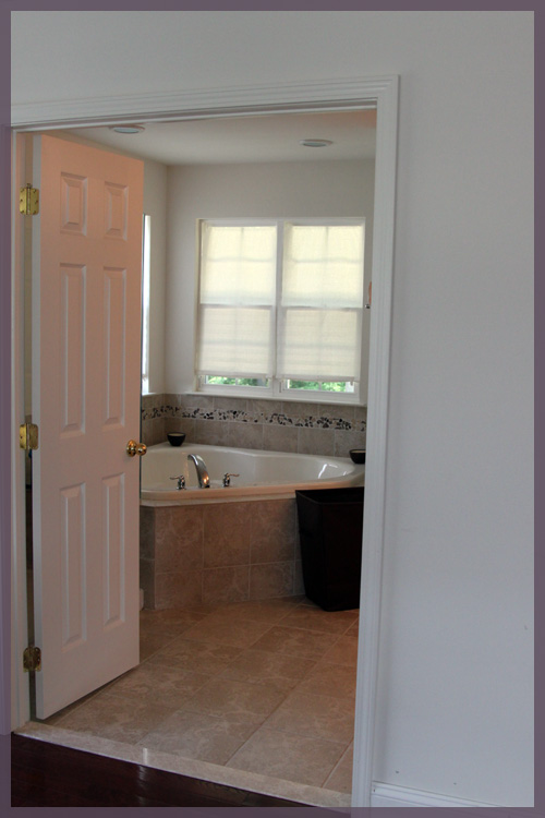
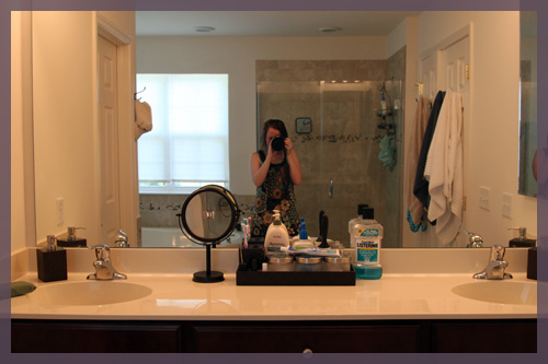
Without further adieu, the current state of the master bath (as I cringe a little….)

I wasn’t going to include this last picture because my hair is wet and fresh out of the shower, the towels are mismatched, there’s a hat hanging on a towel hook and my funny shower cap is clearly visible in the shower. But it’s the best room shot I have. It’s hard to stage a bathroom when you just showered in it, so here’s my very realistic shot πŸ™‚

I wanted that giant corner tub so bad and I even tried to get the builder to put an outlet on the wall across from it so I could watch tv from there. But they told me no, something about passing the electrical inspection because I’d get electrocuted and blah blah. Since we’ve moved in though, my favorite spot is my little Target stool and make up mirror at the vanity. I never realized how lazy I am until I realized I can brush my teeth while sitting down. It’s wonderful.

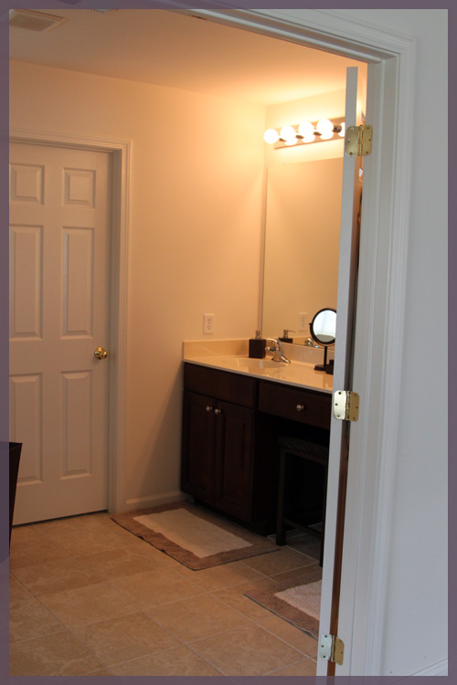
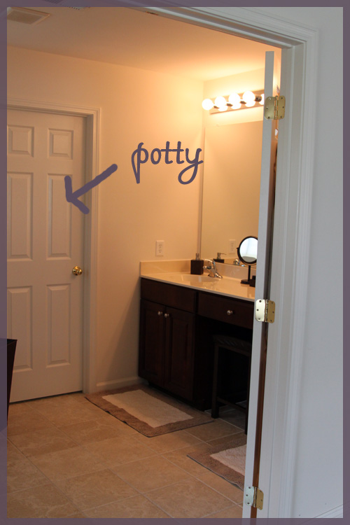
I often forget to mention this even in real life tours, so if you’re wondering where the toilet is, it’s behind this door…

There’s a window in the potty room, so maybe I should have left the door open to show you. But that window also has a paper shade on it, so maybe it is best that I left it closed…

We have a lot of things we’d like to change in this room… the vanity lights, the standard countertop, the public restroom looking fixtures, the paper blinds, the hardware on the vanity, the frameless mirror, perhaps adding some sort of cabinetry/shelving on the center of the vanity to conceal that Listerine. The list goes on and on. But for now, it works and it’s not completey awful, so it’s on the long list πŸ™‚

And that’s the master bath’s blog debut! It only took a year to make an appearance…

Four Paintings are Better Than One

7 Comments

Posted by Rebecca, July 27th, 2011

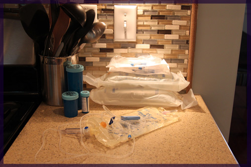
I’m itching to do the next round of the casa tour in the kitchen, but Mike is currently cooking and it’s functioning as a part-time kitty oncology unit…

I hate fluid drips. And we’re now doing them twice a day. Grr.

Anyway, I decided to jump into the dining room next since I have a project lined up for that room this weekend.

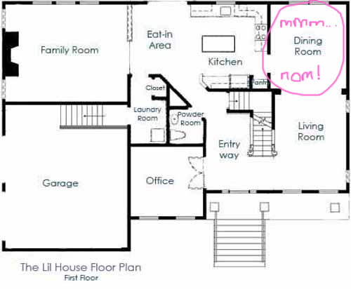
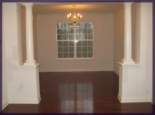
Here’s what the place looked like when we moved in…

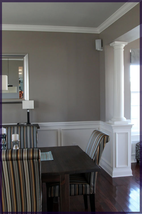
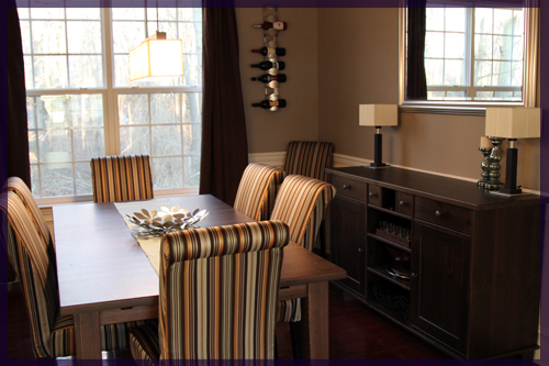
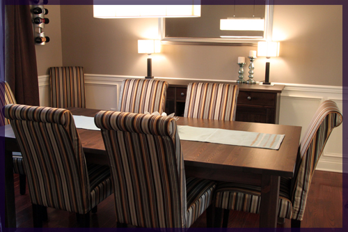
We painted the dining room days after we moved in and bought a Stornas table and buffet from Ikea shortly after. The chairs were a months long saga of searching, ordering, then reordering, but we’re very happy with our Target Avington Stripe Parson’s chairs πŸ™‚

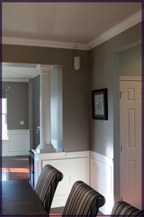
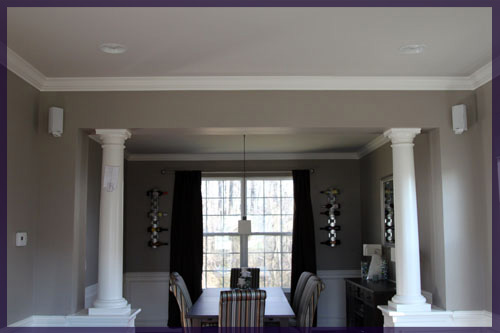
We’re not fans of those columns and hopefully they’re out of there someday! The builder gave us the chair rail in the dining room and we added the boxes underneath (or rather we had someone do it since we hadn’t yet mastered the nail gun). The wine racks are from Ikea and we had them in our condo.

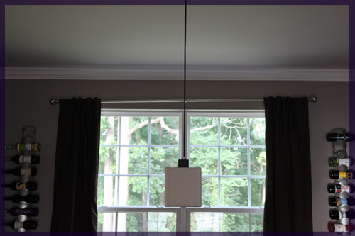
MikeΒ added speakers in this room and the living room so we have some music when we have large groups of people eating over.Β The mirror is also from Ikea and the light fixtures are from Home Depot. We fell in love with the lights before we bought the house, but they’re on their way out. They probably inspired this room the most in the beginning, but as it’s grown and evolved (and we have too) I think we need less square and more round elements in the room. So I’m planning on adding large, white, round lamps (with maybe a blue base?) and 1 (or 2!) large white drum pendants over the table.

We’ll either stick the old fixtures on Ebay or Craigslist, or save them for the basement. Either way, we’re not in a rush to get rid of them right now.

We really love how they make the space seem like a swanky restaurant more than a dining room, but as you can see in that last picture, the proportion of the lamps to mirror is off. They’re too short, mirror is too big, mirror is too square, lamps are also square, molding is white, lamps are off-white. You get the idea.

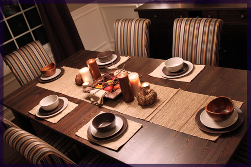
Here’s the table decked out for Thanksgiving…

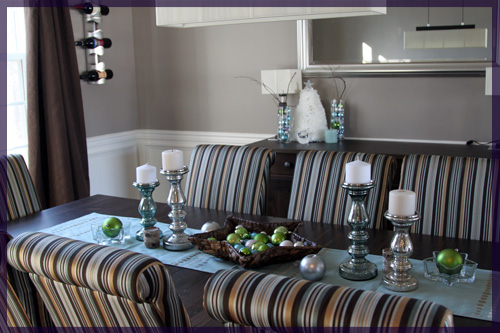
And for Christmas…

The only year round decoration (and the only picture hanging in the entire house!) resides in this room. I got it at Kohl’s for dirt cheap when we moved in and I figured I could always change out the print and reuse the square and double matted (!) frame for the $15 or so it was.

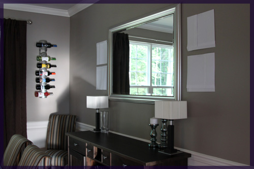
Since we have a serious lack of art and the scale of the mirror is irking me, I decided to pick up four 12″x12″ canvases in Michael’s a couple of weeks ago. I haven’t painted anything in years and I thought this room could use some abstract landscape art. I think that two on either side of the mirror will make the buffet wall look much more subtantial.

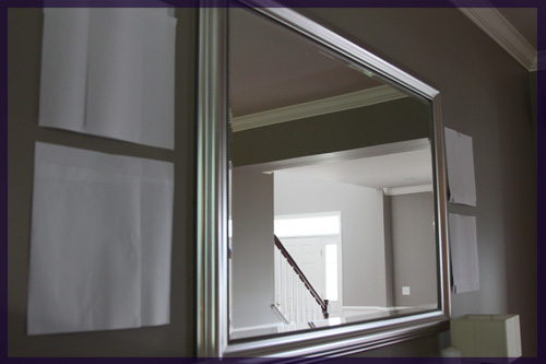
To make sure I wasn’t crazy, I chopped up some pieces of paper to get the size of the canvases and taped them to the wall.

Once we have taller, more substantial lamps, I think it will layer nicely.

I think one of my favorite aspects of this room is that not a single thing in here was expensive. The table and buffet were being discontinued in the stain we bought, so they were $199 each. They are solid wood and the table has two leaves that extend the table to fit 12+ people. The target chairs were about $65 each and they had free shipping. The curtains are from Target, wine racks from Ikea and that’s about it! Classy doesn’t have to be pricey πŸ™‚

ps- What happens when you mix an almost 20lb cat and a curtain rod?

No my camera is not crooked, the rod is. Macky has pulled it partially out of the wall. Someone please tell him that he’s 5 and this type behavior is no longer age appropriate?

Copyright 2010 - 2011. The Lil House That Could. All rights reserved.