The White Box Challenge
Posted by Rebecca, July 26th, 2011
You know how I said yesterday that I might jump around with the house tour? Well I’m about to, hang on kids 🙂
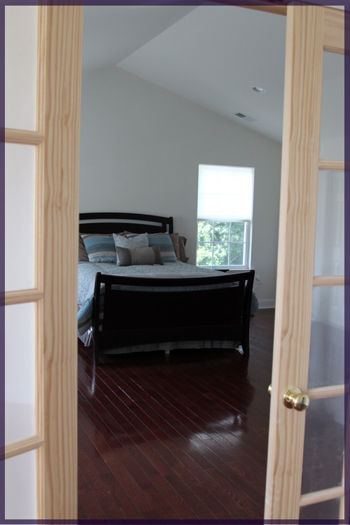
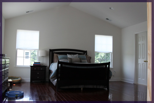
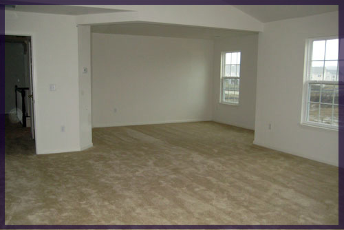
Our master bedroom hasn’t really been touched since we moved in, which is why you haven’t seen much of it yet. We did add hardwood floors (we had gold, builder-grade carpeting before) and we separated the sitting room from the main room with a wall and some french doors. Otherwise the room was ginormously awkward. Like those 7 foot tall basketball players who are only good because they’re eye level with the hoop.
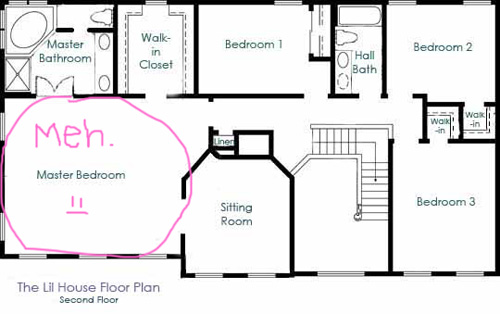
Here’s the master on our floor plan…
I forgot to draw some french doors in the opening to the sitting room, but you get the idea. We did toy with some paint ideas for this room, but we ended up using one of our choices for the office stripes. So somehow, 16 months after moving in, we have white walls and paper blinds. This is embarassing.
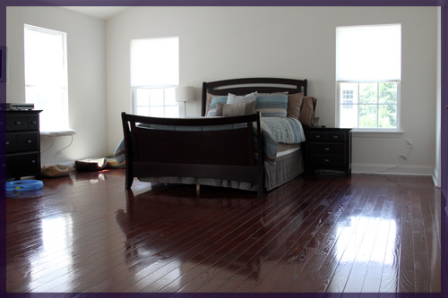
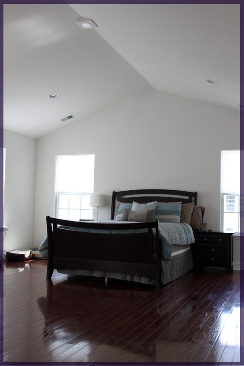
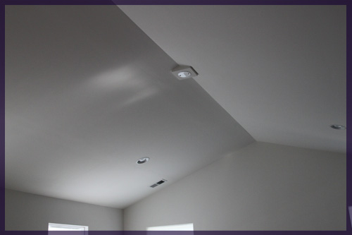
The room does have some great features, like 6 windows between the main room and the sitting room, as well as cathedral ceilings.
And of course, the french doors we added that we still haven’t even primed.
Please ignore the cat beds and toys in the next picture. They sleep here too 🙂
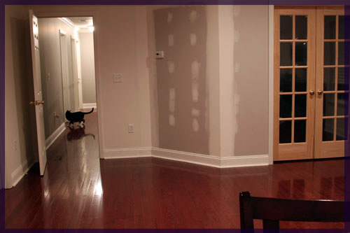
I didn’t take any recent pictures facing the other way because the sitting room is currently Darwin’s hangout since we had to put an extra litter box in there for him. I figured no one wanted a view of that, even though it’s tucked behind the door, so here are some older pictures. The wall looks exactly the same so an updated picture wouldn’t do much for you, though daylight would probably be prettier 🙂
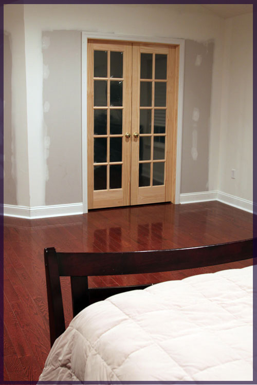
And just for fun, here’s what the room used to look like when we moved in.
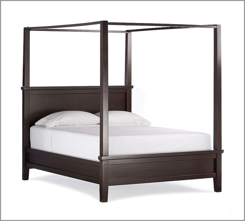
One reason that this room has stayed so blah for so long is that I couldn’t find any sort of inspiration I was in love with. I am beyond sick of being blinded by the white on white and I hate our bed-in-a-bag temporary bedding that has been around for far too long. The room is just so large that something simple wouldn’t do. I thought about painting stripes on the walls, then it was going to be stenciled, then we were going to do molding all the way around the room and it just constantly changed. But lately one idea will not leave my head. It involves this Pottery Barn Farmhouse Canopy bed….
I have wanted a bed like this for my entire life. Mike has never been a fan, but he agrees with me on this one because it looks “classy” (Mike, 2011). I think that with our high ceilings, we actually need a bed this grand. One of the problems with any of the wall treatments that I planned to do was that I couldn’t think of what kind of headboard to do with them that made enough of a statement.
Because of the hefty price tag on this bed, we’re considering 3 options:
1. Save our pennies and buy the bed (which isn’t realistic in the near future because of Darwin’s weekly chemo treatments)
2. Try to luck out and find one on Craiglist (I’ve found some in other states but none close by yet)
3. Build one using Ana White’s plans (while I would love the feeling of accomplishment in this one, we have major time constraints with jobs/school)
On top of this (almost literally) we want to do a fancy ceiling treatment, but I’ll save those plans for another night. I’m off to go talk Darwin into taking his pills, since he’s refusing the cookie treatment tonight. In the meantime, if anyone spots a farmhouse bed deal, send it my way!


