Birds of a… Fabric?
Posted by Rebecca, March 9th, 2011
I know it’s Wednesday, which is normally What I Ate Wednesday, but Mike and I are being super lazy this week. I’m on spring break from school (yay!) so we’re trying to enjoy my stress free days with lots of catching up on shows and ice cream on the couch. We made shepard’s pie again this week since we loved it so much last week. We’ve been eating the leftovers of that, plus some pizza and bagels we got from a visit to my parents’ this weekend. So we’ve been rather uneventful food-wise… as well as house-wise. We’ll be back to our normal antics this weekend 🙂
One thing I’m hoping to decide on this week is the fabric choices for the office. Here is where we are as of tonight…
These are all from the Ty Pennington collection at fabric.com. Who knew Ty made fabrics? Weird. I was drawn to them because of the mix of greens, grays and white that would perfectly compliment our gray stripes and green carpet. Plus I could have sworn they were around $8/yard compared to the Dwell Studio or Waverly fabrics which were around $16/yard. But of course, after I order samples the prices go up! Or maybe I’m imagining things…
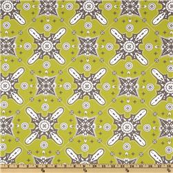
My number one choice from these options is the one I thought I would love and the reason why I chose these fabrics- the white “kaleidoscope” one as Mike calls it…
It’s the blossom pattern in chartreuse. I love this for a few reasons… 1) it has both shades of gray from our stripes 2) it has a white background to lighten up the room 3) it has a circular pattern to compliment the linear-ness of the stripes. Online Mike thought it was too girly, but after seeing the sample he agrees with me. This pattern will make our curtain panels, plus it will cover half of our Ikea storage boxes.
I want another pattern to add to the mix so it’s a little more interesting in this space. The second fabric will just cover some of the storage boxes so it’s more of an accent, I suppose. I thought this one was a shoe-in, but after seeing it, I don’t think it’s graphic enough or bold enough in the color department to compete with the stripes and blossom…
Then I thought maybe this bright green one would be good since it has such a visually appealing pattern, but I think it’s too much green…
So I was left with this guy, the birdy one…
Online I wasn’t crazy about this, but once I put it next to the blossom pattern? Something happened. And I liked it.
I like that it has a dark gray background, as well as some light gray birds to blend everything together nicely. Besides owls, I’m not a big bird person. The fabric isn’t appealing to me on it’s own, but within this context? I like it.
However, Mike does not. He’s not feeling the birds… or the butterflies. I’ve tried, it ain’t happening. Whaaamp whaamp.
I pick and choose my battles and this just wasn’t worth any sort of battle for 2 little boxes. We try very hard around here to make rooms we both love and enjoy, so if Mike really despises the birds, I’m not going to use them. I’m thinking of ordering one more sample in this pattern…
I know there is no green in this one, but I think that it’s the dark gray of the birdy one that makes me like it. We’re planning a couple of other green things around the room so I’m not sure I necessarily need any more green.
Halfway back to the drawing board I go! Goal: to get the perfectly gender neutral office!


