Can You Imagine
Posted by Michael, April 12th, 2012
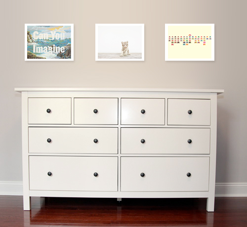
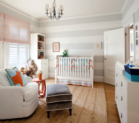
Rebecca has been asking me all week what should we do above the baby’s dresser. We know we want to rock the giraffe sconces, but we’re not so sure what to do exactly in between them.
Do we go with the classic three frame horizontal look? Maybe one large frame? We’ve bounced ideas back and forth to one another ranging from absolutely nothing besides the sconces to crazy framed patterns.
Ok, crazy framed pattern really means what you trendy kids are calling “chevron” patterns. It’s called a zig-zag. Seriously. What’s easier to understand, “I think we should do a chevron pattern” or “I think we should do a zig-zag pattern.” Yup, zig-zag. Mike 1, rest of you 0.
Anyways, tonight I present you a combination that popped in my head as I was browsing 20×200.
(“Can You Imagine” via 20×200)
On the left, we have ‘Can You Imagine’ which instantly grabbed my attention. For one, the background scenery reminded me much of our time spent in Hawaii. And then the typography brought out the aspect of an imagination. This baby girl or boy is going to have one helluva imagination; especially since he or she will be talking about Macky to friends as if Macky was a non-fur-baby.
But really, I glazed at this picture for a solid five minutes watching the waves grow as they approached me and then watching as they hit against the rocks. Then I realized nothing was moving in this piece of art work.
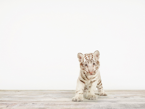
(“Baby White Tiger No 5 via 20×200)
And then I saw this baby tiger. What better way to make The Baby a crazy cat person than to hang a picture of a big cat? Gotta start them young, right?
I love the simplicity of this piece, a baby white tiger on a simple backdrop. But more importantly, I couldn’t help but think that this tiger had a piece of all of our cats — small sized tiger with big paws reminds me of Darwin, the fluffy white chest reminding me of Sunny (our precious guy we lost to panleukopenia), the big eyes with a slight tilt of the head reminding me of Mowie and the overall goofiness that Macky shares with this tiger.
In 20 years, you’re going to hear about The Baby having a TLC special about owning too many cats.
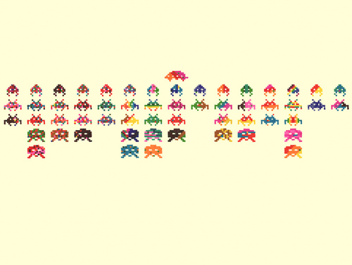
(“Closing Credits at the End of a Movie” via 20×200)
And to end, we have some artwork reflecting the geekiness in me. I love that this really screams our youth while throwing several colors into the mix. I really want to go play space invaders now.
I’m not sure if we’ll go with any of these, but I figured I’d throw them out there. Maybe Rebecca will let me mount three LED televisions up there so the artwork can always rotate and be random.
Now that is a great idea.


