Archive for February, 2010

helping the environment

No Comments

Posted by Rebecca, February 22nd, 2010

After watching this series of videos on the Pacific Garbage Patch, I am feeling guilty for being a selfish human being more than ever.  I had already planned on reducing the massive amount of water bottles we drink from by investing in a fridge with a water dispenser, but part of me still feels horrible for buying a new home and displacing my backyard neighbor that I met today…

IMG_2948

So after we saw 3 of these guys hanging out in our yard, we headed to Lowe’s.  As we were strolling the kitchen setups to price out above mentioned fridge, a countertop caught my eye.  Since we had just decided earlier in the day that we were impressed with our builder grade master bath countertop, I wasn’t even paying attention to any countertops.  I love finding things this way, just buying things I absolutely love.  I never buy something just because I need it.  We once ate off a folding table for 2 years because we couldn’t find a table we loved…

Anyway, I assumed this countertop with a slight sparkle to it was granite.  I was extremely impressed to see that it was made of 75% recycled content.  It was a part of the Eco by Cosentino line, which is made of recycled porcelain, mirror, glass and stone scraps.  It is bounded by a corn based resin.

The husband and I were just talking today about the allure of granite.  Our kitchen came standard with Corian countertops, and I think they look great, though at one time I assumed we’d eventually switch to granite.  We also had an upgraded cultured marble vanity top in our condo which our realtor mistakenly thought was granite.  If the functionality is the same and it looks just as good, why are so many people stuck on the word granite?  I would much rather help the environment and have something unique.  Here’s hoping this sample will go with our master tile!

IMG_2964

a sunny inspiration

3 Comments

Posted by Rebecca, February 15th, 2010

Anyone who knows me knows that I am completely in love with my pets.  In May 2008, I suddenly lost the 2 year old love of my life, Sunny.  He was a bright orange lovable fluff of a former stray kitten, and one of the greatest living things I have ever encountered.

booboo

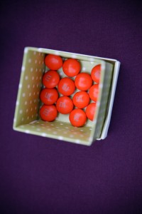
Ever since I met him, I have a new appreciation for the color orange.  I feel like if I put a little touch of it here or there, it is a little tribute to him and has a secret meaning to me.  It all started with our wedding favors, for which we made a donation in Sunny’s honor, but were originally going to give some homemade cookies for our guests to go home with.  We decided that bright orange M&Ms would be a more fitting tribute, though our color scheme was purple and green.

0881-IMG_1559I tend to favor cool color schemes… I never wear red, orange, pink or yellow because they just aren’t flattering on me.  I was once told that how people dress tells a lot about how they decorate their house.  I guess this tends to be true for me as well!  But I’ve decided that in my outdoor space or even in my landscaping, I want to throw in some bright orange for Sunny.  My brother has kindly given us a large yellow umbrella of his that I fell in love with last summer.  I’ve been wanting to take my favorite color, purple, it’s compliment, orange and some yellow and make a playful, yet classy outdoor setting.
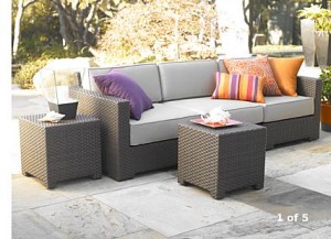
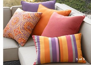
Leave it to Crate & Barrel to read my mind.  They recently added some new outdoor furniture to their website, including accents.  I was delighted to see this entire set up…

c&b outdoorc&b outdoor pillows

These items are a part of the Ventura outdoor collection.  The outdoor sofa is $1899 and the pillows range from $29.95-$39.95.  I love this particular style of furniture and have always wanted a dark wicker style with bright accents.  The price is quite hefty, though we’re not thinking of creating an outdoor space for this summer.  I’m hoping to maybe pick up the pillows and search Target and Walmart for furniture knock offs.  Crate & Barrel outlets also offer some great deals on items that were previously in stores.

Whenever we manage to afford an outdoor space, I’m hoping it is beautiful in color, happy and lovable, just like my Sunny was.  Though not everyone who sits on it will know the happiness the color orange brings, it will be another way to make my house a home and feel like Sunny was able to move with us.

good design in strange places

No Comments

Posted by Rebecca, February 10th, 2010

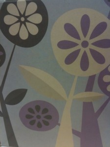
I recently fell in love with this tissue box from Walmart…

tissue box

If I had a daughter, I would be all over this.  I love the color scheme- it’s a mix of grays, purples, browns and creams that somehow looks wonderful together.  The graphic is simple yet so modern and sophisticated, with that little hint of whimsy that I think would be great for a kid’s room.  So often, people assume a little girl’s room has to be pink to be girly.  A little outside the box thinking could make a really unique room.

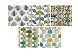
Looking at this pattern reminded me of some prints I bought from Ikea for our condo about a year ago.  They were different variations of a simple pattern….

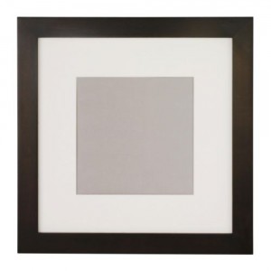
Picture 2Unfortunately, they are no longer available from Ikea’s website for me to link.  I paired them with a frame similar to this simple matted Fjallsta frame.
ikea frame

I’m not sure of the size of the frames I have, they are currently in a storage unit with the other 90% of my belongings.  But I would say they were about a 10″x10″ square.  I then hung 3 of the prints on top of one another and placed them on a long narrow wall space we had. I absolutely loved them and plan on hanging them again in our new house.

I am wondering if there are other variations of this tissue box scheme.  But even on it’s own or the same image multiplied by 3, it would look great with a cream colored mat and a dark brown frame.  Using a mats and great frames arranged in multiples can make even the most ordinary image into a piece of art.  Why not get artwork for the price of a tissue box!

lil background: part 1

2 Comments

Posted by Rebecca, February 10th, 2010

I’m going to go backwards every now and then to fill you in on how we got where we are today, without putting anyone to sleep….hopefully….

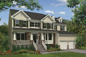
We chose our house because of the wonderful porch and stone facade.

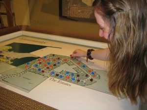
model drawing

Of course there were considerations of location, price, blah blah….

We then had to choose our lot, which had to be wooded to meet our ideal house criteria. We basically choose the lot that had the most dense woods behind it, to act as a buffer between existing homes. That way if we eventually get a pool, I can feel free to belly flop into it without getting the backyard neighbor’s belongings wet. I kid I kid, it was really for the feeling and view from the bathtub…

IMG_0658

Okay so this picture is not so accurate. When we signed our contract we had chosen a different lot because it was the largest one available that was wooded. After a week we decided to lose the whooole extra .05 of an acre in return for more dense trees in our backyard. A smart decision, now that it’s winter and we can see the house behind our original choice.

The day we signed our contract, we also had to choose our exterior options. This part was easy, because how many colors of siding exist? Or rather, how many colors of siding would the builder offer? I knew I wanted something really earthy looking, maybe something that could fit in the Pacific Northwest, so we choose a brown on brown scheme with a round river rock type stone…

IMG_0673

Our roof is also a shade of brown, but apparently that’s something I neglected to take a picture of… whoops.

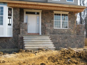
We wanted to keep the stones in the brown family, and that lil red stone in the bottom right corner made me nervous. I definitely did not want large versions of that on my house, but we were told it depends on the lot of stones. We went through this process back in June and a little less than a month ago, our stone finally went up. We couldn’t be happier with the results!

IMG_2866

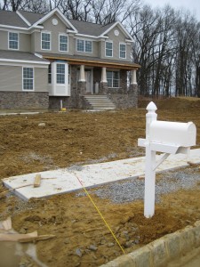
We still don’t have shutters up or our door painted, but so far we’re very pleased with how all of our choices came together. Here we are currently, about 7 weeks before closing….

house without number

Copyright 2010 - 2011. The Lil House That Could. All rights reserved.