Archive for December, 2010

my indoor wreath

16 Comments

Posted by Rebecca, December 12th, 2010

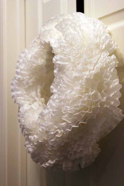
You’ve already seen my outdoor wreath and since it didn’t satisfy my wreath craving, I decided to make an indoor one.  I love very simple wreaths made out of interesting elements, so when I saw that The Nester and Decor Chick! made wreaths out of coffee filters(!!) I just had to try!

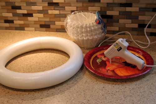
The ingredients…

Wreath form, coffee filters, glue gun (mine’s a cheap-o $2 one)

The method…

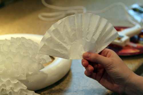
Fold in half

Then in half again

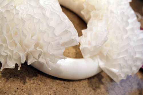
Stick a dab of hot glue on the bottom corner

Then add it in!

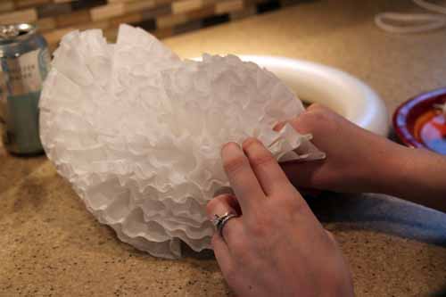
Keep adding until it’s nice and full

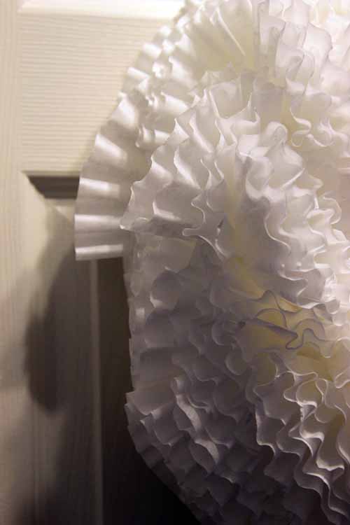
I didn’t have much of a pattern going, except that I tried to keep most of the lines following the shape of the wreath form. I really just filled in until it was big and fluffy.

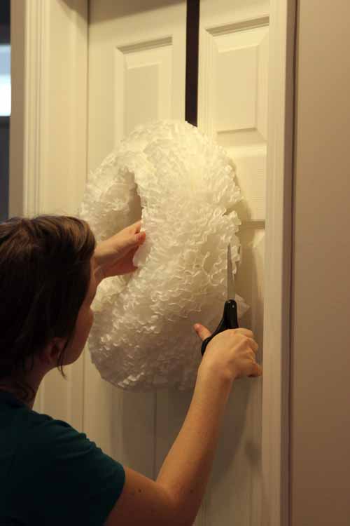
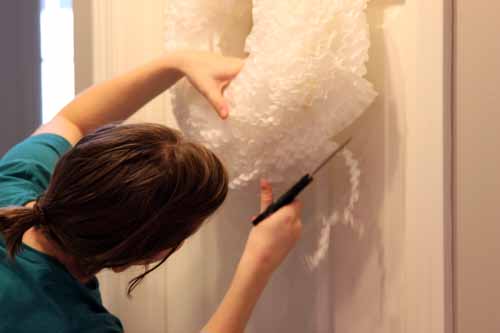
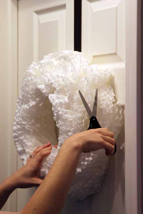
Now my new buddy needed a serious haircut.

So I kept him hanging to give him a trim, since it was a better view than laying him flat.

Um please excuse my hair in these pictures, I didn’t leave the house today….

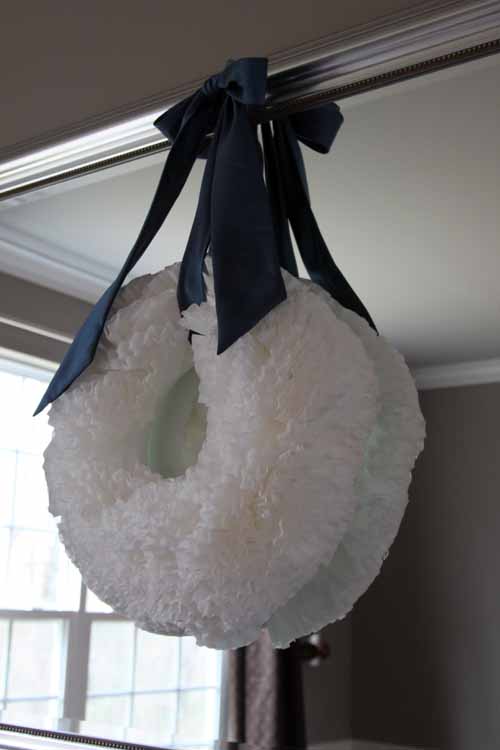
Hair cut complete! Now I had to figure out how to hang this thing.  I decided to use a sash I had worn as a bridesmaid in my friend’s wedding.  Thank you David’s Bridal for this pretty blue!

So I wrapped it around the wreath, marked off the length I needed with a rubberband, oh and I ironed it using my hair straightener…

I wanted to hang it on our dining room mirror, but I had no clue how to go about it.  Then I remembered we had some silver command hooks I bought for my side of the closet but hadn’t used yet.  So I stuck one to the mirror and hung my wreath on there.  Tada!

The finished product!

The best part of this? It is the cheapest thing you could ever make.  I used just under 100 coffee filters- I bought a pack of 200 just to be safe and paid about $2 for them.  The wreath form was a couple of bucks at Joann fabrics but I’ve seen people use cardboard cut into a circle or any other bendable foam.  So if you get your wreath form from something you have hanging around the house and your coffee filters at the dollar store, you could make one of these for a single dollar. Cheaper than a bag of chips in a vending machine these days!

I’m not going to lie, I love this thing.  It reminds me of hydrangeas.  Okay another confession, I made a tree with the remaining coffee filters, but I’m not sure if I like it or what I’m going to do to embellish it.  I ran out of glue sticks for the night 🙁

We’ll save that one for another day. I have to get ready for Dexter!

have a seat

3 Comments

Posted by Rebecca, December 9th, 2010

So just yesterday I posted about the lack of seating in our eat-in area.  I thought of a temporary solution a few weeks ago and this week I pulled the trigger.  We decided to get two stools to put in either corner of our sliding glass door.

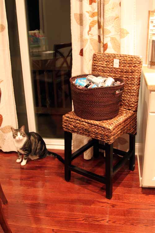
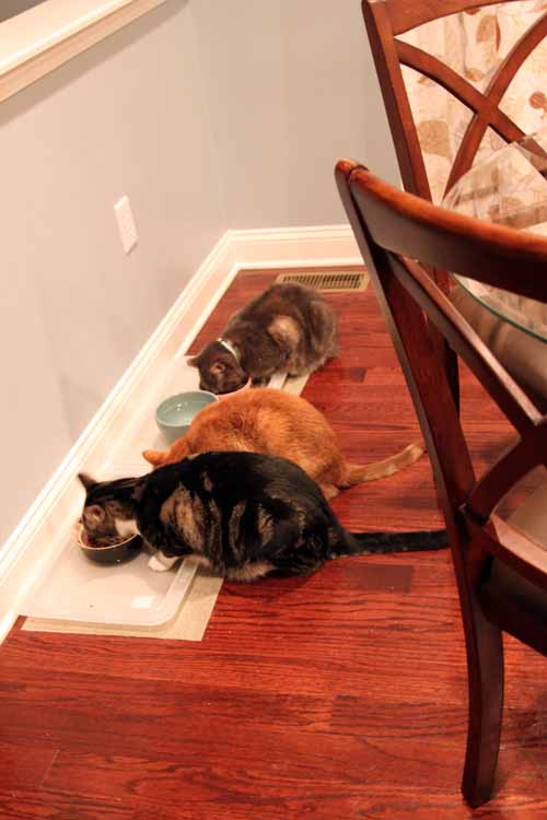
We got one for where our recycling basket currently is, in front of the curtains, and one for the corner where the kittens’ food bowls are, in front of the other side of the curtains.  We generally move the cat bowls when we have company so they’re not intimidated to come downstairs and eat.  Not that Macky has any fear of anything/anyone!

The area by the recycling basket has the countertop and the area by the food bowls has the half wall overlooking the family room for people to stick a coaster or an appetizer plate on.

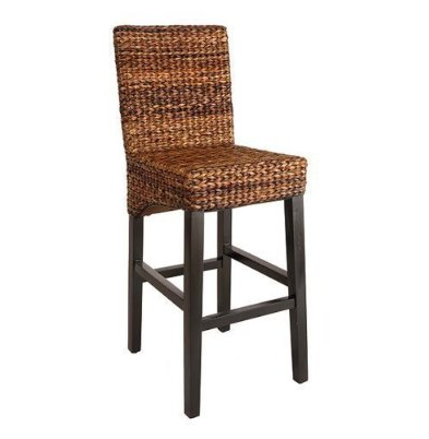
I went to my #1 chair source, Target.com.  Our dining room chairs are from there and they just have the best selection at reasonable prices.  I had an exact idea of what I wanted, a woven sort of chair ala Pottery Barn. Thanks to Target, I found exactly what I wanted.

It’s the Andres Stool in Espresso.  I waited a while and stalked it on Black Friday, then Cyber Monday and no deals!  We wanted them in time for Christmas and fortunately, my stalking paid off and they went on sale this week.  I ordered two on Sunday (they qualified for free shipping yay!) and they arrived today.  Mike put one together while I was at school and texted me a picture of the completed chair.

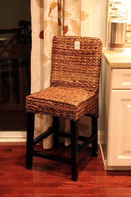
When I got home, there she was…

Okay here is where I am honest.  I was a little disappointed.  Mike warned me before I got home that the legs were super dark, which I honestly didn’t even look at while ordering.  I’m not a matchy-matchy wood tone person and I learned with our dining room chairs that you hardly notice such things.  So I wasn’t disappointed in the near-black legs, but the yellowish tone of the woven part.  I was hoping it would be more like our recycling basket.

I also think that if it wasn’t directly behind our cherry colored table and chairs, it would look perfectly fine.

But as I took these pictures, it grew on me.  The woven part looks good with the curtains and the counters. It also adds the texture I was originally aiming for. Plus when I sat on it, I was pleasantly surprised…that badboy is firm! I imagined it would have a lot of creaky give to it, but none at all.  So I think I’ll keep them since they were affordable and we plan on tucking them away when it is just Mike and I.  They add an extra two seats for people to hang out in the kitchen and who knows, maybe someday I’ll go for this Pottery Barn look I’ve loved for so long.

Once we get the second stool together, I’ll snap a picture of our whole new make-shift area!

planning ahead

9 Comments

Posted by Rebecca, December 8th, 2010

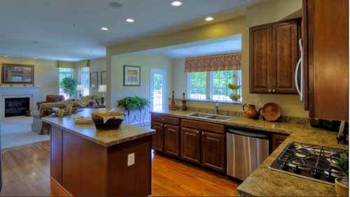
We still have 2 bedrooms with zero furniture in them and an empty formal living room, but we can’t help thinking of ways to improve on our house.  One of the ideas floating around our heads for a future renovation is an overhaul of our eat-in kitchen space.

When we bought our house, the model had already been sold.  We walked through it about a year before, but we were in so many models that we hardly remember the details.  One of those details was whether or not there would be room at our island for some stools.  The saleswoman assured us there would be, but when we moved in  we realized she was wrong.

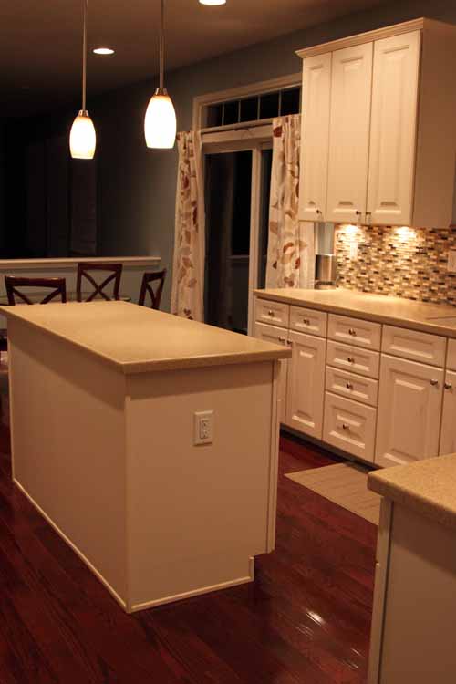
We hoped to change the countertop on our island to a contrasting color (I imagined a dark butcher block) with about a 12 inch overhang for two stools.  Hence the two pendant lights over the island.  Though I was sad that I couldn’t sit at the island as Mike cooked and tell him about my day, we were okay with it.  We always planned to use our condo dining set since I wanted a much more casual dining feel than a formal dining room has (and we paid only $199 for it in ’07- table AND chairs AND glass top!)

(sidenote- it was dinner time when I took these pictures, how cute are they??)

Now that we actually live here, we’ve realized that the kitchen really is the heart of the home.  Whenever we have people over, everyone stands around the island.  We try to tell people to move into the family room or dining room, but they won’t budge.  So we started to think of solutions and I was reminded of a model we walked through about almost 3 years ago now.  It had a similar kitchen floor plan as ours, but the builder offered an optional sunroom.  I remembered that the builder was Ryan Homes and I recently scoured their website for pictures.  Unfortunately, the development we visited was sold out, but I was in luck that I have a disgusting memory and figured out that the model was the Yorkshire.  I managed to find floor plans and pictures on the Ryan Homes website.

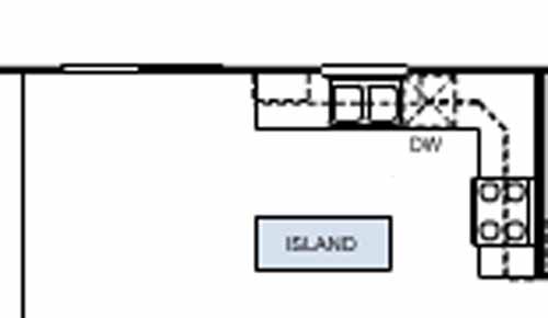
Here is the basic layout of our kitchen, as displayed on their website…

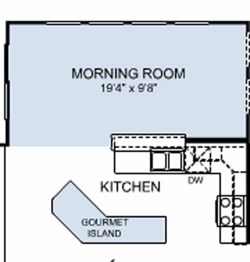
And here are the additions we’d like to make, also via the Ryan Homes interactive floorplan tool…

Our builder did offer an add-on to the back of our house, but it was more vertical than horizontal and we didn’t think it would be very functional.  We liked that this was more of a room than a bump-out and didn’t extend very far into the backyard.  We also have high hopes for the backyard area someday, but that’s for another post.

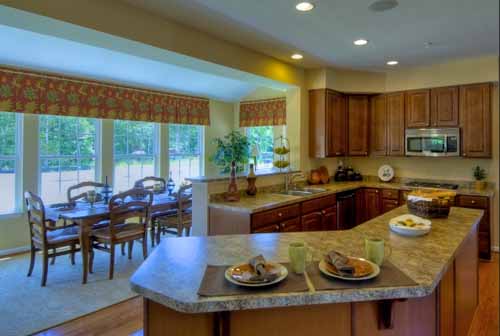
I also found some still images of a Ryan model home that was upgraded with the exact changes we would like…

There is also a virtual tour of this house here!

Ideally, we would love to do something like this, opening up our kitchen, extending our island, adding an area for stools at the island, making a bar area on the opposite side of our sink with additional seating.  We would open up the area from the window through the sliding glass door. We would lose the upper cabinets to the left, but honestly there’s nothing really in those.  And we’d gain the space in the new base cabinets in the island.

We just think we can add some special touches (Wine fridge anyone?? Bookcase area in the island??) that will make our kitchen look more custom and less builder grade.  Plus adding a nice large sunroom will give us a ton of options to work with.  And of course, the cats would love all of those additional windows! 🙂

Maybe in 10 years.  But we can dream, right?

ps- I started a Facebook fan page for this place, come here to join!

pss- Please join, don’t feel creepy, I need friends 🙂

my first wreath

12 Comments

Posted by Rebecca, December 7th, 2010

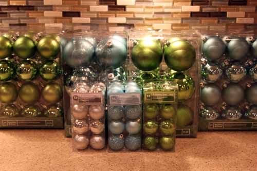
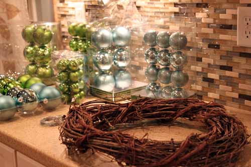
Another item on my Christmas to-do list was to make some crafts, including a wreath.  So last night, I gathered my supplies.

Yes, I am crafting on my kitchen countertops.  Take one guess why that is.  Mhmm, because of Macky.  For some reason he doesn’t acknowledge anything we do on the countertops. The last thing I needed was a glitter covered cat!

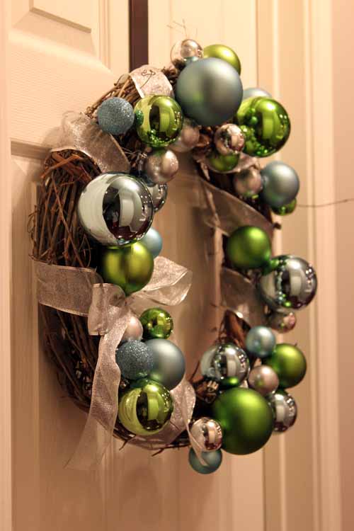
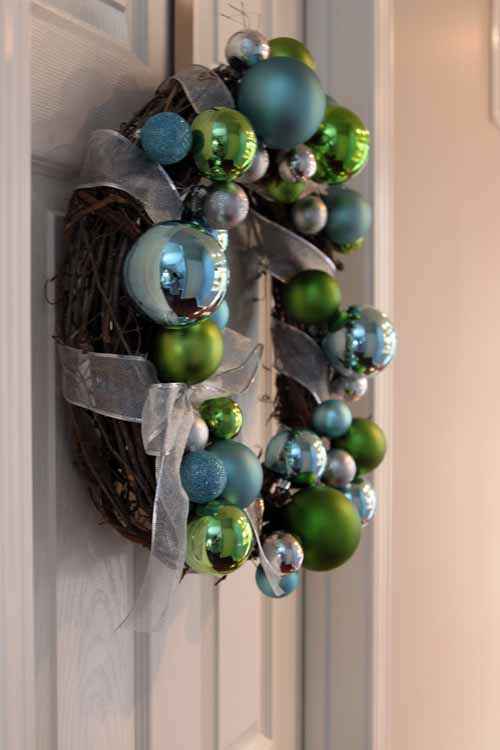
I had no plan of attack.  Actually I did, I wanted to make a full-out ornament wreath.  But then I saw this woodsy wreath at Michael’s and I bought it.  I wanted some of it to show through, but I wasn’t sure how to approach it.  So I attached some floral wire to some ornaments and started adding them in bunches…

(Please ignore my reflection… I am wearing a giant shirt that is even too big for Mike)

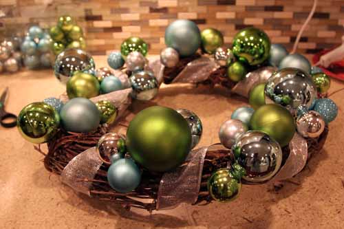
I remembered I had some silver ribbon upstairs that I got to decorate our staircase.  I grabbed that and wrapped it around the wreath.  I wanted to make the ornaments into a sort of wrap around pattern and I figured I could follow the lines of the ribbon to do so.

After I attached the ornaments with wire, I hot glued them to one another to give the tight cluster effect.

Then I just continued to make clusters around the pattern of the ribbon, wiring and gluing!

Then I added a silver bow off to the side to finish it off.

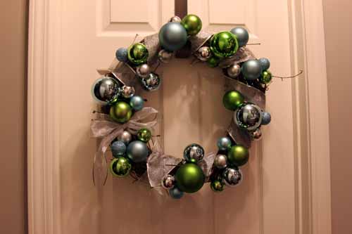
And tada! All finished!! I hung it inside until we decorate the outside of the house this weekend.

For good measure, I took some pictures in the partial daylight this morning.

The dining room gets the most light in the morning, so I brought the wreath in there for a few shots.

I usually prefer cleaner, simpler wreaths, but I decided to step outside of my comfort zone.  I was unsure at first, but now I like my little creation. The different sizes of ornaments have a bubble-like effect and the wooden wreath still shows to add a rustic element.  As I said earlier, this will be going on our front door which is covered by our porch.  To feed my need for a simple wreath, I am planning on making one for the inside too! 🙂

unfocused Monday

3 Comments

Posted by Rebecca, December 6th, 2010

I have the attention span of a gnat tonight.  Here are my random thoughts…

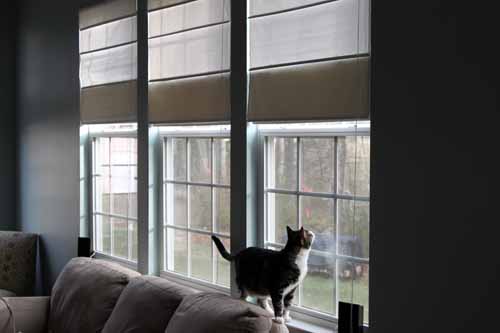
A rare daytime photo snapped before work this morning.  I just had to show you the new shades in the light!

All you need in life….

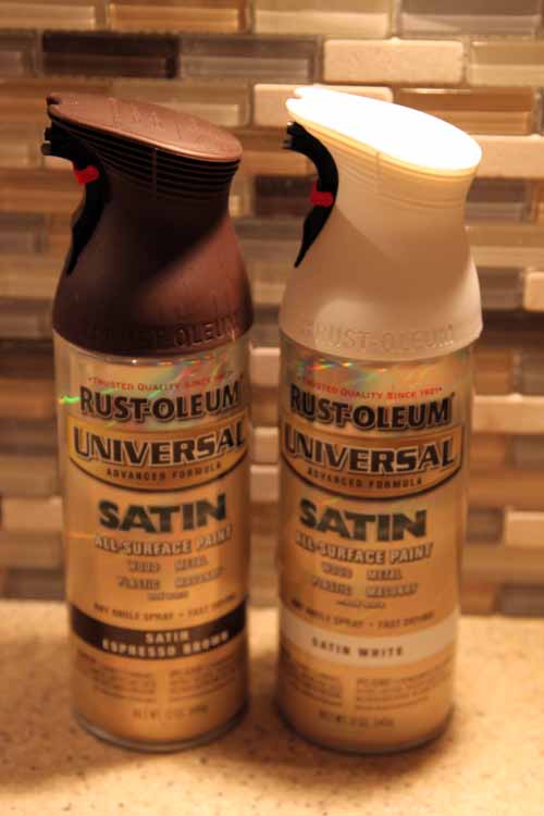
I picked up a can of brown and white spray paint.  I am tempted to run around the house and find things to paint but it’s 10:30 and….

I am tired from playing with these all night…

I figured December 6th is late enough to at least start making some holiday decorations.  We’re planning on getting a tree this weekend.

A sneak peek of my ornament creation…

I’ll tell you aaaall about it tomorrow since I’m tired, cranky and I have glitter all over my face.  Have I ever mentioned that I hate glitter?? Hate it. All you need is one piece on your nose and it annoys you all day.  And I currently have it all over my pajamas…..

‘Til tomorrow kids 🙂

Copyright 2010 - 2011. The Lil House That Could. All rights reserved.