Archive for September, 2011

Fancy-ing the Fireplace

9 Comments

Posted by Rebecca, September 29th, 2011

I’m back! Can I tell you it’s been a hectic and crazy week? To top it off, I worked until 8 tonight and our family room tv just died. I had such big plans of relaxing tomorrow night and catching up on all of the How I Met Your Mother, Modern Family and Jersey Shore that I missed this week. RIP Plasma, you were our first major purchase back in 2005 and you will be sorely missed. Especially by me. Especially this weekend. Because really, who wants to drop all of that cash on a new tv unexpectedly?? Not me.

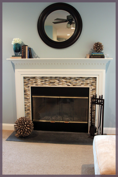
Anywho, while we’re on the topic of the family room, I came across the coolest idea ever on Pinterest a few weeks ago. Remember our fireplace?

We originally wanted a chunkier, more dramatic fireplace surround that the builder offered, but it was too wide for our floor plan. Since then we’ve been trying to come up with ways to make it a little less generic builder looking. We added the tile to it (the same tile from our kitchen back splash) and we plan to paint the slate, metal and gold hardware one of these days.

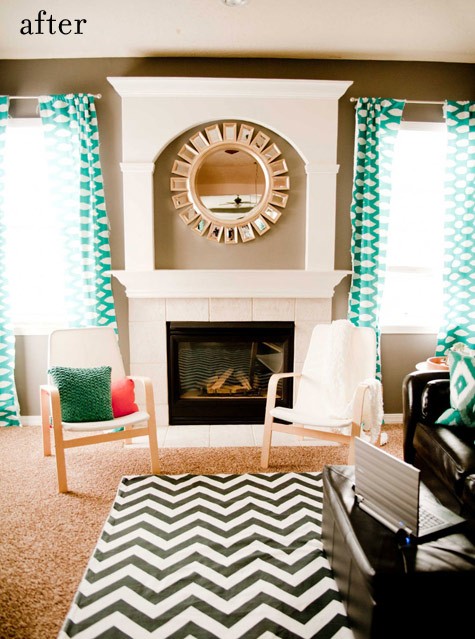
Going back a few months ago, I spotted another image on Pinterest that got the hamster in my head running on his wheel. Why don’t we add some molding above the fireplace!

(via Design*Sponge found on Pinterest)

I liked it, but the arch just isn’t us. I liked the idea of it much more (plus the curtains and the rug). Plus the layout is identical to ours. So I searched a bit and found one much more my style, enter contender numero dos.

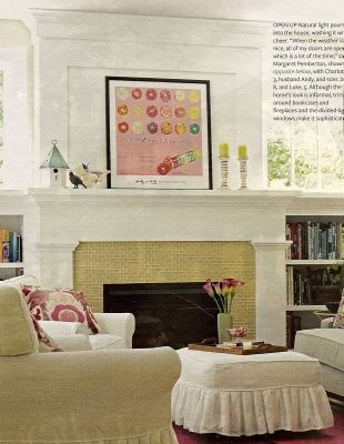
(via Bethany Christensen Design found on Pinterest)

I love the squareness of it and that chunkiness we’ve been aiming for. But, the style of this mantel is completely different than ours. We have that funny dental molding and our opening is framed out with a thinner molding. I wasn’t sure if this would translate well for us, so I pinned it and went about my life.

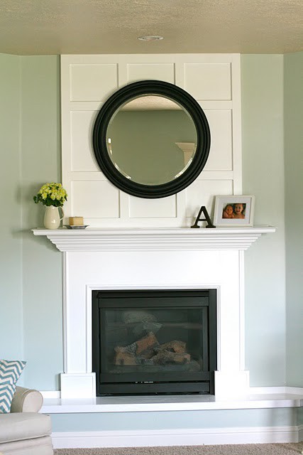
Then recently this showed up in my Pinterest feed…

(via 6th Street Design School found on Pinterest)

Not only does the fireplace itself (at least the mantel part) look like ours, but the whole getup looks like ours. When I first showed Mike from a distance, he thought I had worked some photo shop magic. The best part of this one (besides that I can totally get how ours would look like), is that it is probably the easiest to do out of the 3. Those straight pieces of wood? No ridiculously raised part that would eat my mantel? The fact that my mirror would work with it? Love it.

Admittedly, the only thing I’m missing is a nice chunk of crown molding at the top to mirror the mantel. But I guess that’s a tweak we could add on our own. You know, whenever we get around to finishing the other molding projects we’ve started around here 🙂

Now I’m off to stare at a dead tv… 🙁

What You Know Bout That

8 Comments

Posted by Michael, September 28th, 2011

These last few days, Rebecca has been talking about doing a frequently asked questions post.  She planned to do this tonight.  I just went to the family room and she’s sound asleep; completely exhausted from homework and class.  So here goes… just my version… and not necessarily about our house, our projects, etc.

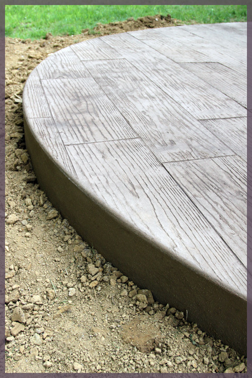
Stamped concrete?  Wood plank stamp?  How much and where do I get the stamp?

All said and done, I believe it ran us just about $10-$11 per square foot to do the concrete patio with the wood stamp.  We had toyed with the idea of doing a wood deck, but in the end, we decided to go concrete patio.  We had found pictures online of a patio that we swore was a wood deck.  And sure enough, it was just stamped concrete with a dark stain.  It absolutely blew our minds.  And so, we knew we’d make the best decision going with the wood plank stamp.

We used a local concrete contractor who was absolutely fantastic.  As for where you can buy the stamp?  I’m not 100% sure, but it looks like you can order it from these guys.
How is Darwin?

Darwin, Diggy, D, Pickles… whatever his name is today, is doing absolutely fantastic.  His cancer is in remission and he’s back to normal.  Actually, he’s better than normal.  Diggy is doing things we either forgot about or are completely new.  He has an abundance of energy, he’s wrestling with Macky and chasing after Mowie.  It’s absolutely amazing how well he is doing and we are so incredibly grateful.

Lately, D has been loving the new couch and cuddling into me as we watch Jersey Shore television.  The little guy actually has his Halloween costume all picked out and ready to go!
What do you and Rebecca do for a living?

I work for a large financial firm where I kinda-sorta administer the content of an internal search engine of sorts.  I would go into what I do for them, but honestly, you’d just sit there confused and be all like, ok so what do you do again?

As for Rebecca, she works for a [not sure if I’m allowed to tell you] company where she does a boatload of statistical analysis.   She comes home at night and tells me all about her day — from what she did in Excel and SAS to how she did such and such analysis.  And I’m all like, ok so what do you do again?

Don’t you also have a music website?

I do!  My partner (What up!) and I run/manage/develop the music community, SongMeanings, where we encourage discussion around lyrics.   It’s been a bit of a side-job for what feels like forever, but has been demanding more and more of my attention each and every day.  We recently licensed over 1 million lyrics from the various record labels, and we pull in about 30-40 million page views per month.

This one time at band camp I filled out one of those ‘Make a donation, write your name on this card’ things and I wrote ‘SONGMEANINGS.NET’ on it.  The employees were all, OMG YOU RUN SONGMEANINGS!  And I was all like, yeah I do — CAN I GET THIS ICE CREAM FOR FREE?

(Rebecca’s comment: We didn’t get the ice cream for free, but Mike felt like Beiber for the night because a bunch of teenage girls knew who he was….)

Did you guys ever paint that newly constructed wall in your master bedroom?

Nope.  We just LOVE looking at drywall as we drift off to sleep each night.  End sarcasm.

3 cats?  Are you crazy cat people?

Yup!  And proud!  Here’s a little ditty about Jack Macky and Diane Sunny.  We found Macky one random day in a driveway, he was less than a half pound, nearly dead and covered in all sorts of bugs.  We immediately brought him to the vet where she said “EW!” and told us he probably won’t make it.  5 years later and Macky is 20 pounds (what Vet, what!).  Sunny came home with us about two weeks later; he was one of Macky’s litter-mates.  He was bright orange, incredibly fluffy and the name Sunny was all too perfect.

One day at Rebecca’s parents house, a cat randomly started crying non-stop at their door.  She was thin, declawed (not cool previous owners, not cool) and was losing her fur from a flea allergy.  We nursed her back to health and then took her in after no one came looking for her.  Oh, we named her Mowie because all she was doing was meow-ing the entire time.
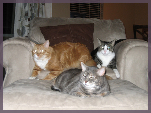
Our life was perfect with these 3 cats for several months.  Then Sunny very randomly contracted feline panleukopenia.  We immediately brought him to an emergency hospital and we fought the virus for two weeks.  After several surgeries, blood transfusions and Sunny telling us he had enough, we made the decision to send him to kitty heaven.   Our little family was devastated.

Several months went by while we mourned Sunny.  Macky would cry non-stop every night looking for his brother.  Mowie wanted (and still wants) nothing to do with him.  Needless to say, Macky was keeping us up every night.

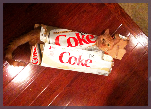
One day, I stumbled upon a cute little orange guy on Petfinder and I fell in love — but we weren’t ready or we thought we weren’t ready.   Then we discovered he had CH, a neurological condition that affected some of his motor skills (he has a very mild, barely noticeable case though).  After doing some research, we found out that CH is caused by the mother having panleukopenia — better known as the virus that Sunny passed away from.  We took this as a bit of a sign and adopted Darwin (see photo as Coke box above)

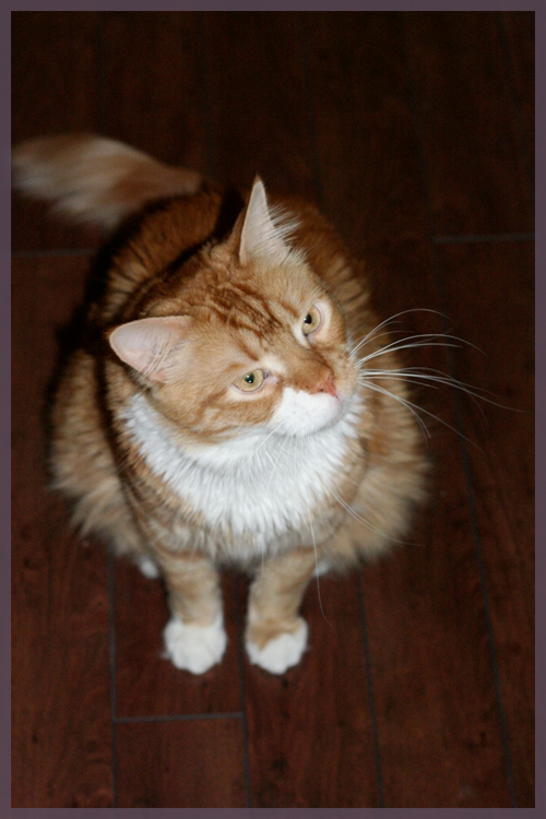
Here is a picture of Sunny in all his fluffy orangeness.  Before getting sick, Sunny was 19lbs.  He was the original big guy in our family and we credit him with keeping an eye out for Darwin through his cancer.
You don’t eat meat?  I don’t understand how anyone can not eat meat! LOUD NOISES!

We’ve been pretty much meat-free for several years now.  However, whenever I’m with Brian (SongMeanings’ partner) I end up eating meat like the time we were in Philadelphia and had cheesesteaks and also the time in San Francisco when I ate, well, something that was meat.  He’s that friend you have from high school where whenever you’re with them, you turn into your high school self.  (Oh come on, you know that How I Met Your Mother episode.)  But in my case, I eat meat.  But Rebecca hasn’t strayed.

I don’t consider myself a vegetarian.  I just do my best to not eat meat.  And you know what?  I actually enjoy it.  Sure I miss the comfort foods we grew up with, but otherwise, it has made me try new meals and dishes. I actually wrote a series of posts for a while with vegetarian recipes, you can read them here.

Well folks, that is it for me for tonight.  I know Rebecca has several other questions she wants to answer so stay tuned… whenever she wakes up!

Shock Value 2.0

7 Comments

Posted by Michael, September 26th, 2011

Remember that dramatic painting we did for office 1.0?  And remember when Rebecca mentioned we might be taking the office upstairs once we have children 5 years from now?  Well, I’ve been thinking a lot about that room lately mainly because office 1.0 isn’t entirely functional.  It’s not the organizing-super-productive-making office we thought it would be.

Now, I’ll never paint stripes again.  (Right.  I once said I would never paint ever again, period.)  But the one thing I do love about office 1.0 are those paint stripes. Every time I walk in here, I’m still sucked in by those dramatic stripes.

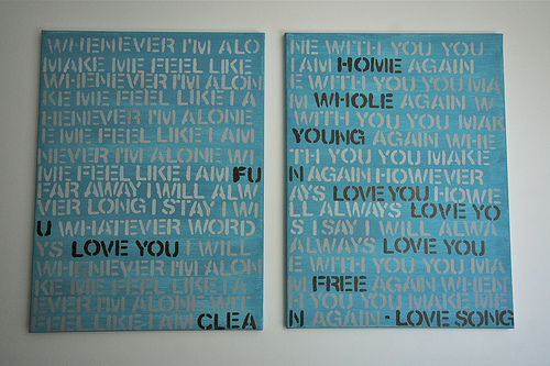
So how can we do this for office 2.0?  No, no, no more stripes for me.   But instead, let me take you back a few weeks ago.  Remember when we said we wanted some lyric wall art for the dining room?

(via First Time Fancy)

Why not do this for office 2.0?  But in more of an office 1.0 dramatic way?

Imagine, if you will, that the image below is the wall that I’ll work off of.  Blank empty space, all we did was paint it a dark gray (thanks photoshop!).

Nothing special, I know.  But what if we did something big?  Like snakes on a mother-f’n plane big?

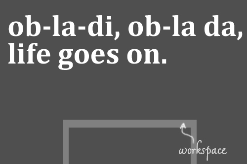
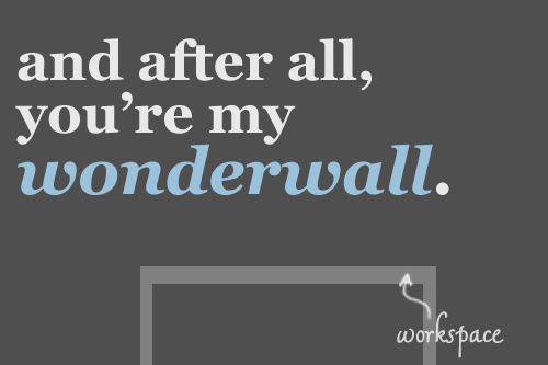
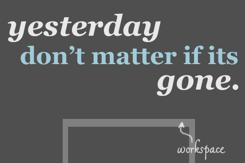
Being that we’re all about lyrics, why not put some on the wall?  I’m talking huge, though.  Like span the entire wall huge.

I’m not sure of the typography or spacing that we’ll need and want, but what I do know is that this thing has to be dramatic.  But not so dramatic that we’ll grow tired of it.  Because honestly, I’m not painting office 2.0 again.  Unless of course I can just use the paint-bucket tool.

Oh, look what I did there!

I know once we do move forward with this project, it will take us a year to decide on the lyrics.  I know I want something inspirational, but nothing too corny.  It needs to be something that I want to look at every day.

Without googling, mad props to whoever names the lyrics above.  They’re mad easy, yo.  

Pushed To The Side

11 Comments

Posted by Rebecca, September 22nd, 2011

Two weekends ago, we got our new sectional and we were ready to ditch the coffee tables turned makeshift end tables we’ve had. Instead of putting them at the ends of the couch where they belong, we immediately wanted them out of sight.

Over the weekend, Mike’s brother and his wife had a yard sale so we dropped the tables off there to get rid of them. But… no one bought them. Whaaamp whaaamp. So we’ll be getting those tables back but they will not enter the house, they’re going straight to Goodwill 🙂

The room is less cluttered, though we still have to pick up a round ottoman and move the rectangular one upstairs. However, I have nowhere to put a drink! Our laptops also stay on the floor when we’re not using them, so we need side tables asap!

My only requirements are dark and round. I would like something with a glass table top since we’re not great with chasing after people with coasters, but it’s not mandatory. We’re not even sure if we want one or two of them, since we like the idea of putting a console on side of the couch (though that would force us to relocate Macky’s area for the second time).

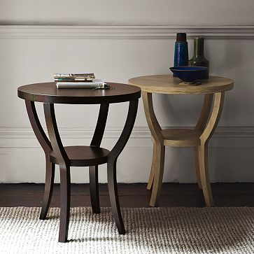
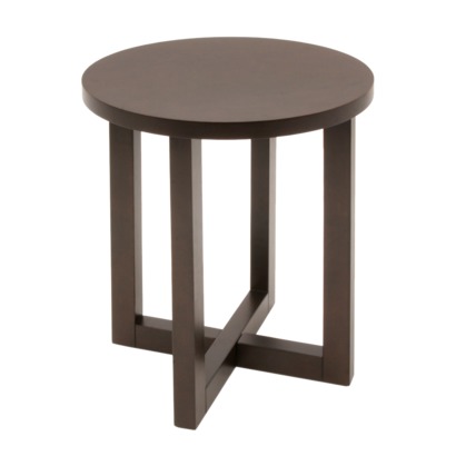
I rounded up (literally?) some of my favorite dark wood end tables hanging around the internet. Yay lists!

1. Silhouette Nightstand– West Elm, $149

I spotted this when I stopped in the store a few weeks ago. I love the design of it, though I’m not sure if the smaller shelf is large enough to be practical (like, for my laptop when I’m too lazy to walk it to the office).

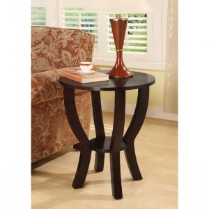
2. Chloe Round Wood End Table– Target, $74.99

I like the price and the design, though I’m not sure how practical those legs are for sliding near the couch. Target normally has some good, affordable furniture options so it’s a visit we’ll have to make in person.

3. Halo Ebony Side Table– Crate & Barrel, $299

Mike and I have liked the whole Halo line since we created our wedding registry at Crate & Barrel over two years ago. It meets all of my critera, though it doesn’t have a bottom shelf. However, that price is a deal breaker. Ouch.

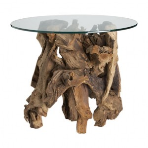
4. Driftwood End Table– Crate & Barrel, $399

If I had endless amounts of money and cats that wouldn’t chew or try to commit suicide with this thing, I would totally want it. How cool is it?? I have a thing for driftwood lately, with my turtle and urchin in the family room. But, I’m going to keep it a little more practical around here 🙂

5. Lewis End Table– Overstock, $104.99

This table is a less expensive version of the first one I listed, so it pretty much has the same pros and cons as that one.

I would like the check out HomeGoods over the weekend and see if anything unique jumps out at me. While I like these tables, I can’t say I’m in love with any of them. But I’m thristy and need somewhere to keep my drink and my phone. Function trumps form… or at least my picky-ness 🙂

A Little More Personal

3 Comments

Posted by Rebecca, September 21st, 2011

So I’m back in school for the semester and by the time Wednesday rolls around, I feel like I’ve worked a full week. My Tuesday night class is until 10:30, which means I don’t get home until 11:30 and I stay at work until almost 7 to leave straight from there. Darwin is also still getting chemo, which we’ve been doing on Wednesday afternoons, since our usual Tuesday evening appointments aren’t possible now. By Wednesday night, I usually collapse on the couch and need a time out.

I’m still trying to find a routine with everything. The spring semester was the hardest for me in content and workload, but my hardest class was on Mondays so I knew that all day Sunday was homework day. One of my online classes this semester has assignments due every Sunday and Monday, but they require participation and the topics aren’t posted until Tuesdays. So I can’t work on them on Sundays because starting late reflects on your grade and I have a strict no homework on Saturdays policy. See the above blurb about being over the week by Wednesday and well, last week I violated my no homework on Saturdays and ended up doing it then. This means I lost my part of my project day this past weekend.

I do best when I know, for example, Saturday is house project day, Sunday is homework, I blog Monday-Thursday and Friday is a day off. I just need to adjust my routine a little and figure out when to do the discussion posts for my online class sometime during the week. Which probably means collapsing and taking a nap after work on Wednesdays is no longer an option 🙂

Since we’re on a personal note, as you know a few weeks ago I went to a blogger meet up with Emily Henderson. While there, someone said I looked familiar, but I knew immediately that they couldn’t possibly know me since there are zero pictures of me on my blog. No, that partial landscape picture with me as an inch tall in my About section does not count. I’ve also been talking to Mike for a while about making some design changes around here (which will be slow coming, see above paragraphs about being stretched thin :)) Then even after that, I read one of those tips for bloggers things (sorry, I don’t remember where I saw it) where one of the tips was to have a picture of yourself so readers know who is talking to them.

You know where I’m going with this right? Photo shoot time!

Note: I put the awkward in Awkward Family Photos.

First it was just me…

Then Mike threw some of the entryway accessories in there to look more designerly…

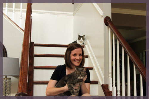
Then, I added a prop! (okay she added herself. That’s Mowie, we call her our forgotten child. She’s not usually photogenic, though a wonderful cuddle muffin that sleeps with me nightly)

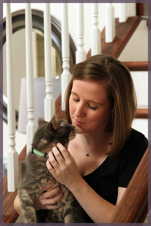
Then we kissed. Because she loves her momma.

Then someone decided he wanted to be included, but didn’t really want to be a part of the lame photo shoot. So he decided to photo bomb, as usual.

I look like I have a cat on my head. That would not be unusual around here…

I already changed up my picture on Twitter because let’s face it, I got married almost 2 years ago and the wedding picture was getting old. I haven’t decided which one to use on the blog yet, but like I said it requires that Mike and I sit down together and figure out how we want this thing to go. I haven’t mentioned this in a while, but Mike single handedly designed this entire blog and I don’t speak graphic design or code or any of that. Our usual process involves him handing me a piece of paper and telling me to draw it out so he can design it. Most of our changes are small and gradual since well, this little blog is at the bottom of his web design totem pole. Occasionally I lose my patience and add things on my own, but I have no time to learn new tricks these days. So progress will be small, gradual, baby steps (though you may have noticed some small changes here and there already). How did a post about being busy turn into talking about more things we want to do? 🙂

Anyone else have a full plate and just itching to blog and paint mirrors? Spill it.

Copyright 2010 - 2011. The Lil House That Could. All rights reserved.