Archive for February, 2012

Chevron in the Nursery

6 Comments

Posted by Rebecca, February 16th, 2012

Confession: I love chevron. Many people think is a trend or played out, but I have yet to put it anywhere in our house and I’ve been itching to. What better choice than the nursery?

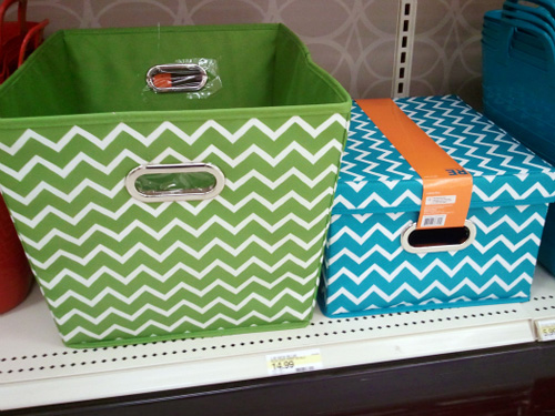
I started this weekend, with one of these green and white chevron storage bins from Target…

(via I Heart Organizing, because it’s not available on the Target website and it’s dark out and we have no light in the baby’s room :))

We have some small stuff we’ve received for the baby and I wanted a place to keep it all. I picked up one of the green bins pictured above for now, plus 2 blue ones for our laundry room (which I have yet to load with stuff). I also have 2 of the clear plastic containers from this line holding some non-maternity tank tops and what not I’ve grown out of in our closet. I like the clear ones in the closet because I will eventually need them again and I can easily see what each one is holding. Anyway, back to the chevron talk!

I’m not sure if the green bin will go with what we’ll end up doing in the nursery, but I figure it’s versatile enough to throw in the playroom or another room if it doesn’t work out. For now, it’s perfect to help me feel organized, but I do know I plan on using some sort of chevron in the room… most likely in the form of curtains.

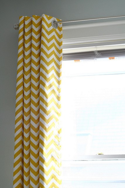
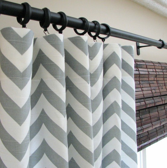
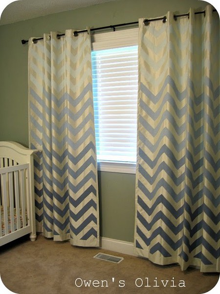
I have long had a love of chevron curtains. I feel like they’re perfect for a baby’s room, as they’re classy and stylish with a hint of fun.

(from Flickr via Pinterest)

(from Castle Creek Designs on Etsy via Pinterest)

(from Remodelholic via Pinterest)

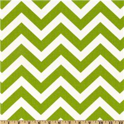
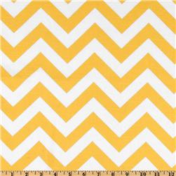
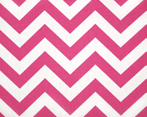
I’m planning on buying some fabric and making my own, either by breaking out the sewing machine or using no sew tape and curtain rings. I want a smaller scale chevron, so painting would be tedious. Plus there are so many great chevron fabrics out there that I can’t really go wrong! Premier prints are some of my favorite patterns…

(via Fabric.com)

(via Fabric.com)

(via Fashion Fabrics Club)

(via Fabric.com)

We decided to forgo making our own cribskirt and instead went with a bedding set, so I feel like I need to add in a good mix of other fabrics to make the room look less matchy matchy. Plus the baby isn’t going to be using the bumper or the comforter, so in reality, if the cribskirt isn’t working for us, it will be easy enough to change out. Therefore, I don’t want to marry the rest of the room to the bedding, since it will be grown out of so quickly and can be so easily changed. As Mike told me, we shouldn’t make the room too “baby” since we want a room the baby will grow into… and they’re only babies for so long ::sniffle::. I figure some bold, yet simple chevron is a good way to make the room last longer!

ps- Mike spent last weekend and half of this week in San Francisco, so we didn’t have any nursery progress to share this week 🙁 But we’re anxious to get back to work this weekend! Aaand I may have already ordered some fabric samples…

I Call This My Gray Period

4 Comments

Posted by Rebecca, February 13th, 2012

I haven’t slept well the past several days. Darwin had a urinary tract infection, on top of kidney failure, which led to many unpleasant accidents that may have occurred on my lap…while I was sleeping. I’ve been peed and puked on way too many times before this baby has arrived. I know, TMI, but I’m just being honest here 🙂 Throw in a super active baby lately and when I finally have the opportunity to sleep, someone is waking me up from the inside. Needless to say, I’m a zombie and I spent the weekend cleaning and organizing some baby stuff that we’re borrowing from my brother and sister-in-law. I felt very accomplished and feel much better about life (and Darwin started some antibiotics and has been accident free, whew!) But, it leaves you with a post full of randomness. Because that’s what’s going on in my head today!

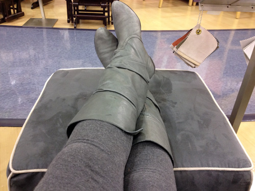
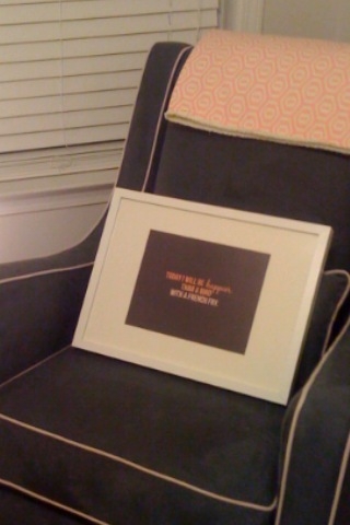
On Friday, Mike and I returned to Babies R Us to test out the glider I wrote about last week. When I kicked my feet up onto the ottoman, I noticed something…

Yes I was wearing gray leggings and gray boots while sitting on a gray chair. At least now I have a good idea of the color and I might be carrying around my leggings as a swatch. Speaking of swatches, in the background are all of the other colors the chair comes in. I think we’re going to go for it, I’m just scoping out coupons and hoping for a Presidents’ Day sale.

Next to the picture of my gray boots on gray pants on gray chair on my phone is a picture of my gray cat…

Isn’t she pretty? She’s not often seen around here, as she normally resorts to a mean face when the camera comes out. Plus she’s often in the shadow of her two special needs brothers, though she gets plenty of loving. She’s my constant sidekick (sitting with me at the moment). I wonder if she knows how chic her gray coat is these days?

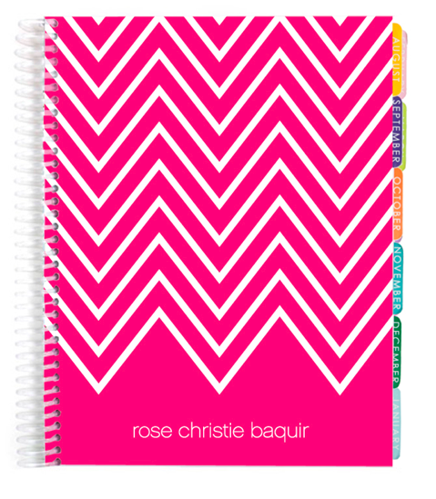
Something the complete opposite of gray (okay it’s rainbow), is my Valentine’s Day gift from Mike. I’m trying to organize my life (hence the mass decluttering I did this weekend), so Mike bought me this Erin Condren planner in the multi-colored chevron pattern…

(via Erin Condren)

Yes I know it’s early, but the box it came in was so obvious that I knew what it was when it arrived today. I wanted one last year, but this adorable video won me over.

YouTube Preview Image

(via Erin Condren)

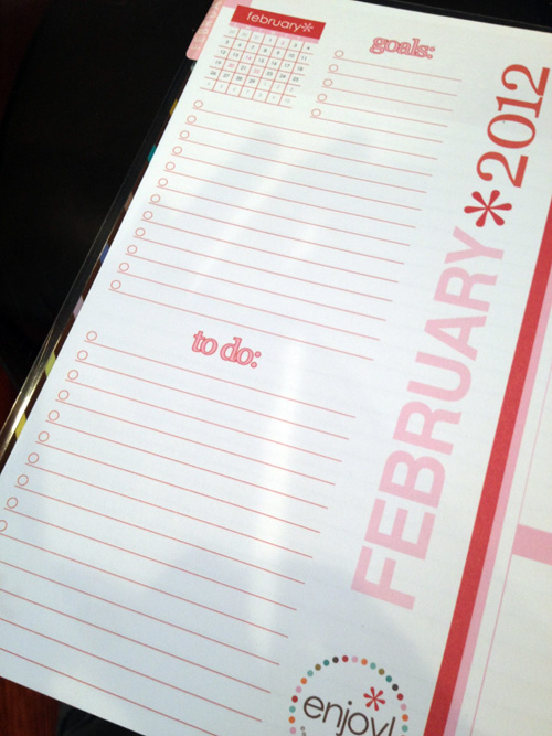
I am already in love with it and it’s only been a couple of hours. I normally carry a small planner, a notebook for blog ideas and I end up sticking post-its all over my notebook/planner/wallet (yes I have a habit of sticking to-do lists to my wallet!) I figured this is only going to get worse as I juggle baby, work, blog and life, so it was time to upgrade my shabby little Target monthly planner I’ve been using for years. It comes with folders for stray papers and blank pages with each month, but possibly my favorite part of my new planner? The monthly and weekly goals and to-do lists…

The only way I managed to keep my head on straight through school, doctor’s appointments, work and blog posts in the fall was constant planning. I pretty much plan out my weekdays from 7am until 10pm in order to get everything done. I try to save Friday night for down time (but it usually turns into running errands) and weekends for doing projects. This planner has days broken into morning, day and night so I no longer have to cram things into one little box that I normally wrote on the top and bottom of. Michelle from Ten June also has one and she gave a nice little rundown of the features here.

Already filled in for this week’s goal? Install crown molding and baseboards in the baby’s room. Thanks to a 3 day weekend coming up, I’m feeling optimistic. Or maybe it’s the stickers with my name on them that came with my planner that made me feel a little brighter? 🙂

Stationary Chair vs. Glider

18 Comments

Posted by Rebecca, February 9th, 2012

I hope you guys aren’t going to get sick of nursery posts anytime soon because with a little more than 12 weeks to go, we’re about to kick it into high gear!

From very early on in my pregnancy, I was pretty certain we weren’t going to buy a glider. I had never seen one that worked for me aesthetically and I get motion sickness in even hammocks. Combined with the hefty price tag, I didn’t think it was worth buying something we wouldn’t enjoy.

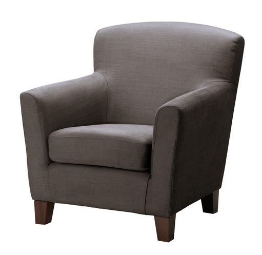
One day a few months ago, we walked into Ikea and spotted the Ekenas chair.

(via Ikea)

We were both drawn to it and were all like “oooh pretty”! where can we put it! We immediately thought that with it’s gray/brown color, it would be perfect for the nursery (we’re planning on mixing some grays and browns, but that’s for another post). At $299 it is cheaper than most gliders, so we made a mental note and moved along.

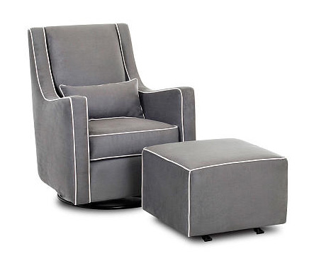
Fast forward 5ish months and we’re in Babies R Us. From across the room, I spot a chair that catches my eye. It’s not anything like the other rockers/gliders around it and I bee line to it. Mike agrees that it was a sexy looking chair. Yes, I just used sexy in a post about nursery furniture. Okay and Mike didn’t say it was sexy, those are my words. She was the Lacey Glider by Klaussner Furniture in a dark gray color.

 (via Babies R Us)

I liked the color, but I was uncertain about it in our room. I’m still uncertain about it in our room, but it goes back to the mixing browns and grays post I’ve been meaning to write for a year. It’s a very dark gray (some may call it charcoal, slate, whatever) and does come in 7 other colors, which were no where near as fresh and modern looking as this one. I also wasn’t really sold on the contrast piping that was a little off white. I think if it were a lighter gray and without the piping, I would have been sold from the beginning.

What did sell me was the gliding. This chair is slimmer than the Ikea one so it would take up less space. Plus the ottoman moves with the chair (as it does with most gliders) and this was super appealing to me. In a perfectly designed room, I would just get the chair and pair it with a round, patterned ottoman to offset the square, matchy-matchy ottoman that comes with the set. But most of the appeal of this chair was that MY BODY AND FEET MOVED AT THE SAME TIME!  I tried to think of what would be best for the baby and what we would get most use out of so we can use it for future babies. Oh and the price tag was huge as expected, $399 for the glider and $199 for the ottoman. Once again, the ottoman was a selling point so cutting out that cost wouldn’t really be worth it for me. I left the BRU scratching my head (I learned in a graduate school class that mommies refer to Babies R Us as BRU…and I learned this while I was pregnant and had no clue…I’ll promise I’ll never call it that again…)

Of course when I got home, I did a little googling. Little did I know, that glider has been used in nurseries I have seen and liked… it just never stood out to me like it did in the store.

First, I realized that it was the glider pictured in this photo on Little Baby Garvin, a blog I found from Pinterest because I like to compare my giant belly size to other people…

(via Little Baby Garvin)

She hasn’t yet revealed the full room, but I like the chair paired with pink. No, that’s not hinting anything about the baby’s gender, I said earlier that I want a chair that can be used for all of our babies and is neutral 🙂

Google also led me to this picture from Turning the Tables….

(via Turning the Tables)

How fabulous (and very nicely gender neutral) is this bedding she chose?

(via Turning the Tables)

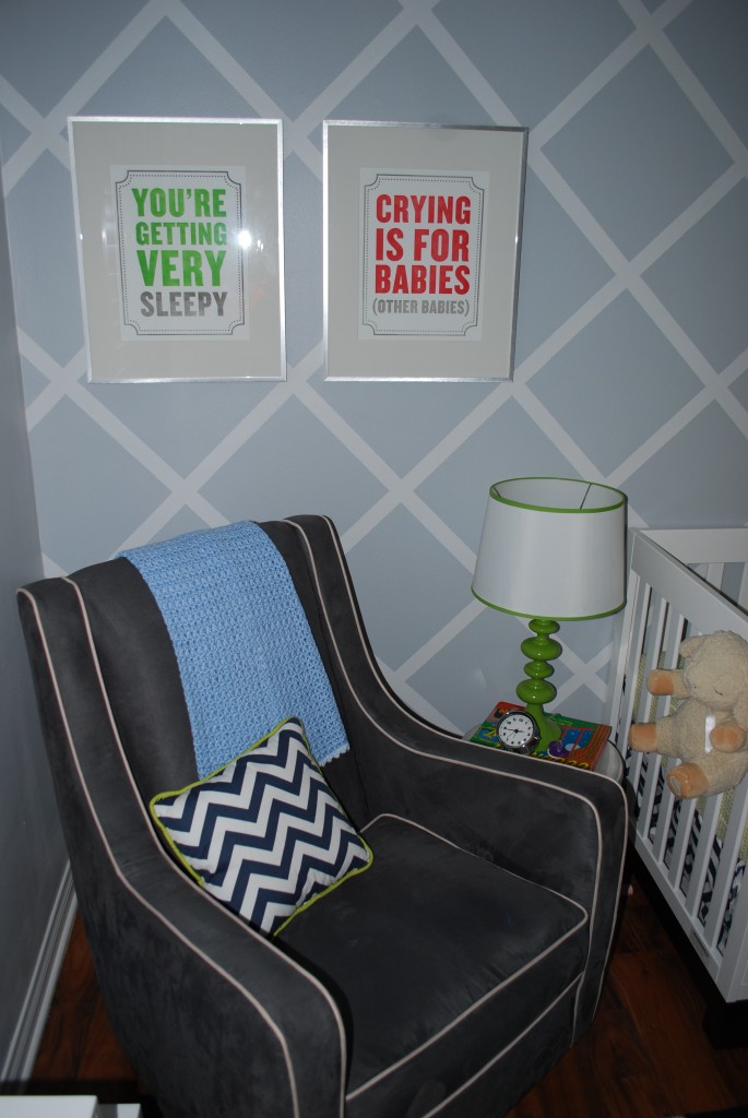
And then there are a couple of nurseries featured on Project Nursery that have the Lacey glider and prove that it goes well in boys’ rooms as well…

(via Project Nursery)

(via Project Nursery)

I’m still thinking about it, but I think we’re leaning towards getting it. I would cover the lumbar pillow (and possibly the ottoman) with some fabric to make it less of a matchy set. I’m thinking of putting it in one of the corners against our new paneled wall, which will be painted white, so the darkness of the chair won’t be so bad. We’ve been saving our pennies and we’ve been fortunate enough that most of our big nursery expenses have been generously paid for by family members, so splurging on this one big purchase wouldn’t be too bad. And I just read on one of the other blogs that the chair does go on sale and someone got it for $279… not bad at all.

I’ve found so many amazing blogs through designing this nursery and I could seriously get lost in Google for hours. When I’m unsure of something, I Google it and almost always find a small blog with amazing style. This is why I love blogs (and Google for sending me to them)! I am also very thankful to have my own little space here to share my random ramblings and ideas… and for all of you for listening 🙂

How to Create a Paneled Accent Wall

20 Comments

Posted by Rebecca, February 8th, 2012

Yesterday I shared how we decided on and planned out the accent wall for the nursery. Once we had made all of our major decisions, we headed to Lowe’s to buy some wood. We decided to use solid wood for this project, despite the fact that nearly every tutorial I saw used MDF. We figured since we were being neurotic about having a solid wood crib, it would be a little counterproductive for us to line the entire wall behind the crib with MDF. While MDF would have been the cheaper option, we decided to buy some 1×4″ whitewood boards. We liked the chunkier look of a 4 inch wide board and it was most cost efficient to go with the 1 inch depth. We picked up 10 foot pieces and it ran us about $75 for more than enough wood. Which we paid for with a gift card from Christmas 🙂 But if you wanted to save money you could certainly use MDF boards, or have a sheet of MDF cut for half the price. I’ve also read of some people using lattice or furring strips, which we were open to using but the sizes didn’t work out for us.

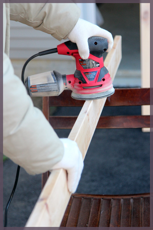
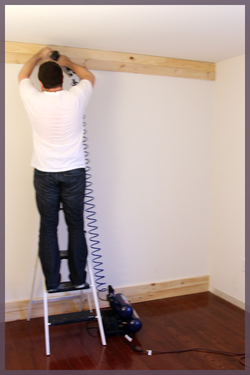
Once we got the boards home, we sanded the fronts and sides with our new sander, which we also got for Christmas.

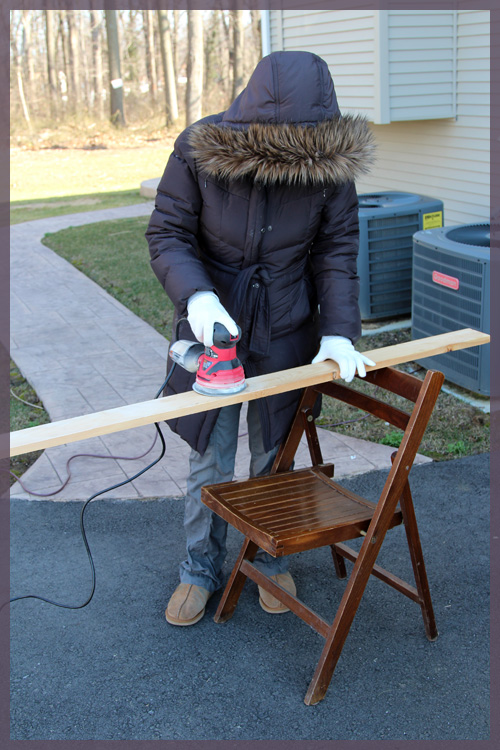
Since we bought decent boards and were picky about the ones we chose, we didn’t have to do too much sanding and used 220 grit paper. We mostly just got rid of the rough edges and made sure the fronts were nice and smooth. I even got to play with the sander, since it was extremely user friendly.

I have no face! The only way you can tell it’s me is by the exceptionally tight non-maternity jacket I am still squeezing into. Every week I think it will be the last for that coat and a few weeks ago my belly actually busted the zipper. But I managed to get the zipper back on track and continue to squeeze myself into it. Anyway, despite the fact that I had a dust mask and goggles nearby, the new sander sucks up the dust as you sand so there really was none. Pretty fancy 🙂

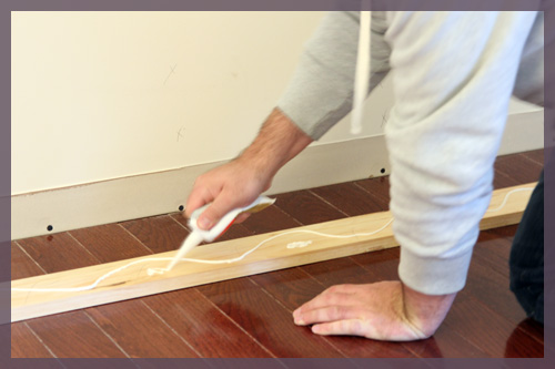
When we researched how to get the boards onto the wall, we saw that most people glued and nailed their boards. Knowing that our solid wood, 1 inch thick boards were larger and heavier than most other tutorials, I thought gluing and nailing was our best bet. But then we were back in the VOC predicament… here I am, the lady who emailed Baby Appleseed to ensure that the crib we wanted did not use glue that contained formaldehyde and I’m about to glue a bunch of boards to my nursery wall. After a little visit to the Liquid Nails website, I saw that their “Projects” product worked on wood and molding and came in a low-VOC, green certified, no toxic fumes and safe for use around children, version. We picked some up and put some on each board.

Yeah we have no light in the baby’s room so we’re working with a single Ikea lamp for the time being. Please forgive the poor quality pictures until we buy a light fixture.

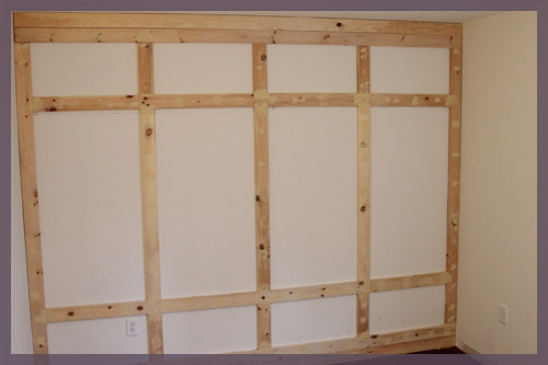
We started with the bottom boards, then added the top boards. We made sure that these 4 boards were nailed into studs and well, we nailed the hell out of them. We wanted to make sure that the weight of the 10 foot board was not going anywhere.

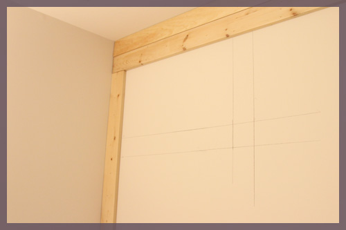
Then we added the two boards to either side.

At this point, as you can see in the picture above, we decided to trace some boards to make sure our interior boards would work. We ran into 2 very minor issues… #1- there is an outlet on the wall and #2- 1×4″ boards are actually smaller than 4 inches wide.
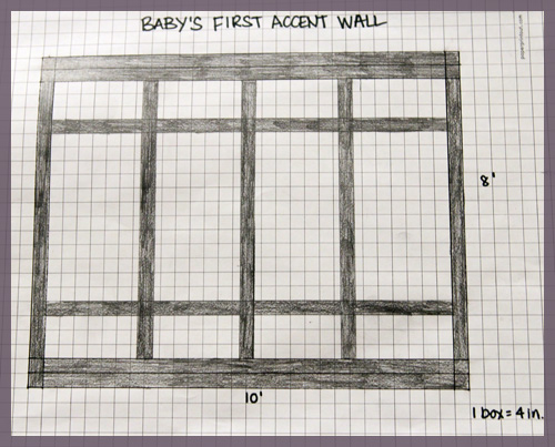
In my sketch, the two interior horizontal boards are 12 inches from the frame. The vertical boards are 24 inches apart.

There is an outlet in the bottom box on the left hand side, about 12 inches from the bottom board. We easily fixed this by making each of the horizontal boards 13″ from the frame rather than 12″. Like I said, easy fix.

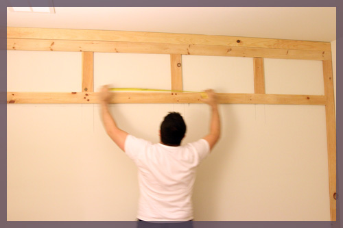
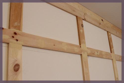
For the vertical boards, since we couldn’t nail them into studs, we decided to make those our “choppy” pieces that we cut in 3 pieces to keep them lighter. We kept the horizontal boards (which could be nailed into multiple studs) whole. Since we did this, it was easy to cut the 3 top small pieces and adjust them to compensate for the slightly thinner boards. Here’s Mike measuring before they were actually attached to the wall…

I think each gap ended up being around 25 1/4″. Then we just lined up the remaining vertical boards to make sure they matched the top ones, leveled (plumbed?) them, and we were done!

Mike filled all of the seams and nail holes with wood filler and it’s just waiting for a sanding.

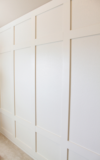
Then we need to add crown molding to the top, base boards to the bottom, caulk, prime the boards, paint… and we’re done!

Really this wall was incredibly easy and took us such little time. We spent maybe 2-3 hours on it Sunday before the Superbowl, which allowed us to sand and install the boards for the outside frame. Then last night we spent another 2-3 hours sanding and installing the interior boards and that was it! Oh and included in that is the time I spent sitting on a chair eating Thin Mints….

Planning an Accent Wall

4 Comments

Posted by Rebecca, February 7th, 2012

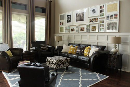
I’ve mentioned before how our nursery plans included some sort of board and batten. I’ve always wanted to add some molding to the nursery and I was inspired by Emily’s living room makeover this summer…

(via Decorchick)

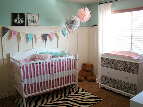
I figured we’d do something a little higher than chair rail height like hers, but all the way around the room. Here are some nursery versions I’ve seen around Pinterest…

(from Sweet Tea Paper on Etsy via Pinterest)

 (from The Fickle Pickle via Pinterest)

I’ve always liked this idea because I figured it would add a pop of white for me to put dark nursery furniture against. It would also allow me to add some darker colored walls than I would if the more classic molding was not there. But, I didn’t want to do a simple vertical board and batten and I liked the design of Emily’s wall in the first picture the most.

When I started to think about how I could make our board and batten more interesting, I realized that the multiple lines in the first design, the part I loved the most, would get kinda busy and clashy with the crib and straight dresser. I debated whether or not to keep my board and batten as the usual horizontal boards on top and bottom with vertical lines in between, but I didn’t want it to compete with the wainscoting we started to add to our entryway, which will be right outside of the baby’s room. I didn’t want our house to have a molding identity crisis!

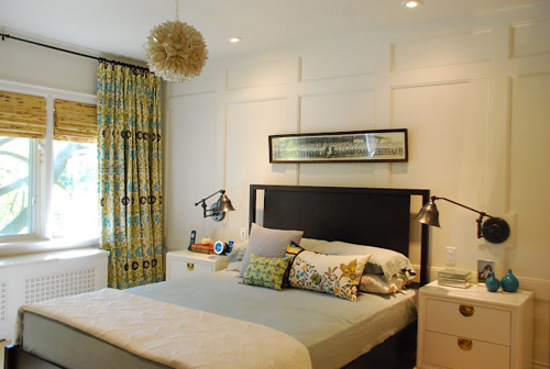
So just recently, like the past week or two, I started thinking more about keeping the molding limited to just one accent wall, like Rambling Renovators did behind their bed in their master….

(via Rambling Renovators)

And Emily did in her stepson’s room…

(via Decorchick)

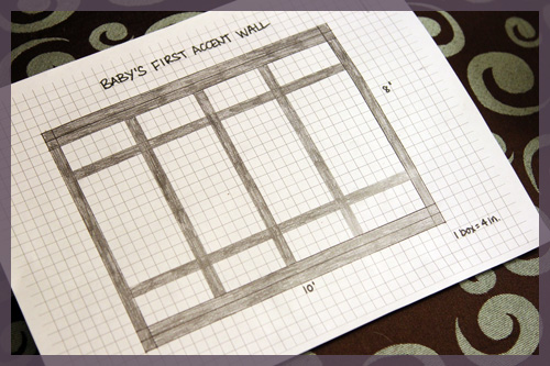
I thought this would be a great solution because the dark, curved back of the crib would fall in between all of the horizontal lines of the molding, so they would not compete for attention. The problem was that I didn’t know how many boards to add or how it would look in our room. I’ve used both Photoshop and Google SketchUp before, but I am not used to either and they take me for.ev.er. So I decided to just sketch it out by hand to give myself an idea of what design we could do.

Then I got a better idea… I could draw it to scale with some graph paper!

First, I printed off some free graph paper from PaperPrintout.com. I used the 1/4″ sized squares so that I could draw it to scale without it being too small or too big. The wall we are adding the molding to is 8’x10′, so I counted each box as 4 inches. So I needed my wall to be 24 boxes by 30 boxes on my graph paper.

After a trip to Lowe’s and some googling, we decided to use 4 inch wide by 1 inch thick boards for our molding. I’ll explain that decision a little later, but then each board in my sketch took up either a row or column of boxes. I kept it as easy as possible 🙂

Note that the 3 vertical boards in the middle ended up being smack in the middle of a column of boxes! Just my luck, though still easy to sketch 🙂

The top and bottom boards are doubled- there are two 4 inch boards stacked on top of one another. This is to integrate 5.25 inch baseboards and crown molding with the rest of the room. Once those moldings are added, the seam between the 4 inch boards will be covered and we can still have higher and beveled crown and baseboards on the other walls of the room. We wanted to ensure that everything sat nice and flush.

Having everything drawn out made the process so much easier… and it took me a whole 5 minutes to draw. And spoiler! We finished putting the boards up tonight and will snap some pictures and share more details tomorrow 🙂

Copyright 2010 - 2011. The Lil House That Could. All rights reserved.