Smoked Oysters
Posted by Rebecca, January 27th, 2011
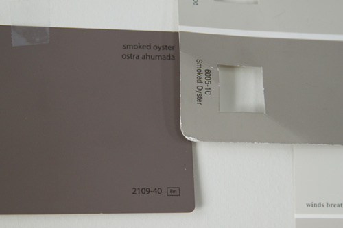
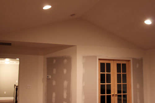
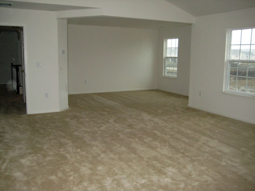
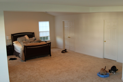
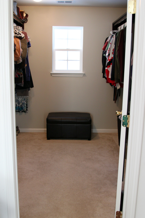
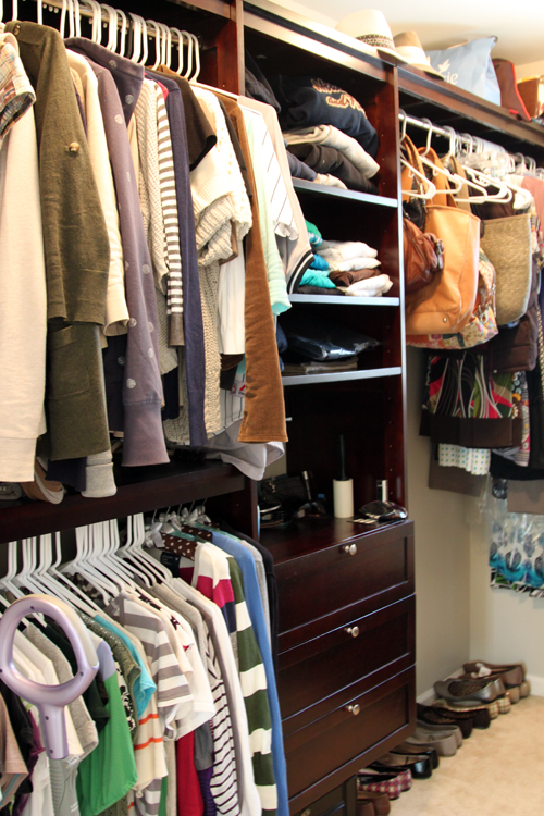
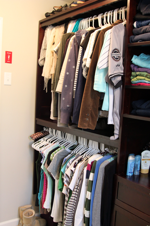
Remember that funny paint swatch we put on the wall a few weeks back? Well we’re working on finding a light taupe color for the master bedroom. I mentioned in my walk-in closet post that I liked the color in the closet, but I didn’t remember what color it was. Well I was looking in my drawer full ‘o swatches for some ideas when I figured out why I thought I no longer had that closet swatch…
On the left is Benjamin Moore’s Smoked Oyster. We used this color in our condo bathroom and loved it, so we’re planning to use it for our office. It’s a nice purpley/gray color. On the right is Valspar’s Smoked Oyster, it is a taupe color and we used the color one shade lighter for our walk-in. So when I looked for the closet color, I spotted this Smoked Oyster and assumed it was the old bathroom color. I even looked at it and was like wow! It looks so much more brown than purple in the new house! Then I found the other Oyster and realized. How weird is that?
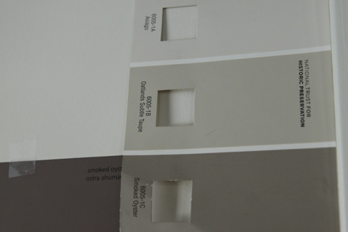
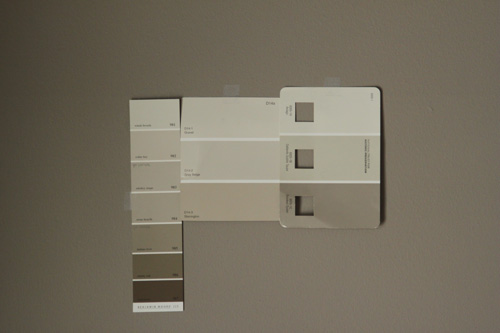
Anyway, here’s a sampling of my taupe swatches…
I am still leaning towards the closet color, which is the center swatch, center color. It is called Oatlands Subtle Taupe by Valspar.
I’ve learned, mostly the hard way, that neutral beige type colors have either a pink, gold or gray undertone to them when they get light. Our first painting attempt in our condo resulted in a pinkish beige hallway. Our second painting attempt resulted in a goldish beige hallway. Then we moved here and wanted taupe and well, we ended up with a silvery hallway. Which is fine because even though it’s not what I imagined, I like it anyway. And gray is like the new brown right now!
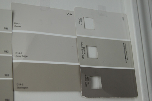
Not following me? Here are some more pictures and how I narrowed the colors down…
My other potential front runner was Gray Beige, the middle color in that middle swatch there. But looking at the colors surrounding it, the Gravel and the Stonington, it’s reading a little peachy to me. I still want to stay in the taupe family.
Here are some more Benjamin Moore colors which were actually contenders for the living/dining room and entryway. I even wrote “get sample” on two colors way back when. I’d probably go with the second one down for the bedroom, the Cedar Key, and it’s just not rubbing me the right way.
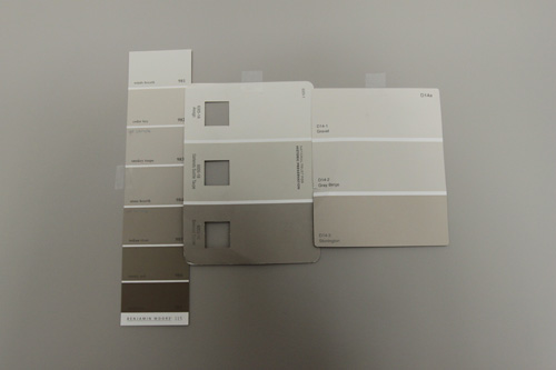
For a little perspective and to make sure these colors were more of a taupe than our hallway turned out, I taped them against one of those walls. The wall color is Benjamin Moore’s Himalayan Trek…
Sorry about that shadow, that’s my noggin in the way. But now are you seeing the peachyness of the swatches on the far left and far right? (Sorry I wasn’t consistent with my arrangments!) Once again, my first choice is on the center swatch (the one with the little squares cut out) and the center color.
And just for good measure, I hung these on the dining room wall. I love this taupe color and wanted to see how these colors measured up. It is Benjamin Moore’s Waynesboro Taupe…
I moved my favorite one again! But its on the right (with the little cut out squares still). This definitely reassures me that the Oatlands Subtle Taupe is the way to go. I’m thinking of doing our little sitting room area a darker more dramatic shade, so I think the ooother Smoked Oyster may just be it!


