Archive for the ‘inexpensive design’ Category

a very Ikea weekend

5 Comments

Posted by Rebecca, October 3rd, 2010

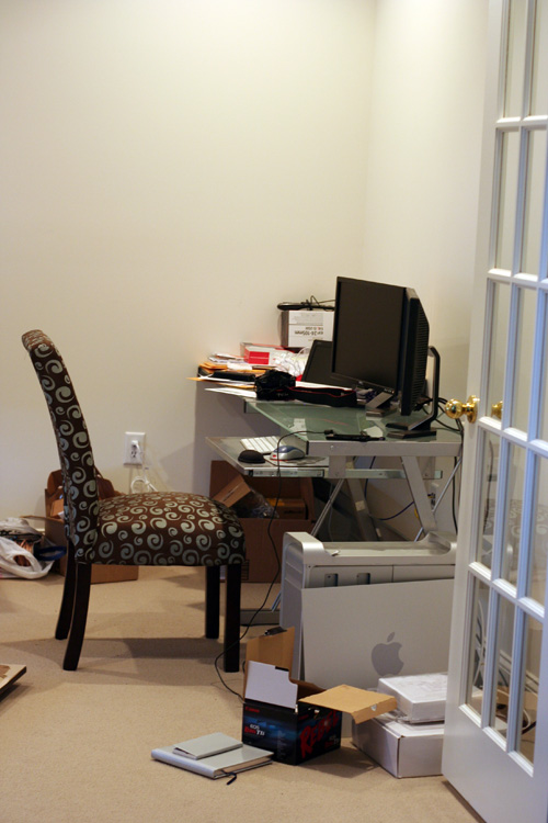
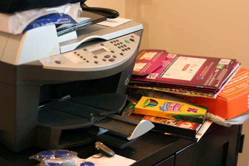
This weekend we planned to enjoy the fall weather, maybe take a few pictures locally and get some small things done around the house.  On Saturday morning, I walked into our office to print something for my sister and law and this is what I saw…. (cue the horror movie music)

Not that I didn’t know this catastrophe existed, but I guess it’s just been bothering me more lately since this is my desk….

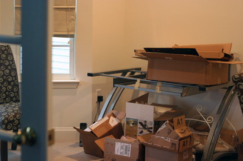
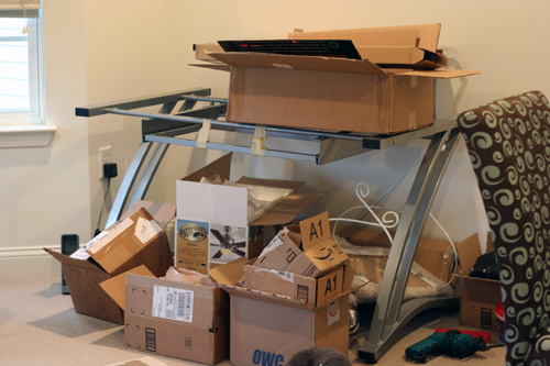
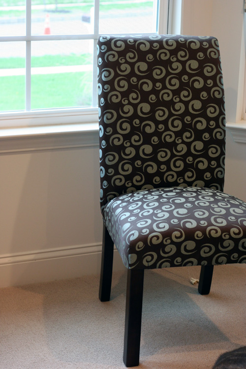
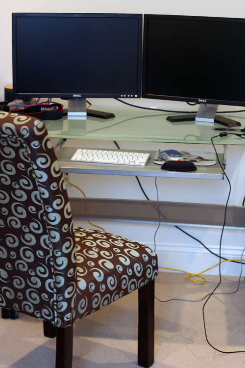
Yes.  There is no glass in that frame.  And my husband has been using it to store a bunch of empty boxes from things we have ordered.  So since my physical ‘desk’ is that, I tend to take my laptop and sit myself here, in the timeout chair…

While Mike sits here….

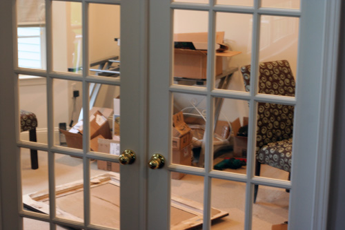
Now we’re both to blame for this mess.  The office has been a very neglected portion of our house, mainly because we had such big dreams for it.  The room is probably my favorite in the house… it has the bay window, french doors and loads of light.

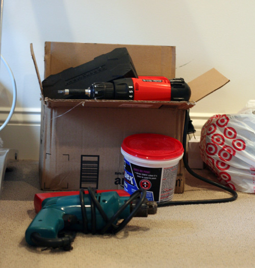
Because it has doors that can be closed, it has become the “keep things from the cats” area.  So it stores tools…

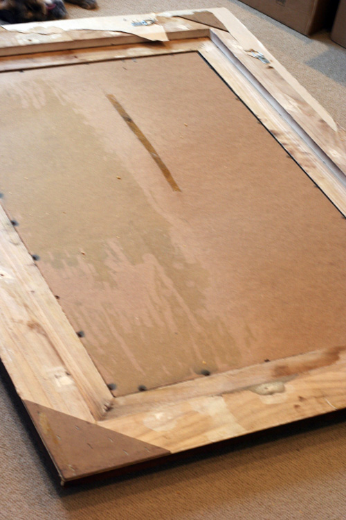
And failed design projects, such as this large mirror from our condo I planned to hang over the fireplace…

And as far as storage, we had this piece of furniture left over from our condo, which I am fully to blame for cluttering…

Now the office is mostly Mike’s space, he spends hours in there each day so I wanted to make sure he got the dream office he always wanted.  I use my laptop and got used to having it on my lap while we lived with my in-laws, so I didn’t miss having a desk until I recently went back to school and started this gig.  Our original idea was to someday do custom cabinetry, where Mike could have an L shaped desk and I would get an extended portion of one end.  We even went so far as to sit down with some cabinet designers at Lowe’s who came up with this…
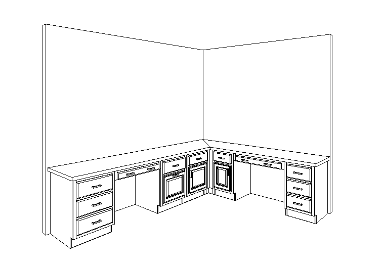
We planned to do some dark wood cabinets with my favorite countertops, the Eco ones from Cosentino.  However when we got the estimate, it came out to be a small fortune.  But we knew it was an investment and with all of the work Mike does, we wanted it to suit our needs.

Turns out we had another pressing project to put our money towards.  Next week we will be getting hardwood floors in our upstairs hallway and bedroom, as well as adding a wall up there.  More about that later, but we decided to put the office project on the back burner for a year or so.  Until yesterday morning…

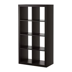
When I was attempting to print, sitting in my timeout chair, a little light blub went off in my head.  I knew we needed more storage, so I told Mike that we should go to Ikea to get one of the Expedit bookcases I’ve loved for years.  I knew it would fit nicely inbetween our desks and we would get some much needed storage.

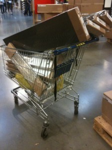
So Saturday afternoon it was off to Ikea.  We picked up this bookcase and headed home.  Fast forward to this morning, when Mike had the idea to just get two desks, which would face each other.  We bounced ideas off of each other and ran back to Ikea.  We found a bunch of things that would work for us, but they were out of some of the pieces.  So we ran to yet another Ikea, the third location in 24 hours.  Luckily they had everything we needed to finally organize our office… for a very small fraction of the price of cabinetry.

I’m actually more excited about this spontaneous change of plans then I was for the original one.  I’m always up for a challenge and in the end I guess we took our own office advice…

To be continued, office!

mailbox makeover

2 Comments

Posted by Rebecca, September 30th, 2010

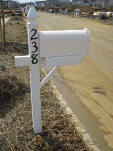
The very first project I tackled after moving in was to do something with this awful mailbox the builder gave us.

I just could not stand the font of the numbers and the fact that both the mailbox and the post were white. Where’s the contrast? So uninteresting!

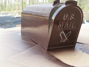
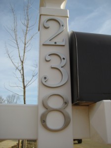
So I decided I was going to paint it and change the numbers. Lucky for me, Lowe’s had some house numbers in a font that I actually liked for a couple of bucks each (I am extremely font-picky and swore I’d have to order some online). I also picked up a can of spray paint in a dark brown color to match our doors and shutters.

First, I unscrewed the very dirty mailbox and wiped it down (the thing was covered in orangey construction dirt). I also popped off the red mailbox “flag”….

Then I started to spray paint…

First coat….

Then second coat…

Then time to dry….

I then unscrewed the existing numbers to put on our pretty new ones!

There are no pictures of me with drill in hand 🙁

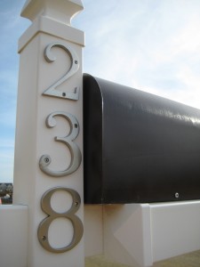
Then I snapped the red mailbox “flag”, arm thingy back on, screwed the mailbox back into place and tada! The finished product!

It was such an easy and inexpensive fix that helped our mailbox better compliment our house and stand out from the neighbors (we all got the same one). It is now very easy to give directions since we’re the only people on the block with a brown mailbox!

ps- These pictures were taken back in April, before we had sod, neighbors and when the street was very much a construction zone. I plan on posting an updated view from the street soon, since the final house on our street was recently completed 🙂

pps- I’m linking this post up to Thrifty Decor Chick’s spray paint party. Go check out some good spray paint makeovers!

making wall letters for kids, part 2!

1 Comment

Posted by Rebecca, September 21st, 2010

Okay, round 2! If you need to start at the beginning of this post, click here.

When I chose the paint colors, I decided to use two shades of pink and two shades of brown to compliment the bedding.  I figured this was the best way to make sure the letters went well with the color scheme of the room. Had I used only one shade of each, they may not have meshed as well, especially since I didn’t have anything with me to compare pinks and browns.

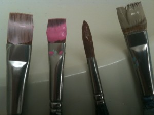
I started off with 4 paint brushes, one for each color…

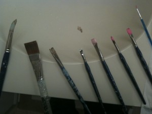
…but ended up using many more

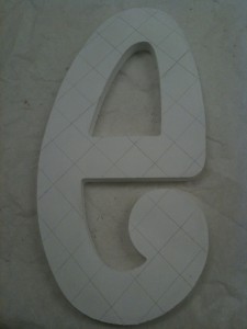
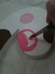
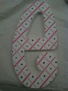
I tackled the middle letter, the one of a kind ‘e’ first.  I am very thankful I decided to use this pattern only once, because it was very, very challenging. But I secretly enjoy an artistic challenge. I first drew lines with a pencil and ruler…

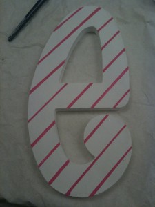
From this point, I thought I could just freehand a pink line over the pencil line.  WRONG.  Not only is it ridiculously hard to paint a line thaaat straight, but the pencil line could be seen through the paint.  I had to resort to taping on either side of my pencil line, basically eyeing the width of the resulting line.  The 2 lines at the very top, the shaky crooked ones, were freehanded.  The rest is being done with scotch tape…

And completed with first set of lines (the darker pink)…

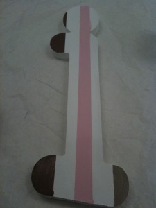
It’s not perfect, I know.  And believe me, looking at it now is bothering me.  But you live and you learn, so I set it aside to dry before I crossed those lines with the lighter pink lines.  I then moved on to the simpler patterns.  My favorite, the block of colors, separated with a white line (using scotch tape)….

Then the large dots, which were done freehand…

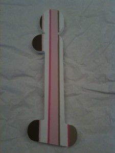
And the lines of random widths…

But wait! I could only fit 3 colors on that little i! So I decided to line each thick line with a thinner line in a contrasting color…

Then I went back to that dreaded ‘e’ and crossed the dark pink lines with the lighter pink lines, using the tape-over-pencil-marks method I used earlier. I then free handed the pin dots in alternating dark and light brown with a very small, round paint brush…

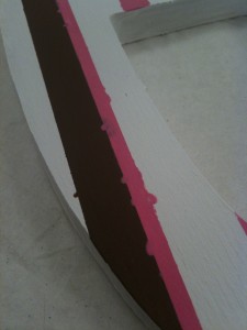
And that that is how I did my 4 main patterns. The end? Oh no, it was not that simple and pretty. Most of the letters that were taped (all but the large polka dot patterned ones) had some form of bleed through such as this…

To touch this up, I used the smallest brush in the history of the world, pictured here with my ring finger for perspective.

I then removed all of this tape…

…and touched up as needed. Note, this is the part that requires a very steady hand and a LOT of patience. First I fixed up the brown lines… (may be shaky due to the fact that I was painting with 1 hand, holding iPhone with the other)

Then I fixed up the pink…

And finally I touched up areas that needed to be covered in white for the final product!

As a whole…


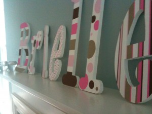
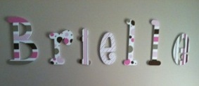
And here is the picture my sister in law sent me, after they hung the letters up in baby Brielle’s room.

Though this is a great way to save money, it is not without it’s downfalls. Each letter takes me about 2 hours from start to finish, over several days. Maybe it’s because I have OCD and wanted to make sure they looked professional, but I wanted to put that warning out there to anyone to attempts to make their own. But in the end, I couldn’t be more proud of how they turned out. Not just how they turned out, but that they came from the absolute bottom of my heart, and that Brielle will have something special, made just for her, to hold on to for the rest of her life. Or at least until she’s a teenager and decides she hates them…. but that will be okay 🙂

making wall letters for kids, part 1!

6 Comments

Posted by Rebecca, September 15th, 2010

Now that my niece has been born and her name is officially released to the public, I can share my little art project.  I decided to make letters for the wall above her crib. Once I knew her name, I was able to begin my planning!

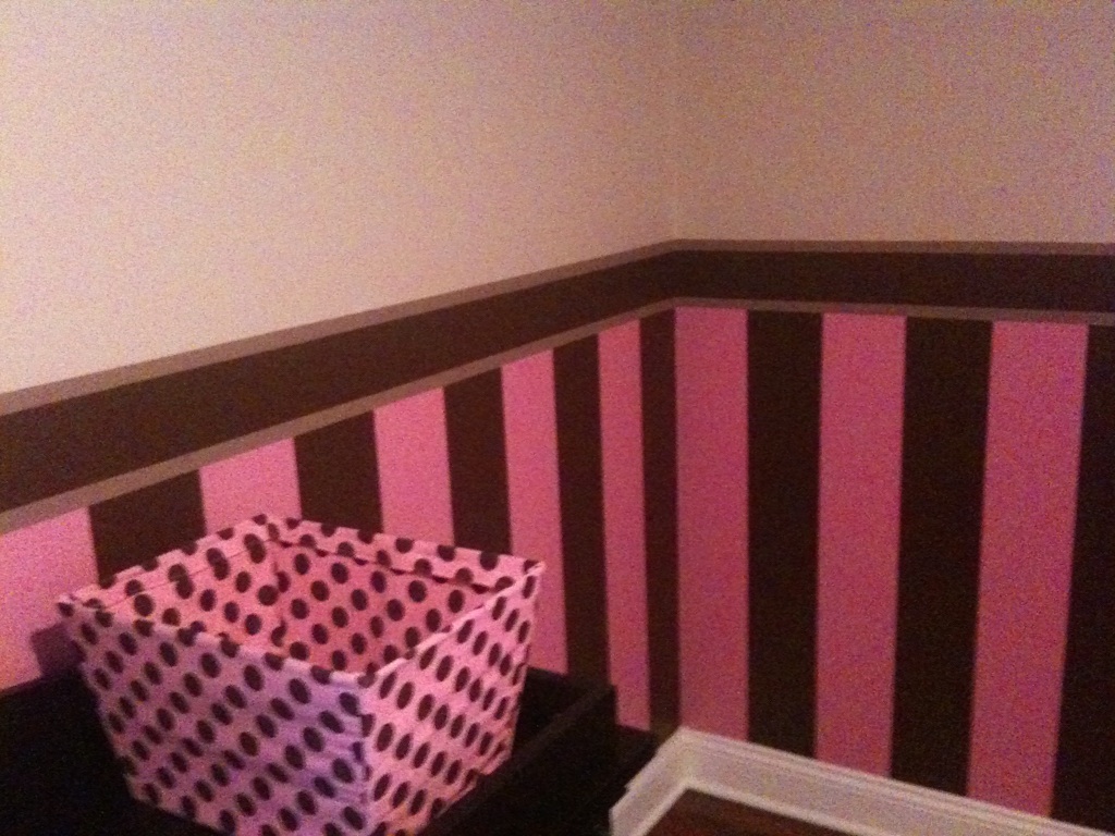
I’m sure most people are familiar with the painted letters trend that has been around for several years (If you are not, here is an example from JCPenney). When creating them, I take many things into consideration… the color of the room, the bedding patterns and the overall vibe. I knew that my brother had painted the walls and that the bedding was Trend Lab’s Maya set.

The paint job…(done with my brother’s blood, sweat and tears)

and the bedding….

So I knew that for a font, I wanted something fun and childish, perhaps cartoon-like.  I’ve used a variety of websites in the past, but this time I ordered the letters from WoodenLetters.net.  I was very impressed by the amount of fonts they offered since I have font OCD. I was also happy with the variety of letter sizes.  I was EXTREMELY impressed with the quality when they arrived.  They were thick, sturdy and clean cut.  I think that if I decide to paint letters again, I will use WoodenLetters!

One more point that I forgot, I always use unfinished wood.  Why you ask?  Can’t you buy letters painted?  Yes you can, but I prefer to paint the base coat myself so that there are no surprises as far as how my paint is going to stick.  I tape a lot, use pencil, erase and touch up, so I want to make sure that I am able to do that successfully.  Plus it’s cheaper.

The font I chose is called Whimsical and I decided on 10 inch letters.  The baby’s name! ::drumroll:: Is Brielle!! Actual names are another thing I take into account.  I usually judge fonts by their lowercase ‘a’, but since her name doesn’t have any, I didn’t have to worry about that.  The ‘i’ looked cute so I was sold.  As for the sizing, the letters from this particular site are sized based on the SMALLEST letter.  I was originally going to do 12 or 14 inch letters but then the ‘B’ would have been ginormous.  The downsize meant that the letters cost me a minimal price of $2.50 each.
So I had my font, size, atmosphere… time for a design plan.  I thought of some patterns that may go with the nursery…(please excuse my colored pencil, elementary school quality, sketches…I was not planning on sharing these)

There are 7 letters in Brielle, so I gave myself the following options:

a) 2 patterns, alternating every other letter

b) 4 patterns, with 3 of them appearing twice and the middle letter having a one of a kind pattern

c) 7 different patterns

Taking into account the variety of patterns in the bedding, I knew I needed more than 2, but not as many as 7, as to not appear too busy.  So choice ‘b’ was the winner!  I wanted a mix of striped and polka dot patterns, so I went with….. top row, the 1st and 2nd patterns and the bottom row, the 1st pattern.  I decided to do the pattern in the 1st row, 4th position as my one of a kind pattern since it had both stripes and dots.  I decided to do all patterns on a white background, since the walls are a light tan where the letters would be, yet the molding in the room is white.

I then sketched out the order of the patterns to see how each one looked on each letter…

Then it was finally time to start painting! I used simple, inexpensive acrylic craft paints.  I first painted all of the letters (front, back and sides) with 2 coats of white paint over several days.  The letters are unfinished so it takes a decent amount of paint to get that solid white look.

I stuck them on a box to get the edges, look at that thickness!

Once the letters were all white, pretty and dried, I got ready for the fun part… colors!

Since this post is long enough, I will get to how I painted the patterns in part 2! So suspenseful! 🙂

shower style

1 Comment

Posted by Rebecca, July 22nd, 2010

I threw my sister-in-law a baby shower this past Saturday.  I have a little niece on the way, so she requested a pink and brown theme.  I did not want to just pick up those horrid decorations from the party store, so I had to do a little thinking as to how to pull this off.  I have never been in charge of shower design and I have definitely never thrown a baby shower!  I had some ideas in mind, but the execution happened on a whim and with some prayer.

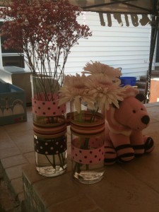
shower1I bought these inexpensive vases (in 2 heights) at Michael’s and wrapped them in various ribbon from Walmart.  I taped the ribbon on since I planned to give them to guests to take home afterwards.  The stuffed lion is from Home Goods.  This display was on the corner of the bar and the mirrored version (with stuffed giraffe) was on the opposite corner.  I forgot my camera that day and am limited to the pictures I snapped with my iPhone to send my husband.

shower2

shower3

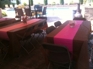
There were 4 rectangular tables which I covered with brown plastic table cloths from Party City (they were a whole $2!).  I then put either a hot pink or light pink “runner” made with another plastic table cloth that was folded (or not completely unfolded).  I knew I wanted this look and it was so incredibly easy to get.  I feared I would have to trim table cloths, so I bought a few extras.

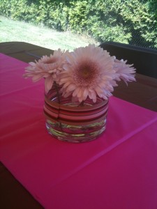
For the flowers I followed a simple rule: either all one bloom or all one color.  I also made sure all of the leaves were removed from the stem and that the blooms sat just nicely above the rim.  I don’t like filler flowers, mixed bouquets, or long stems… but that’s just my personal taste.  I used some shorter vases also from Michael’s, wrapped in a single strand of ribbon and alternated between hot pink flowers on the pale pink runners and light pink flowers on the hot pink runners.  My flower philosophy goes something like this… I am no botanist, I don’t know what 75% of them are named, but I know what looks good.  The hot pink/white baby’s breath things I have never seen before, but I loved.  They really looked great paired with the light pink daisies.  All of the flowers came from the “build your own bouquet” section of my local supermarket.  They were 3 bouquets for $10.

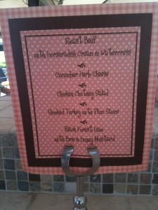
shower4Overall I was very happy with how everything turned out, despite the fact that I have no photos of the gift table.  The caterer even contributed these adorable menu signs for the buffet….

shower5I gave most of the vases to guests at the end of the shower, but the lower ones would be a great storage solution for a little girl’s hair accessories, jewelry, etc…especially with some fun ribbon attached!

Copyright 2010 - 2011. The Lil House That Could. All rights reserved.