Posts Tagged ‘Benjamin Moore’

Our Paint Colors

52 Comments

Posted by Rebecca, October 13th, 2011

A couple of weeks ago when I planned to do a post with some frequently asked questions, I wanted to include a section for all of the paint colors we’ve used in our house. Mike ended up taking over the post for me when I fell asleep, answering his own version of our FAQs. Since the #1 question I am asked is what paint colors we’ve used in various rooms, I figured it was about time the question received it’s own post!

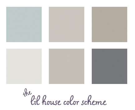
Here are all of our current paint colors displayed together. Some observations…

1. I never realized how well all of our house colors blend together. Since I didn’t really have the whole house in mind when choosing colors, I’m surprised that they all work well! I especially thought the dark gray was bolder and less expected, but even that blends in well.

2. The two middle colors on the top and bottom rows do not look that similar in real life. Or maybe they do? Mike says they do. I think the top color is more brown based and the bottom one is more of a true gray. At least I’m consistent in my choices πŸ™‚

Here is our color breakdown, by room.

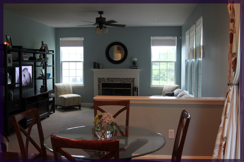
Family Room & Kitchen:

Wedgewood Gray

Benjamin Moore HC-146

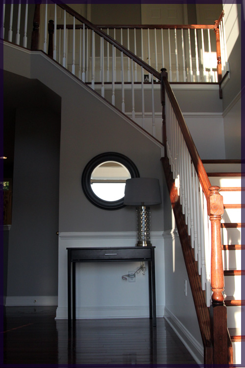
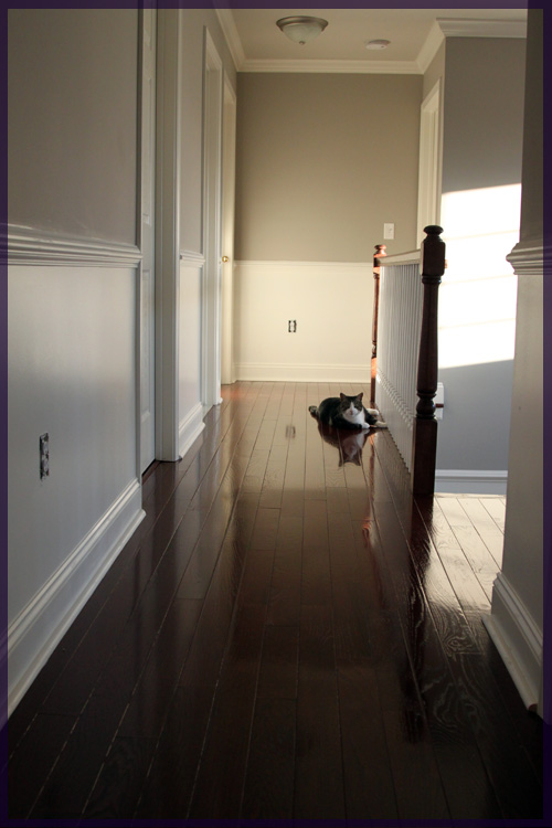
Entryway & Upstairs Hallway:

Himalayan Trek

Benjamin Moore 1542

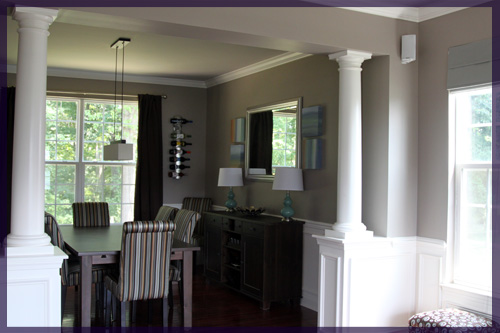
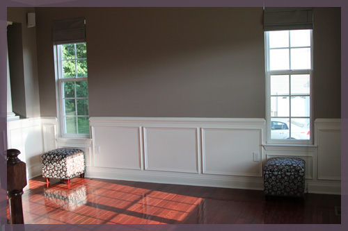
Living Room & Dining Room:

Waynesboro Taupe

Benjamin Moore 1544

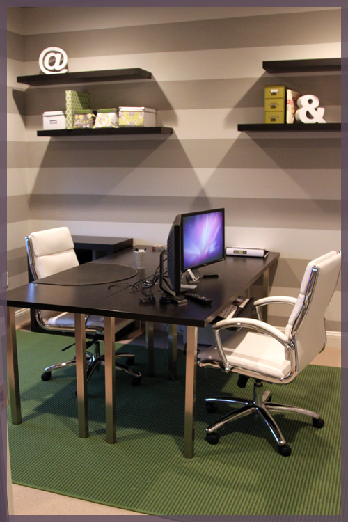
Office:

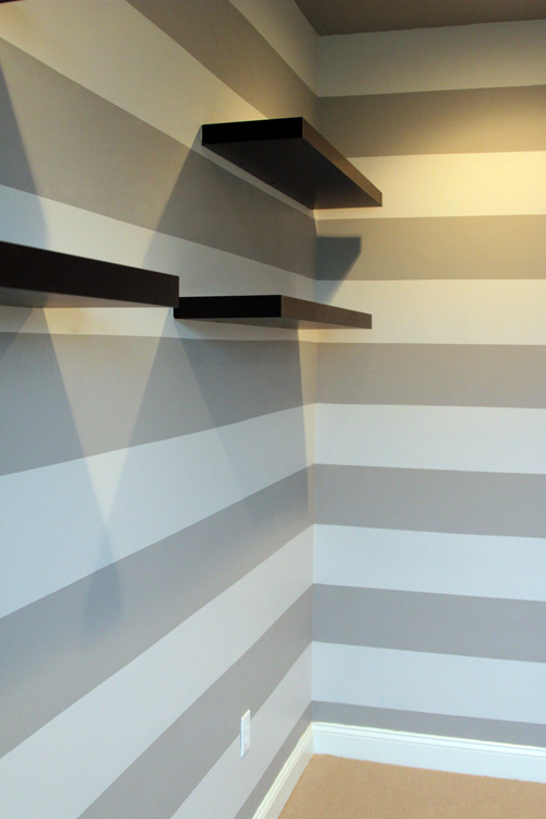
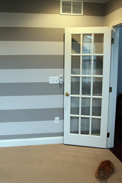
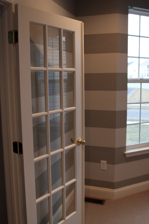
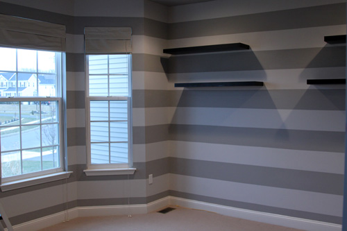
Light Stripe- Gray Ghost

Olympic D17-2

Dark Stripe- Silver Fox

Benjamin Moore 2108-50

(we color matched the dark stripe to Olympic, but it is nearly identical to Olympic’s Silver Dollar D17-3)

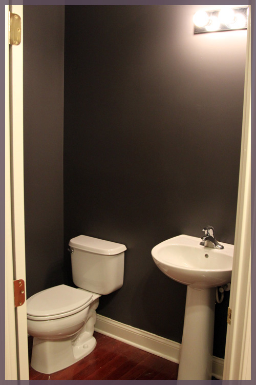
Powder Room:

Cracked Slate

Olympic D44-5

You’ll notice that our recent paint projects have been done with Olympic’s no VOC paint. We try to keep things as toxin free as possible around here since Macky has seizures and we don’t want any unnecessary triggers. Plus those smells just aren’t good for anyone πŸ™ The Benjamin Moore paints we used were for rooms we had professionally painted before we moved in so Macky wasn’t exposed to those fumes (we couldn’t paint our two story entryway on our own so we hired it out).

I hope this post answers all of your paint questions in one spot. I plan to update it as we paint more rooms down the road. I’ll also add this post to our top navigation bar for easy access πŸ™‚

A Day of Labor

6 Comments

Posted by Rebecca, September 5th, 2011

Remember that project I mentioned last week? Yeah well, I didn’t work on it at all this weekend. Mostly because it’s labor intensive and not a Mike job, so it’s a lonely one. With a spare day in this weekend, I woke up and decided to tackle an entirely different project, yay! Because really, what is this blog if it’s not full of unfinished projects and decorating A.D.H.D.?

With a little twisting of the arm, I talked Mike into painting today. He HATES painting. Did I ever tell you that we started our chair rail project because Mike didn’t want to paint the powder room? Yes, he would rather start a major molding project than paint a very small room. Well today, his time was up. The powder room it was!

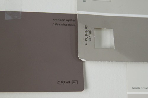
We had a spare can of Benjamin Moore Smoked Oyster that was color matched to Olympic’s no VOC paint. We originally bought it to paint our office stripes but our lighter stripe ended up being darker than we wanted so we made that our dark stripe and picked a new light stripe, sidelining the Smoked Oyster. The Smoked Oyster was actually the color of our spare bathroom in our condo and I always loved it. I’ve been itching to incorporate it into this house and I figured the small powder room was the best choice.

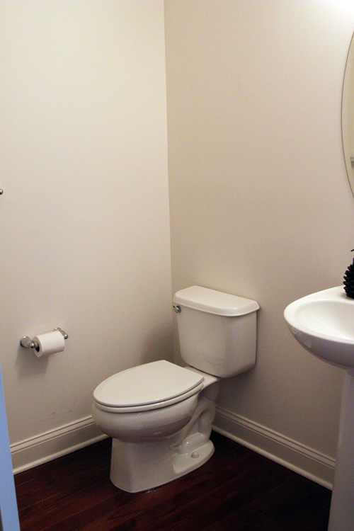
First, I guess I should introduce you to the powder room?

It’s not much (and very hard to take pictures of), but it’s a decent size for a powder room. My major pet peeve with this room is that the towel bar is to the left of the toilet paper holder in this picture. So you wash your hands at the sink, then have to run across the room for a towel? No bueno.

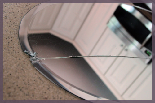
We knew that towel bar was coming down, so we removed it (along with the toilet paper holder, to paint. I wanted a quick and easy day project, so we didn’t plan to replace anything else at this point…just get some color on the walls and do the rest gradually. We were going to remove the mirror because we were planning to replace it eventually and we didn’t want to paint around it, but upon unscrewing… it broke.

Seven years of bad luck…or less time with an awkward, oval shaped mirror. No biggie, it’s not like we get dressed in there in the morning.

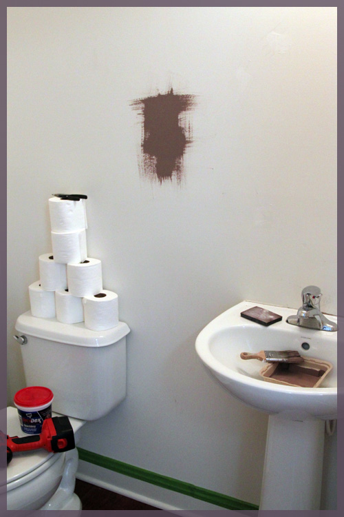
Then something else happened, I put the Smoked Oyster on the wall and… it was fugly.

(ps- if you follow me on Twitter you already know about the T.P. teepee. Mike stacked it on Thursday night in an attempt to liven up the space? It was removed before painting)

It had this red violet tint to it that I don’t remember it having…

I was going to live with it, but Mike hated it and I pretty much did too. I didn’t want to have to repaint again in a few months, so off to Lowe’s we went (it was 5:30 tonight, btw)

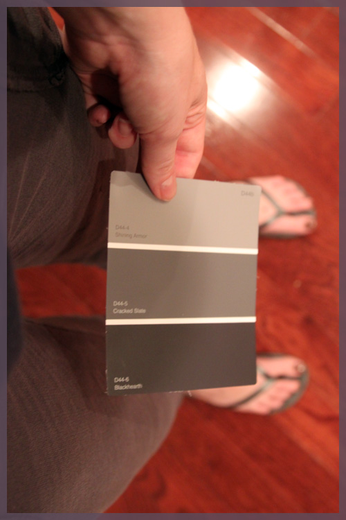
I knew I wanted something dramatic, so we decided to go with a dark gray color. We picked it straight off of the Olympic selections in a matter of minutes. I later realized that my choice matched my pants and flip flops…

It’s the color in the middle- Cracked Slate.

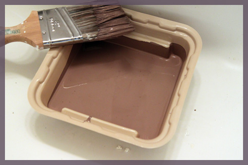
Yes, it’s incredibly dark and dramatic (I think the picture above makes it appear even darker than it is). I’m still having my doubts, but I secretly love my nearly black bathroom. Mike literally just finished rolling (he was still rolling when I started writing this) so there won’t be any after pictures just yet, but here it is during my cutting in…

I know, some of you just fell over. I painted a small room with no windows nearly black? Yes, yes I did. And it’s not black, it’s very hard to capture on camera. It’s a satiny navy blue-ish, deep purple-ish, very inky color. I normally never tape and just free hand it, but I thought a dark color was risky. Turns out taping made more of a mess and we have a lot of touch ups to do. Somehow our to-do list has grown to include crown molding, since a dark wall meets white ceiling is near impossible to do flawlessly.

I think this room will be one that is transformed with accessories. I love the dark color now, because I can see it and I know where I’m going with it. I didn’t plan (at least at the beginning of this day) to paint it so dark, but I plan on adding glossy white accessories, possibly large matted frames and pops of yellow. Somehow my little 2 hour Labor Day project has turned into a room overhaul complete with a stretching of my limits πŸ™‚

ps- I start grad school again tomorrow and I have class on Tuesday nights until 10:30… which means I won’t be home until 11:30. I will do my best to get you some after pictures tomorrow!

The Office Stripes

117 Comments

Posted by Rebecca, February 21st, 2011

If you follow me on Twitter, you know what I was up to this weekend. Never have I thought of an idea on a Wednesday, blogged about it on a Thursday, started it on a Friday and finished it (mostly) on a Saturday.

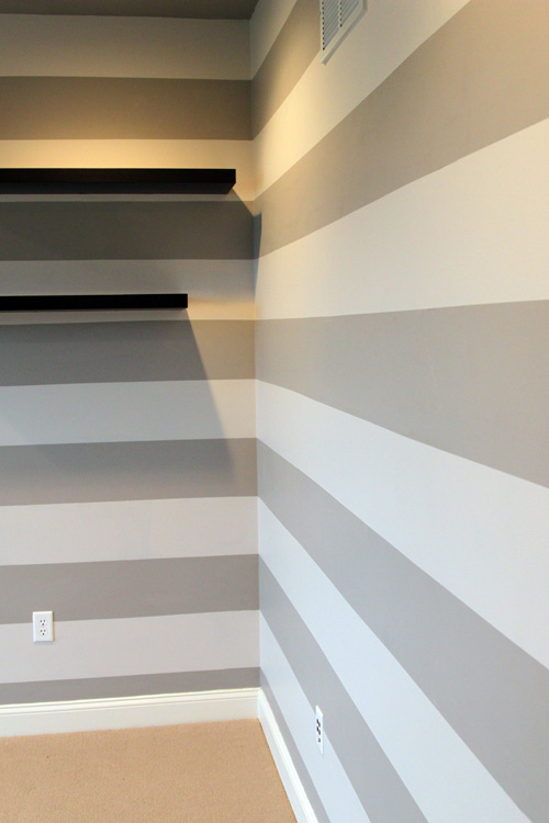
Needless to say, we were a little spontaneous this weekend and decided to do this…
The temperatures were in the high 60s here on Friday, so Mike and I planned to take the afternoon off from work to do something fun. At 11:50, we still didn’t know what that was and we had an email exchange that went something like this..

Me: What do you want to do today? NYC, beach, stay local, find some waterfalls, Ikea, couch shopping, outlet shopping?

Mike: I don’t care, it’s your choice

Me: You know if it was up to me we’d paint the office

Mike: I’m game.

We did grab some lunch and take our time to relax, but by 4:00, it had begun.
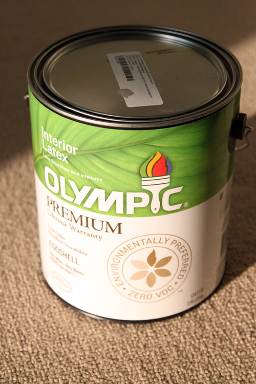
I decided to go with my beloved Smoked Oyster by Benjamin Moore color matched to Olympic’s no VOC paint. We chose one shade more gray and one shade lighter, Benjamin Moore’s Silver Fox, for our lighter stripe since the colors below Smoked Oyster on the swatch appeared lavender. We also color matched that to Olympic. We brought it home and started putting our “lighter” color on the walls and ceiling…
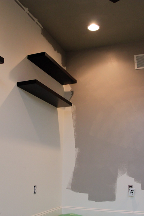
Holy dark! We also painted the ceiling this “lighter” color and yes for a little bit, we were completely panicked. I think the color match was slightly darker and a little more purple than the Silver Fox appeared on paper. After painting this, I knew we couldn’t go with the darker, even more purple Smoked Oyster for the stripes. Luckily I picked up some testers for our bedroom and tried out Olympic’s Silver Dollar and Gray Ghost on the wall. Silver Dollar was the exact same color as Benjamin Moore’s Silver Fox (funny huh?) so we decided to go with the much lighter Gray Ghost, which was just one color below our darker one on the swatch.
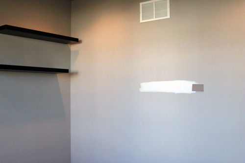
The original, darker Smoked Oyster we were going to do for the stripe is on the right. The Gray Ghost, our new choice, looks white in this picture.

By around 8pm on Friday, our office was all painted, ceilings and walls.
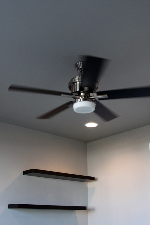
The ceilings actually look higher now that they’re darker! I love a painted ceiling. I know not everyone understands it, but they don’t call it the 5th wall of the room for nothing! πŸ™‚

We loved the way this color looked. We loved the drama of it and were a little nervous going with such a light stripe. But by Saturday morning, we had already gone to Lowe’s to pick up a gallon of our new stripe color and were hard at work taping out some lines.
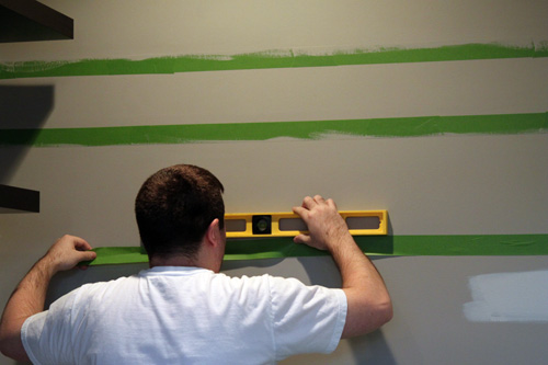
Our ceilings are 9 feet tall, so to keep things simple, we did twelve 9-inch stripes. We are planning on adding crown molding to this room at some point, so I just measured from floor to ceiling. Our top stripe will eventually be cut in half or so by crown molding and our bottom stripe is currently cut in half by our baseboards. I didn’t want to try to estimate the width of our future crown molding, or have to live with a too large top stripe for years if we don’t install it right away.

As for measuring method, I know there are a lot of tutorials out there. We had a plan, but we didn’t stick to it. In the end we went with what worked for us. Mike ended up doing all of the taping. He said I was too neurotic and taking too long, though he wasn’t much better with the OCD. But thank goodness for him, he did such an amazing job, never once lost his patience and kept at it for hours and hours. Such a keeper!

Here is how we measured:

1. We started at the top and measured 9 inches down from the ceiling and made a mark about every foot or so across.

2. We then took a level, lined up the marks until they were level and drew a line with a pencil to connect themΒ (usually about 3 feet long at a time, see photo above)

3. We lined the tape up to that line and stuck it to the wall

I did a lot of research before striping to make sure we’d get the best result possible. We took every single recommendation and precaution ever listed on the internet.

Extra steps for clean lines:

1. We used Frog Tape (and loads of it, about 50 feet!)

2. We flattened any bubbles in the tape with a credit card

3. We brushed some of the base color over the tape to “seal” any potential bleed through points
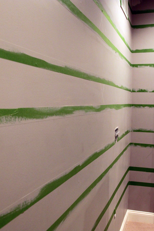
One thing we were not prepared for was the amount of time it would take to tape stripes. It took us all day Saturday. And by all day, I mean it took us about 10 hours to do. Granted, every single line in our office is perfectly level and 9 inches wide. At one point Mike told me he wished we weren’t such perfectionists, and he’s right, it would have been much faster to just wing it!

By 10pm Saturday night, we were ready to start painting our stripes.
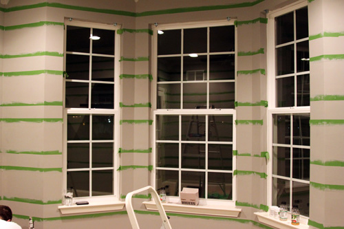
We were nervous about painting over such a dark color. Mike thought we needed primer, but I was worried that multiple coats of paint wouldn’t allow for us to pull of the tape while the paint was still wet. So we took a risk and just put a very thick coat of the Olympic Gray Ghost. We worked fast, doing just one stripe at a time then removing the tape. The reveal part was extremely nerve wrecking.
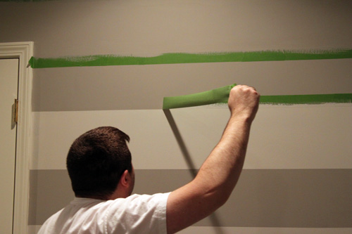
See that line??? Clean as a whistle!! We were estatic at this point and quickly finished painting the stripes and removing the tape, probably in just a little more than an hour.

We had just a few touch up areas and we’re not sure why. In about 3 spots, the tape actually removed the drywall paper.
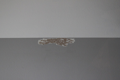
Maybe we used a little too much muscle with that credit card method! But these were much easier to fix than bleed through on every line. We just put a layer of spackle on them and sanded them down.
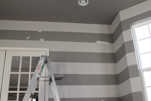
We painted them with a coat of the lighter color yesterday. Today we just re-taped the small area along the line, painted the darker color again and it was good as new!
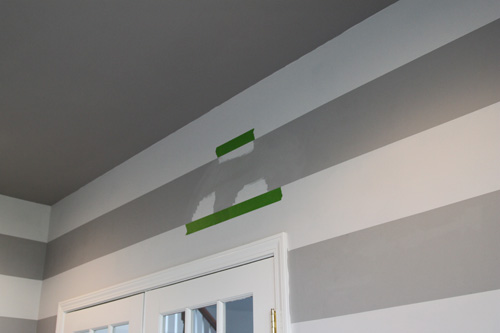
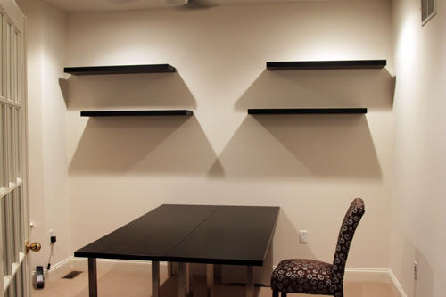
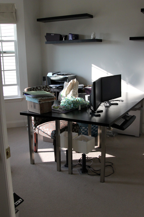
And now for the before and after shots!

Before:
AFTER!!
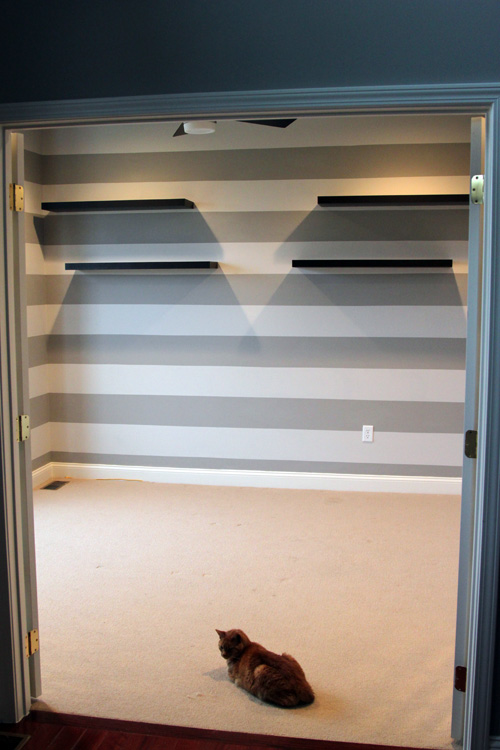
Tonight we shampooed the carpet and brought our Expedit bookcase back into the room. We are definitely looking forward to some organizing and accessorizing this room this week! We’re so excited about how this turned out and we’re back on an office kick now πŸ™‚

I’m sharing this little how-to at the Lettered Cottage’s link party. They also have awesome horizontal stripes so check them out!

Striped Walls

8 Comments

Posted by Rebecca, February 17th, 2011

I couldn’t think of a good title today.

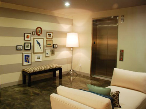
Since we moved in, I’ve had striped walls on my mind. Originally, I thought of doing a light tone on tone horizontal stripe in our bedroom. I’m not sure where I got this idea, since I had it in my head long before I discovered house blogs. Probably some show on HGTV!Β I was thinking something like this…

(via Apartment Therapy)

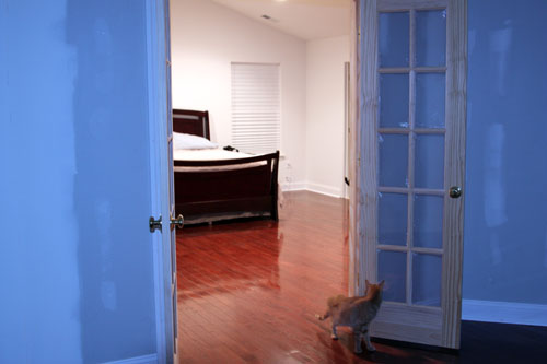
Our bedroom is large and I knew the walls needed something, but I was too intimidated to try a stencil or wallpaper. If I ever made the bed and took a picture, I could show you a decent angle. And I’d rather not show you the uber embarassing kitten conference, unmade bed, pants on the ground picture again. So here’s an equally awful and creepy picture of the wall behind our bed, taken from our sitting room which has no light fixture in it (hence the ghostly looking cat…)

I just couldn’t imagine stripes in here, but it was the easy solution. Then I decided to man up and attempt a stencil.. attempt still pending.

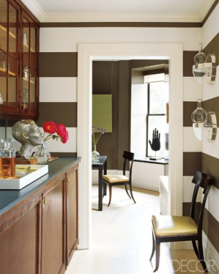
So I diverted my need for stripes to another room after seeing this must-have inspiration photo from Elle Decor…

(via Elle Decor)

I fell in love with the dramatic contrast and figured the perfect place for something so bold would be the powder room. Until one day recently when I was analyzing the powder room and I realized my beloved stripes wouldn’t look good in there.

The ceilings are pretty high..

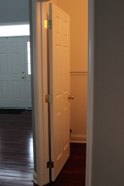
And the door is actually at an angle, so the room isn’t a perfect square.

At this point I figured that maybe I’d just use my dark brown stripes in our future basement. Note: our basement is no where near finished. By the time we finish it, I’ll probably think of something else. I have no clue why it took me so long to think of this, since this was my original, original idea, but the office could use some stripes.

Way back when we were buying office furniture and all gung-ho office, I wanted to do stripes but knew the bedroom needed a fancy wall paint more and I didn’t want to be the stripe house. We’ve lost some motivation in the office, since it needs so much organizing and I was having a hard time visualizing the finished space. We went with the furniture we could afford and I wanted to balance the Ikea modern with some more traditional elements to keep it classy. I think the stripes will do just that.

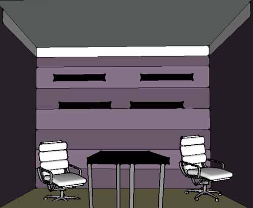
To reassure myself, I download Google SketchUp last night and played with it for just a half hour or so. Awesome program. I just fiddled and wasn’t aiming for perfection, but this is what I got…

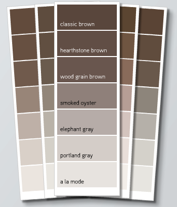
The walls on the sides are the same color as the darker stripe, SketchUp just does a 2D shadow type thing. The room is missing the bay window on that left wall and the gallery wall would be on the right wall. The white line at the top is crown molding we’d eventually like to do. We’ve been eyeing up these white chairs from Staples and that’s as far as I got last night. I didn’t rotate that one chair, but then I realized it was kind of funny to keep it like that because we will probably never push our chairs under anyway! The paint color is the Benjamin Moore Smoked Oyster we’ve had in mind since we moved in, though we’ll have to throw a little sample on the wall before deciding. The color in this SketchUp is far more purple than the actual color. Here’s a little image from the Benajamin Moore site…

We’d probably pair the Smoked Oyster with the Elephant Gray or Portland Gray. Smoked Oyster definitely has some purple tones (to make my purple loving self happy) but falls into the brown/gray family as well. That is the only reason why Mike agreed to it as well, I even gave him the option of a green!

Anyway I’m super excited about my new area to put some stripes. Now maybe the office will make some progress soon πŸ™‚

Paint Color Trial Run

6 Comments

Posted by Rebecca, February 1st, 2011

Okay so I told you last week that I had pretty much decided on the Oatlands Subtle Taupe for our master and the Smoked Oyster (Valspar rendition) for the sitting room. When we had most of our downstairs painted before we moved in, we chose three Benjamin Moore colors- Wedgewood Gray for the kitchen/family room, Waynesboro Taupe for the living/dining room and 2 shades lighter than Waynesboro Taupe, Himalayan Trek for the entryway. The Wedgewood Gray was more blue than we had wanted and the Himalayan Trek was a little too gray. Since the entryway is two stories and we had to hire someone to paint it, we knew changing it wasn’t an option. I do like it though, it’s just not what I had pictured.

While we’re on the topic, I’ve been meaning to do a ‘how I choose paint colors’ post since I started this blog. Outside of the blog, it is probably the #1 question I am asked. I’ve gone paint shopping or have visit quite a few people’s homes to help them choose colors, though they don’t always listen to me or they end up not painting at all! I know this is a very poor business model, I won’t be quitting my day job for this one. But the moral of the story is, I don’t think anyone has a fool proof method of choosing paint. It is all a bunch of trial and error that depends on so many variables. Our Wedgewood Gray is a little blue because we overestimated the amount of light the room would get and went one shade darker than we were going to go. But it’s okay, because it’s still pretty close to what we wanted. In fact, I was watching HGTV a few nights ago and commented that I liked a wall color on one of the shows. Mike pointed out that it was our exact family room color, as evidenced by the fact that the TV is mounted on the wall color itself for a side by side comparison. Whoops. But we seem to get the blue/gray feel we were going for more at night than during the day.

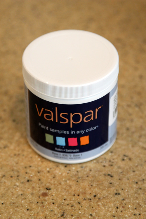
So for the bedroom, we decided to take the extra step and pick up some testers. We headed to Lowe’s and paid $2 and change for these things…

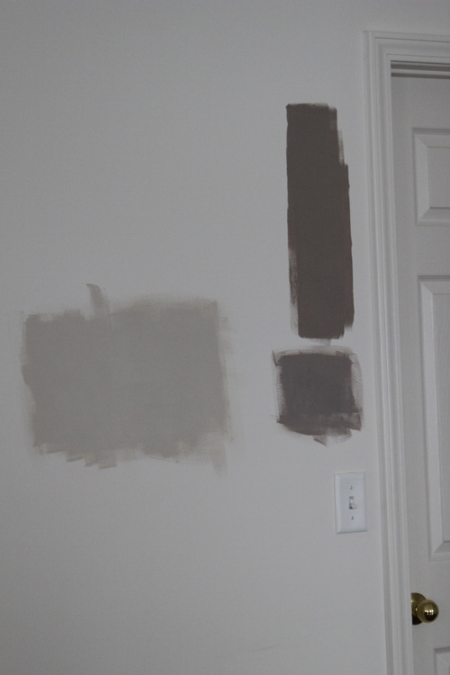
Then I pulled out my brush and got to painting! And can I tell you, even a little dabble felt great. I cannot wait to actually paint. I added the two new colors to the old failed Waynesboro Taupe trial area

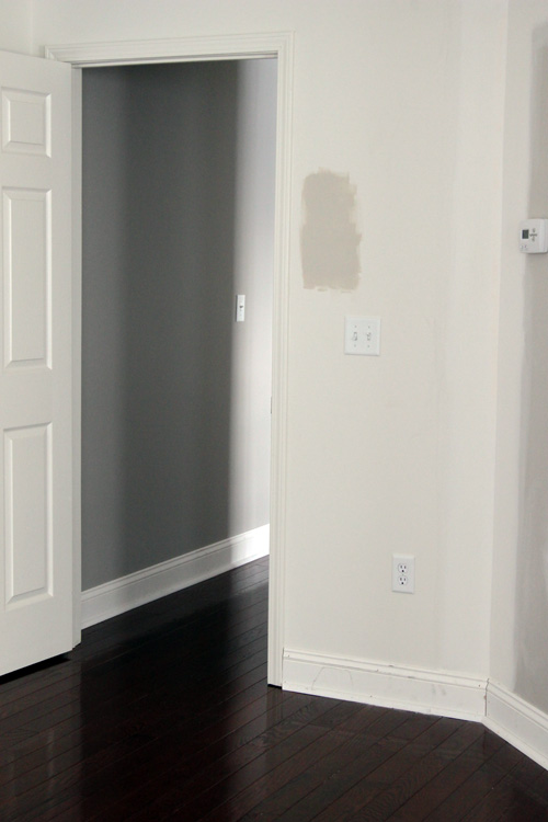
The big giant light one is the Oatlands Subtle Taupe. Β The top dark one is the ruled out Waynesboro Taupe and the bottom one is the Valspar Smoked Oyster. Not having enough evidence, I added the Oatlands to another wall…

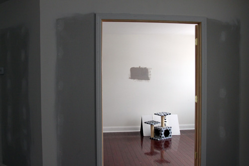
And the Smoked Oyster to the sitting room (where it would go)…

(Please ignore the cats’ scratching post and playhouse. Yes that is a Crate and Barrel box and they love it…)

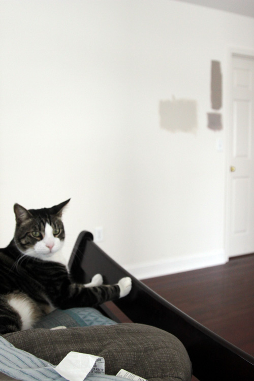
The verdict? Love the lighter Oatlands, but the Smoked Oyster is too purple. Which is ironic because the Benjamin Moore Smoked Oyster IS purple but this Valspar one looks more brown on the swatch.

The Smoked Oyster on the right is the one on the sitting room wall, doesn’t it look completely different??

For a second opinion, I called upon my always present sidekick, Macky.

“HmMmMM!”

“No like!!”

I’m going to try one more option, Olympic’s slightly more gray versions of these colors. I like the Oatlands Subtle Taupe, but I get nervous when trying to do two different shades between different brands/swatches. I’ve made that mistake before and though they may look like they go well together, it’s tricky to match the undertones. Plus, I want to use Olympic paint regardless, without a doubt. I asked the worker at Lowe’s to color match the Valspar color to Olympic and she told me they couldn’t. I’m pretty sure she was lying. But we might as well try the pre-existing Olympic colors first. The no VOC aspect is huge to us since a) the room is our bedroom and I’d rather not sleep on the couch for a week while the stench leaves b) it’s winter and we can’t open any windows while painting and c) Macky has seizures and we try to keep him away from any and all possible triggers- chemicals being one. We had our downstairs areas painted long before we moved in and in the spring, so we dodged that bullet. But from now on, I’m sticking to no VOC, and I’m thankful Olympic has provided an easily accessible and affordable option!

Back to the drawing board!

Copyright 2010 - 2011. The Lil House That Could. All rights reserved.