Posts Tagged ‘Olympic’

Nursery All Painted!

20 Comments

Posted by Rebecca, March 19th, 2012

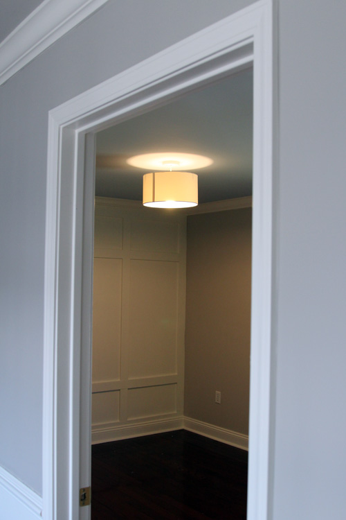
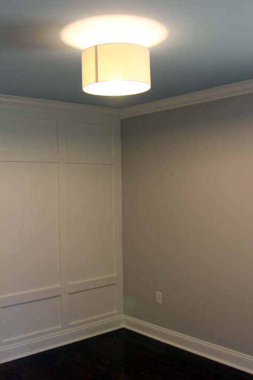
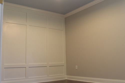
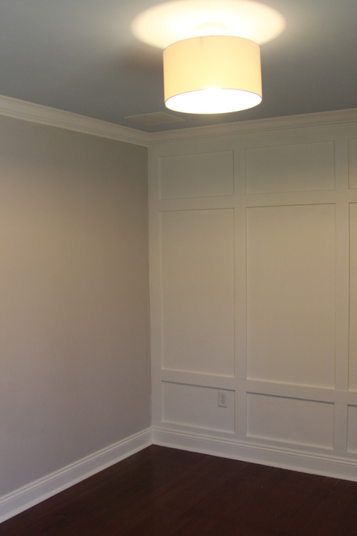
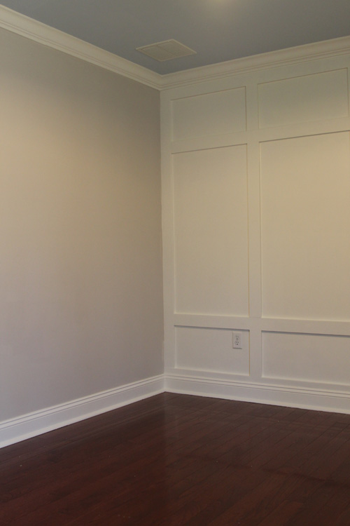
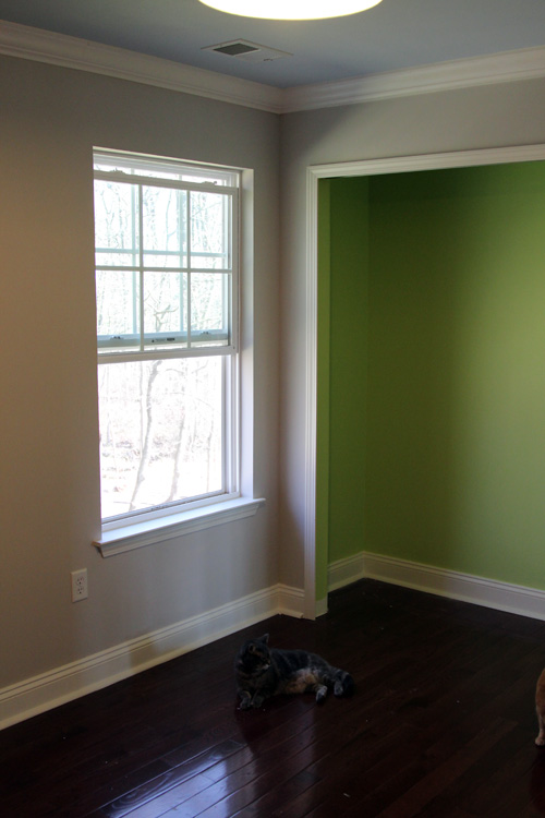
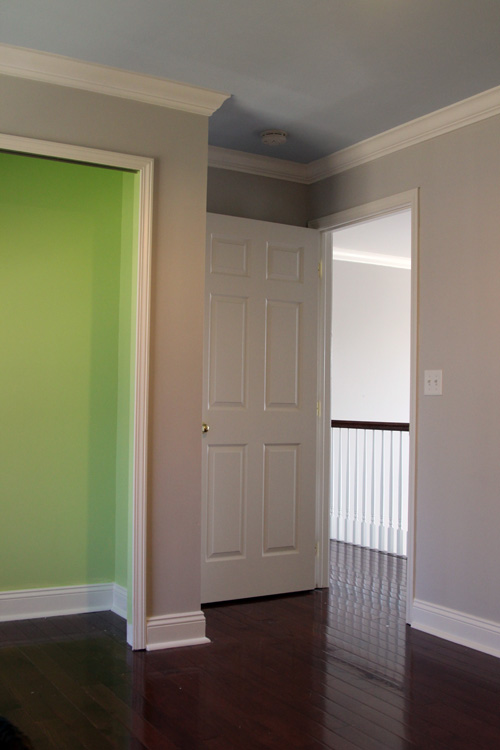
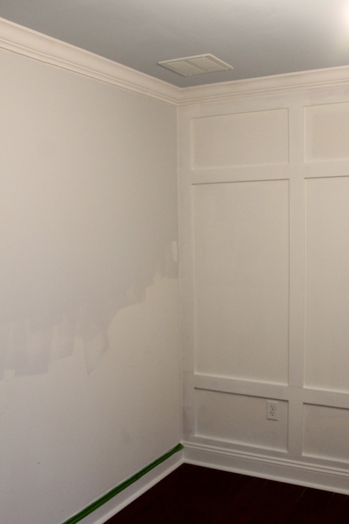
Finally! Finally this weekend Mike and I finished painting the nursery. By finished painting, I mean we literally painted the walls, paneled accent wall, crown molding, baseboards and closet in a matter of a day. So I guess you can consider this post a paint reveal, a finished accent wall reveal and a completed crown molding reveal. Weeeee!

I guess I’ll let the pictures do the talking?

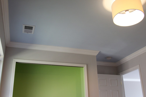
Wait, quick interruption already. We ordered a silver tipped light bulb to see if that reduces the glare of our diffuser-less light fixture. When we switch the bulbs out, we’ll be sure to rotate the shade so that the seam is not smack in your face when you walk in the door. Okay back to the pictures!

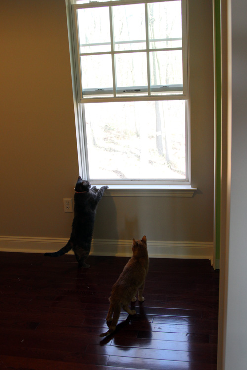
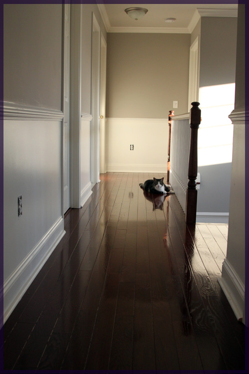
No post is complete without a photobombing cat. That’s Mowie, you don’t see her often and she thinks she’s finally getting a room away from her two brothers. Oh another note, the floors still need to be cleaned from all of the construction in here…

You probably noticed that we took the closet doors off. We’re planning on hanging curtains and installing a closet organization system.

Kitten tested, kitten approved! They’re loving the 75 degree weather we had today 🙂

Here’s a quick recap for anyone interested…

Paint Colors (all Olympic paints):

Ceiling- Comes the Dawn D52-2

Walls- Gray Ghost D17-2

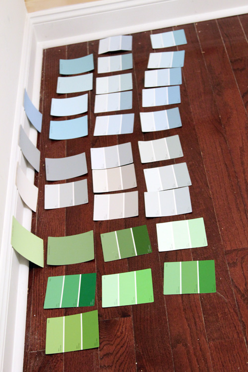
Closet- Lettuce Alone B68-3

Trim- Crumb Cookie C20-1

How-To:

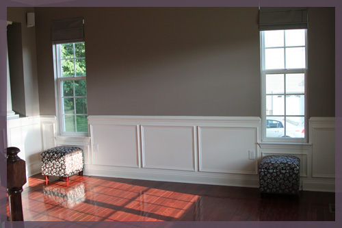
Paneled Wall

Crown Molding

Overall, we are very happy with how everything turned out. It took us a little longer than usual to settle on the perfect gray for the walls, but we’re very happy with our final choice (which is one of the colors from our office stripes!) Mike loves the green closet and I’m still adjusting to the bold color, but I know once it has a white wood closet system on top of it and some curtains it will be less of a solid green mass. Plus I am likely going to stencil it, once I do a trial run to confirm. Now it’s on to buying furniture and adding details! Fingers are crossed for smooth sailing from here on out… 🙂

A Beard, A Goose And A Ghost

1 Comment

Posted by Rebecca, March 8th, 2012

No that’s not the beginning of a bad joke, that’s how our adventures in finding the perfect shade of gray for the nursery could be described. If you remember, we started off with Olympic’s Gray Beard…

Which was way too light and way too blue for our taste. We rummaged through some of the 8 million swatches we picked up once again and chose another gray.

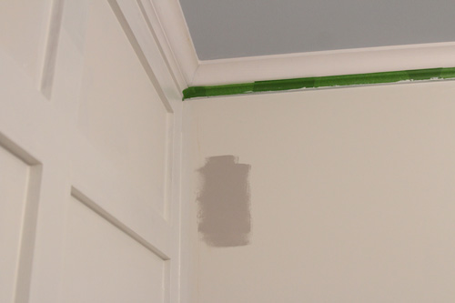
We pulled out Gray Goose and decided to (wisely) get a tester this time. But we put the color on the walls and it wasn’t what we expected…

It was too brown and had some funky purpley/pink undertones in the room. I scratched my head for a bit trying to think of what color we actually wanted. Gray was too gray, taupe was too brown… was I losing my mind? But then I started to feel like I’ve been down this road before in the search for a perfect neutral. I mean, most of our house is painted in varying shades of gray…

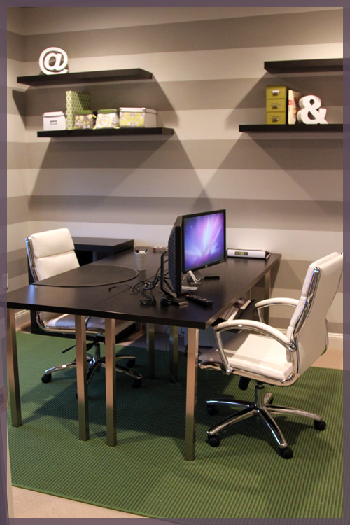
I had all of these shades of gray to look at right on our own walls. I thought our entryway color, the middle color in the top row, might give off the too brown/pinkish tinge in the nursery though it looks normal in the entryway. Then I thought that the first gray in the second row might be perfect. It’s Olympic’s Gray Ghost and we used it for the lighter stripe in our office…

By some sort of miracle, I stumbled upon the swatch while I was getting dressed in our closet on Tuesday morning. I apparently stash swatches everywhere and it was one of the neutrals we considered for our bedroom (which has yet to be painted). I immediately brought it into the nursery and held it up to the wall to see how it worked. I also held it up against the bedding, curtain fabric and my dark gray leggings which represented the glider we’re planning to buy. Everything looked promising, but since we’ve been there, done that (twice!), we wanted to try some paint on the walls. I figured we had to have some left over from the last time we painted but even better, we still had the tester we used a year ago (already!)

Mike put some of it on the wall and sent me pictures while I was at work (since I never make it home before dark)…

There is is on the bottom of the corner, with the Gray Goose above it and the Gray Beard in the background. It’s definitely much better than the other two!

You can see here that it doesn’t have that purpley/pink thing going on that the Gray Goose did.

Nor is it blue, which you can see from this picture where the Gray Ghost is on top of the Gray Beard. The testers only come in satin, hence the sheen in this picture.

After a journey through what felt like any color that Olympic started with the word “gray”, I think we have a winner! We don’t have enough paint leftover from the office to cover the entire nursery, so we have to pick up another can this weekend. Hopefully then the painting will be completed because this little set back has cost us a week of time!

Maybe rather than a bad joke, Beard, Goose and Ghost can make some childhood game. Like duck, duck, goose or rock paper scissors? I want to be a paint color namer when I grow up…

Our Paint Colors

52 Comments

Posted by Rebecca, October 13th, 2011

A couple of weeks ago when I planned to do a post with some frequently asked questions, I wanted to include a section for all of the paint colors we’ve used in our house. Mike ended up taking over the post for me when I fell asleep, answering his own version of our FAQs. Since the #1 question I am asked is what paint colors we’ve used in various rooms, I figured it was about time the question received it’s own post!

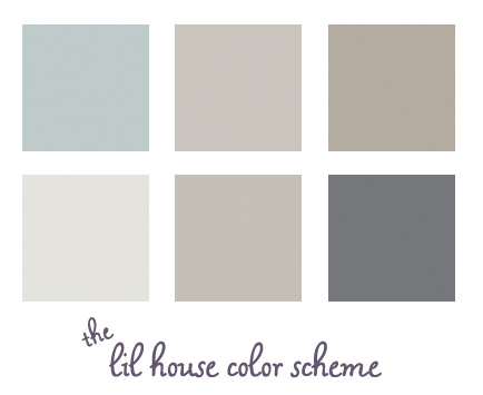
Here are all of our current paint colors displayed together. Some observations…

1. I never realized how well all of our house colors blend together. Since I didn’t really have the whole house in mind when choosing colors, I’m surprised that they all work well! I especially thought the dark gray was bolder and less expected, but even that blends in well.

2. The two middle colors on the top and bottom rows do not look that similar in real life. Or maybe they do? Mike says they do. I think the top color is more brown based and the bottom one is more of a true gray. At least I’m consistent in my choices 🙂

Here is our color breakdown, by room.

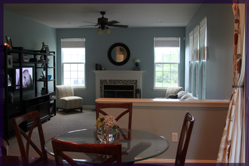
Family Room & Kitchen:

Wedgewood Gray

Benjamin Moore HC-146

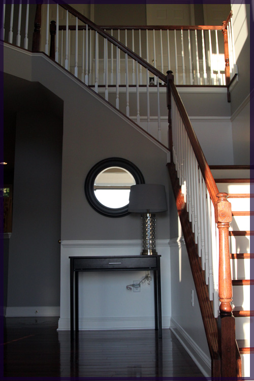
Entryway & Upstairs Hallway:

Himalayan Trek

Benjamin Moore 1542

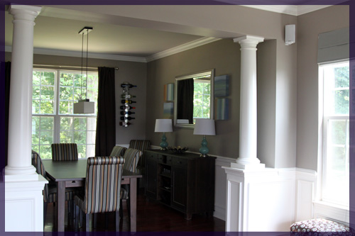
Living Room & Dining Room:

Waynesboro Taupe

Benjamin Moore 1544

Office:

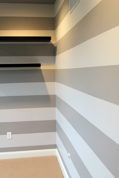
Light Stripe- Gray Ghost

Olympic D17-2

Dark Stripe- Silver Fox

Benjamin Moore 2108-50

(we color matched the dark stripe to Olympic, but it is nearly identical to Olympic’s Silver Dollar D17-3)

Powder Room:

Cracked Slate

Olympic D44-5

You’ll notice that our recent paint projects have been done with Olympic’s no VOC paint. We try to keep things as toxin free as possible around here since Macky has seizures and we don’t want any unnecessary triggers. Plus those smells just aren’t good for anyone 🙁 The Benjamin Moore paints we used were for rooms we had professionally painted before we moved in so Macky wasn’t exposed to those fumes (we couldn’t paint our two story entryway on our own so we hired it out).

I hope this post answers all of your paint questions in one spot. I plan to update it as we paint more rooms down the road. I’ll also add this post to our top navigation bar for easy access 🙂

A Day of Labor

6 Comments

Posted by Rebecca, September 5th, 2011

Remember that project I mentioned last week? Yeah well, I didn’t work on it at all this weekend. Mostly because it’s labor intensive and not a Mike job, so it’s a lonely one. With a spare day in this weekend, I woke up and decided to tackle an entirely different project, yay! Because really, what is this blog if it’s not full of unfinished projects and decorating A.D.H.D.?

With a little twisting of the arm, I talked Mike into painting today. He HATES painting. Did I ever tell you that we started our chair rail project because Mike didn’t want to paint the powder room? Yes, he would rather start a major molding project than paint a very small room. Well today, his time was up. The powder room it was!

We had a spare can of Benjamin Moore Smoked Oyster that was color matched to Olympic’s no VOC paint. We originally bought it to paint our office stripes but our lighter stripe ended up being darker than we wanted so we made that our dark stripe and picked a new light stripe, sidelining the Smoked Oyster. The Smoked Oyster was actually the color of our spare bathroom in our condo and I always loved it. I’ve been itching to incorporate it into this house and I figured the small powder room was the best choice.

First, I guess I should introduce you to the powder room?
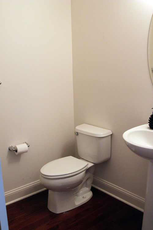
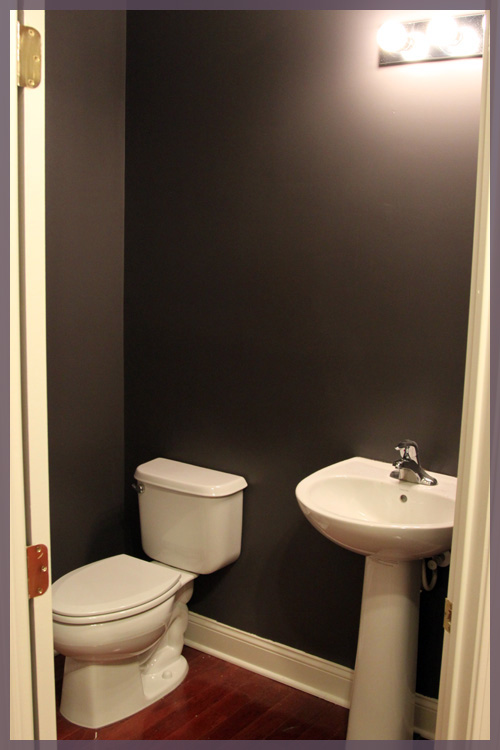
It’s not much (and very hard to take pictures of), but it’s a decent size for a powder room. My major pet peeve with this room is that the towel bar is to the left of the toilet paper holder in this picture. So you wash your hands at the sink, then have to run across the room for a towel? No bueno.

We knew that towel bar was coming down, so we removed it (along with the toilet paper holder, to paint. I wanted a quick and easy day project, so we didn’t plan to replace anything else at this point…just get some color on the walls and do the rest gradually. We were going to remove the mirror because we were planning to replace it eventually and we didn’t want to paint around it, but upon unscrewing… it broke.
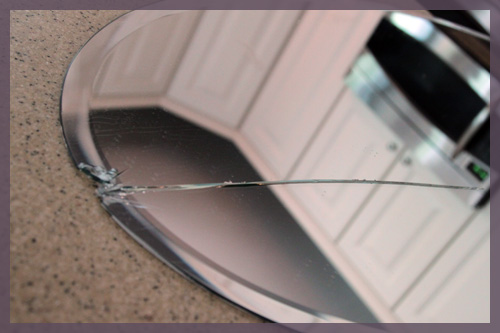
Seven years of bad luck…or less time with an awkward, oval shaped mirror. No biggie, it’s not like we get dressed in there in the morning.

Then something else happened, I put the Smoked Oyster on the wall and… it was fugly.
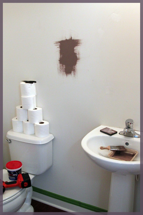
(ps- if you follow me on Twitter you already know about the T.P. teepee. Mike stacked it on Thursday night in an attempt to liven up the space? It was removed before painting)

It had this red violet tint to it that I don’t remember it having…
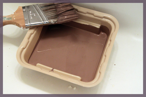
I was going to live with it, but Mike hated it and I pretty much did too. I didn’t want to have to repaint again in a few months, so off to Lowe’s we went (it was 5:30 tonight, btw)

I knew I wanted something dramatic, so we decided to go with a dark gray color. We picked it straight off of the Olympic selections in a matter of minutes. I later realized that my choice matched my pants and flip flops…
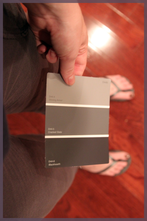
It’s the color in the middle- Cracked Slate.

Yes, it’s incredibly dark and dramatic (I think the picture above makes it appear even darker than it is). I’m still having my doubts, but I secretly love my nearly black bathroom. Mike literally just finished rolling (he was still rolling when I started writing this) so there won’t be any after pictures just yet, but here it is during my cutting in…

I know, some of you just fell over. I painted a small room with no windows nearly black? Yes, yes I did. And it’s not black, it’s very hard to capture on camera. It’s a satiny navy blue-ish, deep purple-ish, very inky color. I normally never tape and just free hand it, but I thought a dark color was risky. Turns out taping made more of a mess and we have a lot of touch ups to do. Somehow our to-do list has grown to include crown molding, since a dark wall meets white ceiling is near impossible to do flawlessly.

I think this room will be one that is transformed with accessories. I love the dark color now, because I can see it and I know where I’m going with it. I didn’t plan (at least at the beginning of this day) to paint it so dark, but I plan on adding glossy white accessories, possibly large matted frames and pops of yellow. Somehow my little 2 hour Labor Day project has turned into a room overhaul complete with a stretching of my limits 🙂

ps- I start grad school again tomorrow and I have class on Tuesday nights until 10:30… which means I won’t be home until 11:30. I will do my best to get you some after pictures tomorrow!

Therapeutic

11 Comments

Posted by Rebecca, July 11th, 2011

On Saturday, we took Darwin to a speciality vet for some extra tests on his kidneys. We found out today that he has cancer.

We were also told that he has already lost 75% of his kidney function and lost even more weight in the past 3 weeks. We thought he was getting better.

Though I know that strangers offer some of the most comforting words, I’m not ready to post about it. How could I ever express in words how much I love him? Or what it feels like when I think of losing him? I feel like I wouldn’t do him justice.

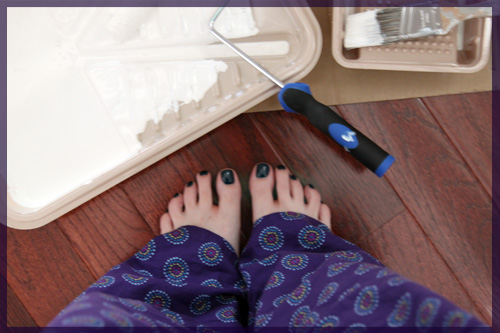
So what are a heart broken cat momma and dadda to do? Paint. In our pajamas (with gothic looking nail polish to suit my mood).

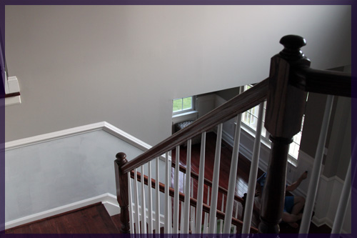
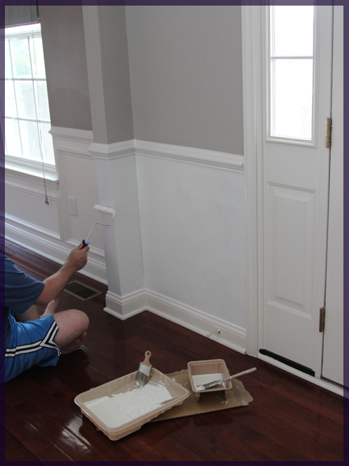
We’ve been itching to tackle the primed walls of our entryway and have had a can semi-gloss paint on hand for months. Tonight we decided to scrape our energy together and begin to complete this mess. We started with the chair rail install at the end of March.

We took a break halfway through to order some pizza AND we had it delivered. This is monumental because we’ve only done that once before- during a snowstorm. We didn’t want to have to dig out the driveway so we figured we’d order pizza, only to realize that we had to clear the walkway and porch for the guy to actually get us the pizza. So we ended up shoveling anyway and kicking ourselves for being dumb. This time it worked out as pizza deliveries should 🙂

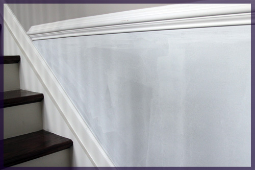
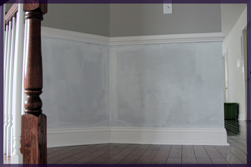
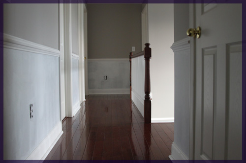
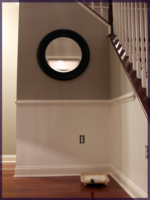
We didn’t get to paint the upstairs hallway today, but we were able to paint the lower walls and chair rails downstairs and along the staircase in just an hour or two.

It’s so much brighter already! The paint color is Crumb Cookie by Olympic. It’s a slightly off-white with grayish undertones. We brought a piece of our trim that the builder painted to Lowe’s and had it color matched to Olympic’s no VOC paint. The Lowe’s employee was super helpful and tried a bunch of colors against the trim sample to make we had a good match. We brought home a sample just in case and checked it against our existing trim. Thankfully it matched. This all happened back in like, April when we bought the paint.

We decided to paint the walls before finishing up the picture frame portion of our molding because we figured it would be faster this way. Now once the rest of the trim is up, we can just caulk it and go over it with a brush and forgo the roller. Plus we obviously do projects in small segments, so at least we can deal with a plain white wall for a while if need be.

The painting was relaxing and much needed. It was such a small area that it didn’t feel like more of a chore than something fun. I’m very happy I peeled my watery face out of my pillow to join Mike and put a dent in this overdue project. It felt good to drop everything for a bit.

Darwin watched us for a little bit and gave us the paws up. Though he said he would have painted the walls orange…

Copyright 2010 - 2011. The Lil House That Could. All rights reserved.