Shock Value 2.0
Posted by Michael, September 26th, 2011
Remember that dramatic painting we did for office 1.0? And remember when Rebecca mentioned we might be taking the office upstairs once we have children 5 years from now? Well, I’ve been thinking a lot about that room lately mainly because office 1.0 isn’t entirely functional. It’s not the organizing-super-productive-making office we thought it would be.
Now, I’ll never paint stripes again. (Right. I once said I would never paint ever again, period.) But the one thing I do love about office 1.0 are those paint stripes. Every time I walk in here, I’m still sucked in by those dramatic stripes.
So how can we do this for office 2.0? No, no, no more stripes for me. But instead, let me take you back a few weeks ago. Remember when we said we wanted some lyric wall art for the dining room?
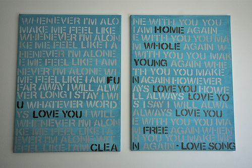
(via First Time Fancy)
Why not do this for office 2.0? But in more of an office 1.0 dramatic way?
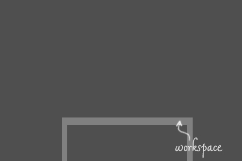
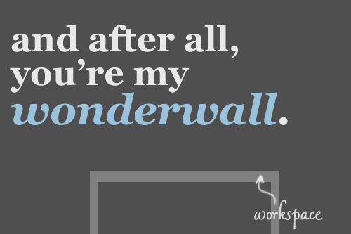
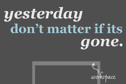
Imagine, if you will, that the image below is the wall that I’ll work off of. Blank empty space, all we did was paint it a dark gray (thanks photoshop!).
Nothing special, I know. But what if we did something big? Like snakes on a mother-f’n plane big?
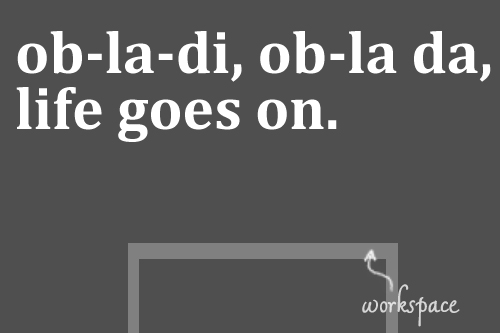
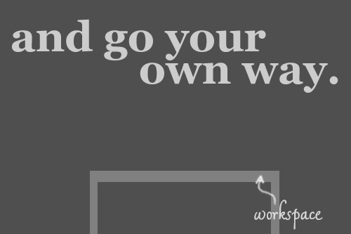
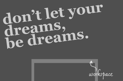
Being that we’re all about lyrics, why not put some on the wall? I’m talking huge, though. Like span the entire wall huge.
I’m not sure of the typography or spacing that we’ll need and want, but what I do know is that this thing has to be dramatic. But not so dramatic that we’ll grow tired of it. Because honestly, I’m not painting office 2.0 again. Unless of course I can just use the paint-bucket tool.
Oh, look what I did there!
I know once we do move forward with this project, it will take us a year to decide on the lyrics. I know I want something inspirational, but nothing too corny. It needs to be something that I want to look at every day.
Without googling, mad props to whoever names the lyrics above. They’re mad easy, yo.


