Archive for the ‘artwork’ Category

A Combination of Inspiration

44 Comments

Posted by Rebecca, October 31st, 2011

I mentioned last week how I wanted to make something for this season’s Pinterest Challenge with Sherry at Young House Love, Katie at Bower Power, Ana at Ana White and Erin from House of Earnest. I just wasn’t sure what to make! One of the projects I’ve been wanting to make was this washer monogram, but Michelle from Decor and the Dog tackled it during the last challenge…
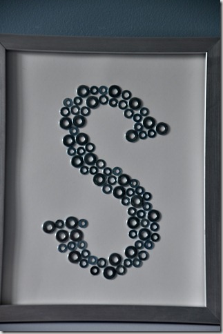
(from Decor and the Dog)

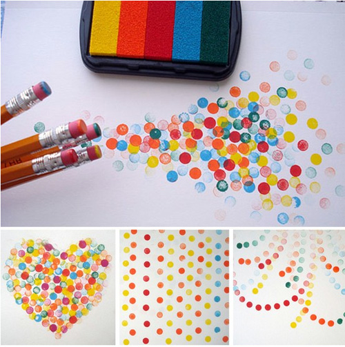
So I looked through all of the things I’ve pinned the past few months to come up with something I could tackle in a few hours. I stumbled upon this pencil-eraser-used-as-stamp art from Li’l Magoolie

(from Li’l Magoolie via Pinterest)

And I had a light bulb moment… why don’t I make a monogram using pencil erasers as stamps? That way it’s entirely different, but bringing together two Pinterest projects! So that’s what I decided to do 🙂

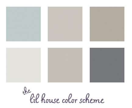
I decided to stick with the color scheme of our house… various grays/greiges/blues.

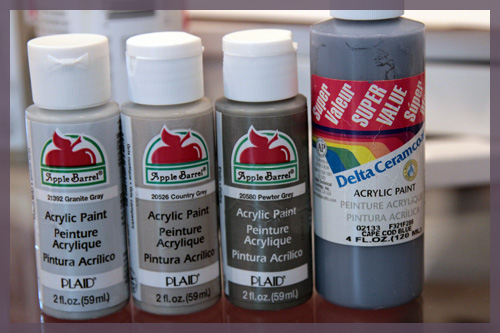
I picked up a couple of extra bottles of 89 cent craft paint just to make my life easier. I basically bought all of the shades of gray they make and I already had the blue.

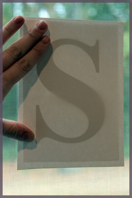
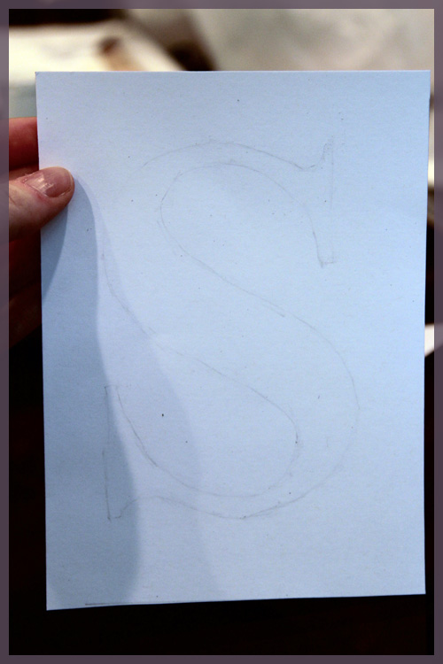
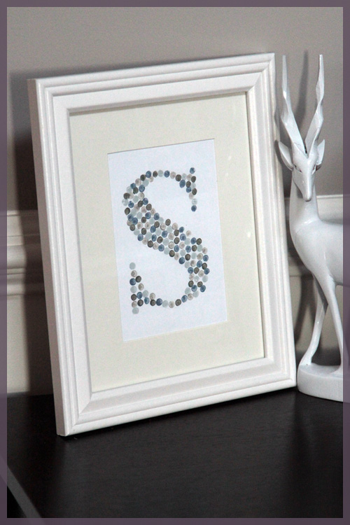
The rest of my materials were 100% free! I used some cardstock I already had, pencils that were laying around and a frame I already purchased. To get the monogram, I printed out our last initial, an S, in a very fancy font called… Times New Roman. I printed it in bold to give me thicker lines to follow. I eyeballed the size in print preview and figured it would look decent on a 5×7 piece of paper. I then traced my printed S onto my cardstock by holding it up against my sliding glass door.

I traced it ever so lightly, then also erased what I had just traced. Sounds crazy, but it left me with the most faint line ever so that it wouldn’t be noticeable under the paint but I could still follow it.

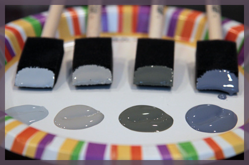
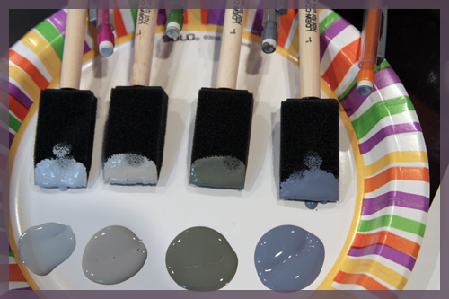
Then it was time for paint! I didn’t use stamps like the pinned image did, so I squirted a little of each paint onto a paper plate, then dipped some sponge brushes I already had in each color…

Then I dapped my pencil erasers on the sponge brush, not the paint itself. If I dapped too much I could use a cleaner part of the sponge to remove some. I had a pencil for each color (digging out a 4th one required some office scouring!)

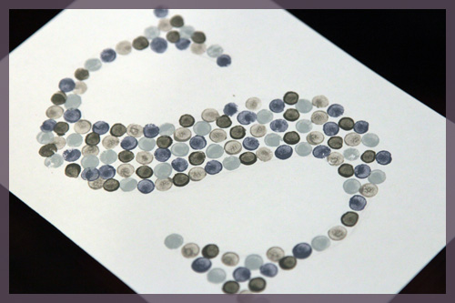
I did some test dabs on a piece of scrap paper before starting. Then I just followed the lines and alternated colors along my S and tada! All done!

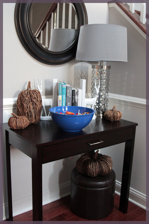
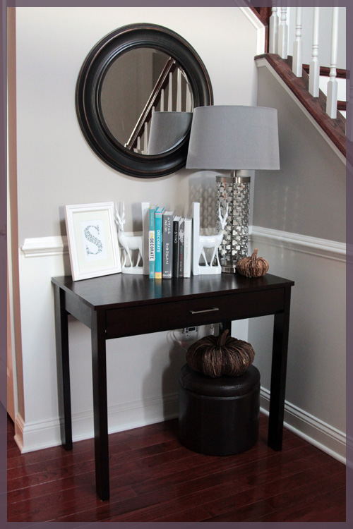
It took me about an hour or so, which was honestly longer than expected, but well worth it. I had to decide where to put my new work of art so I decided on the entryway table, which was filled with pumpkins and Halloween candy today.

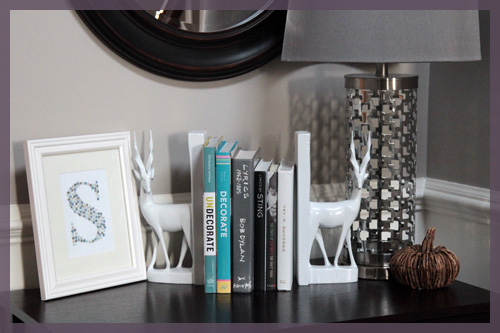
The candy will be leaving tonight, so I just put my art in a matted frame and leaned my frame over by one of my beloved deer bookends. Ps- I’ve been searching for a white lampshade to replace that gray one for months.

I’m not sure if my monogram will be staying here, since we’re planning on adding a whole gallery wall(s) up and down our staircase. Ideally, I’d like to eventually hang it, especially since the frame I had on hand is meant for hanging 🙂

I strangely love that the mat that came with the frame is a little off-white. Since the chair rail, deer and cardstock are bright white, it mixes it up a bit. Maybe even a fun colored mat will look good until I hang it?

I’m very happy that I chose to do another art piece for this Pinterest challenge. I love making things for our house but I often don’t have the time to dedicate to making things anymore. Spending an hour making this completely made my day and I wish I had more creative time these days. I am also proud of myself for scaling down my always overambitious projects. I originally planned to do this monogram, plus two 8×10 more abstract pieces. Once I started eraser stamping I realized how time consuming it was and that an even larger piece of paper would take even longer! Maybe I’ll make them another day (since they were pretty cool ideas, I must say), but for now I am perfectly happy with my monogram 🙂

Challenging

7 Comments

Posted by Rebecca, October 26th, 2011

So Sherry at Young House Love, Katie at Bower Power, Ana at Ana White and Erin from House of Earnest are hosting another Pinterest Challenge. Remember the one back from August where I made those 4 landscape paintings? Well it was fun, and I want to do it again 🙂
Buuut, I have several obstacles in the way. First, I’m not sure what to make. This is partially impacted by my second obstacle, the ever existing lack of time. I have a week to make something and the difference between August and now is a giant thorn in my side called grad school. Plus Mike and I have a jam packed weekend complete with family gatherings and vet visits, so I’m really not sure where I will even find the time to make something along with the obligatory homework, cleaning and laundry. All of this said, I CANNOT FIGHT THE URGE TO PLAY! Pinterest + a bunch of amazing bloggers (not just those hosting, but the 100s sure to link up) = a party I want to attend.

So I’ve been thinking about this all day. I have several ideas, though some are admittedly over-ambitious given the time constraints. Some involve finishing projects I’ve already started. I’m ashamed to admit how many of these exist…

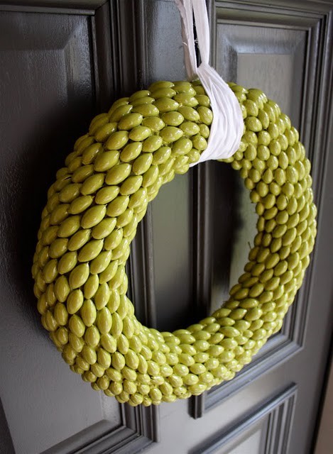
First, of course is the acorn wreath I blogged about last week. It’s the ideal choice, but I honestly don’t think I can pull it off this weekend.

(from Dana Made It via Pinterest)

Then there’s a project I never blogged about but I started, it’s this amazingly creative frosted window courtesy of my buddy Ashley at 7th House on the Left. But once again, very tedious and time consuming (and carpal tunnel inducing.. I can only trace so many a night!)

(from 7th House on the Left via Pinterest)

Then there’s finishing up our power room, which I am quite sure I have tons of inspiration pinned that I can use in that room! Like maybe painting the mirror, hanging some art, decorating the shelves….

Then there are the new projects that I can’t resist wanting to do. First is this DIY roman shade that our walk-in closet needs desperately. The glory of this is that it’s based off of an inexpensive mini-blind, but I’m worried I won’t find the awkward size we need off the shelf anywhere.

(from 365 Days to Simplicity via Pinterest)

Then there is the chevron. The amazing chevron painting that I want to make so badly. I tackled a painting (or 4) last time so I’m not sure I want to do another, though paintings are so fun to me and this one is totally different. I’m also not sure of where to put it? Hmm..

(from here via Pinterest, sorry the blog isn’t in English so I can’t credit the title!)

Then there is the washer art that I’ve mentioned making before. I definitely want to make it, but the lovely Michelle from Decor and the Dog made it during the last challenge (and we have the same last initial!)

(fromDecor and the Dog)

So there’s where I am at the moment (I’m sure I’m missing a bunch of things). Even though I tend to be hard on myself and make myself finish one thing before starting another, maybe I need a fresh new project to boost my confidence? I guess you can find me over at Pinterest for the rest of the night, scouting out some new inspiration on a short time frame 🙂

Anyone else planning on participating? What are you guys making? (or what would you make in a perfect world!)

Just Let It Go

3 Comments

Posted by Michael, September 13th, 2011

A few months ago, I wrote about my obsession with 20×200.  And that obsession continues tonight!

Ever since we’ve visited the Museum of Modern Art, I’ve been obsessed with typography (well, more so than usual).  It’s been catching my eye on just about everything — advertising, signs, letterhead, etc.  It’s amazing that so much thought is put into typography yet we all really take it for granted.

If you’re in New York City and can visit MoMA, check out the Typography exhibit; it’s well worth it.

Oh and just remember, if you plan on visiting and you’re a Bank of America customer, you get free tickets to museums during the first weekend of every month.

Back to typography — it’s no surprise that my latest two finds on 20×200 have been pieces around typography.

“Just Let it Go” by Kotama Bouabane.  Such a simple photograph with subtle text, yet you can almost make an entire story out of it; a couple wine glasses, a lemon, a napkin, an empty glass.  Maybe an argument took place at this table?  And then you’re hit with Just Let It Go.  Sometimes you just have to let it go.  Forget regret, or life is yours to miss.  No day but today.  Okay, now I’m just quoting Rent.

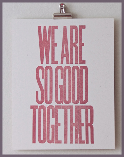
“We Are So Good Together” by Dylan Fareed.  I love the spacing between the characters; so incredibly thin yet enough to notice the distance.  I find it pretty funny that the artist created this after a breakup.  He created it to find humor and then the thing blew up with several people asking for copies.  I love that it’s more than ‘Better Together’ à la Jack Johnson.

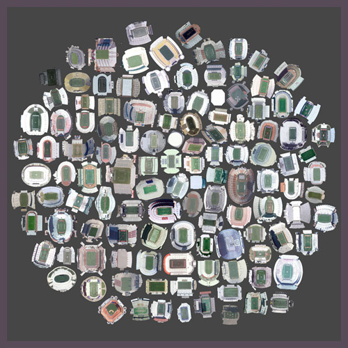
“125 Stadiums” by Jenny Odell.  Get this, these are satellite views of various stadiums in the United States.  This would be an awesome piece for my man-cave one day.

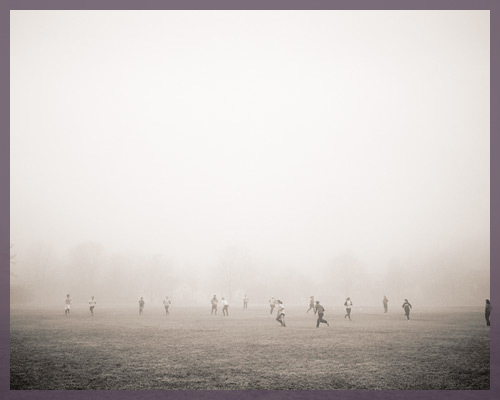
“The Suspension of Physics Necessary for All Athletic Endeavors” by Colin Blakely.  I was really taken aback by this piece.  I love the subtle lomo effect captured here and the top-half which looks to be nothing more than a haze.  Yet, you can depict the individuals on the bottom of the picture playing some kind of sport or activity.  Definitely neat.

Remember folks, 20×200 makes it incredibly cheap to own some unique art.  And no, I wasn’t paid to write this post;  I genuinely enjoy what they’re doing.

A Happy Update

8 Comments

Posted by Rebecca, August 16th, 2011

Remember last week when I mentioned that we were told that Darwin most likely would not beat his cancer and that there was very little hope that his kidneys would regain function? At the time I said that all we needed was that little hope to keep us going and guess what? His kidneys are currently functioning at a manageable level!!!

I rushed home from work today, snapped some pictures for a post on another topic and ran off to our weekly chemo appointment. The doctor was running late so it took forever, which only made the weekly knot in my stomach grow larger. Then we received the great news. So that other post can wait 🙂

We still have to keep that little bit of a guard up since he is still battling cancer and it can come back at any time. He skipped chemo tonight and will receive it next week if need be. Regardless, this is a huge hurdle we have gotten over, one which we were told from day one would be very difficult to achieve. Now the cancelled vacation, constant cleaning of accidents (his kidneys were so bad a few weeks ago that he was having accidents in his sleep :(), the twice daily fluids, the pills and the emotional rollercoaster were all worth it for this week. I am so proud of him, unbelievably proud of him. No matter what happens from here on out, he has proved that he is such an incredible little life. One in a million. And all mine.

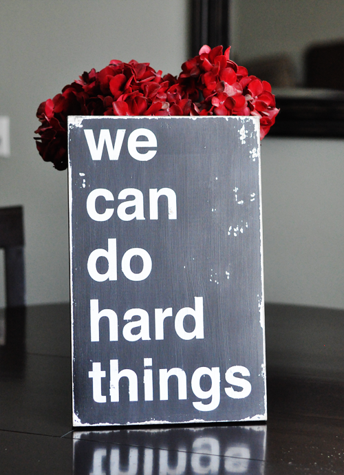
I’ve always loved this sign from Barn Owl Primitives on Etsy… it seems appropriate to have now 🙂

I’m off to smile myself to sleep. Cautiously, as the vet always says 🙂

Art Inspired

2 Comments

Posted by Rebecca, August 11th, 2011

As part of our staycation, today we headed into New York. One of the perks of living sandwiched in between New York and Philadelphia is that we are fortunate enough to have so many wonderful things to do within driving distance (plus about 6 Ikeas, no exaggeration). All we knew for sure today was that we were going to a Yankee game at 1. We were delighted when we walked outside this morning and saw how gorgeous the weather was.

We had a great view from the 2nd row of the bleachers, but my goodness it was hot in direct sunlight. We were roasting and decided to leave after 6 innings. My friend Shannon was with us (hi Shan!) and we decided to hit up a museum. We wound up at the Museum of Modern Art (commonly known as MoMA) and managed to get in for free since the company Mike works for receives free admission for up to 3 people. Woohoo we saved ourselves $60!

I thought I had made all of the museum rounds for college classes, but as we walked in I realized that I don’t remember ever being at MoMA. Maybe with a high school art class but I don’t remember it. We were pretty exhausted so we didn’t stay too long, but we did manage to browse most of the place. I wasn’t sure if you could take pictures at first, but then I saw nearly everyone had a giant camera around their neck. I figured I’d take the opportunity to snap some highlights on my fancy…iPhone.

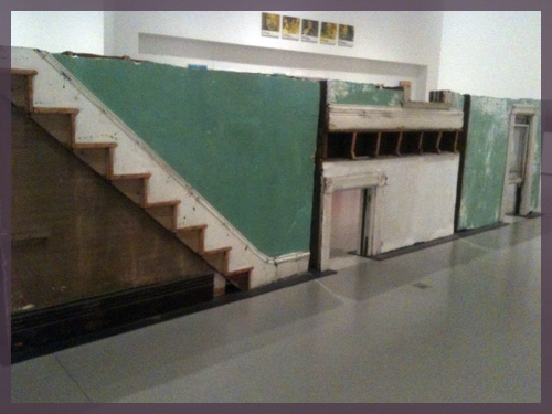
First, the very literally house related. This is a cross section of a house from Niagara Falls, NY that was going to be torn down. Those are 3 different pieces, so no, the stairs are not going into a doorway 🙂

I loved seeing the architectural details up close and personal. Like that thick baseboard, they don’t make them like that anymore!

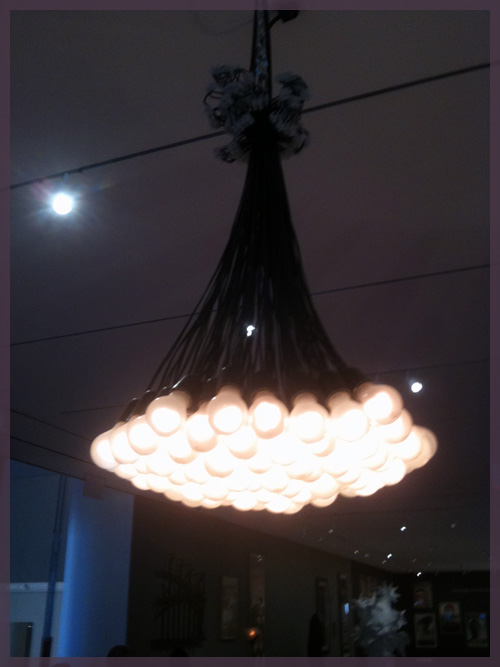
Then there was an entire area dedicated to furniture/interior design. There was this very West Elm-like industrial light fixture that was made out of a cluster of single bulbs (maybe the West Elm designers have been hanging out at MoMA?)

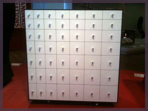
And this cabinet, which looked like it was straight out of Ikea but instead the drawers got taller and wider as you moved down and over.

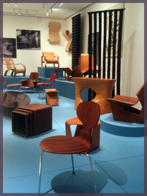
When I first saw this next display, it reminded me of the Brady Bunch house. But then I realized that the 70s are totally in style right now and most of this furniture could be in any West Elm/Ikea today.

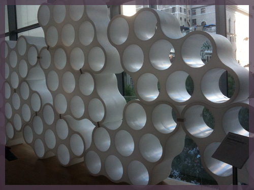
This bubbly thing was called the cloud bookcase. I wish they would have stuck some books in there, but I guess museums are not meant for staging. A mini version could make for a cool wine rack though 🙂

This next stack of drawers just reminded me of Alice in Wonderland, so I had to include it…

Then there were the art pieces that set off a little light bulb in my head in terms of inspiration. All of these things I think I can use as a starting point to create some of my own art.

First is this panaramic ocean view made out of single prints arranged in a line.

I had to do something like this for a Fundamentals of Design course I took as an elective in college. All it takes is to stand in one spot but focus your camera on different areas as you move along. I did mine with Times Square back in the day.

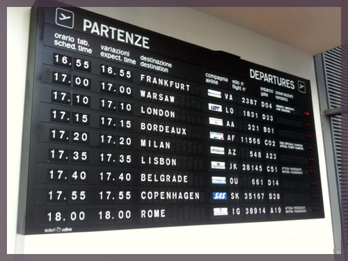
Next was this departure/arrival board.

When I saw this, I got the idea of using this as a personal travel log. I’ve always been interesting in displaying our travels and I think it would be fun to list all of the places we’ve been on a board like this! I was thinking departure and arrival can be dates instead of times. Of course, it wouldn’t be functional, but maybe just a painting or print.

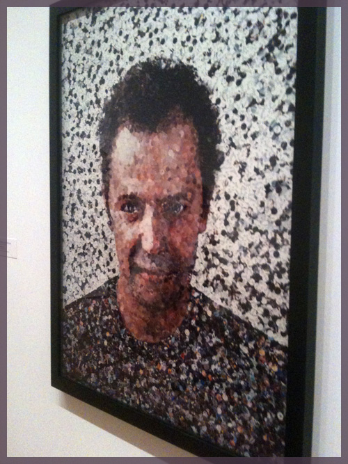
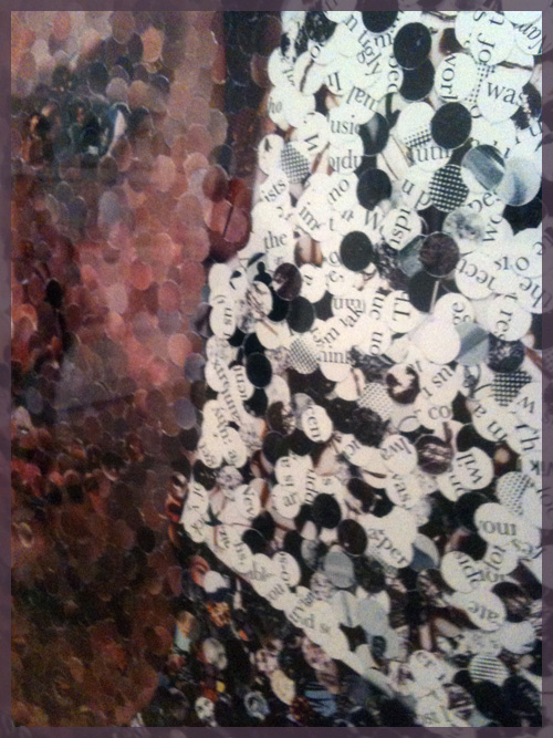
And finally, I love a good mosaic. This one takes the cake.

No that is not a photograph, it’ is actually small pieces of magazine pages!

I had to make something like this out of magazine pages in high school, but mine was awful. I tore the pieces rather than making them a consistent shape (like these circles) and was overly ambitious with my image. It ended up looking like a 4 year old made it. I would love to attempt something like this again, but I think I’d learn from my high school mistakes and use some simple circles and would definitely not make a face! This artist is clearly way more talented than I could ever be.

That’s the quick summary of our MoMA trip. We cut it short because we had to sit down for a good hour before our legs decided to function again. Regardless, it was a nice unexpected stop on our staycation!

Copyright 2010 - 2011. The Lil House That Could. All rights reserved.