Painting projects

12 Comments

Posted by Rebecca, January 12th, 2011

Lately I’ve been dying to paint something. I’ve been thinking of the powder room or office, but mostly I would love love love to paint our master.

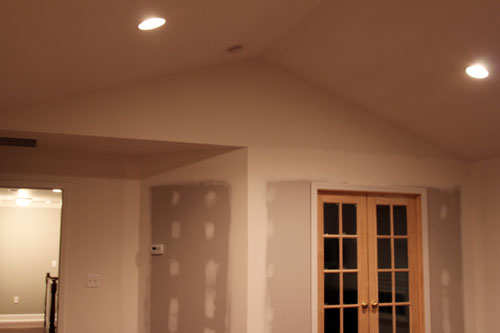
The problem with this is with the new trim, wall and french doors we had installed when we added hardwood floors upstairs, this is no simple project. We can’t just throw some paint on the walls, we have to….

1. Caulk the trim

2. Prime the new wall and doors

3. Paint the many walls

4. Paint all of the trim

5. Stencil wall behind bed

Now, our master is not your simple 4 walls type of room. It has cathedral ceilings…

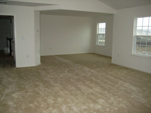
A sitting room, which I’d like to paint a different color than the rest of the room…

This one is obviously a ‘before’ picture- when we still had carpeting and no wall, but it is the best view I have of the sitting room size since there is no light fixture in there and the new wall makes it extremely dark. It’s on the to-do list πŸ™‚ But anywho, it’s a large room in itself. Our main bedroom part is about 17’x19′ and the sitting room is about 14’x12′ I believe. So that’s approximately 491 square feet to paint! Oy!

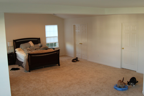
Since I referenced this picture in yesterday’s post and it’s a good view of our bed area, I figured I’d share. The messy bed, clothes on the floor and cat conference going on just add to it’s charm…

Once again it’s a pre-hardwoods, pre-wall picture, but it’s entertaining and it shows the size of the room pretty well. This one was taken from the sitting room, looking into the main bedroom part.

What you see in that picture is the only furniture/stuff we have in our bedroom. Paper blinds, no paint, no pictures…NOTHING. It is like a blinding sea of white in the morning. We know we’ve put the office on the back burner, but because of my inability to sleep well and my need for a little sanctuary, I think this will be tiptoeing its way up on the list.

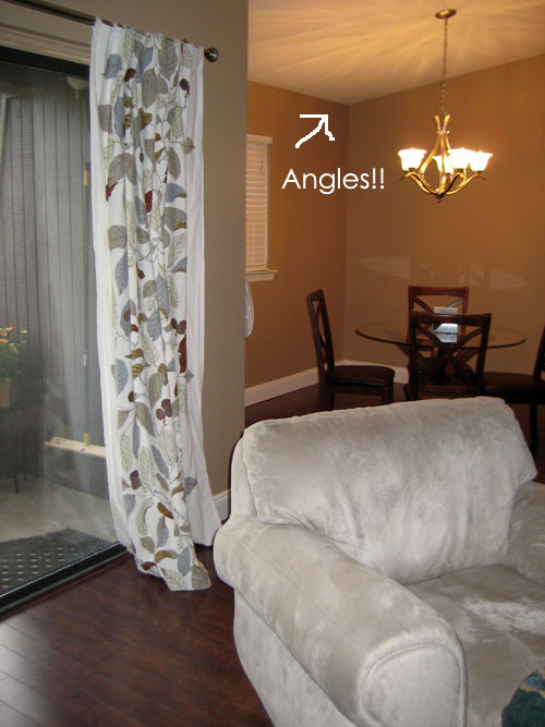
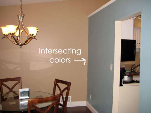
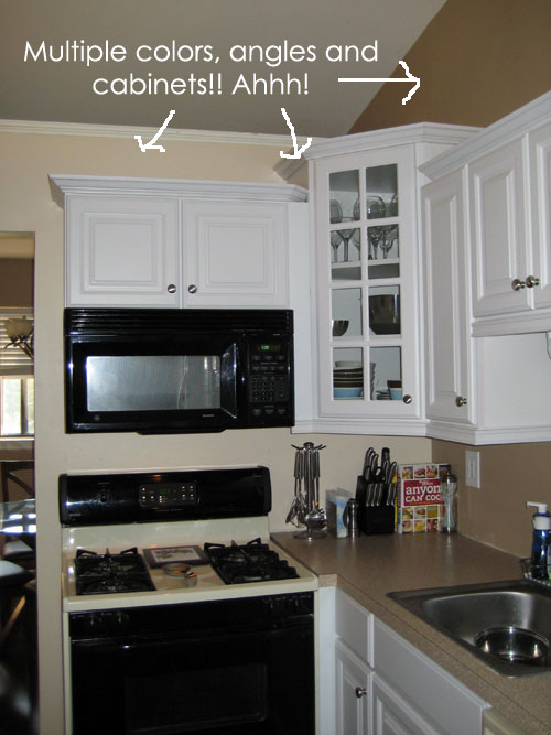
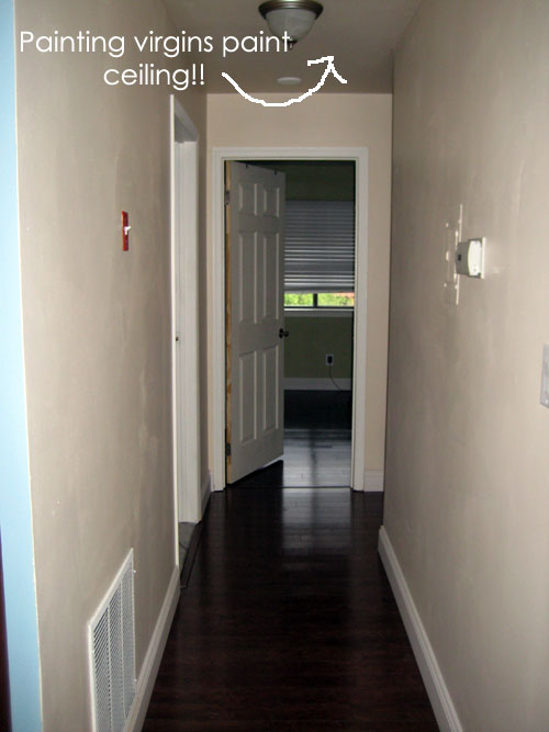
This wouldn’t be the largest and most complicated paint job we’ve undertaken. When we had our condo, we painted our connecting kitchen, dining and living rooms, 3 different colors, with angled ceilings at a maximum height of 12 feet. Oh did I mention that this was the first time either of us had ever painted a room? And that we didn’t have a proper ladder, or really any money for paint and supplies?? Oh and we accomplished it in one weekend? Here are some pictures of the hard work we accomplished in 2 days…

We actually repainted all of these walls about 2 years later because we didn’t like the colors we choose. Another lesson learned, looking at your old pictures will make you cringe. But when we toned down the colors a little (and went more beige than peach), we had it professionally done. This experience was traumatic for us, plus Mike put a huge hole in the drywall that needed to be patched beyond his skills, so a professional painter was key.

Long story short, as much as I’d love to tackle my major painting plans this upcoming 3 day weekend, I’mΒ traumatized by past experiences. I’m thinking this will be a project we’ll tackle piece by piece, over many weekends. Lesson learned πŸ™‚

ps- you know you love the arrows I drew up there! πŸ™‚

  • StumbleUpon
  • del.icio.us
  • Twitter
  • Facebook
  • Google Bookmarks

Bookcase Envy

16 Comments

Posted by Rebecca, January 11th, 2011

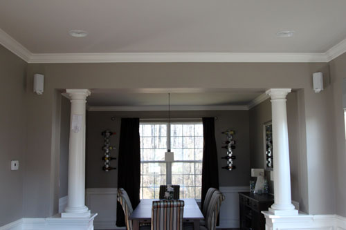
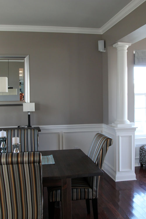
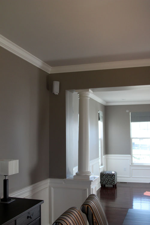
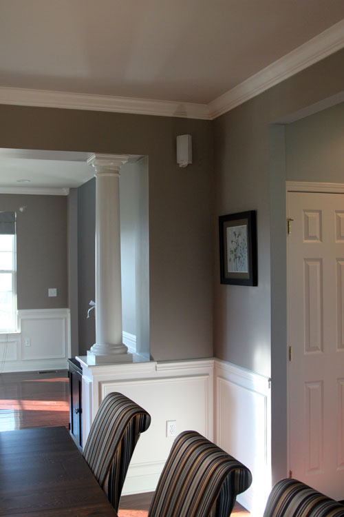
When we bought our house, included were these columns in between our dining and formal living rooms.

I stole that picture from Mike’s speaker files, since he still hasn’t posted about it and they’re nice daylight pictures. So please ignore the sloppy curtains and the speaker template taped to the column. I once asked him to take some daytime pictures of our bedroom and he took a picture that included his dirty clothes on the floor, so let’s consider this an improvement πŸ˜‰

Anyway, here are a few more shots of the columns, which were technically part of the upgraded trim package we were given as a result of a crappy real estate market.

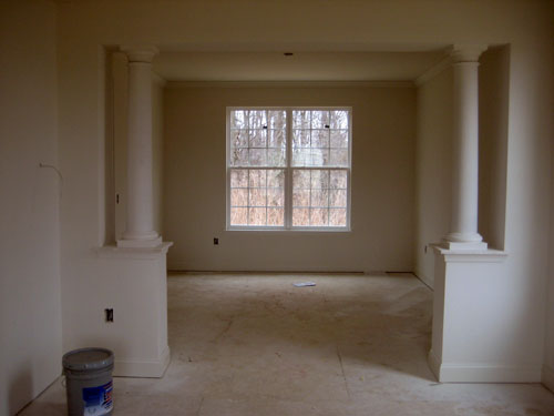
I know some of you will cringe at this statement, but we’re not crazy about them. They’re nice, but they’re just not our style. We were considering asking for a credit rather than having them put in, but we did want the extra wall piece between the rooms, so we decided to keep them around. Before we even closed on the house, we were scheming up things to do with the space. Here’s a vintage lil house pic from shortly after the columns were installed, nearly a year ago…

What a crazy difference from the first picture in this post, huh??

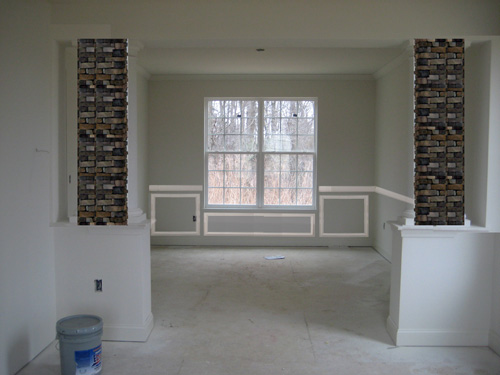
My first idea was to do some sort of a stone column, maybe a brick type or dry stack to compensate for the fact that new homes have no exposed brick. So long before we moved in, Mike photoshopped some stone columns into this picture.

He even stuck some wainscoting in there, which we had installed the day after closing πŸ™‚ Nice to see one idea come to life! We thought we could maybe even stick some sconces on those stone columns and make them feel all warm and fuzzy.

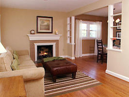
Then just Sunday, I sat on our JetBlue flight home from Disney watching HGTV. Isn’t JetBlue lovely?? You can just sit there and watch tv! Anyway, I did fall asleep due to exhaustion and woke up to a reveal of a room on Designed to Sell. I tapped Mike and pointed to my screen (he had headphones on too) and he nodded back in approval. Lucky for you guys, I found an image of what I saw on HGTV.com

It’s small and hard to see, but they built bookcases in the space between the rooms. Genius!! I am currently loving built-in bookcases after seeing Sara’s bookcases over at Russet Street Reno and Young House Love’s bold painted bookcases. Though I’m still thinking of places in our house where I can replicate Sara’s project, I’m thinking some bookcases in between our living and dining rooms could be an inexpensive, happy compromise to both issues… my bookcase envy and my column hatred.

  • StumbleUpon
  • del.icio.us
  • Twitter
  • Facebook
  • Google Bookmarks

Home Sweet Home

37 Comments

Posted by Rebecca, January 10th, 2011

Though this is a pretty sweet house…

…It still doesn’t beat being home. There was once a time where we looked forward to going to hotels because they were nicer than our own place, but now we have our very own suite everyday. With double sinks in our bathroom, which I forgot were so very important until Mike and I were bumping into each other while getting ready to explore Disney. Plus Macky is greater than Mickey πŸ™‚

One thing the resort had that was better than our own castle was a king sized bed. Getting one has been on our to-do list and we’ve been talking about it a lot recently, but sleeping in one in Disney was heavenly. I did not wake up once in the middle of the night, for 4 nights. Maybe that was because Macky wasn’t screaming, or Mowie wasn’t sleeping on my head, or because I was completely exhausted, but I credit it to a larger bed. I could comfortably sleep in the fetal position (my legs practically horizontal) without kneeing Mike or hanging off the bed. Because of my sleeping preference, I normally sleep better when napping on our family room chair since I can tuck my legs up without injuring anyone. Plus at night I am usually sandwiched between Mike and Mowie and I end up sleeping in pencil position. It’s rough being the family body pillow.

We are BEYOND exhausted from running all over Disney, cross your fingers that we have enough snow tomorrow night to stay home on Wednesday! We need an extra day in our lil castle since flying home on a Sunday night was not our brightest idea. Is there such thing as jet lag when you don’t leave your time zone??

Cinderella Castle picture from Wikipedia. I wanted to post the one we took standing in front of it, but apparently my eyes were closed. Boooo πŸ™

  • StumbleUpon
  • del.icio.us
  • Twitter
  • Facebook
  • Google Bookmarks

Live from Disney World!

8 Comments

Posted by Rebecca, January 7th, 2011

I finally got a hold of an internet connection here in Disney. This is what it looks like…

Seriously Disney?? It’s 2010 2011. My laptop doesn’t even know what that wire is. Oh and the lighting in this room is awful and we only brought our point and shoot, so please excuse the bad pictures.

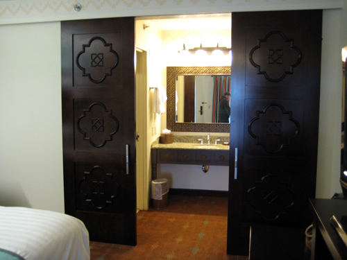
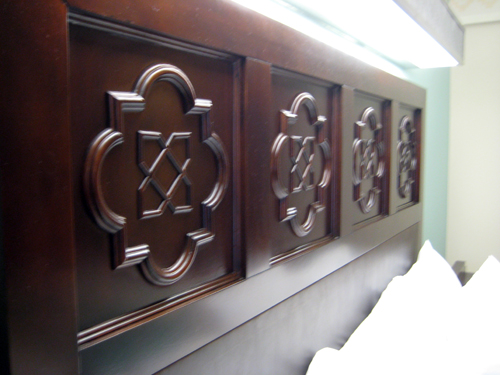
Our room is much nicer than I expected and has some things I really like in it, so I figured I’d share. Like these awesome doors separating the bathroom/vanity area from the rest of the room…

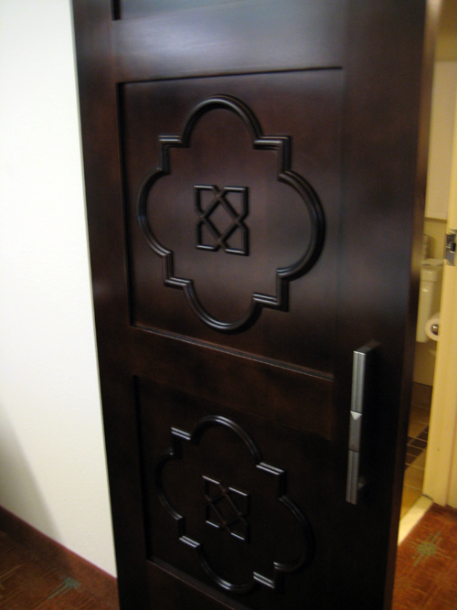
Close up…

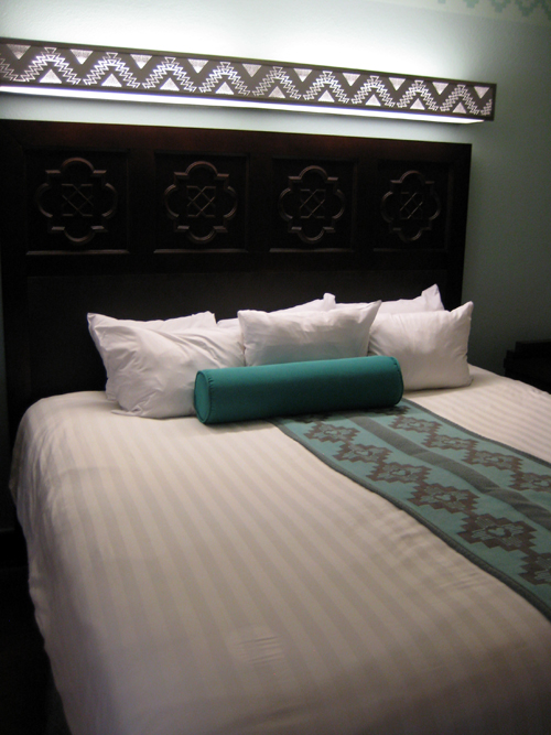
The pretty woodwork is also on the headboard, though it has some awful florescent light fixture above it…

That light is the only light in the room, besides a small fixture by the door that gives absolutely no light. And it’s blinding when you’re sitting in the bed.

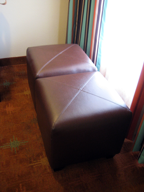
Here are some cute little brown leather ottomans with some colorful striped curtains behind them…

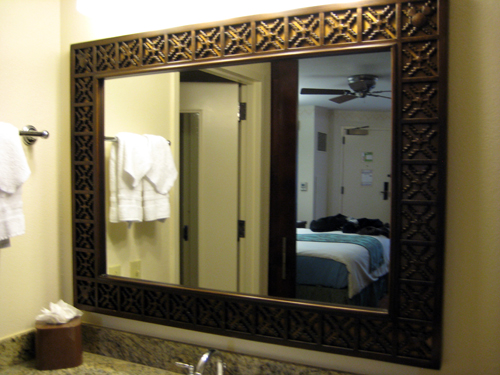
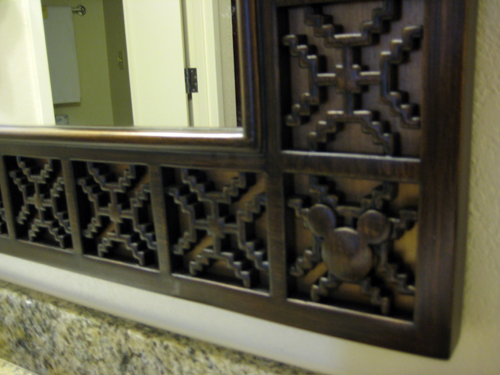
The bathroom mirror has some nice woodwork on it too…

With a nice little added feature in each corner…

But don’t worry, we’ve been out and about too. Here’s me with Mickey at breakfast this morning…

And Mike and I with Minnie…

That’s all for now, we’re pretty bad with taking pictures of ourselves on vacation, but I’m determined to get a picture in front of Cinderella’s castle at some point! Now back to my vacation πŸ™‚

  • StumbleUpon
  • del.icio.us
  • Twitter
  • Facebook
  • Google Bookmarks

Mmm West Elm

3 Comments

Posted by Rebecca, January 5th, 2011

West Elm is quickly becoming my favorite store, which is a huge statement considering how I feel about Crate and Barrel. Just lately, I love everything in West Elm. So when I received an
email and a catalog telling me about their new arrivals, I drooled. Twice. Once while at my computer and once while standing at my counter. I’m all about technology and everything and would be the first to tell you that I’d rather look at something online than buy a magazine (ie- all things wedding related) but boy, that catalog was dreamy. So I obviously felt compelled to give you a list of my favorites!

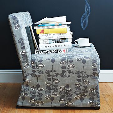
1. Slipcovered Slipper Chair, $349 for chair, $69 for slipcover

I’m generally not one for skirted slipcovers, but for some reason I love this one. It’s a nice mix of traditional and modern. Plus I love that print. A cheaper option would be to buy a much more affordable slipper chair at Target or HomeGoods and just use the West Elm slipcover (if it fits, I have done zero research).

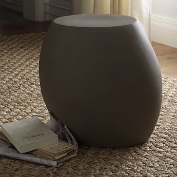
2. Pebble Side Table, $149

I am just intrigued by this thing, part of me likes that it’s asymmetrical and if it wasn’t, I probably would have browsed right past it. It says its for indoor/outdoor use and I do like it, but I’d probably love it outside.

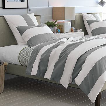
3. Stripe Duvet Cover, $59 for queen

Thick stripes? Check. Gray/white color scheme? Check. This thing is right up my alley.

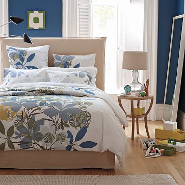
4. Spring Floral Duvet, $59 for queen

While we’re on the topic of bedding, which just so happens to be one of my favorite topics, I love this set as well. I love a white themed bed and this has just the right amount of color to add interest. Never mind that awesome floral graphic.

5. Metal Squirrel, $29

Because he’s cute, and I love a woodland animal. But at $29?? I’ll wait for him to go on sale…

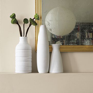
6. Textured Pure Vases, $29-$39

I’d like to add some more white accessories to the office to keep my little owl company and I love the texture in these.

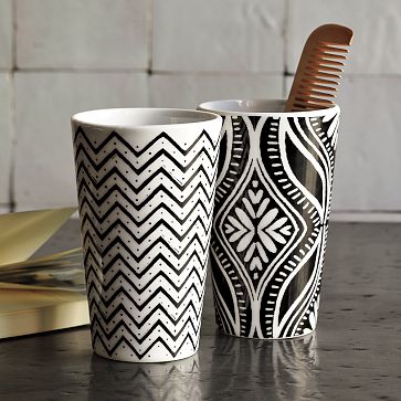
7.Porcelain Tumblers, $8

I love a nice little find for under $10. The bold patterns on these make them a nice little accent piece for pencils and pens, toothbrushes or as a little vase.

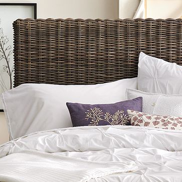
8. Modern Weave Headboard, $379 for queen

This is something that caught my eye in the catalog and if I had $400 hanging around, I’d totally buy it to compliment my future, stenciled, bedroom. Hm this list was too long for a top 5, but too short for a top 10. So I leave you with my top 8! πŸ™‚

  • StumbleUpon
  • del.icio.us
  • Twitter
  • Facebook
  • Google Bookmarks
Copyright 2010 - 2011. The Lil House That Could. All rights reserved.