a sunny inspiration
Posted by Rebecca, February 15th, 2010
Anyone who knows me knows that I am completely in love with my pets. In May 2008, I suddenly lost the 2 year old love of my life, Sunny. He was a bright orange lovable fluff of a former stray kitten, and one of the greatest living things I have ever encountered.

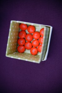
Ever since I met him, I have a new appreciation for the color orange. I feel like if I put a little touch of it here or there, it is a little tribute to him and has a secret meaning to me. It all started with our wedding favors, for which we made a donation in Sunny’s honor, but were originally going to give some homemade cookies for our guests to go home with. We decided that bright orange M&Ms would be a more fitting tribute, though our color scheme was purple and green.
 I tend to favor cool color schemes… I never wear red, orange, pink or yellow because they just aren’t flattering on me. I was once told that how people dress tells a lot about how they decorate their house. I guess this tends to be true for me as well! But I’ve decided that in my outdoor space or even in my landscaping, I want to throw in some bright orange for Sunny. My brother has kindly given us a large yellow umbrella of his that I fell in love with last summer. I’ve been wanting to take my favorite color, purple, it’s compliment, orange and some yellow and make a playful, yet classy outdoor setting.
Leave it to Crate & Barrel to read my mind. They recently added some new outdoor furniture to their website, including accents. I was delighted to see this entire set up…
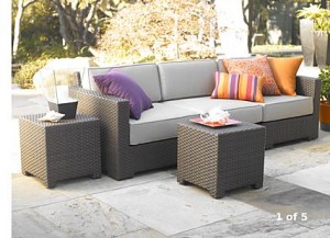
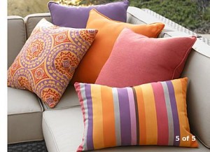
These items are a part of the Ventura outdoor collection. The outdoor sofa is $1899 and the pillows range from $29.95-$39.95. I love this particular style of furniture and have always wanted a dark wicker style with bright accents. The price is quite hefty, though we’re not thinking of creating an outdoor space for this summer. I’m hoping to maybe pick up the pillows and search Target and Walmart for furniture knock offs. Crate & Barrel outlets also offer some great deals on items that were previously in stores.
Whenever we manage to afford an outdoor space, I’m hoping it is beautiful in color, happy and lovable, just like my Sunny was. Though not everyone who sits on it will know the happiness the color orange brings, it will be another way to make my house a home and feel like Sunny was able to move with us.


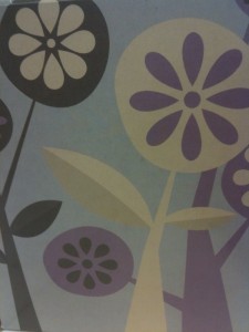
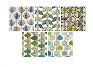 Unfortunately, they are no longer available from Ikea’s website for me to link. I paired them with a frame similar to this simple matted Fjallsta frame.