Archive for the ‘dining room’ Category

Happy Thanksgiving

2 Comments

Posted by Rebecca, November 23rd, 2011

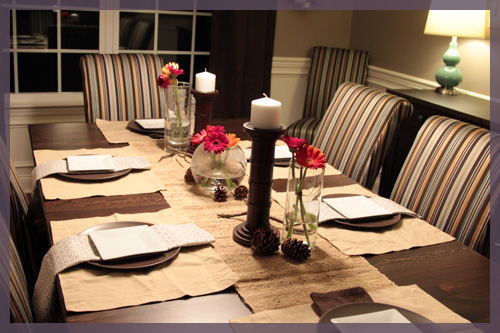
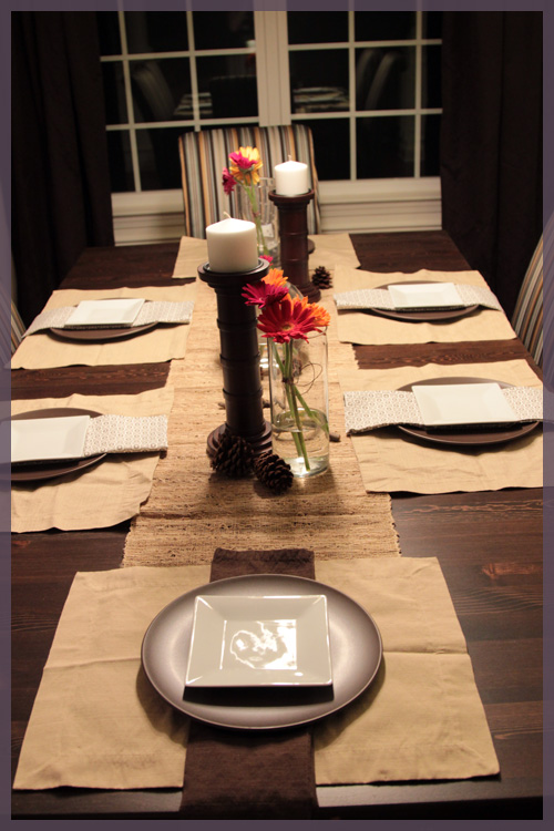
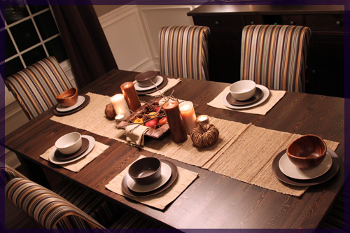
Last year I did some table decorating for Thanksgiving… the day before. I figured, why break tradition! So today, I once again decorated our table using most of the same materials (hey, I only own one set of placemats and napkins). This year I was without the apples and pumpkins, plus it has been raining for two days so my plan to collect some sticks and leaves instead was foiled. I was able to whip up a little something with what we had on hand 🙂

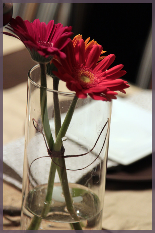
When we went grocery shopping yesterday I picked up some flowers in pretty fall colors. They look much more pink in the pictures, but they’re really red, orange and yellow. I figured they would add some much needed color to the table.

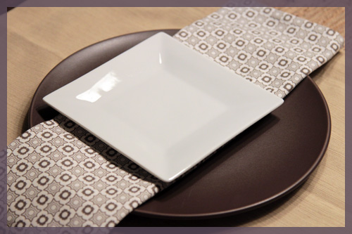
I used the same ramie runner from Target last year and the placemats and napkins are also from Target. No, I did not iron the placemats, obviously. I did this at about 8:00 tonight with a very curious Macky trying to attack my flowers. I don’t think our parents are going to mind the creases tomorrow. Or I might even just throw down our brown table cloth, which definitely has to be done while Macky is sleeping since he thinks that anytime a clean piece of cloth goes on a flat surface, it means the bed is made. We seriously cannot get sheets on our bed without wrestling with him because he wants to live under each layer…

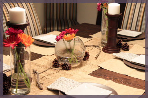
I put some pine cones and some leftover sticks from last year scattered on the runner to keep the earthy, fall thing going. I also tied a little piece of twine around my bundles of daisies to more easily arrange them and make them slightly more rustic.

The twine was leftover from our wedding and I wish it was a little thicker. I didn’t have to tie the flowers in the rose bowl because well, the bowl kind of shapes them for me 🙂

Probably my favorite addition this year are these West Elm napkins I picked up a while ago. I liked the bright white on the table so much that I added a square appetizer plate to each setting (which have no utensils and glasses because well, I’m lazy)

Makes me want a white runner or placemats or something…

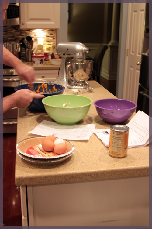
I couldn’t fuss over the table for too long though, because we have lots of cooking to do 🙂

Computer printouts=modern day cookbooks….

Thanksgiving is my favorite holiday because it involves no fuss, no pressure to shop for a month and just good food and good people 🙂 Plus we have a lot to be thankful for this year. This summer, we honestly thought that once the holidays rolled around, we’d be just a family of 4. Little did we know that Darwin would be a miracle kitty and the baby in the belly would bring our family headcount up to 6. Plus, I’m thankful to have a husband that texts me things like this…

Mike: I think we need to paint the powder room ceiling bold and add some crown.

Me: You mean gray?

Mike: No…. I’m thinking an accent color… like a pale aqua.

And with that, I hope you all have a Happy Thanksgiving! 🙂

Our Paint Colors

52 Comments

Posted by Rebecca, October 13th, 2011

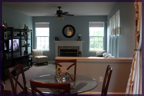
A couple of weeks ago when I planned to do a post with some frequently asked questions, I wanted to include a section for all of the paint colors we’ve used in our house. Mike ended up taking over the post for me when I fell asleep, answering his own version of our FAQs. Since the #1 question I am asked is what paint colors we’ve used in various rooms, I figured it was about time the question received it’s own post!

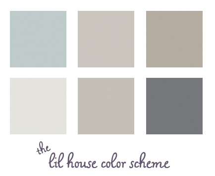
Here are all of our current paint colors displayed together. Some observations…

1. I never realized how well all of our house colors blend together. Since I didn’t really have the whole house in mind when choosing colors, I’m surprised that they all work well! I especially thought the dark gray was bolder and less expected, but even that blends in well.

2. The two middle colors on the top and bottom rows do not look that similar in real life. Or maybe they do? Mike says they do. I think the top color is more brown based and the bottom one is more of a true gray. At least I’m consistent in my choices 🙂

Here is our color breakdown, by room.

Family Room & Kitchen:

Wedgewood Gray

Benjamin Moore HC-146

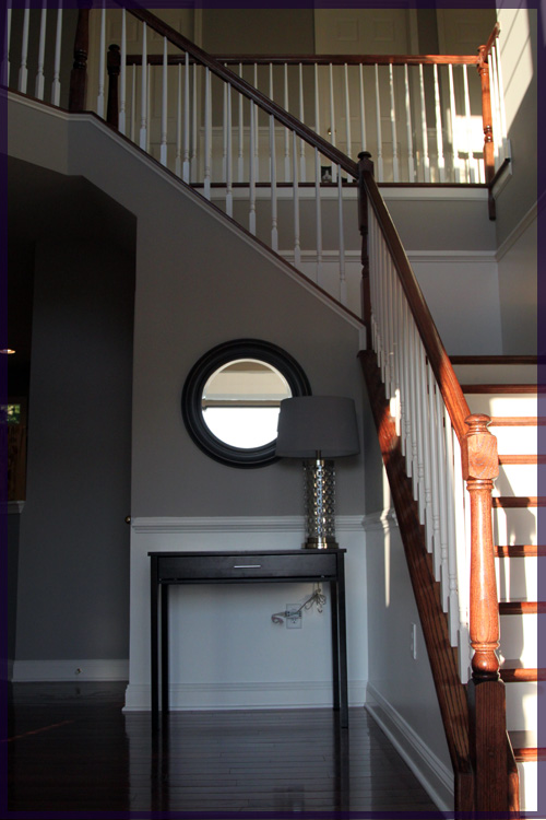
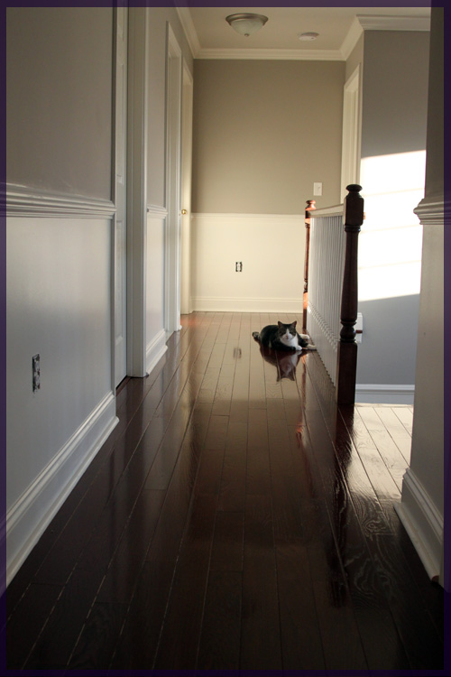
Entryway & Upstairs Hallway:

Himalayan Trek

Benjamin Moore 1542

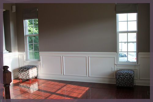
Living Room & Dining Room:

Waynesboro Taupe

Benjamin Moore 1544

Office:

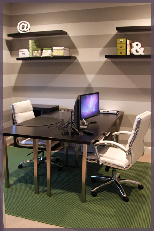
Light Stripe- Gray Ghost

Olympic D17-2

Dark Stripe- Silver Fox

Benjamin Moore 2108-50

(we color matched the dark stripe to Olympic, but it is nearly identical to Olympic’s Silver Dollar D17-3)

Powder Room:

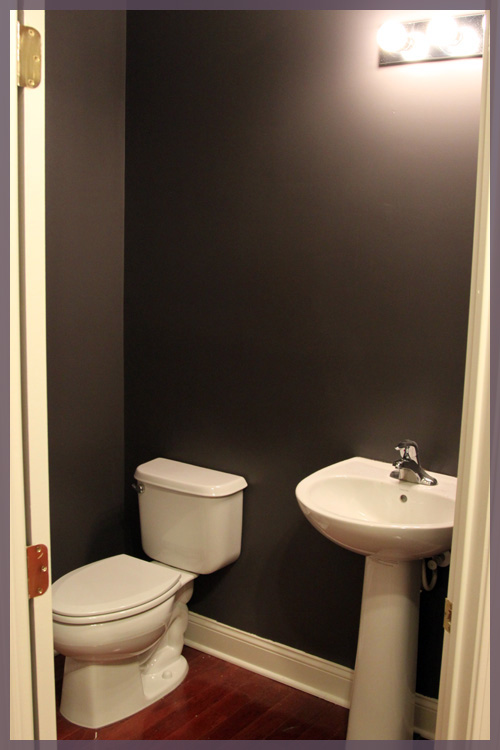
Cracked Slate

Olympic D44-5

You’ll notice that our recent paint projects have been done with Olympic’s no VOC paint. We try to keep things as toxin free as possible around here since Macky has seizures and we don’t want any unnecessary triggers. Plus those smells just aren’t good for anyone 🙁 The Benjamin Moore paints we used were for rooms we had professionally painted before we moved in so Macky wasn’t exposed to those fumes (we couldn’t paint our two story entryway on our own so we hired it out).

I hope this post answers all of your paint questions in one spot. I plan to update it as we paint more rooms down the road. I’ll also add this post to our top navigation bar for easy access 🙂

Knocked Up

10 Comments

Posted by Michael, August 3rd, 2011

No, mom, this entry title does not mean Rebecca is knocked up.  I wouldn’t tell you via the blog; I’d do on Facebook instead.  Or via an email.  I’m not sure yet, I’ll let you know after our 5-year plan to have kids.

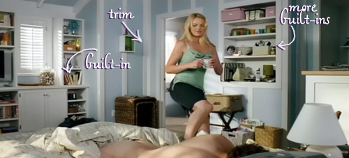
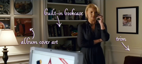
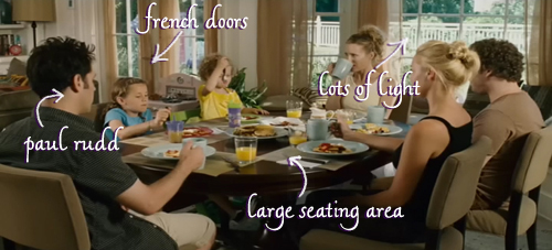
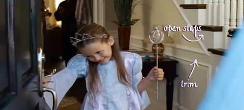
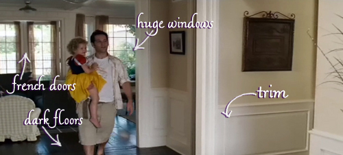
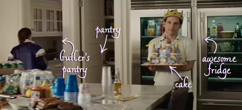
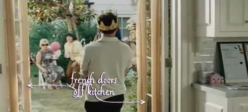
Every time Rebecca and I watch Knocked Up, one of us always brings up how we love the house in this movie.  Then we spend the next 5-10 minutes discussing why we love the house so much.  And then we spend the following 5 minutes laughing about how whenever we watch this movie, we comment on the house.  It’s a vicious cycle.

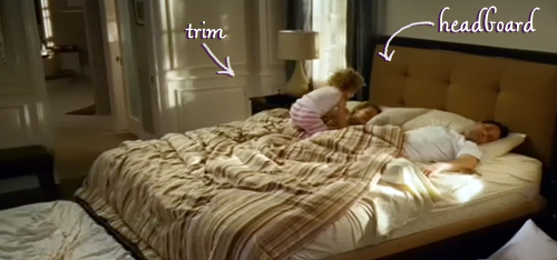
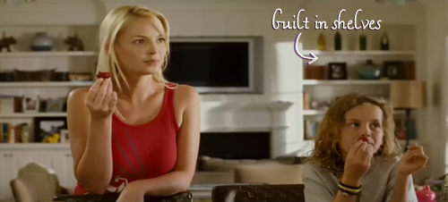
Anyways, as we watched Knocked Up the other night, I had the idea to highlight the areas of the house we love and post them!  Original, right?  Right!  So for your viewing pleasure, here are all the things we love about the Knocked Up house!  (btw, it was incredibly hard not to label Katherine Heigl in every picture).

Okay, I don’t like this pool and seating area.  I like the idea of this pool and seating area.  Got it?  Good.

Actually, is that house for sale? We want to trade up.

ps- This is our 200th post! So far we’re doing well on our list of goals we set out in our 100th post, which can be found here.

A Picture Is Worth 1,000 Words

29 Comments

Posted by Rebecca, August 1st, 2011

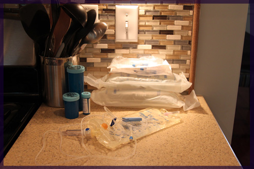
It has been another week of ups and downs here at the lil household. We learned that Darwin’s kidneys are physically healthy after just one week of chemo- an absolute miracle in itself. Then about 20 minutes after that we learned that while cancer free, his kidneys are still only functioning at less than 20%. This meant that we now had to give him 100ml of fluids TWICE a day in hopes that it would somehow kick start his kidneys. While I hate having to poke him with a needle twice a day and make him stay still, it is done out of an insane amount of love between all of us. Our family would be incomplete without D, so we’ve turned fluid time into Powerade (because the fluids give him electrolytes and magic powers :)) and snuggle time. The past few days, D has caught on and has taken advantage of the one on one time to snuggle into my chest and put his head below my chin. I have taken advantage of this time to be thankful that I have another day with my family intact. None of us are going down without a vicious fight, and fight we’ve had to. 

After finally settling into a routine, D caught a cold this week. Poor guy started sneezing on Wednesday, which was followed by watery eyes, a warm head and a stuffy nose. The vet called in some anti-viral treats for him, which seem to be working. My fear is that this little cold will prevent his kidneys from improving and he won’t be able to receive the chemo drug on his treatment plan this week. Fingers crossed as we go back to the vet tomorrow!

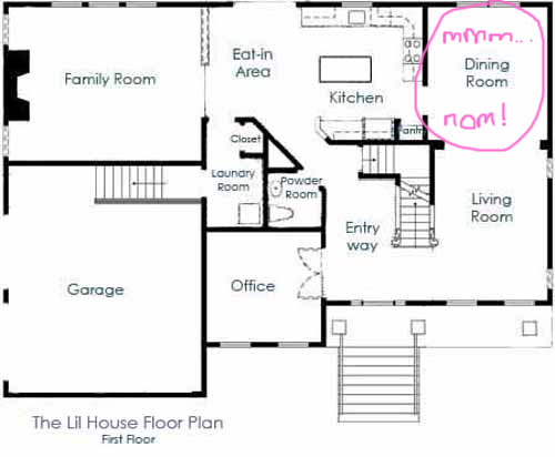
In the middle of all of this, I finally finished my summer classes and I was faced with my first free Saturday in… months? years? Not sure. I had purchased 4 canvases a few weeks back at Michael’s and decided to put them in our dining room (as mapped out in this post), with some sort of abstract landscapes painted on them. With the Pinterest Challenge from Sherry (YoungHouseLove.com), Katie (BowerPowerBlog.com), Emily (StyleByEmilyHenderson.com) and Lana (JoeyandLana.com) looming, I knew I could use some more therapeutic painting time!

I haven’t painted anything in at least 4 years. I have always been interested in art and even took some courses in college, but after I graduated I painted some canvases that other people requested and I just never felt that sense of pride from them. I think I needed to make my own little creation, on my own time, since well, I am my own worst critic and hate feeling like I gave someone a painting that wasn’t my best work. To get past my previous lack of pride, I bought these pre-gessoed, solid wood squares to paint on. I’ve never preferred canvas, but since that’s what the common painting surface is, I always just went with it. I hate the bumpiness of a canvas, so while more expensive, (about $14 at Michael’s) I thought these would work better for me!
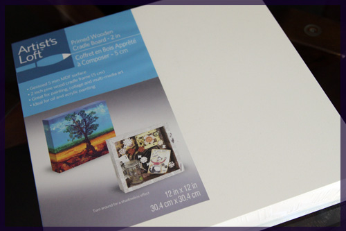
I used all craft paint that I have accumulated from various other projects throughout the years. I used a paper plate for my paint and some random styrofoam bowl I found in the pantry for my water. My Russian Intro to Painting teacher would die.

I was also armed with my (p)inspiration!
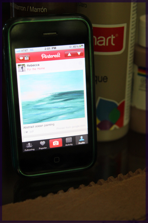
I pinned several landscape type of paintings for inspiration…
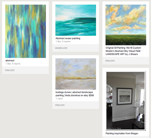
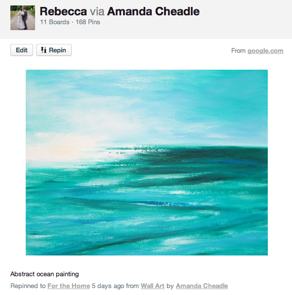
While this one was my favorite, I really just planned to wing the whole process.
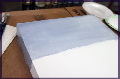
I started to casually add some paint to the first board, and this is the first and only in-progress picture since I was kinda busy figuring out what to make after this 🙂
I wanted to make four clearly related, but different paintings. I really just started painting and trying things, then repainting the ones I didn’t like/didn’t mesh with the others. Finally, after painting probably six of these (since I completely re-did 2 of them), I had my finished products drying on the island 🙂
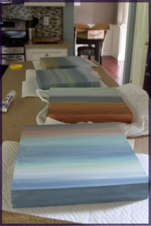
Some of the craft paints I used were metallic, which made a nice sparkly finish on some of the paintings (yes that is a cat food can cover in the background, we’ve been feeding Darwin on demand so he must have been awake and looking for food in the midst of my photo shoot :))
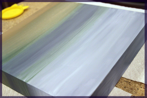
These things dried pretty quickly and I was anxious to hang them, but we had no nails! So we made a trip to Lowe’s and on Saturday night, paintings were hung!
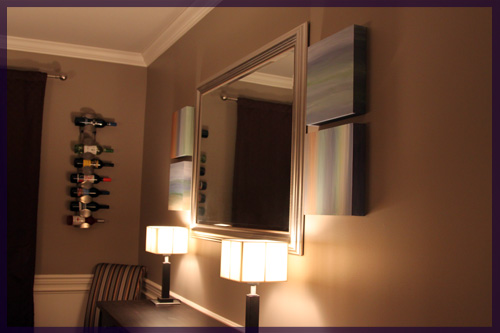
I likes, but there was one obvious problem.
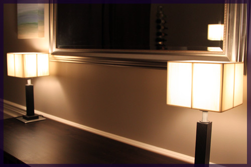
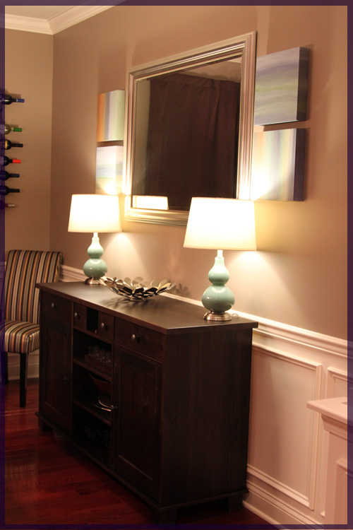
Meh lamps. Square paintings + square mirror + square lamps = Meh. Plus the height of the lamps has been irking me since they fall right at the line of the mirror, making the whole scene very uninteresting. Knowing the lamps wouldn’t work with the paintings, we found some new ones while at Lowe’s (after checking HomeGoods with no luck)

I found exactly what I wanted: blue base, round shape, crisp white lampshade. Now my paintings fit in 🙂
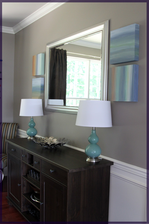
I think the top painting below is my favorite. It’s my oopsy painting that used to be a mountain with clouds, but got painted over. Somehow I ended up loving it 🙂 I love the bottom one for the tint of yellow I added as a little opportunity to add some yellow to the dining/living room down the line. I also used a smaller brush and stripey method on this one.
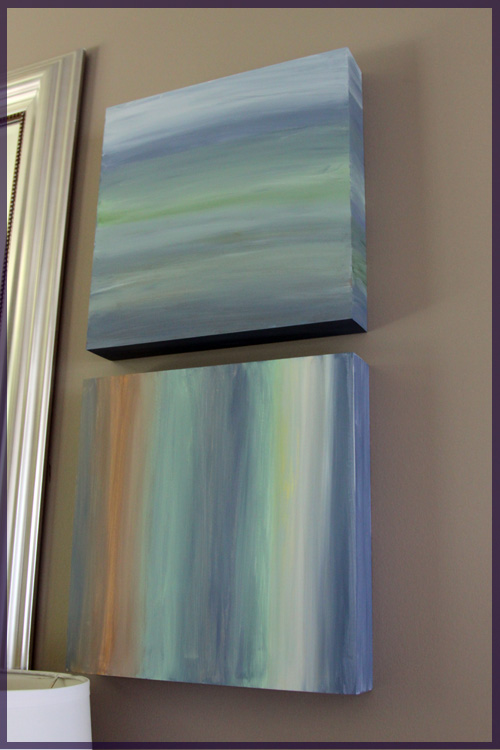
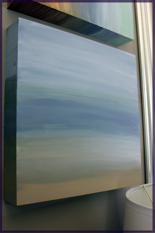
I love this one below because a) it was the first one I did, b) then it was the worst one for a while, c) I saved it by re-doing it and d) it has sparkly sand!
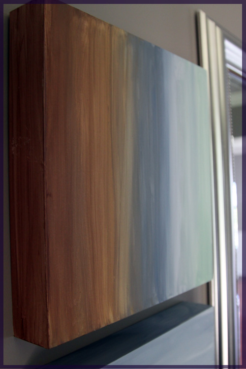
And this guy is a little streaky sideways one with some more yellow in it, almost looks like Arizona or something?
The lamps and paintings add some much needed color and interest to the dining room, though they are going to take some getting used to. I worried that it looked beach themed, which was not at all my intention, but Mike assured me it still looked classy.
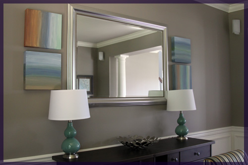
Lamp height? Way better!
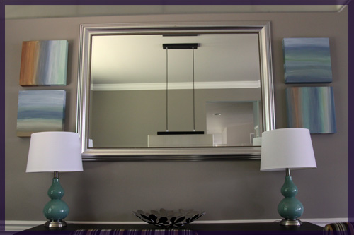
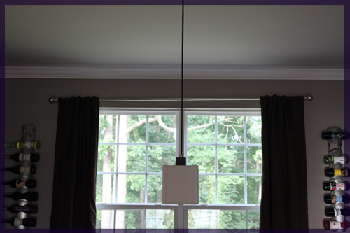
Now we need to change out our dining room light for a round, white, drum pendant. We didn’t expect to find lamps so quickly so we’re not in much of a rush on that one.

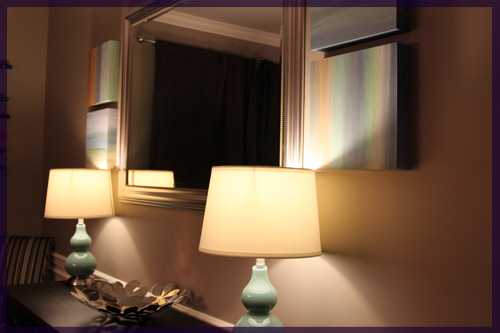
And of course, I had to take pictures of the new lamps at night 🙂
I felt good to have a brush (that wasn’t meant for walls) in my hand again. It was a very much needed break from the norm. We had a trip to Florida planned for next week, but we decided to cancel it to be home with Darwin. Now at least I have a little bit of the beachy tropics right at home, even if it was sort of unintentional 🙂

Four Paintings are Better Than One

7 Comments

Posted by Rebecca, July 27th, 2011

I’m itching to do the next round of the casa tour in the kitchen, but Mike is currently cooking and it’s functioning as a part-time kitty oncology unit…

I hate fluid drips. And we’re now doing them twice a day. Grr.

Anyway, I decided to jump into the dining room next since I have a project lined up for that room this weekend.

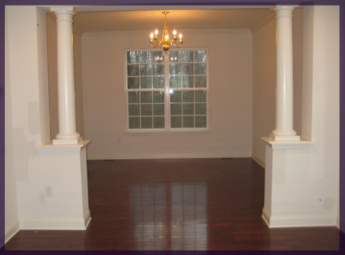
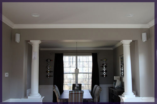
Here’s what the place looked like when we moved in…

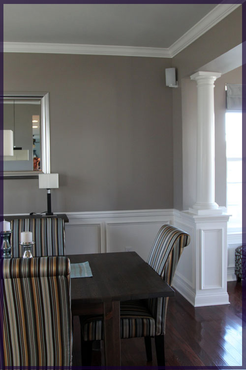
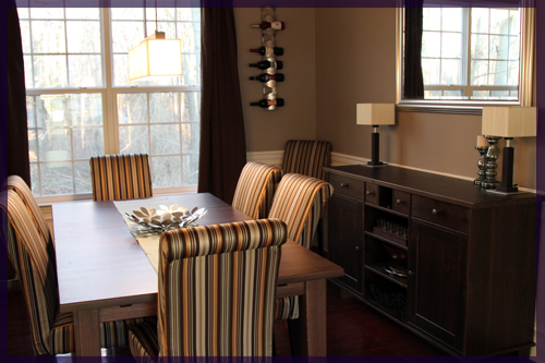
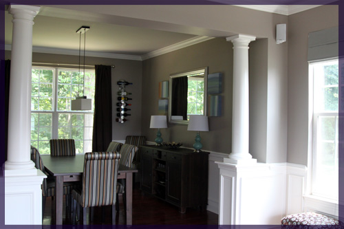
We painted the dining room days after we moved in and bought a Stornas table and buffet from Ikea shortly after. The chairs were a months long saga of searching, ordering, then reordering, but we’re very happy with our Target Avington Stripe Parson’s chairs 🙂
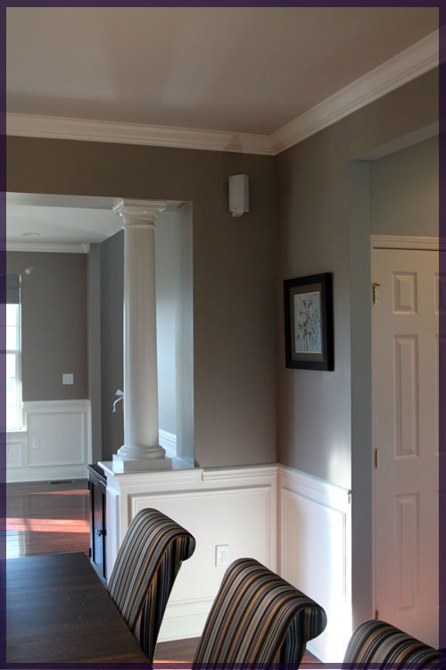
We’re not fans of those columns and hopefully they’re out of there someday! The builder gave us the chair rail in the dining room and we added the boxes underneath (or rather we had someone do it since we hadn’t yet mastered the nail gun). The wine racks are from Ikea and we had them in our condo.

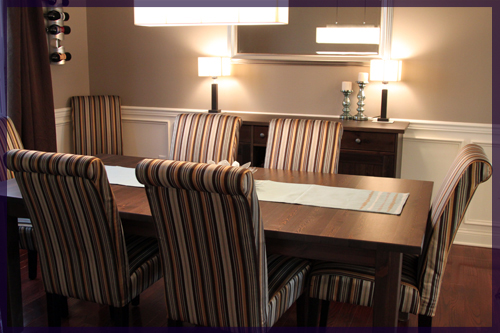
Mike added speakers in this room and the living room so we have some music when we have large groups of people eating over. The mirror is also from Ikea and the light fixtures are from Home Depot. We fell in love with the lights before we bought the house, but they’re on their way out. They probably inspired this room the most in the beginning, but as it’s grown and evolved (and we have too) I think we need less square and more round elements in the room. So I’m planning on adding large, white, round lamps (with maybe a blue base?) and 1 (or 2!) large white drum pendants over the table.

We’ll either stick the old fixtures on Ebay or Craigslist, or save them for the basement. Either way, we’re not in a rush to get rid of them right now.

We really love how they make the space seem like a swanky restaurant more than a dining room, but as you can see in that last picture, the proportion of the lamps to mirror is off. They’re too short, mirror is too big, mirror is too square, lamps are also square, molding is white, lamps are off-white. You get the idea.

Here’s the table decked out for Thanksgiving…

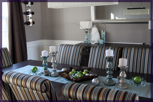
And for Christmas…

The only year round decoration (and the only picture hanging in the entire house!) resides in this room. I got it at Kohl’s for dirt cheap when we moved in and I figured I could always change out the print and reuse the square and double matted (!) frame for the $15 or so it was.

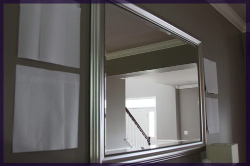
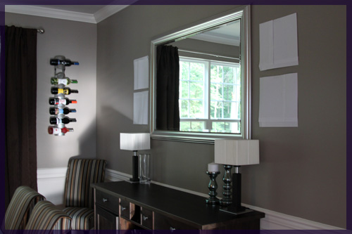
Since we have a serious lack of art and the scale of the mirror is irking me, I decided to pick up four 12″x12″ canvases in Michael’s a couple of weeks ago. I haven’t painted anything in years and I thought this room could use some abstract landscape art. I think that two on either side of the mirror will make the buffet wall look much more subtantial.

To make sure I wasn’t crazy, I chopped up some pieces of paper to get the size of the canvases and taped them to the wall.

Once we have taller, more substantial lamps, I think it will layer nicely.

I think one of my favorite aspects of this room is that not a single thing in here was expensive. The table and buffet were being discontinued in the stain we bought, so they were $199 each. They are solid wood and the table has two leaves that extend the table to fit 12+ people. The target chairs were about $65 each and they had free shipping. The curtains are from Target, wine racks from Ikea and that’s about it! Classy doesn’t have to be pricey 🙂
ps- What happens when you mix an almost 20lb cat and a curtain rod?

No my camera is not crooked, the rod is. Macky has pulled it partially out of the wall. Someone please tell him that he’s 5 and this type behavior is no longer age appropriate?

Copyright 2010 - 2011. The Lil House That Could. All rights reserved.